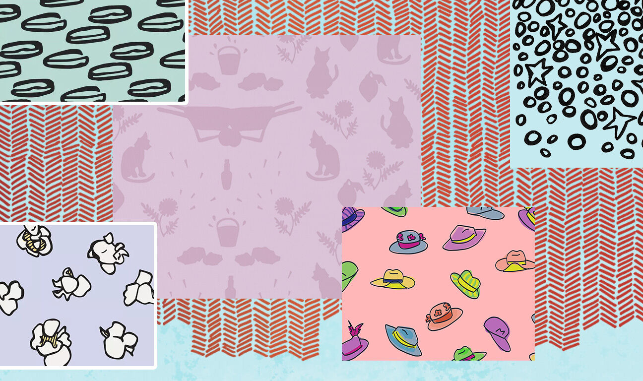
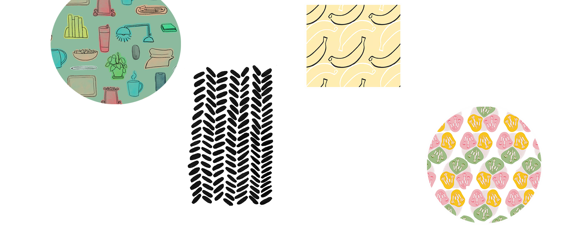
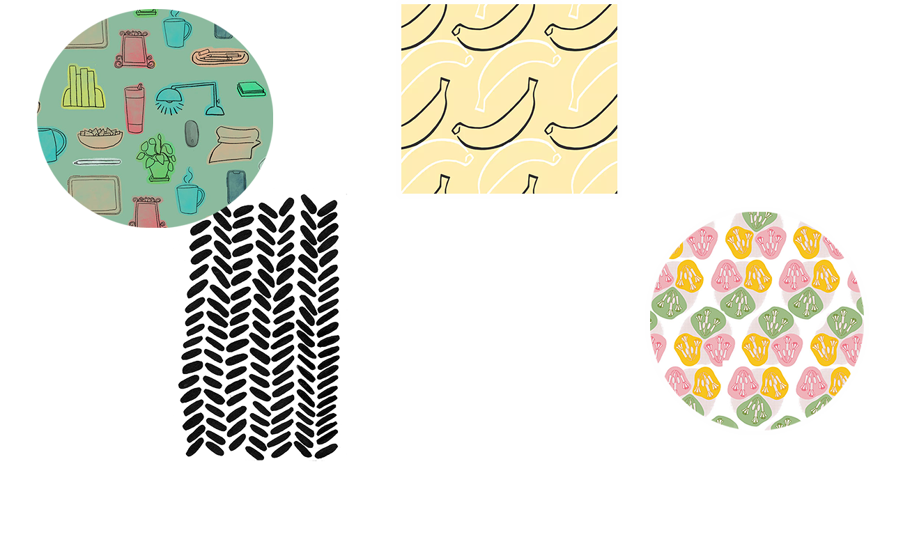
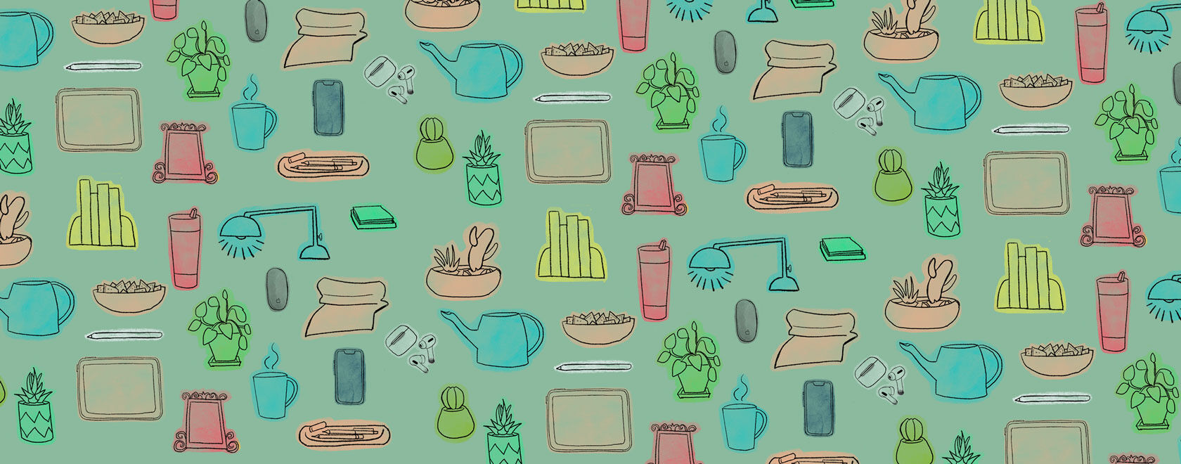
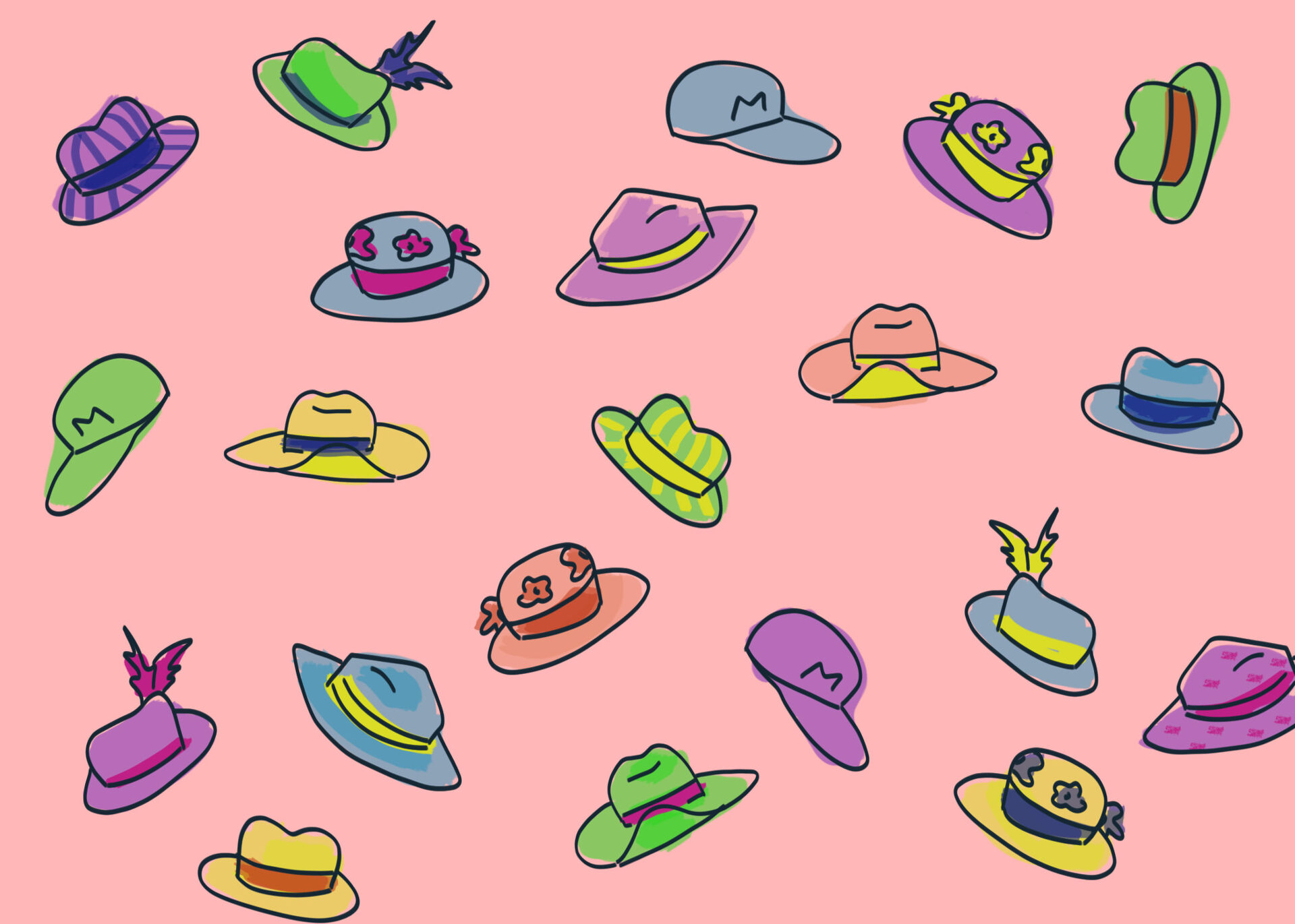
Pattern & Surface Design
Illustrations & Graphics
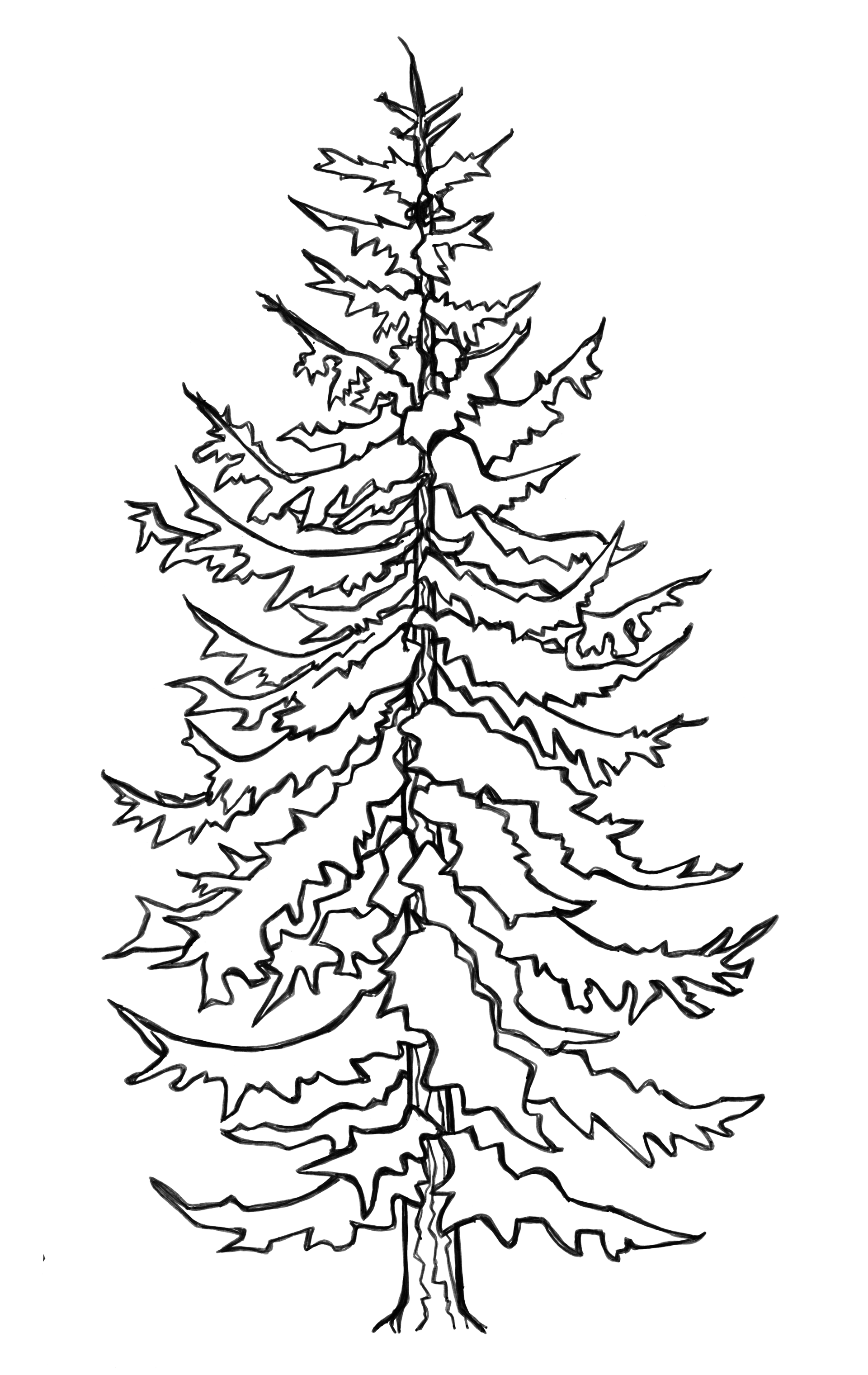
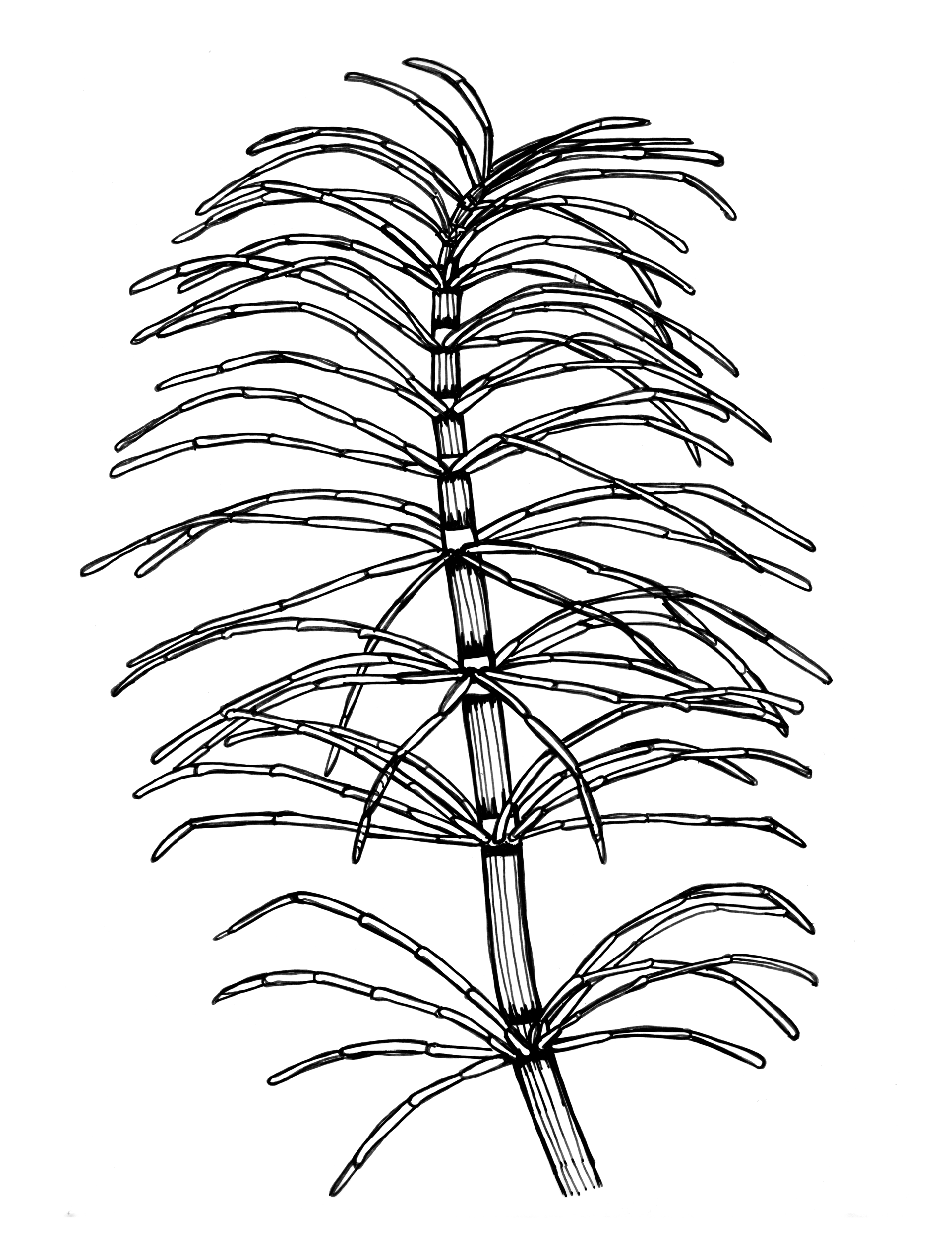
Here we are. It’s the year 2020; the world has a human-based virus and (hopefully) we are all doing our part by staying home as much as possible and flattening that curve! I wanted to find a way to make our home stays a little easier. If you have kiddos or are a kid at heart, this project is for you. Feel free to print and share coloring pages for you, your family and friends to enjoy. Also, feel free to tag me on social media with your completed pages. Just please refrain from selling, stealing or making a profit from these. They are my gift to you and I can’t wait to see how your creativity shows itself.
Love,
Amy
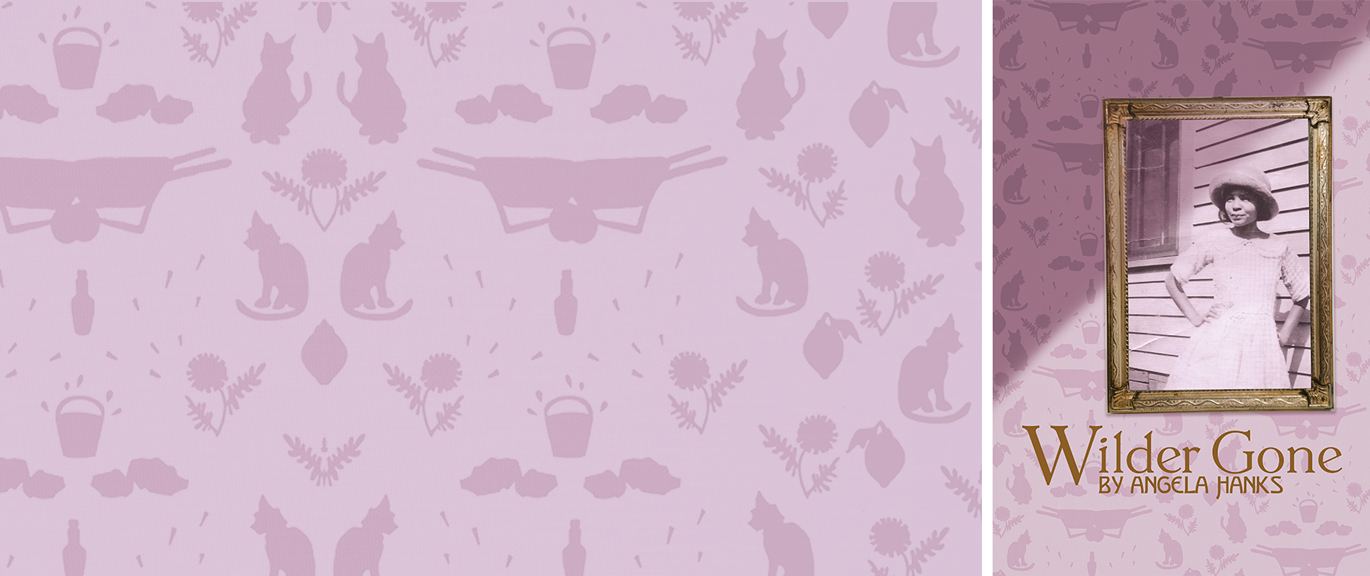
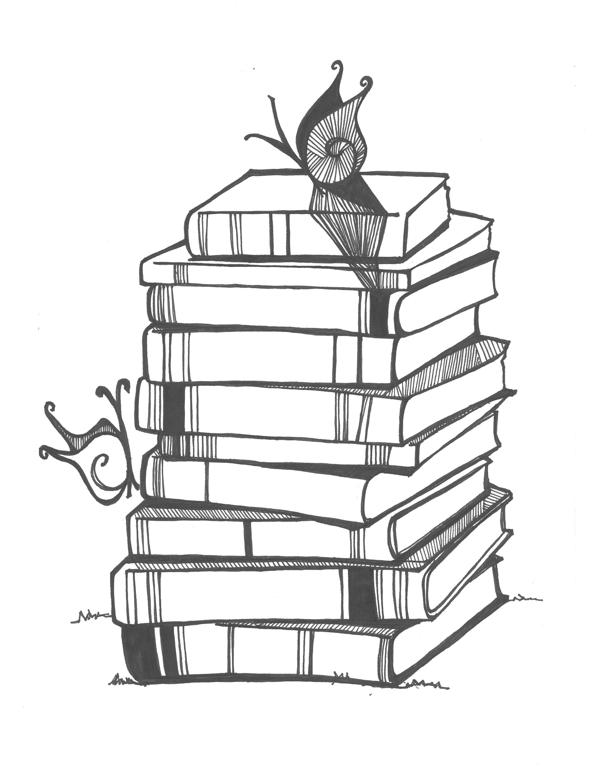
Spring Book Club
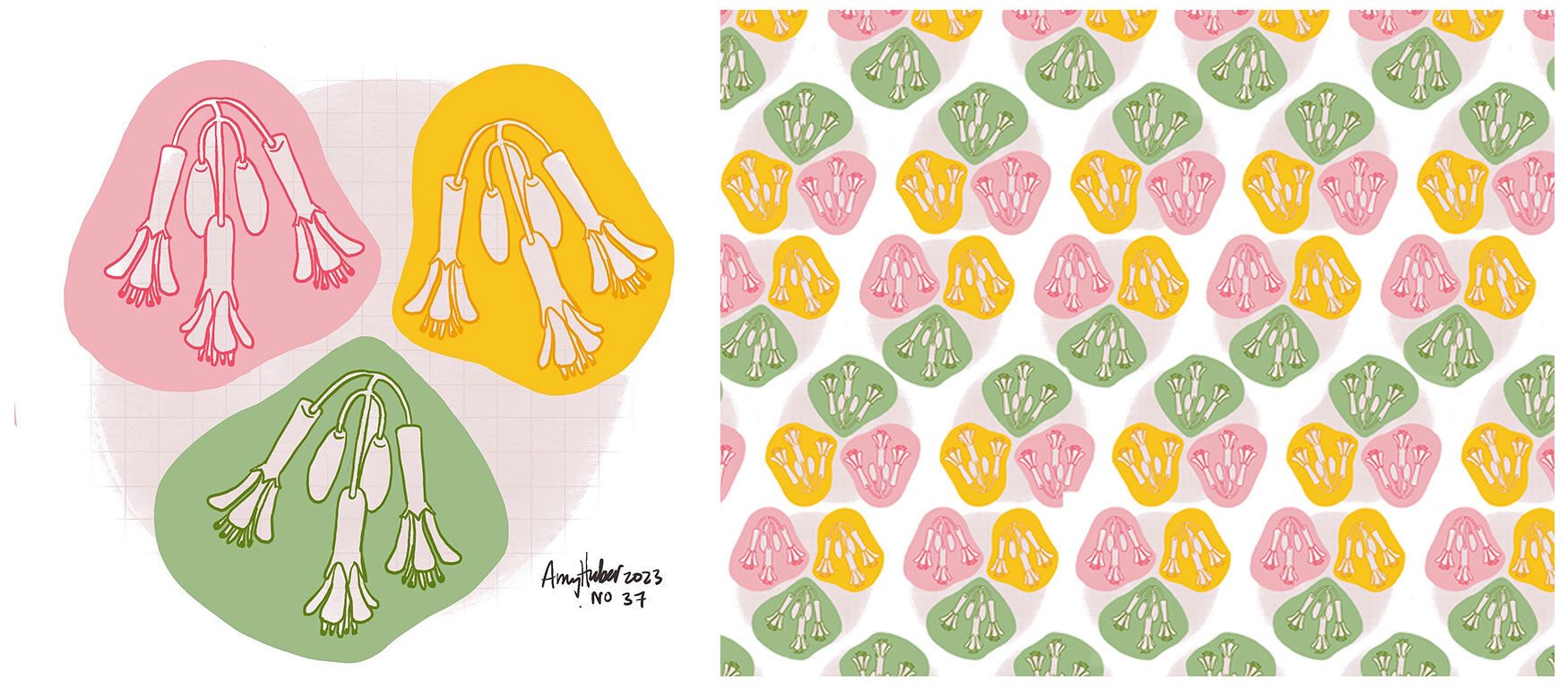
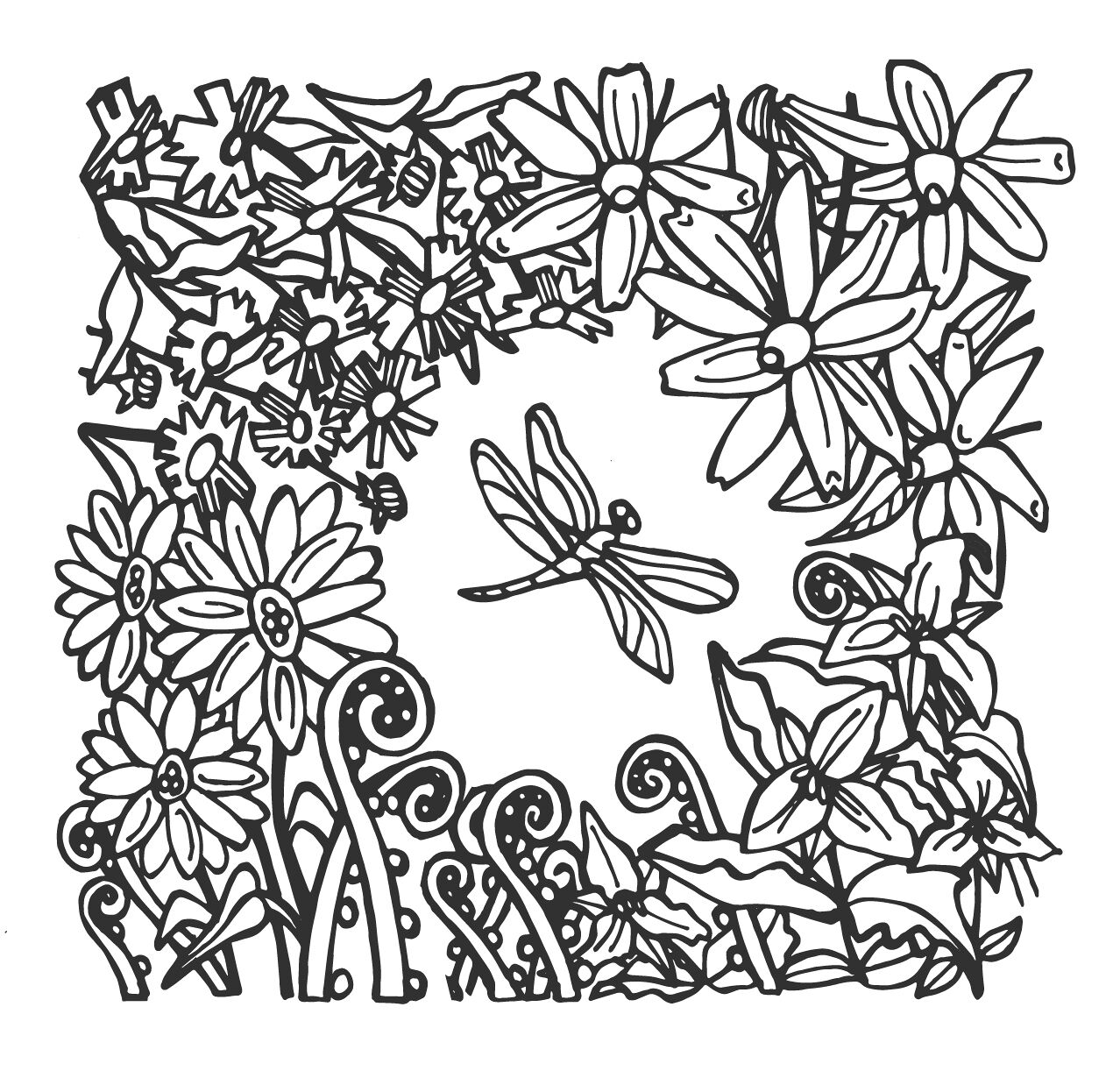
Wildflower Garden
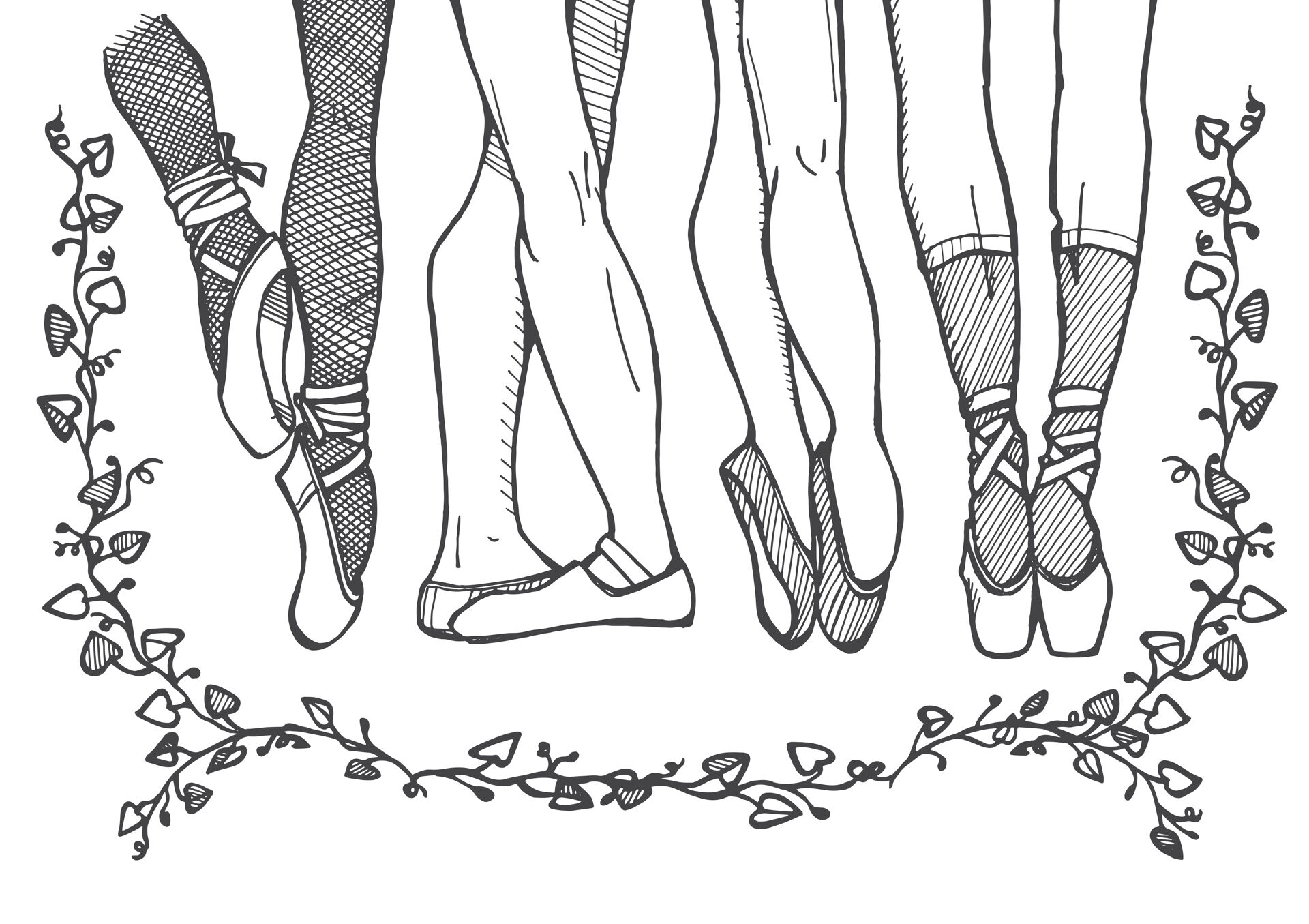
Garden Dance
Download/Print
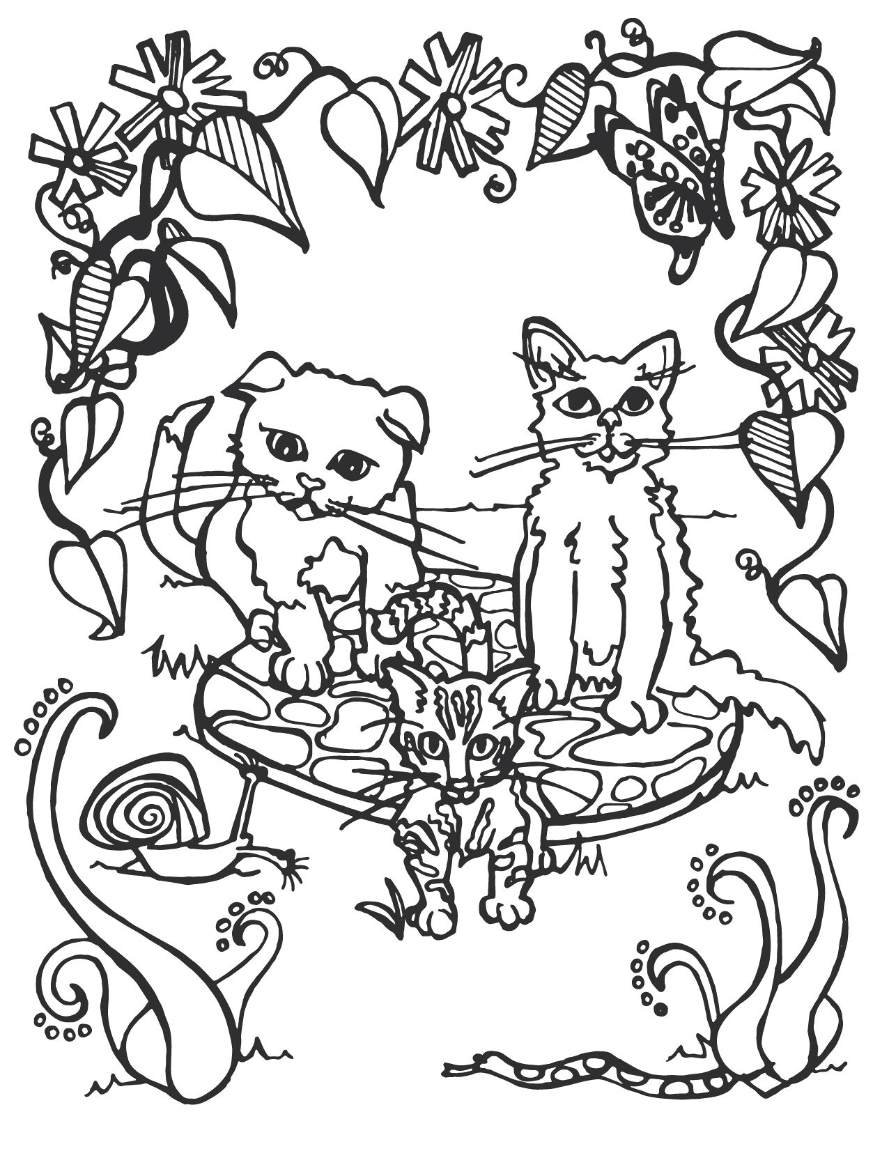
Kitten Garden
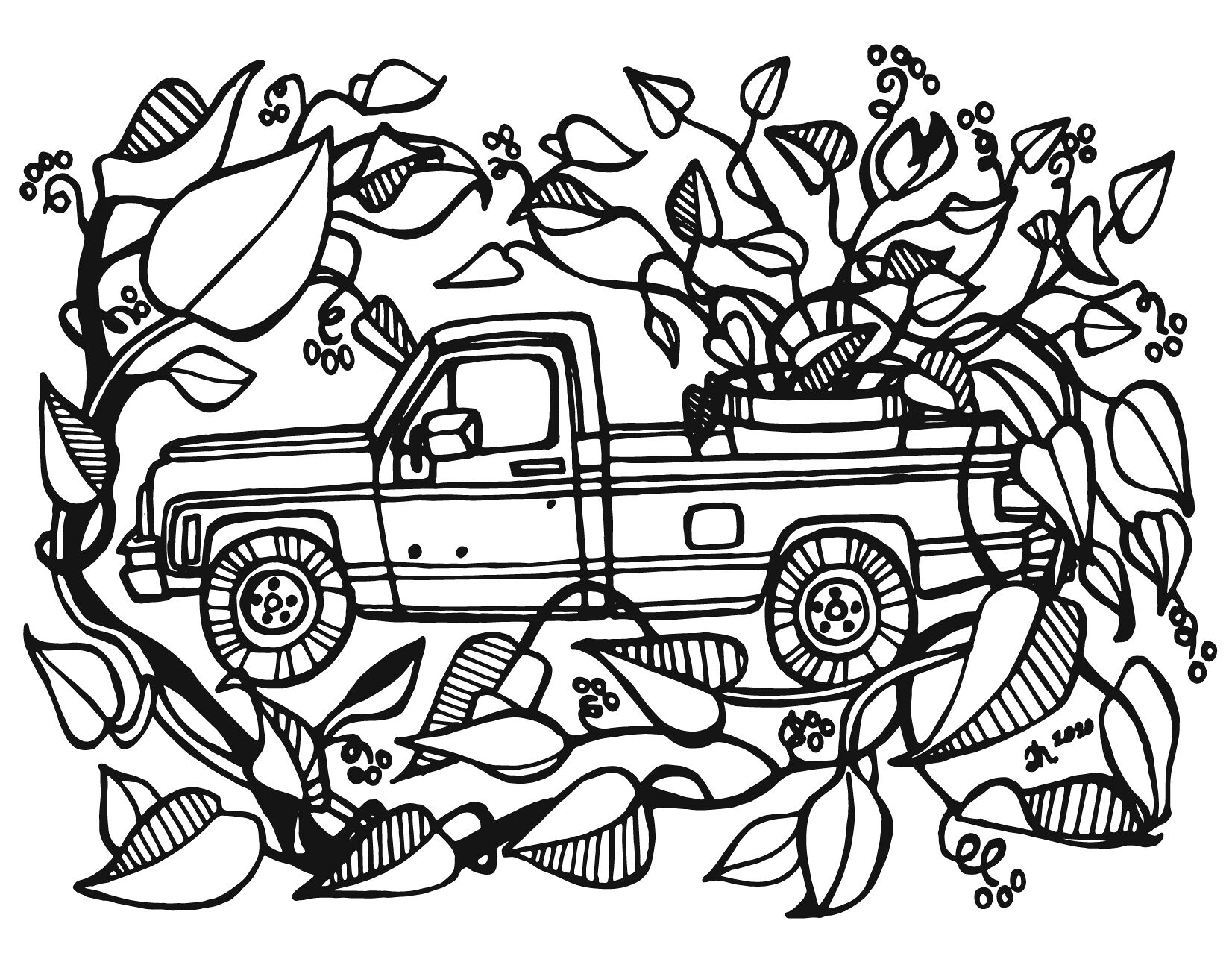
The Gardener’s Truck
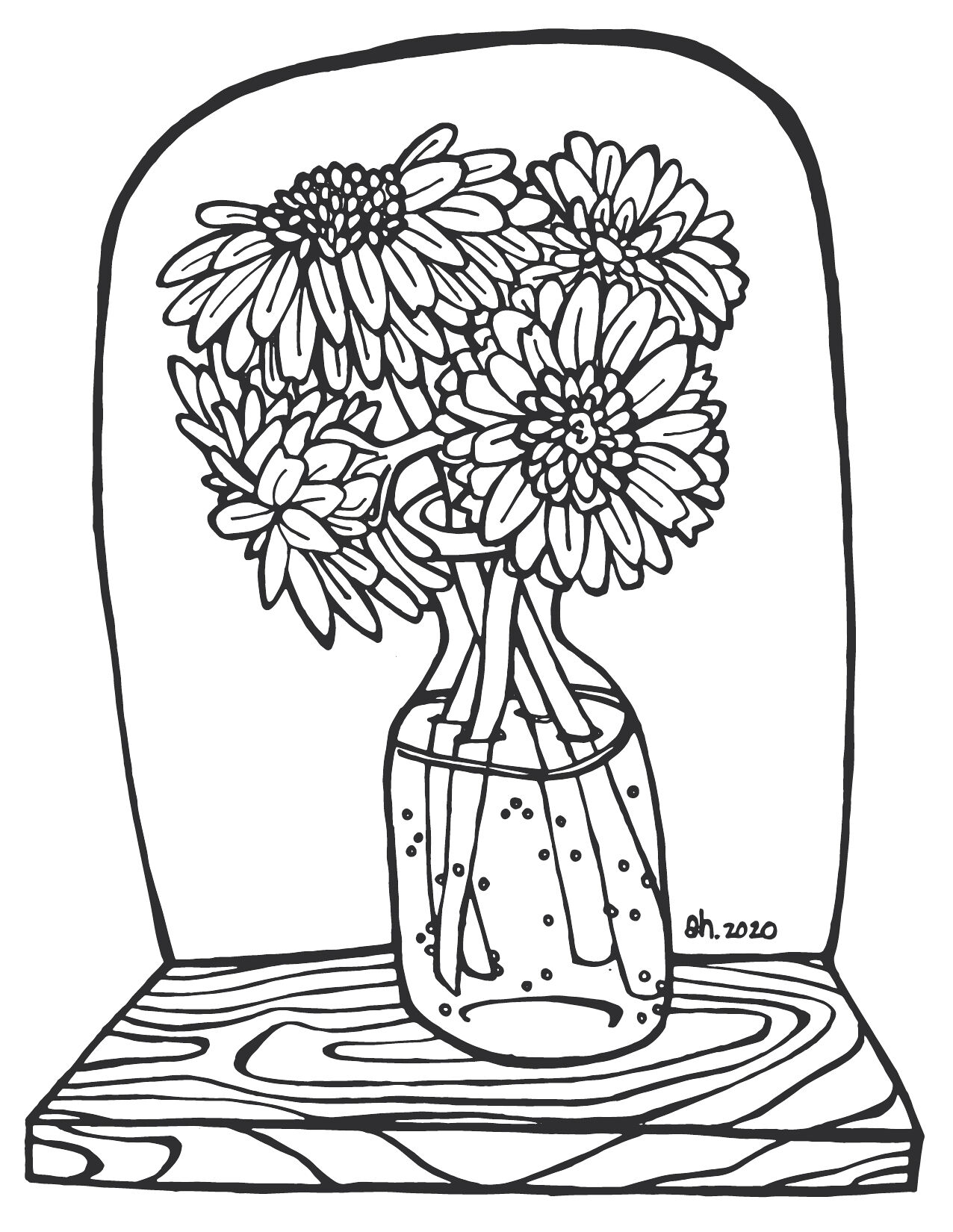
A Vase Full of Cheer
Transpose, a Seattle-based start-up, aimed to make everyday data storage more simplistic.
When they came to me looking for illustrations for their new e-book, I was excited. Together we explored concepts for imagery that would best support their overall company message. We settled on the theme “consolidation is key” for the chapter header illustrations. Using a keychain as a metaphor, I created a series of images supporting the idea that digital consumers store their data in too many places and that by using Transpose’s online services, users can pair down to one platform. The fox—Tranpose’s logo/mascot—holds the key.
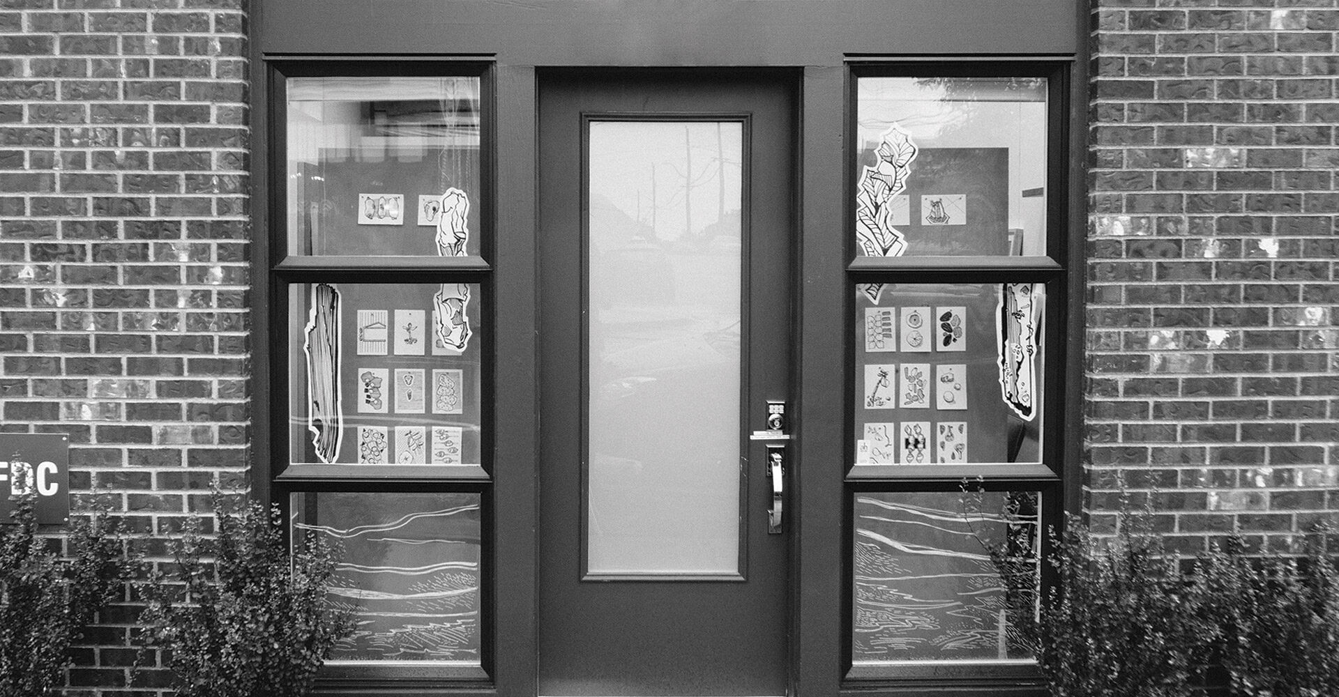
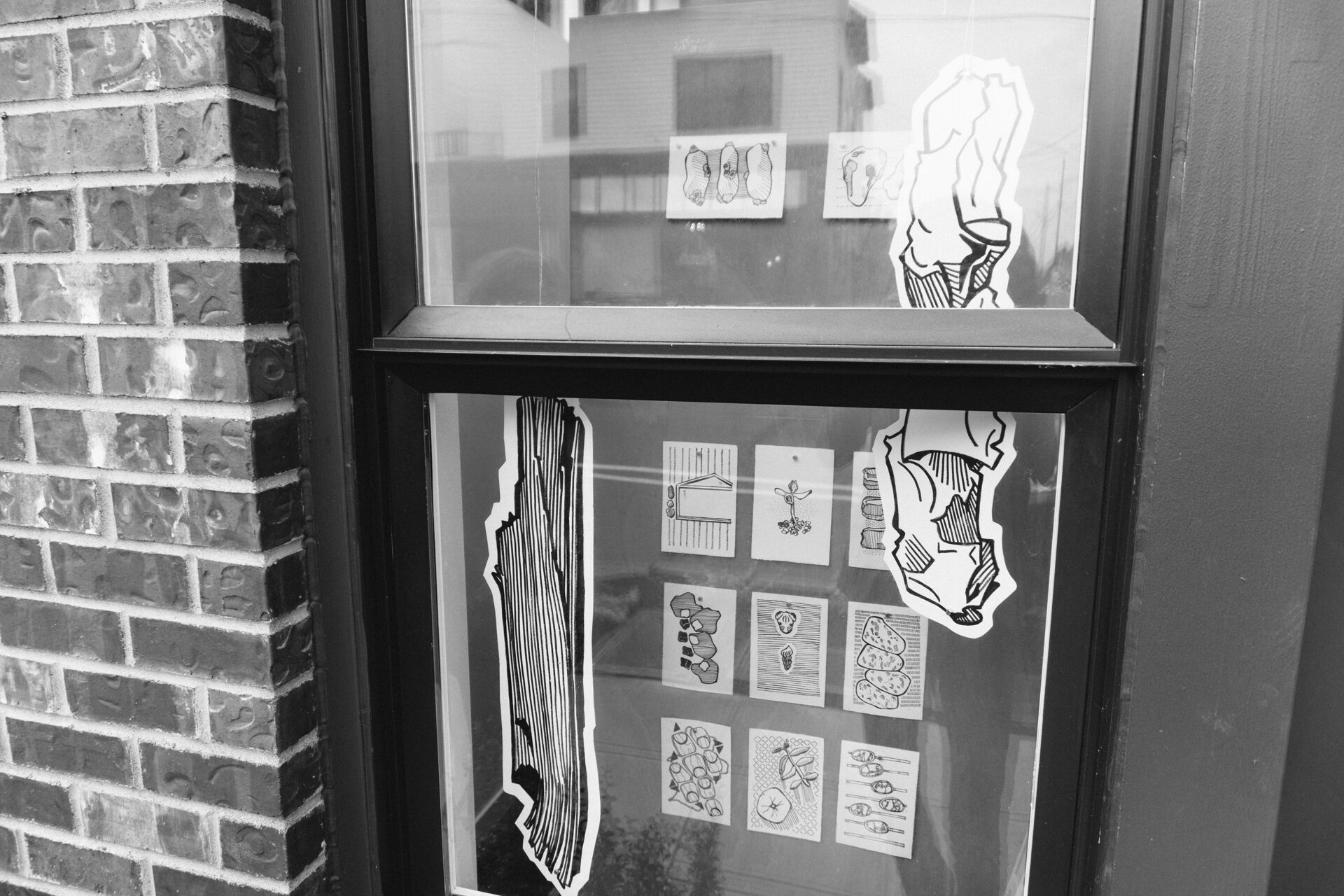
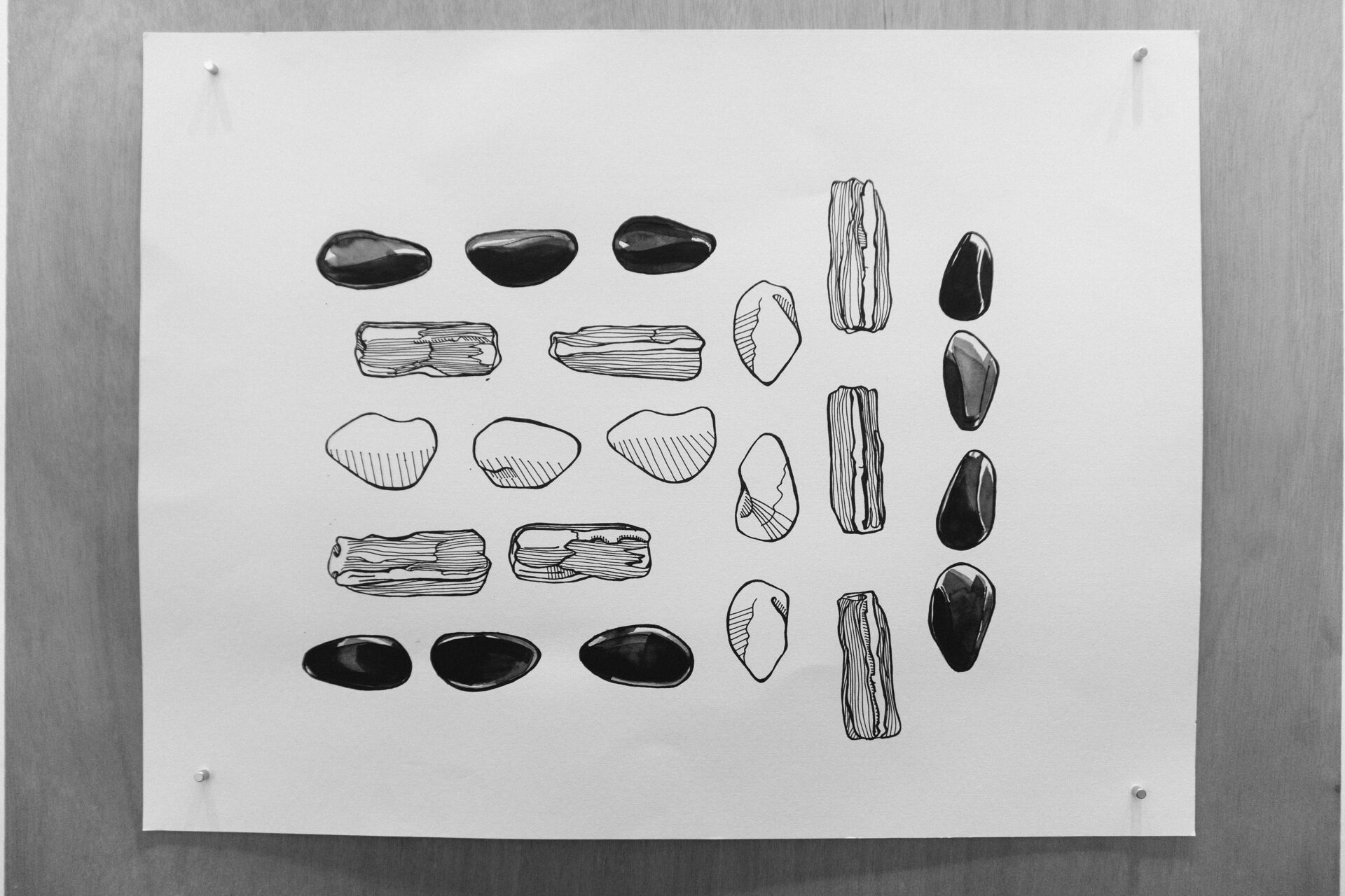
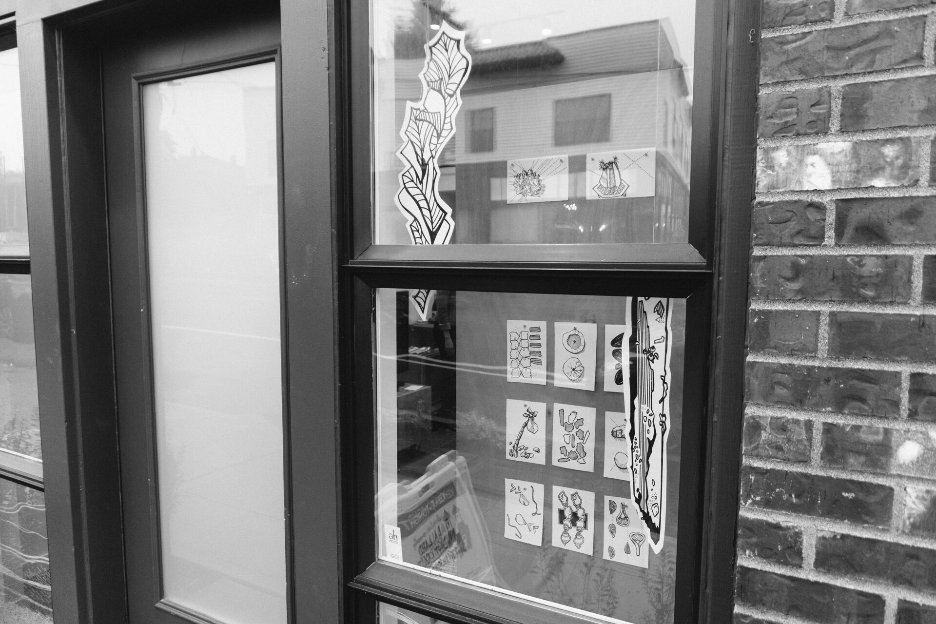
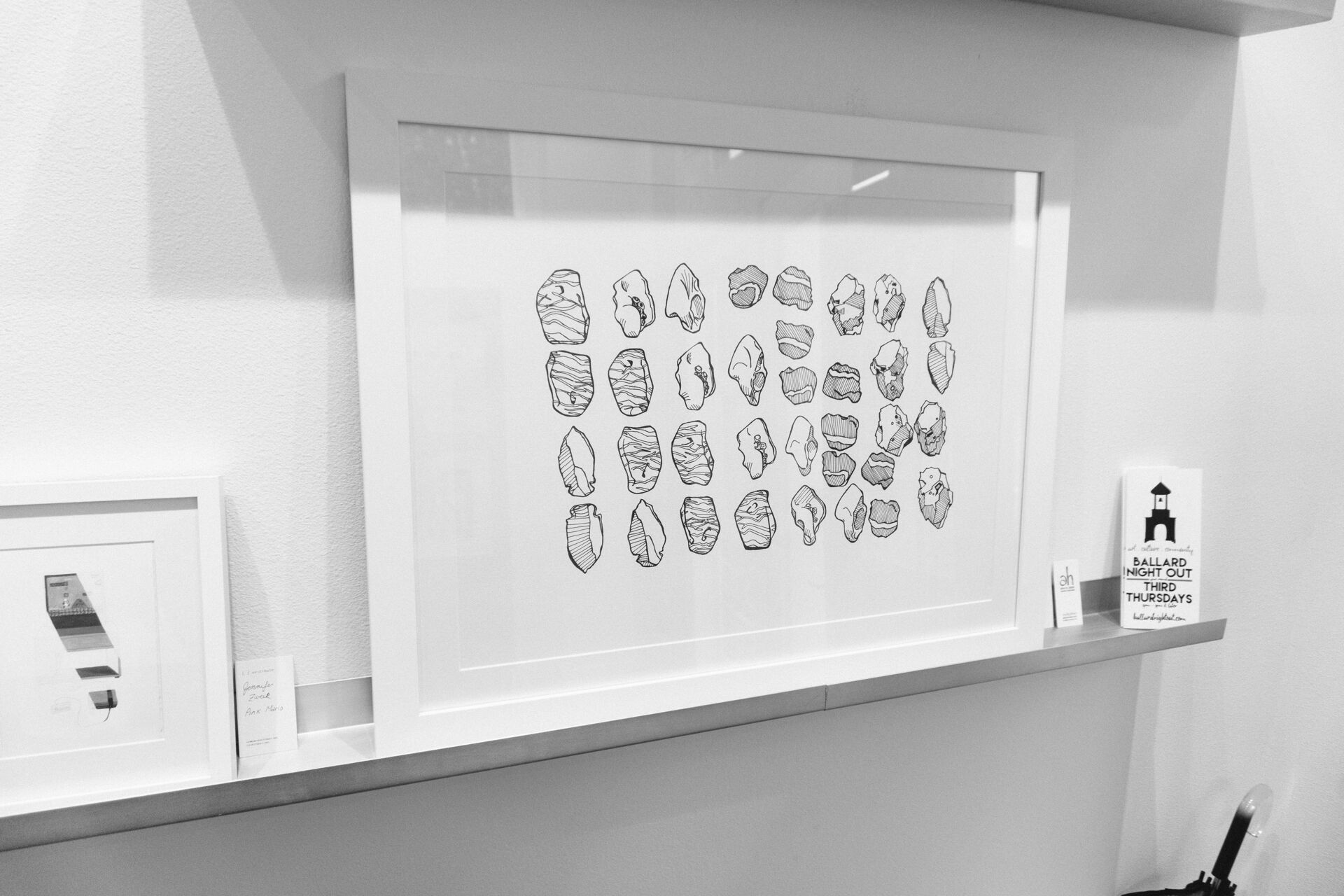
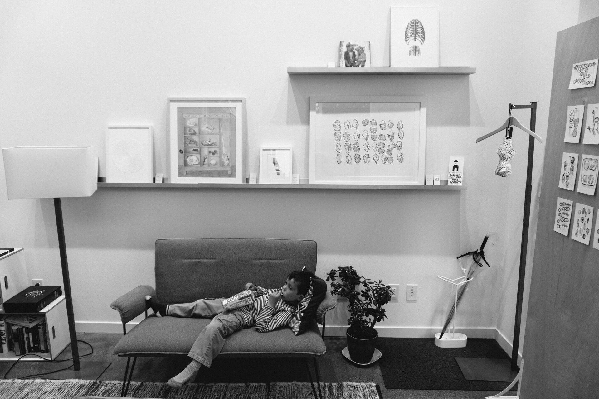
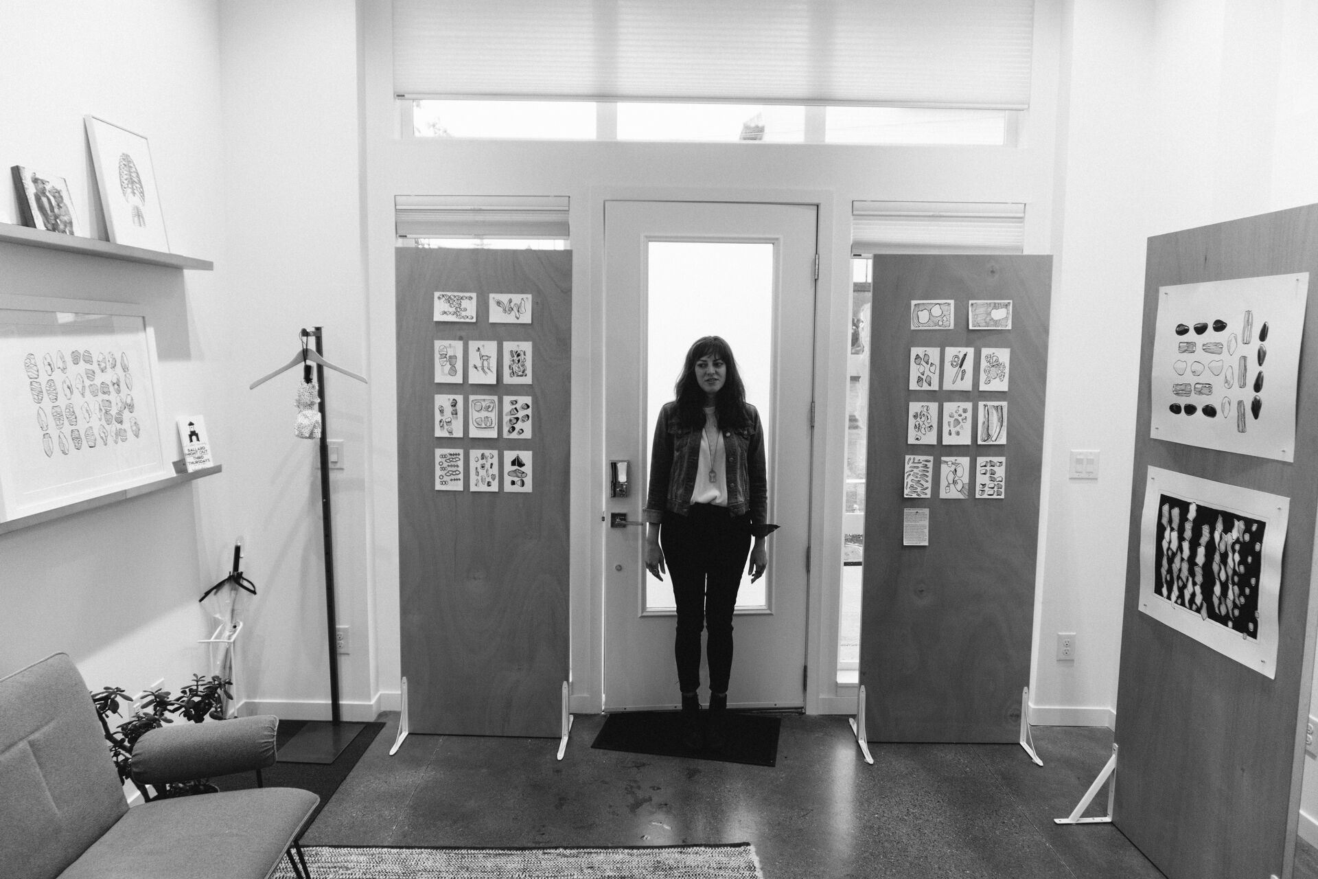
The Vestibule, a unique family-owned space, is both a neighborhood gallery featuring local artists and an Airbnb accommodation.
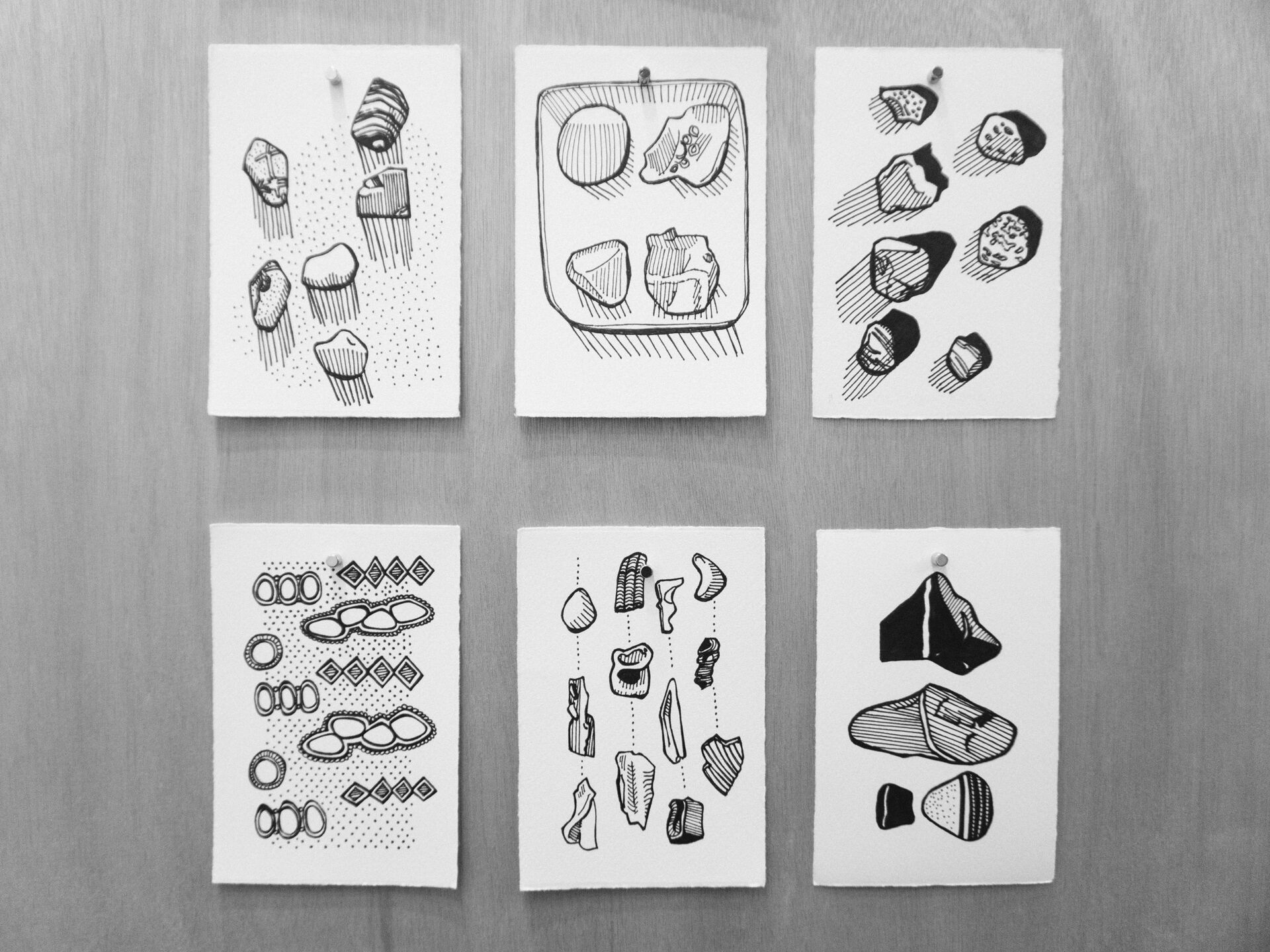
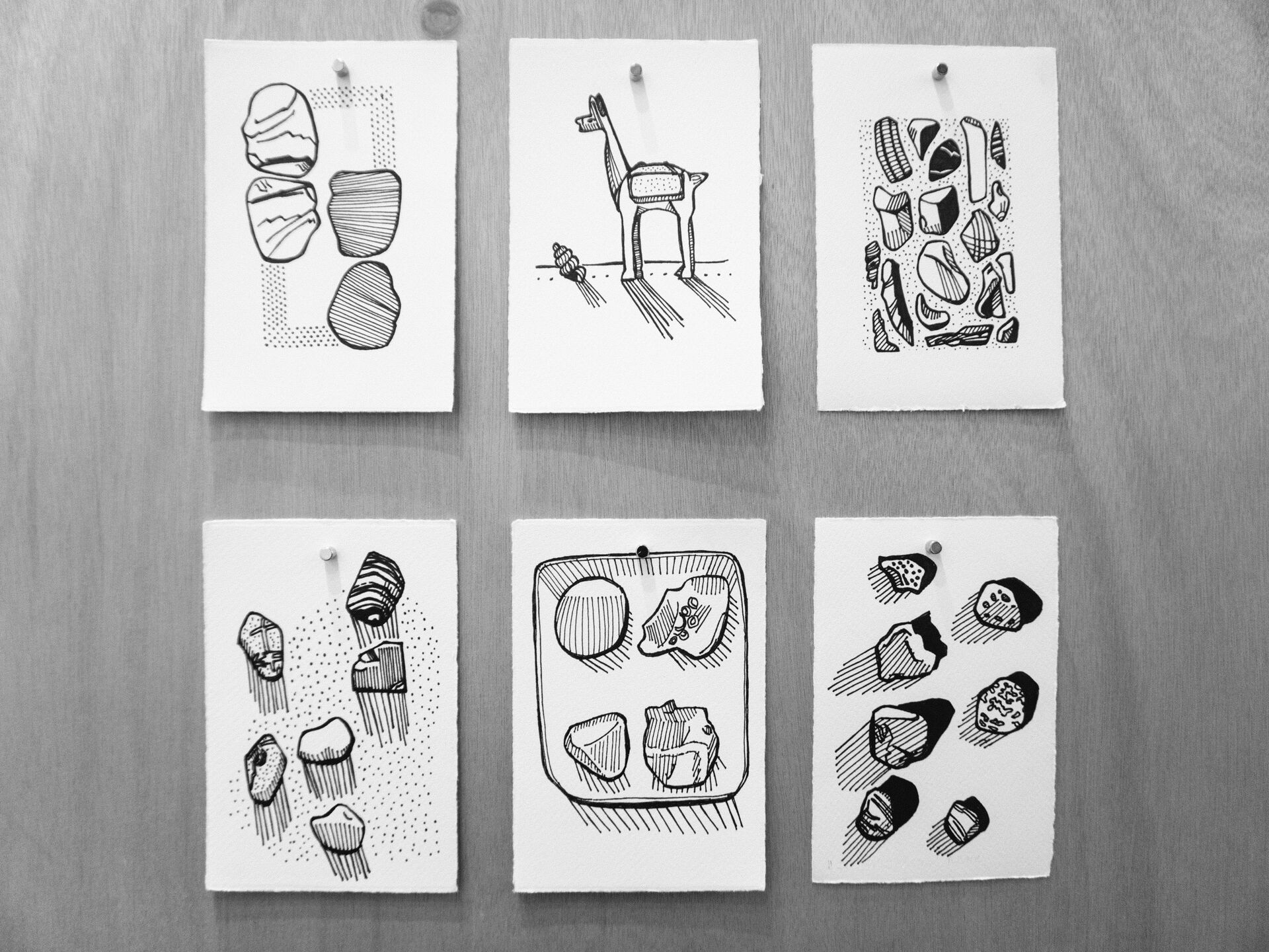
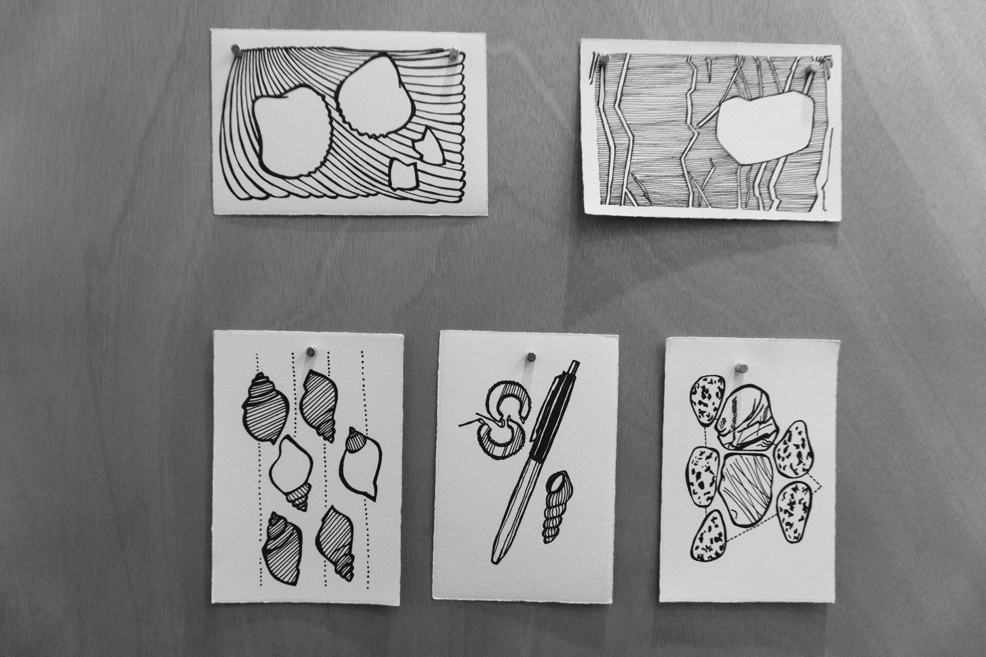
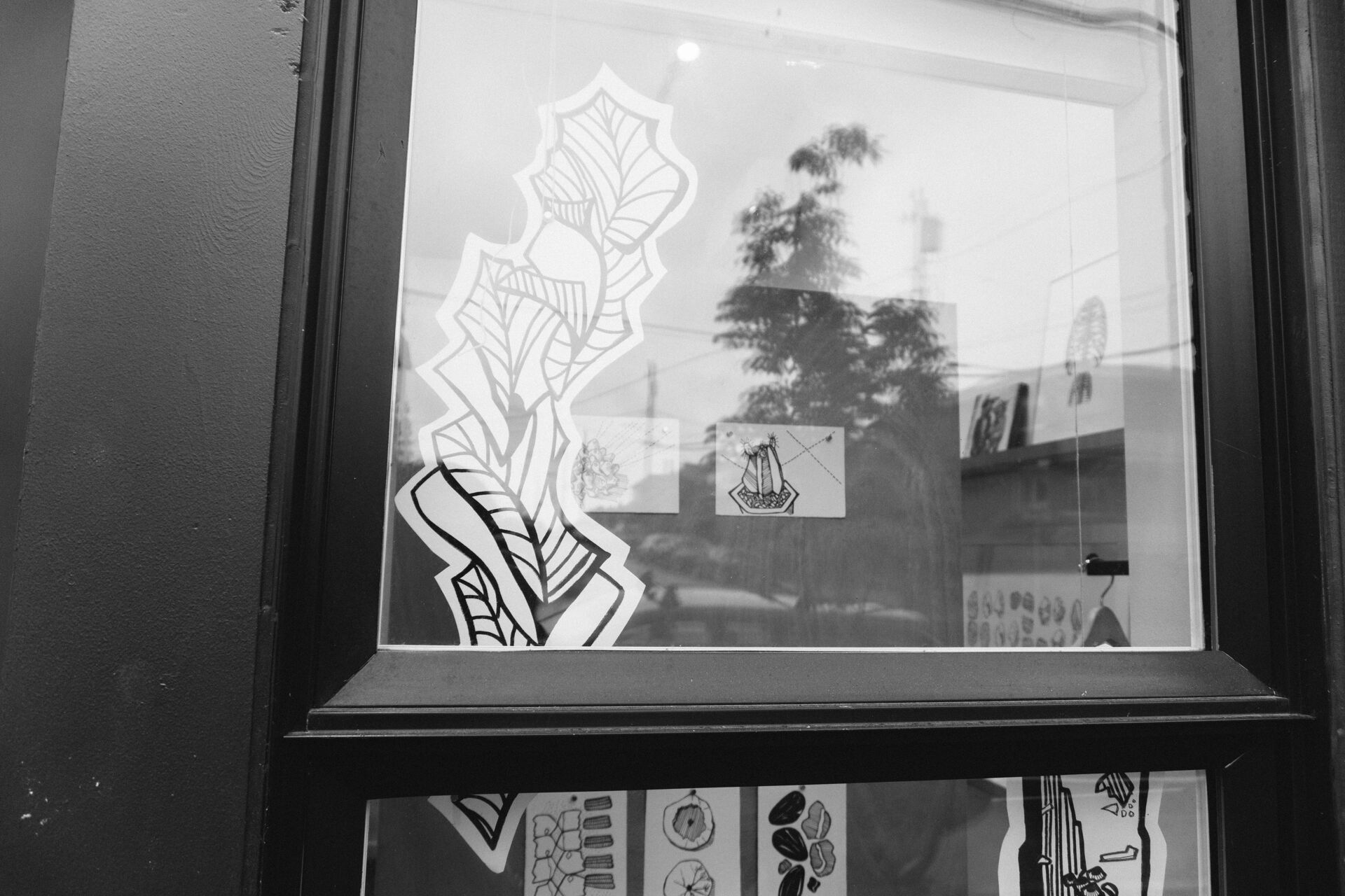
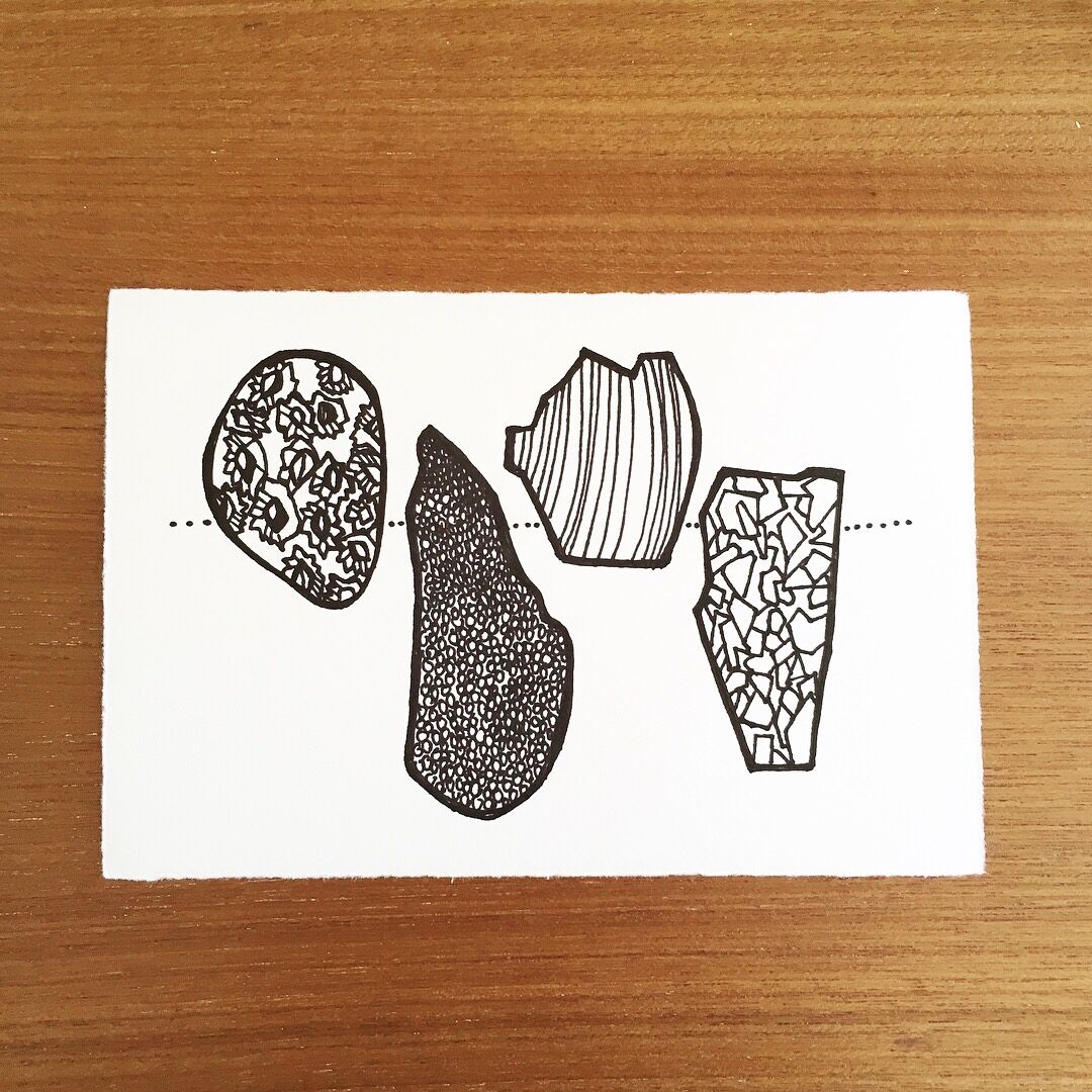
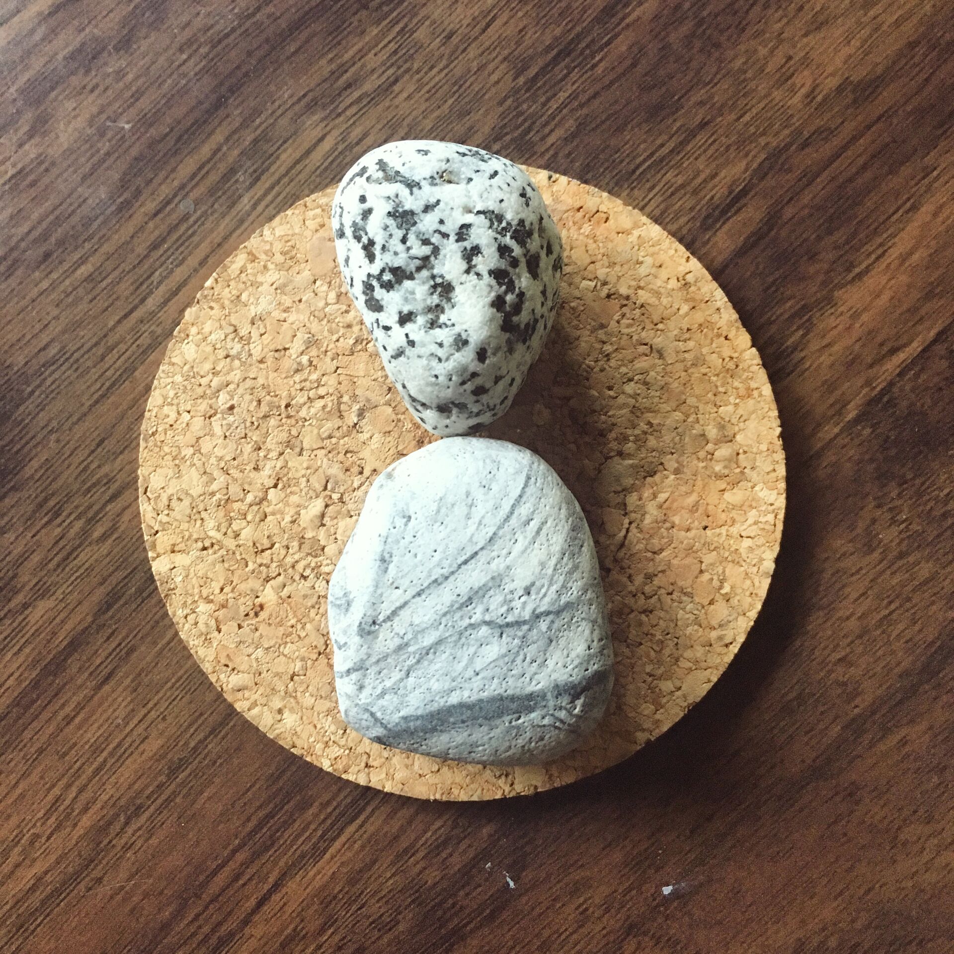
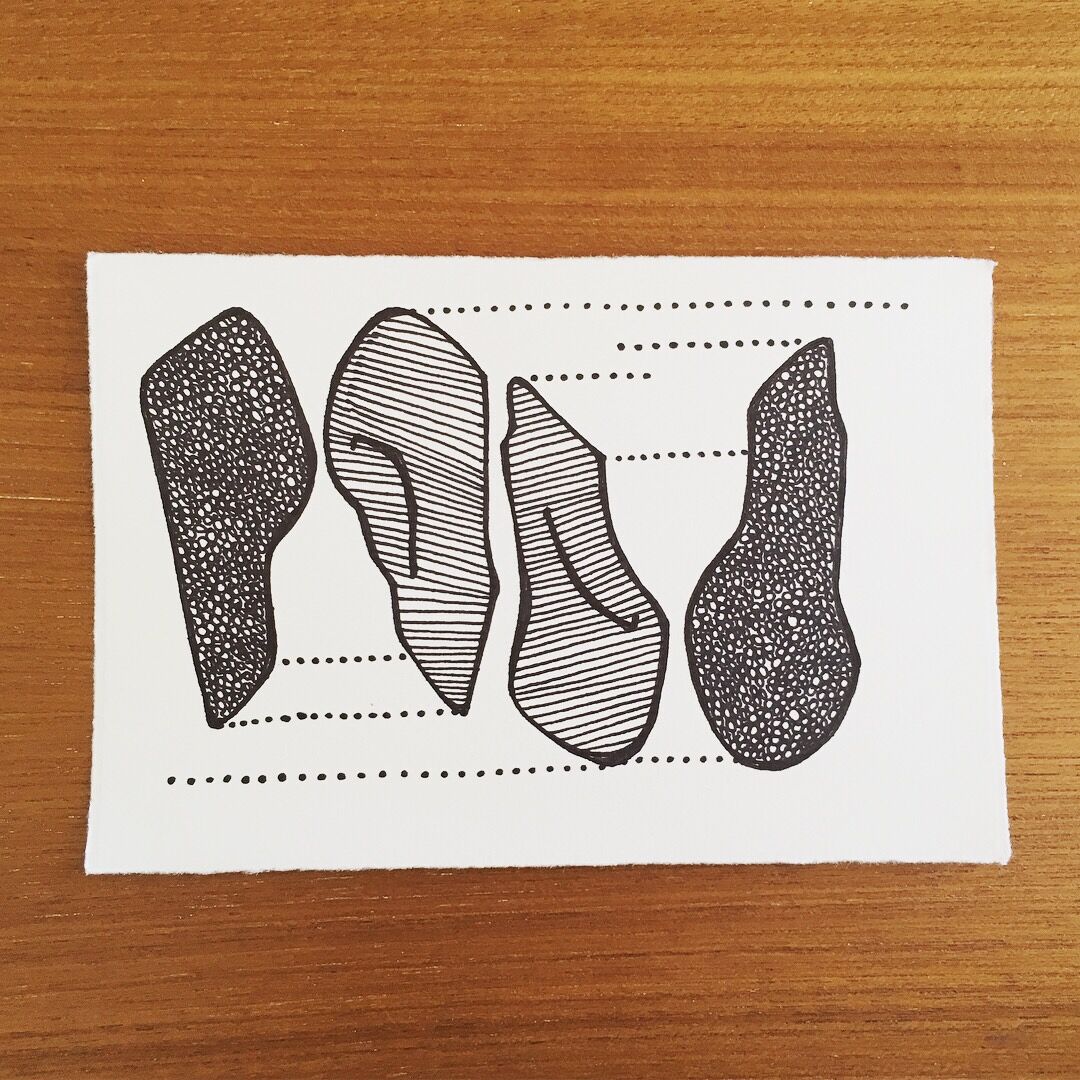
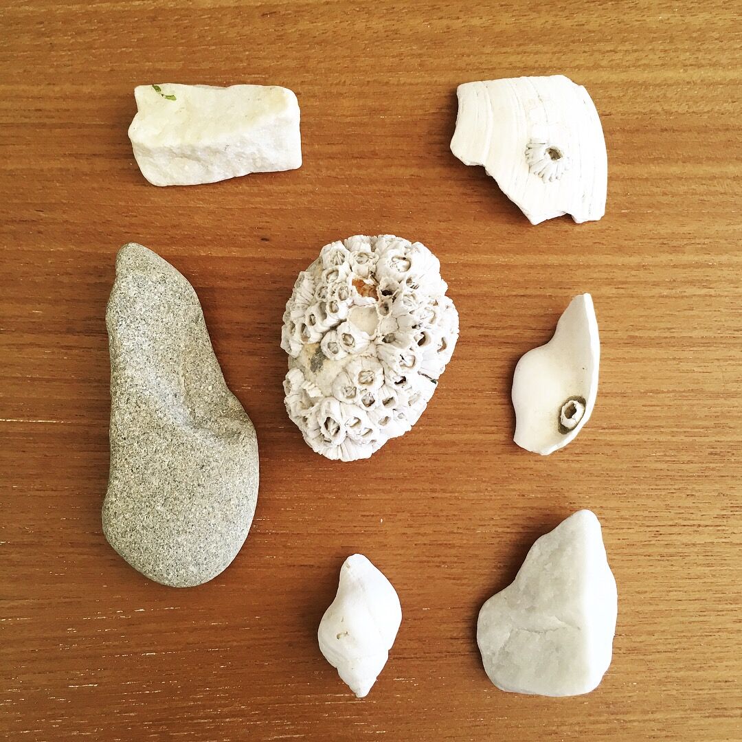
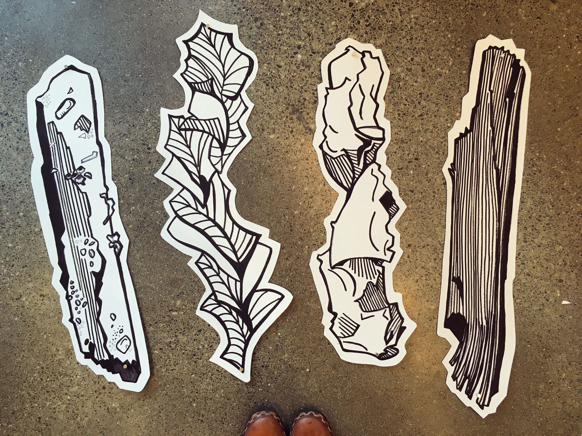
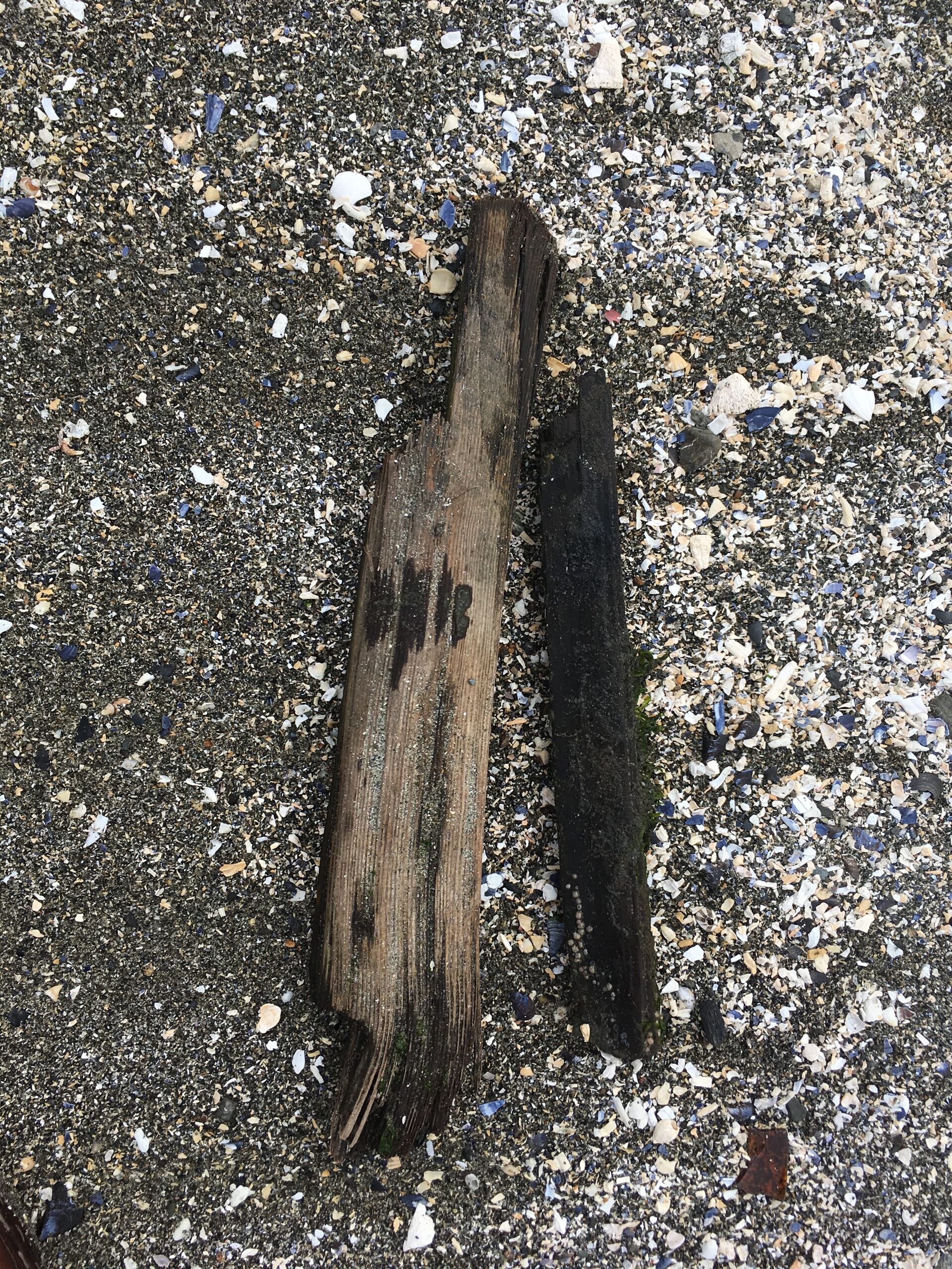
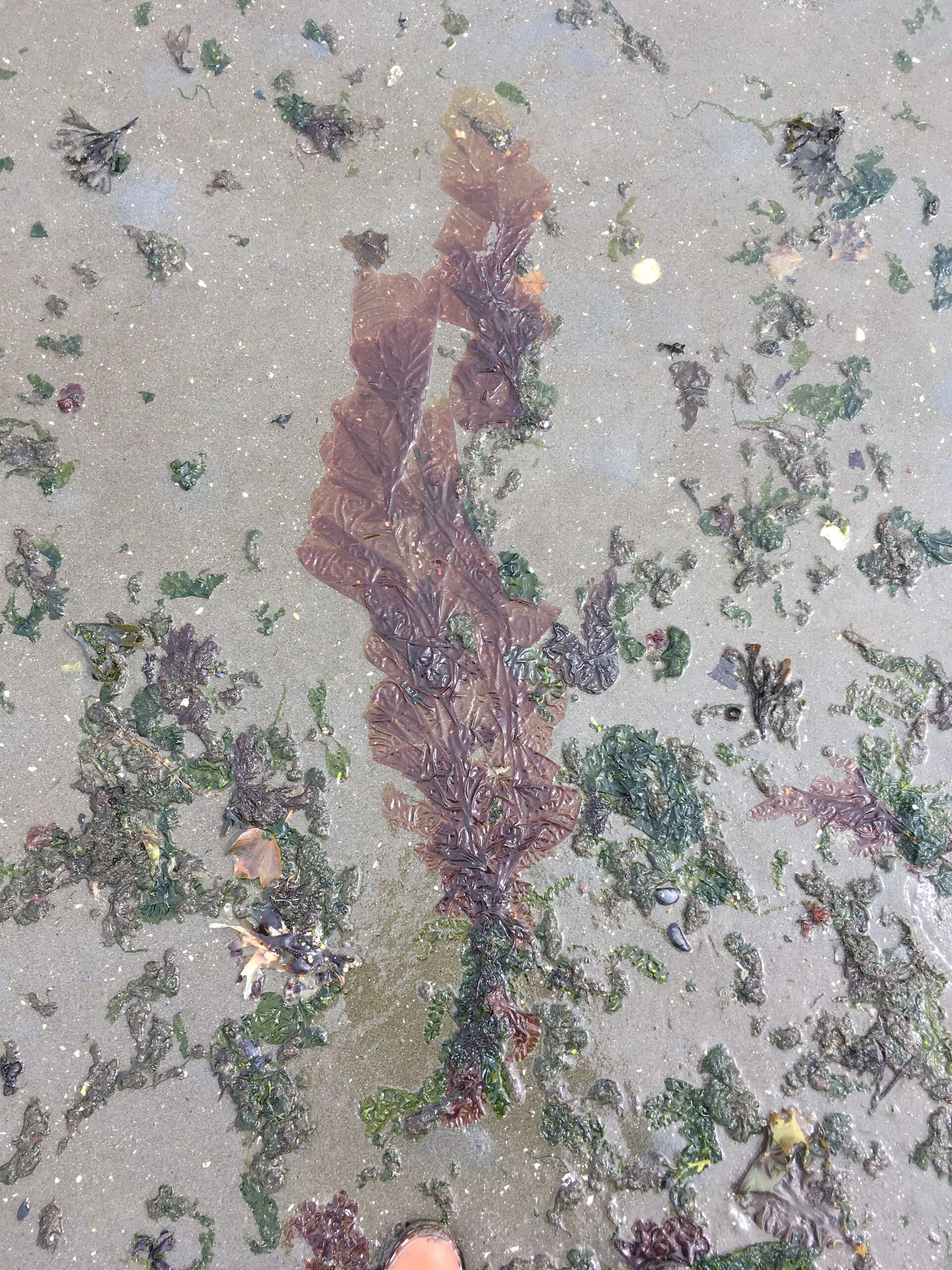
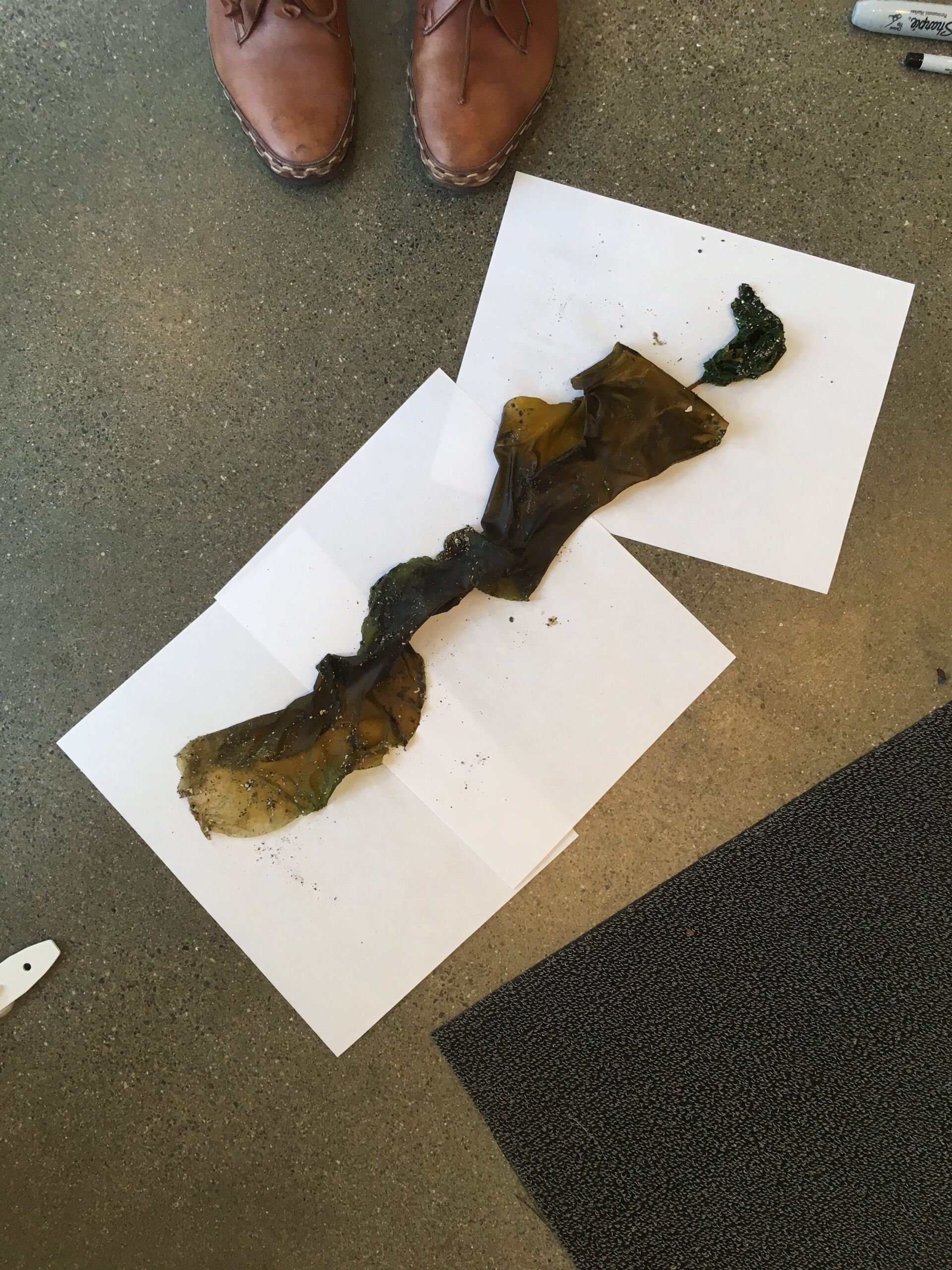
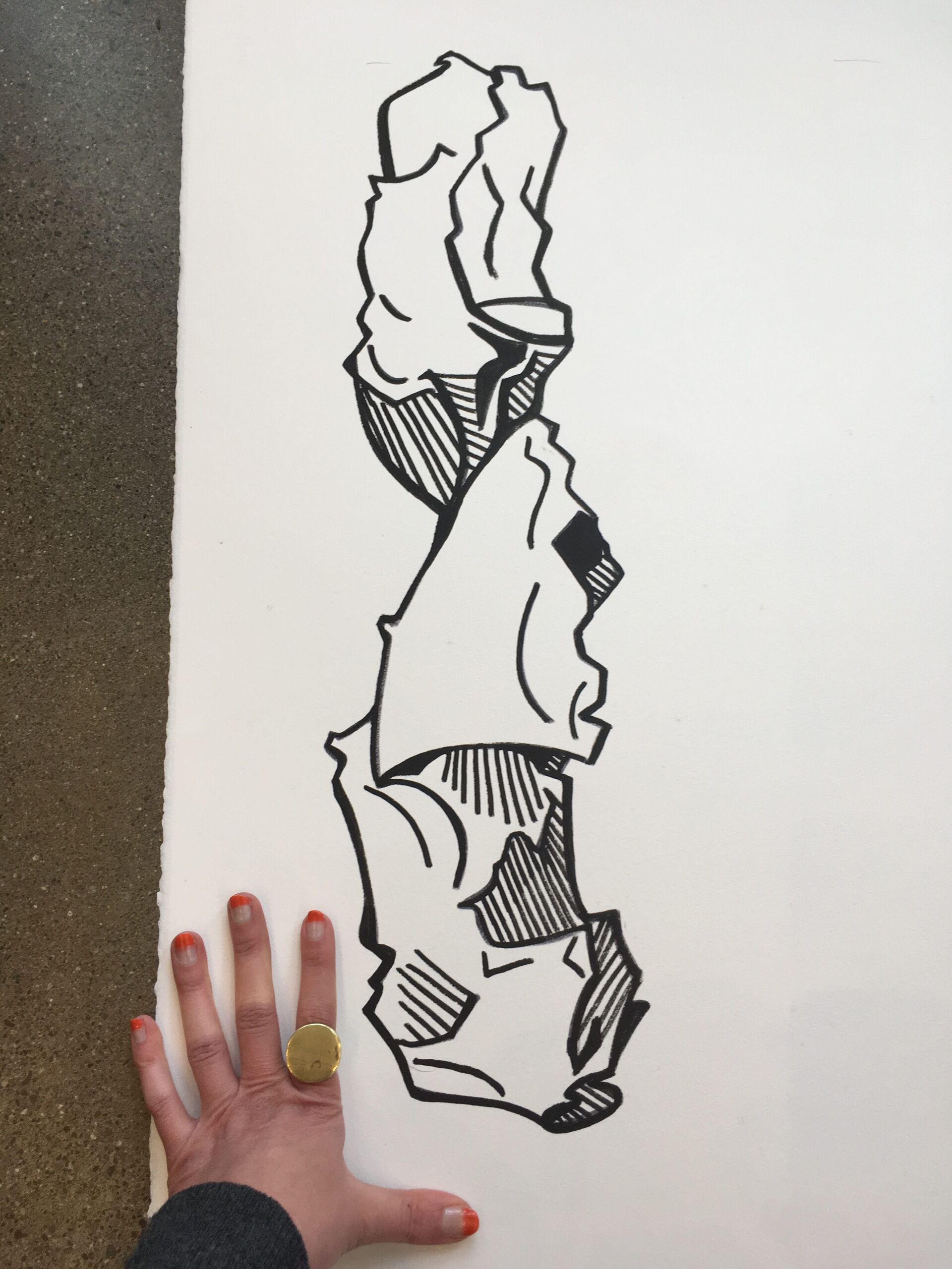
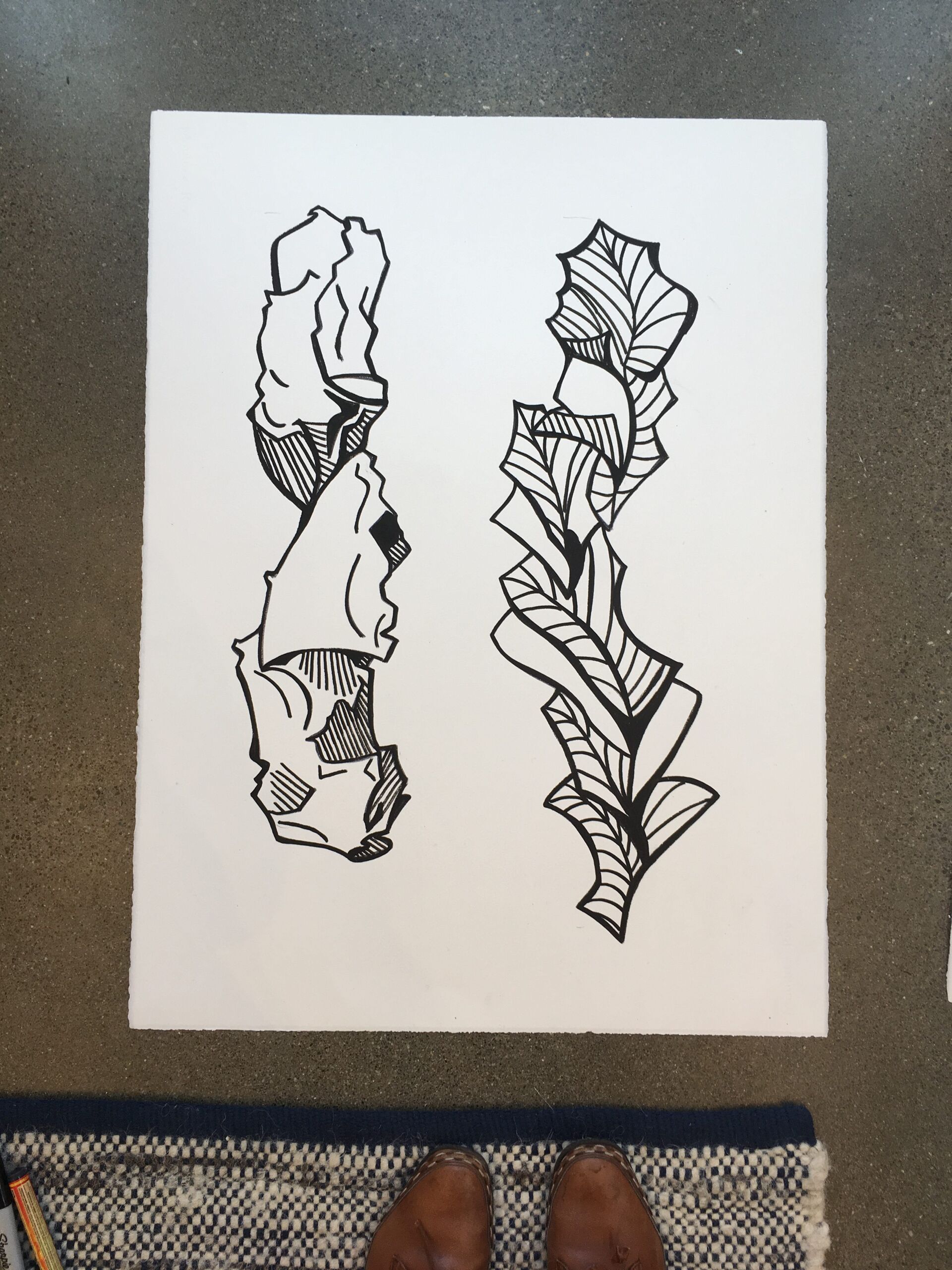
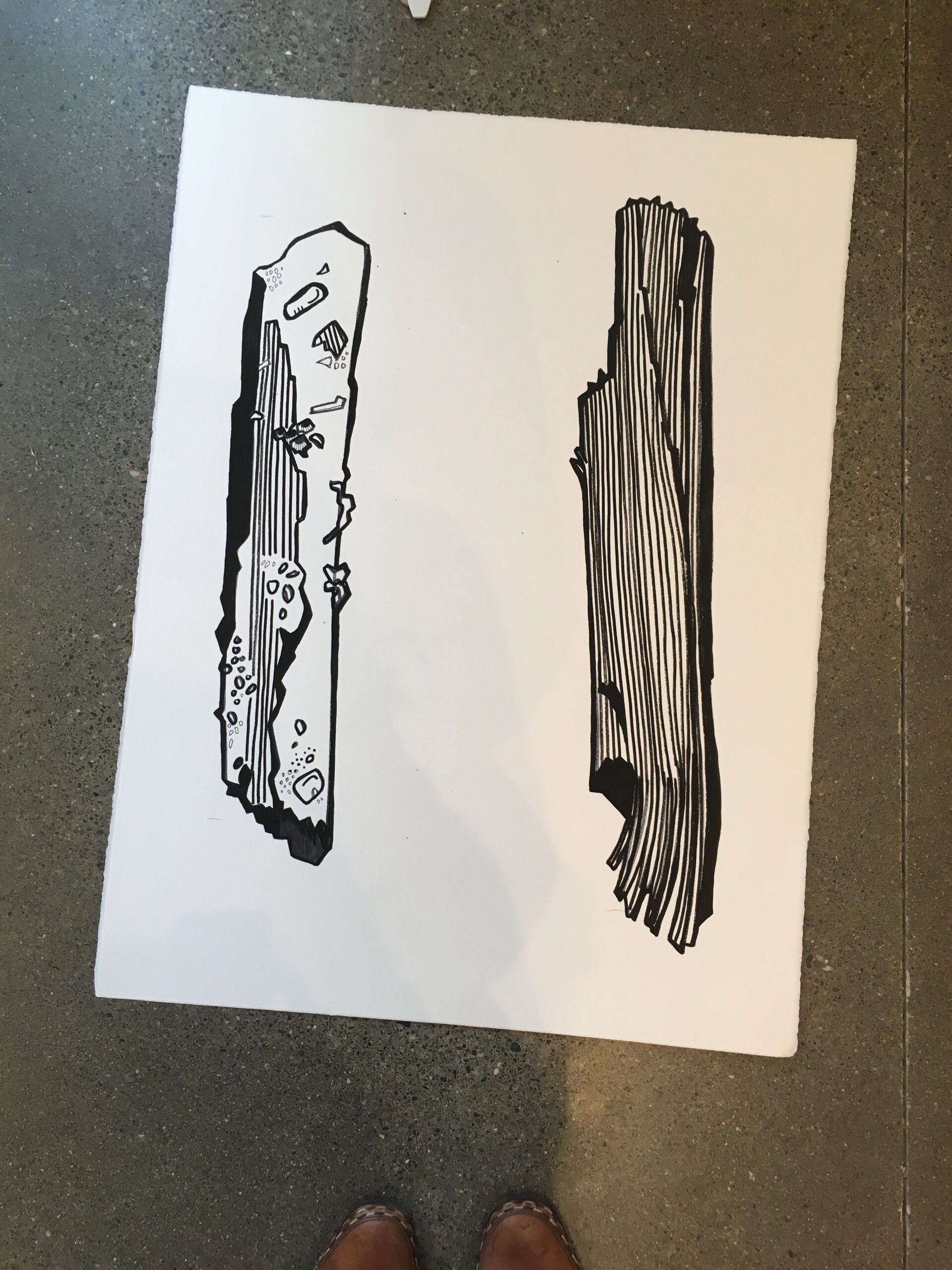
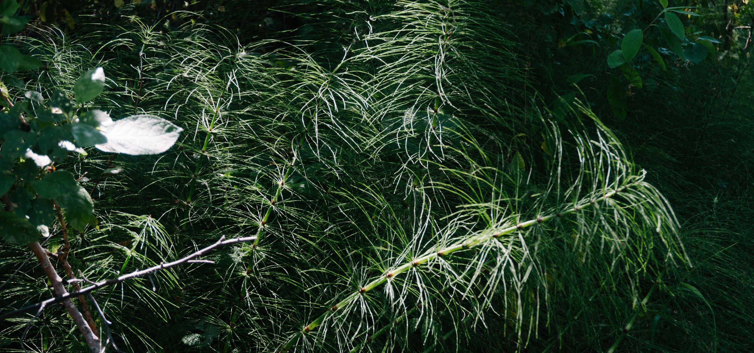
When owners Kascha and John Snavely approached me, they were interested in showing my nature-themed illustrations from my Morning Sketching collection. The gallery’s primary presentation space features a mini window-display that passersby can enjoy even when the space is not open to the public. In addition to showing pieces from my existing series, I wanted to add something special for the space. The gallery is located near a secret beach in Seattle’s Ballard area, and I gathered specimens (driftwood, seaweed, and kelp) to draw as hanging artworks in a window installation. On the lower half of the window I painted line-drawings representing the tides that brought to shore the objects I collected and drew.
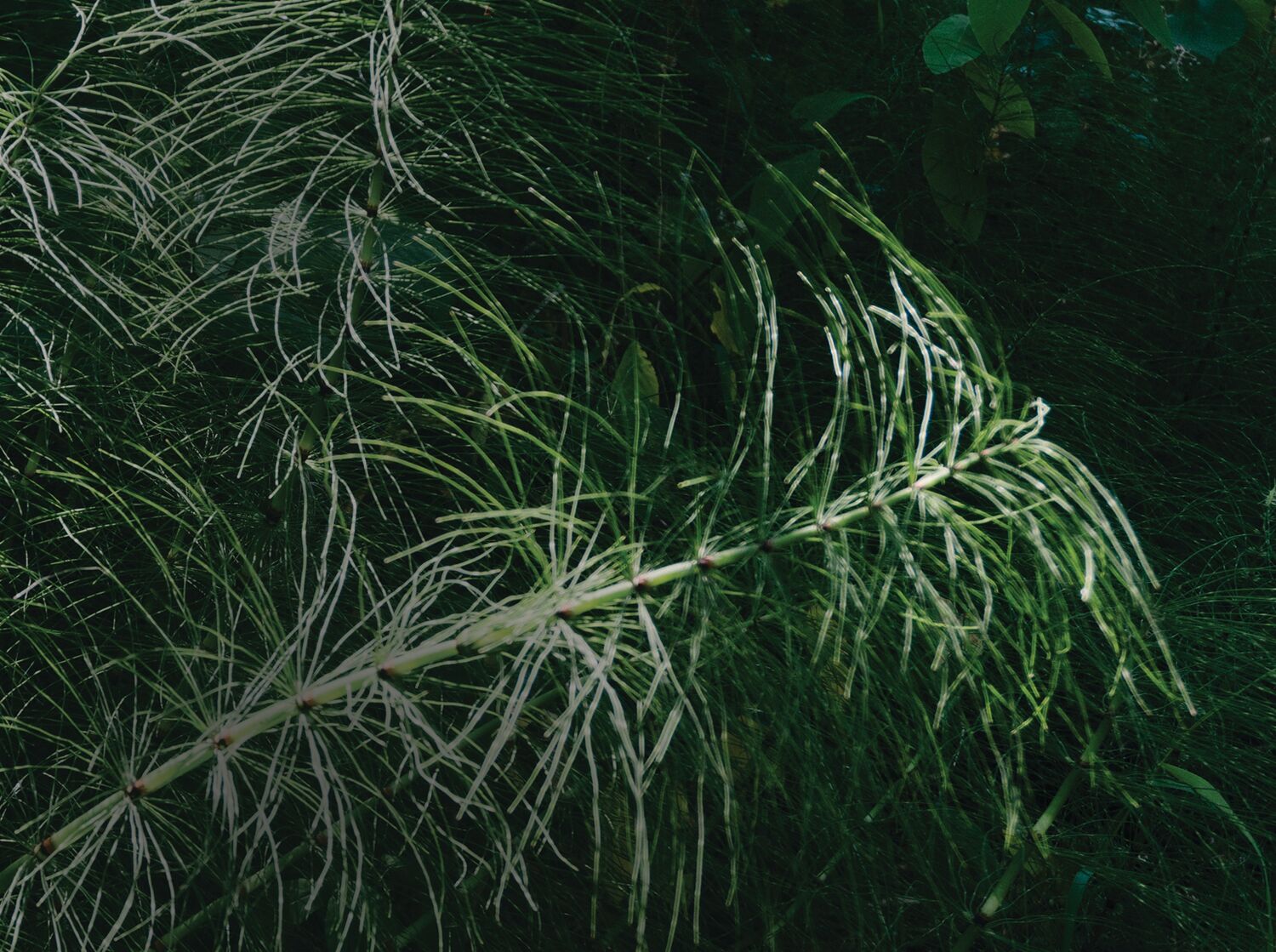

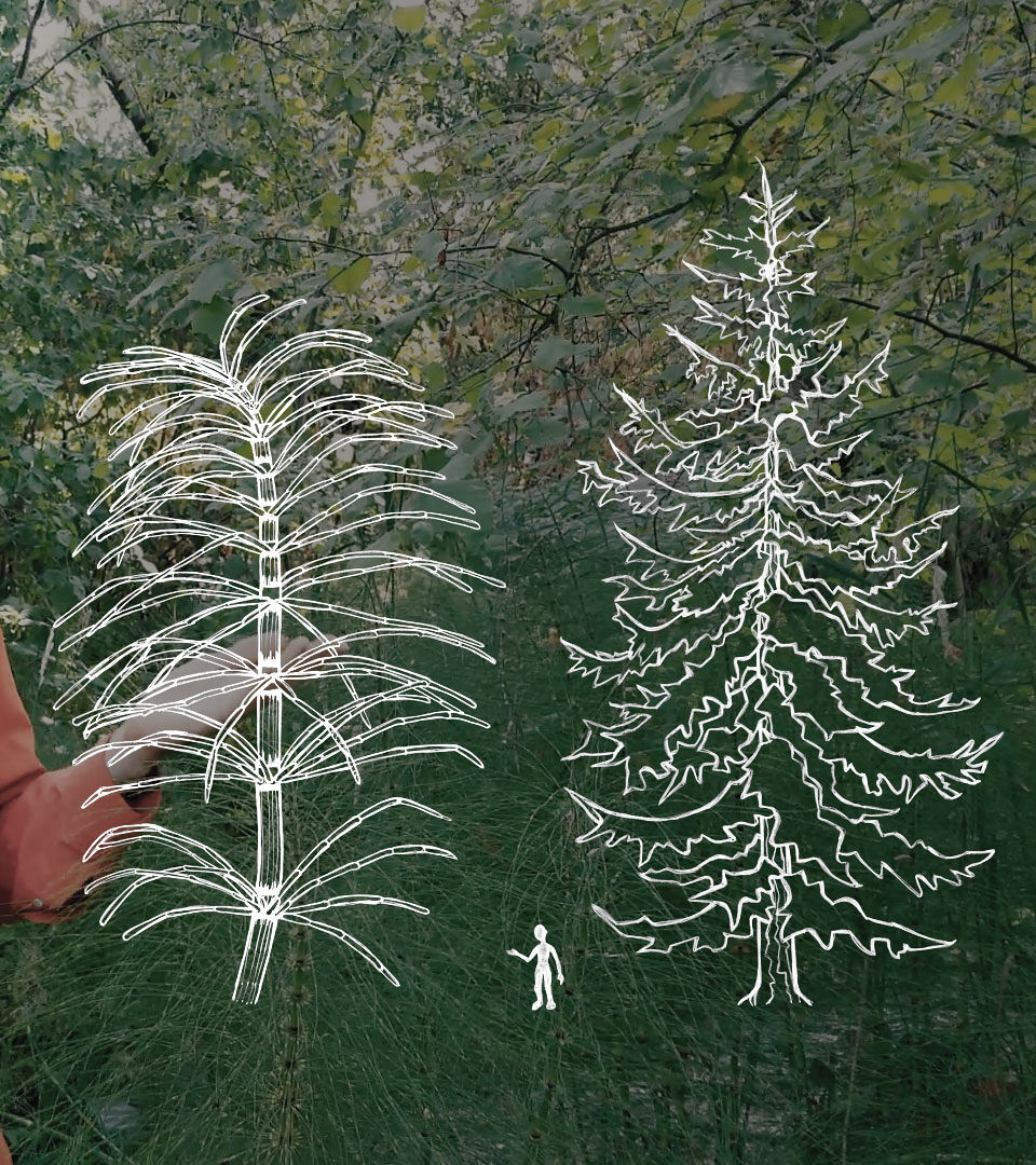
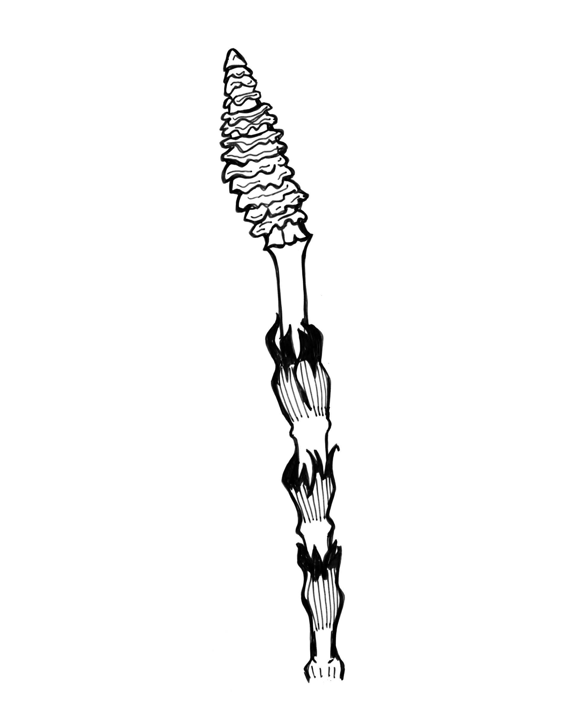
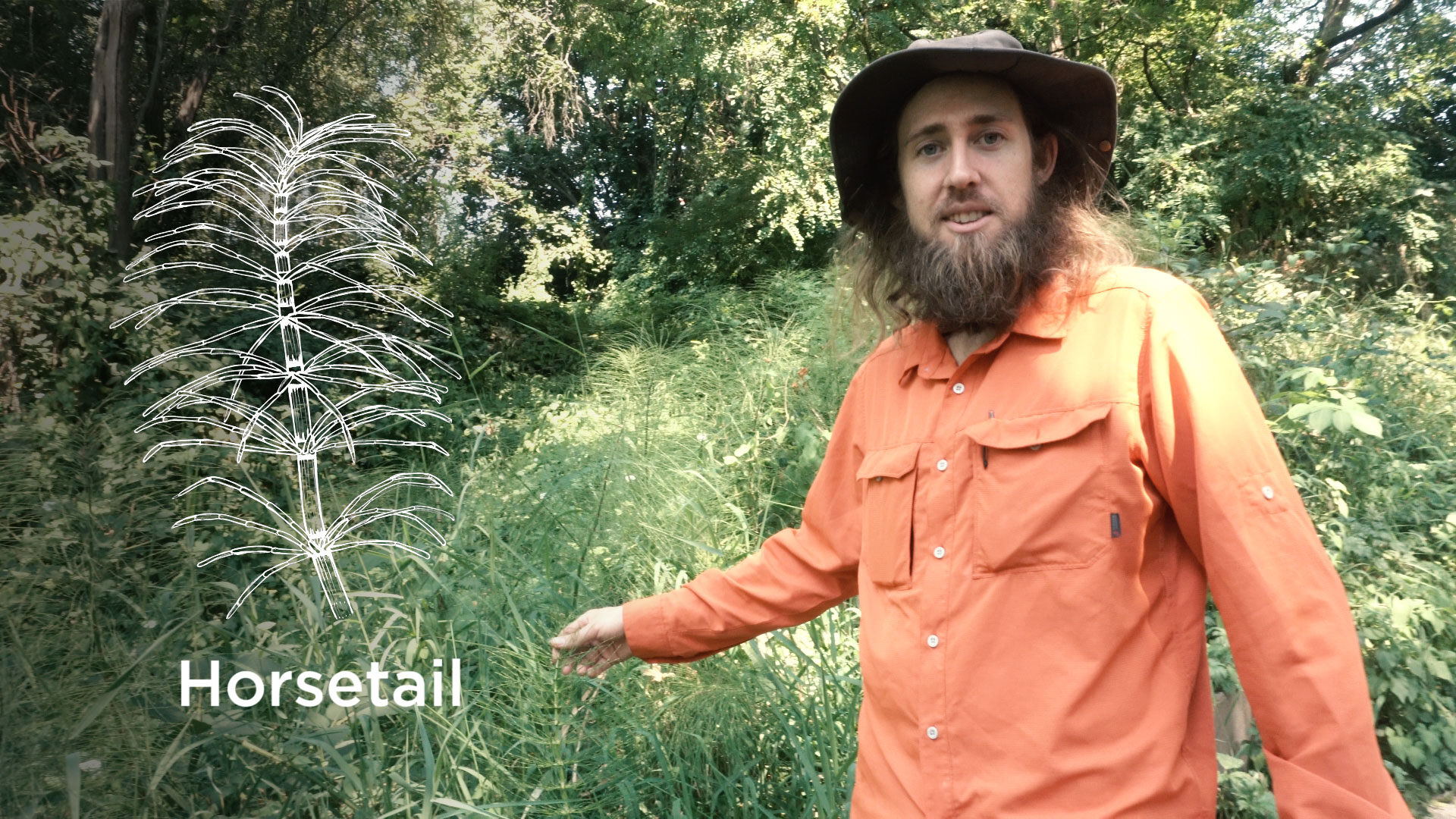
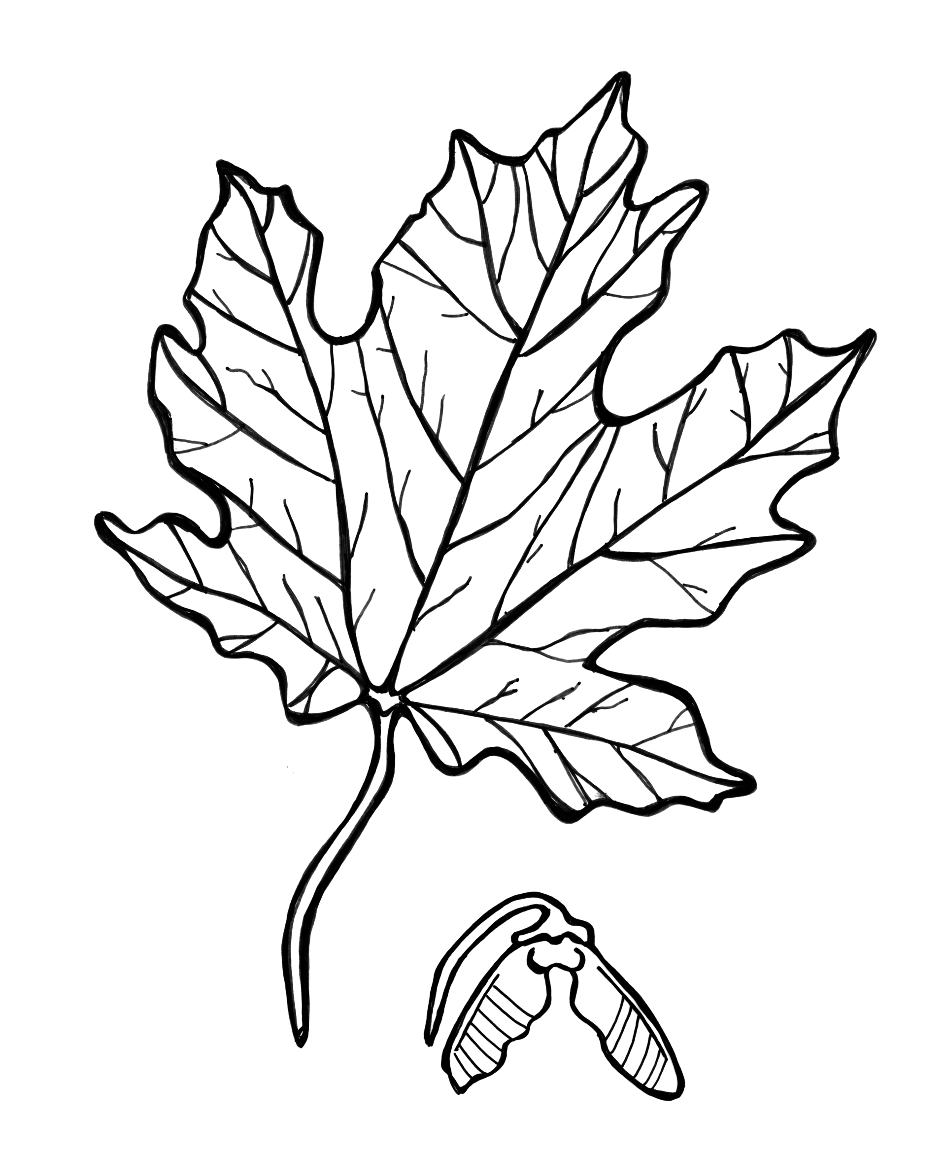
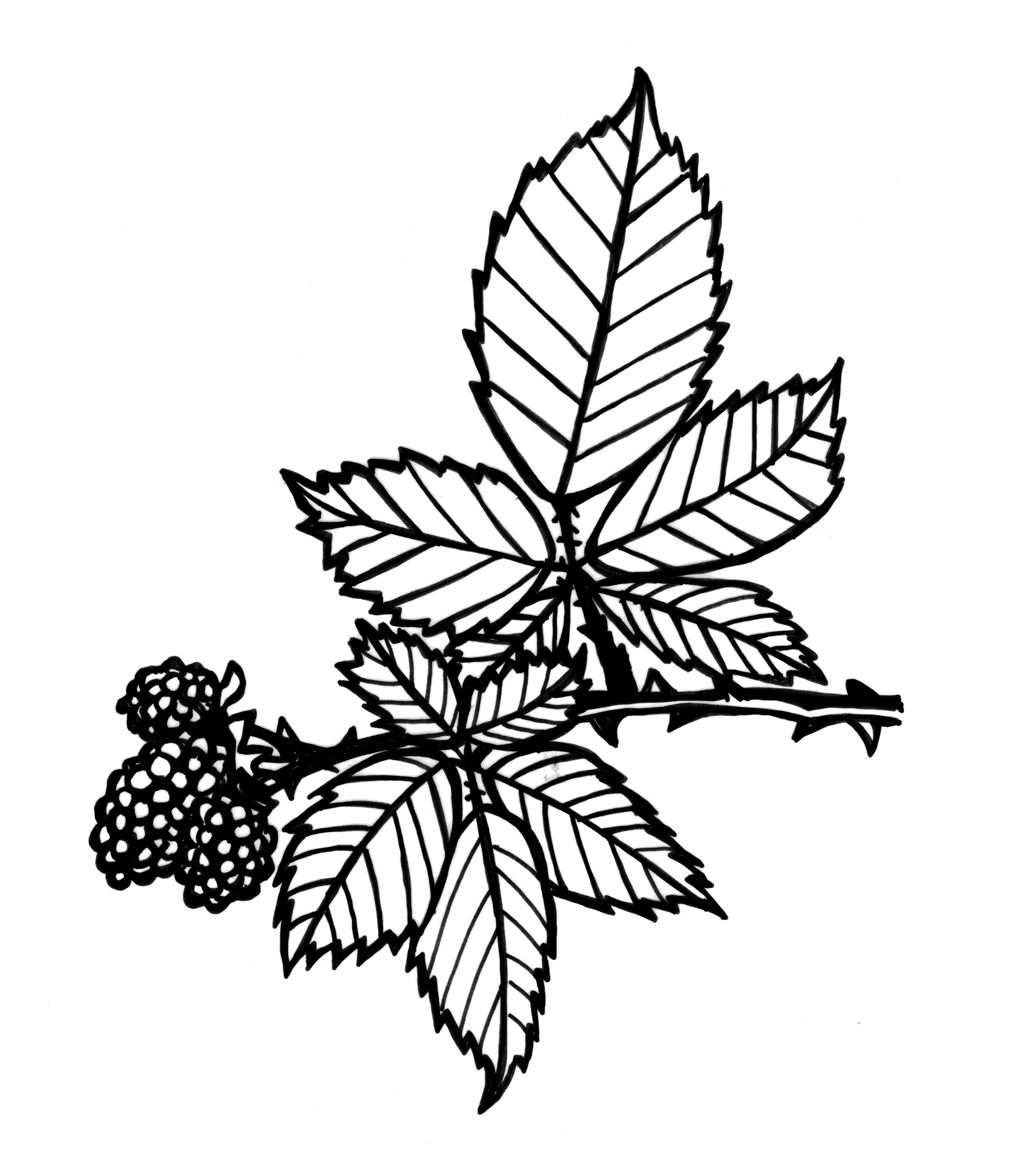
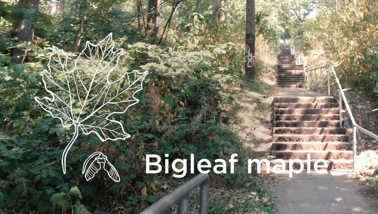
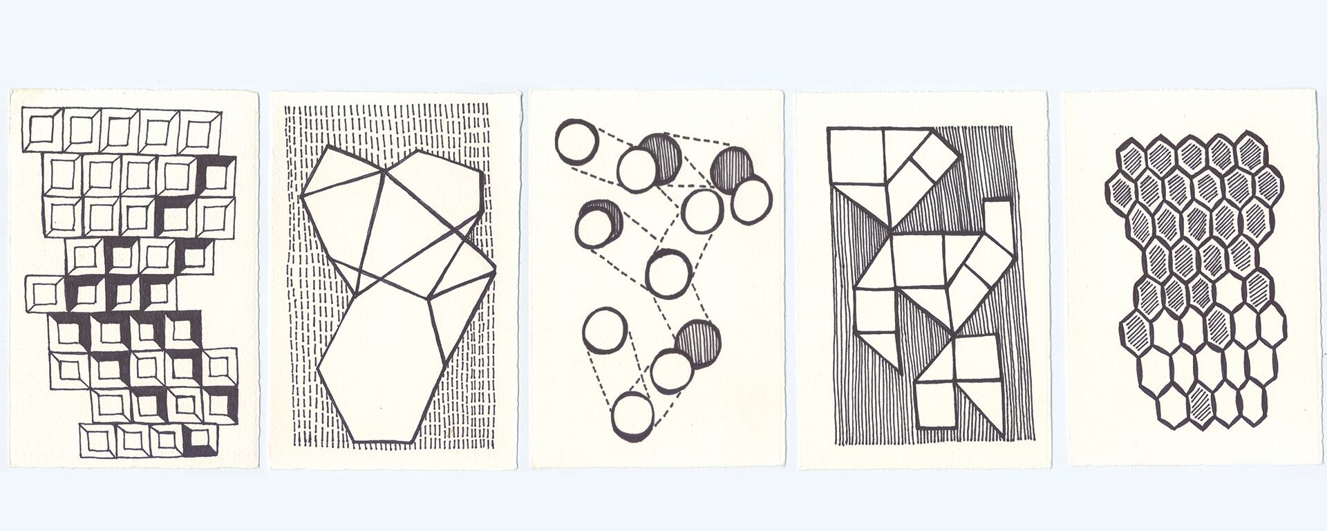
Naturistic is an online educational film series exploring biology and ecology by scientist Nash Turley, PhD, and musician/composer Hamilton Boyce.
The two friends brought me onto their team to create illustrations. We discussed what areas in the video would benefit from diagrams, small animations, and more focused visuals, and I worked with Hamilton to create line drawings that clarify and support each episode’s topic. To reflect the accessible and light-hearted mood of the series, I gave the hand-drawn illustrations a slightly comical yet realistic style. We then layered the drawings over foliage-rich background photography and video to create a multidimensional feel.

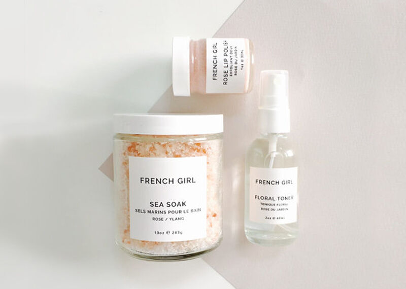
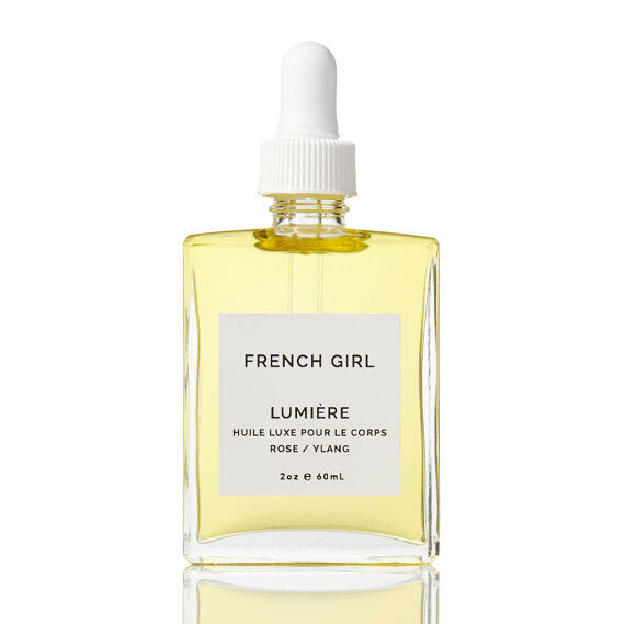
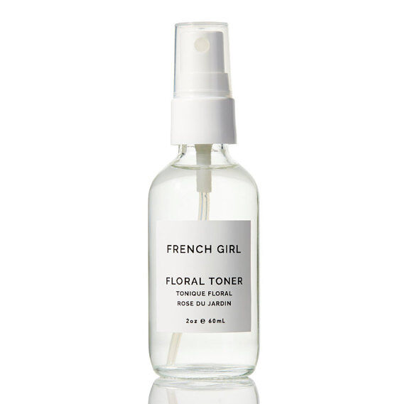
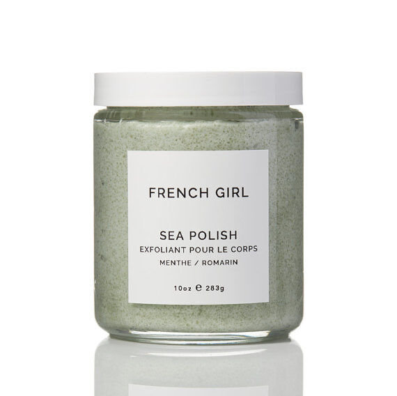
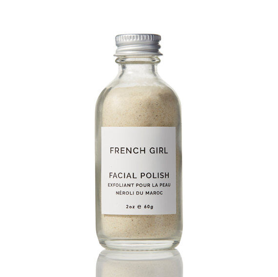
French Girl Organic creates luxurious products for everyday self-care with high-quality ingredients that are sustainable for the planet and also their producers.
I was approached to help flesh out a previously designed label template for their popular botanical products, which have been featured in fashion magazines and are sold online and through retailers such as Madewell and Anthropologie. The owner of the company wanted a simplified design using CoCo Channel’s typographical treatment as inspiration. We worked together to create classic but current labels for the company.
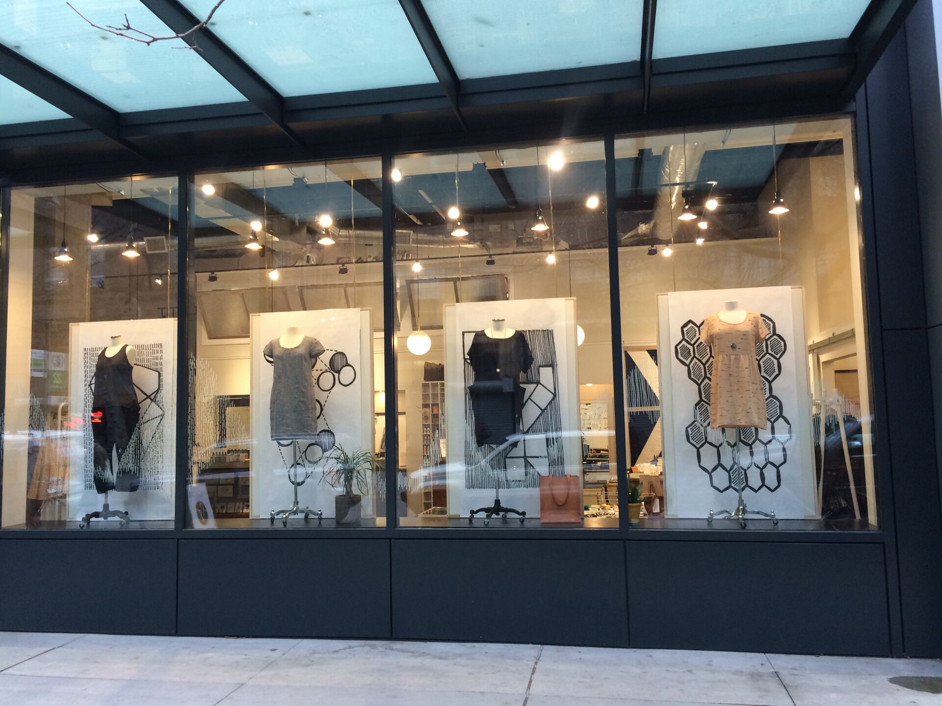
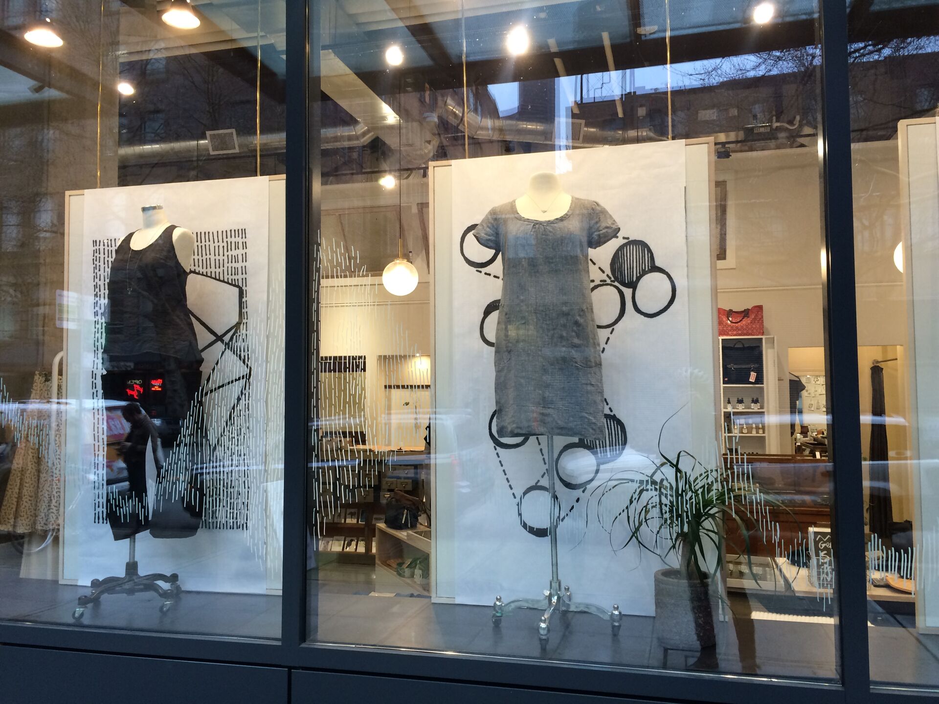
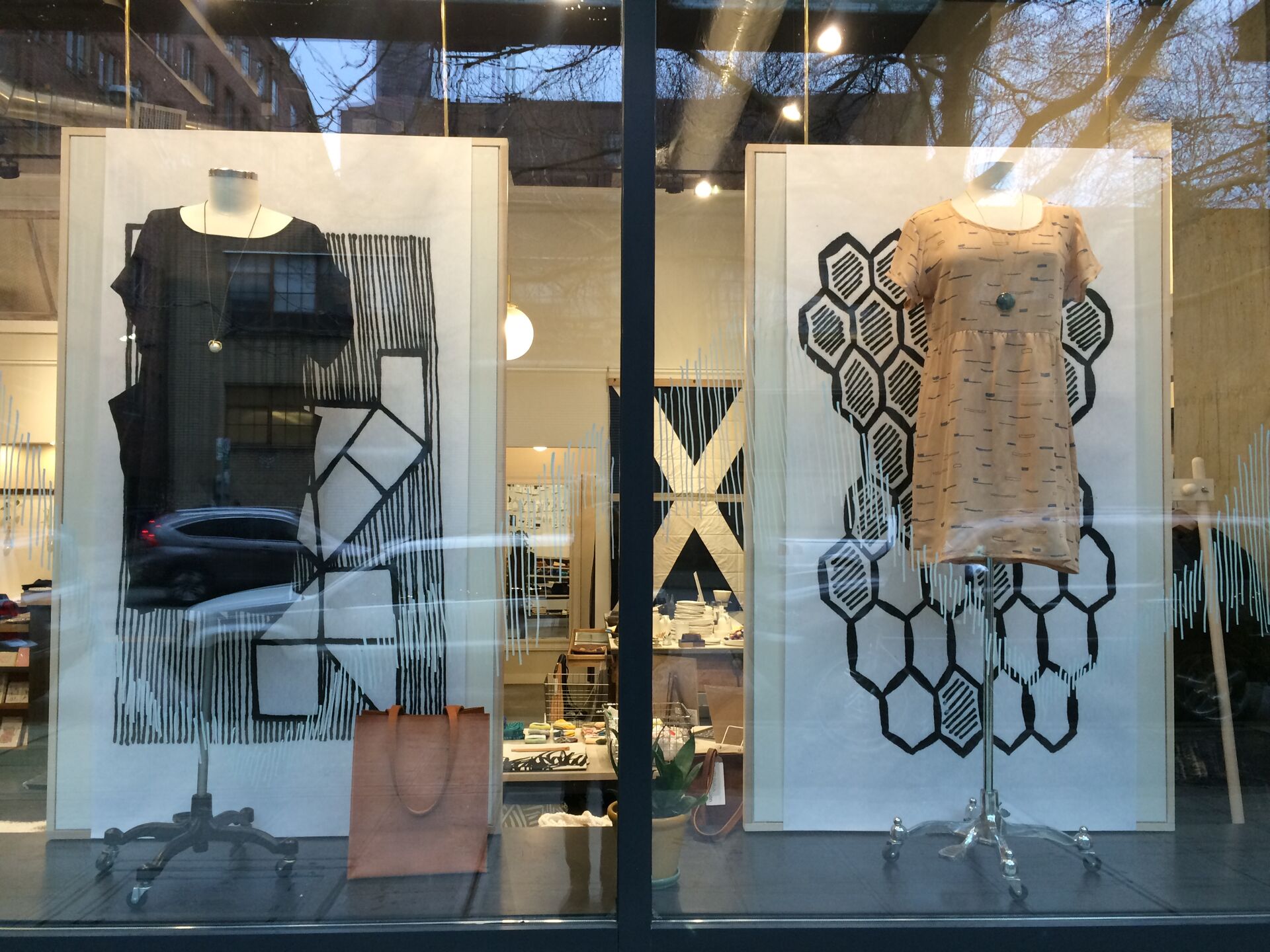
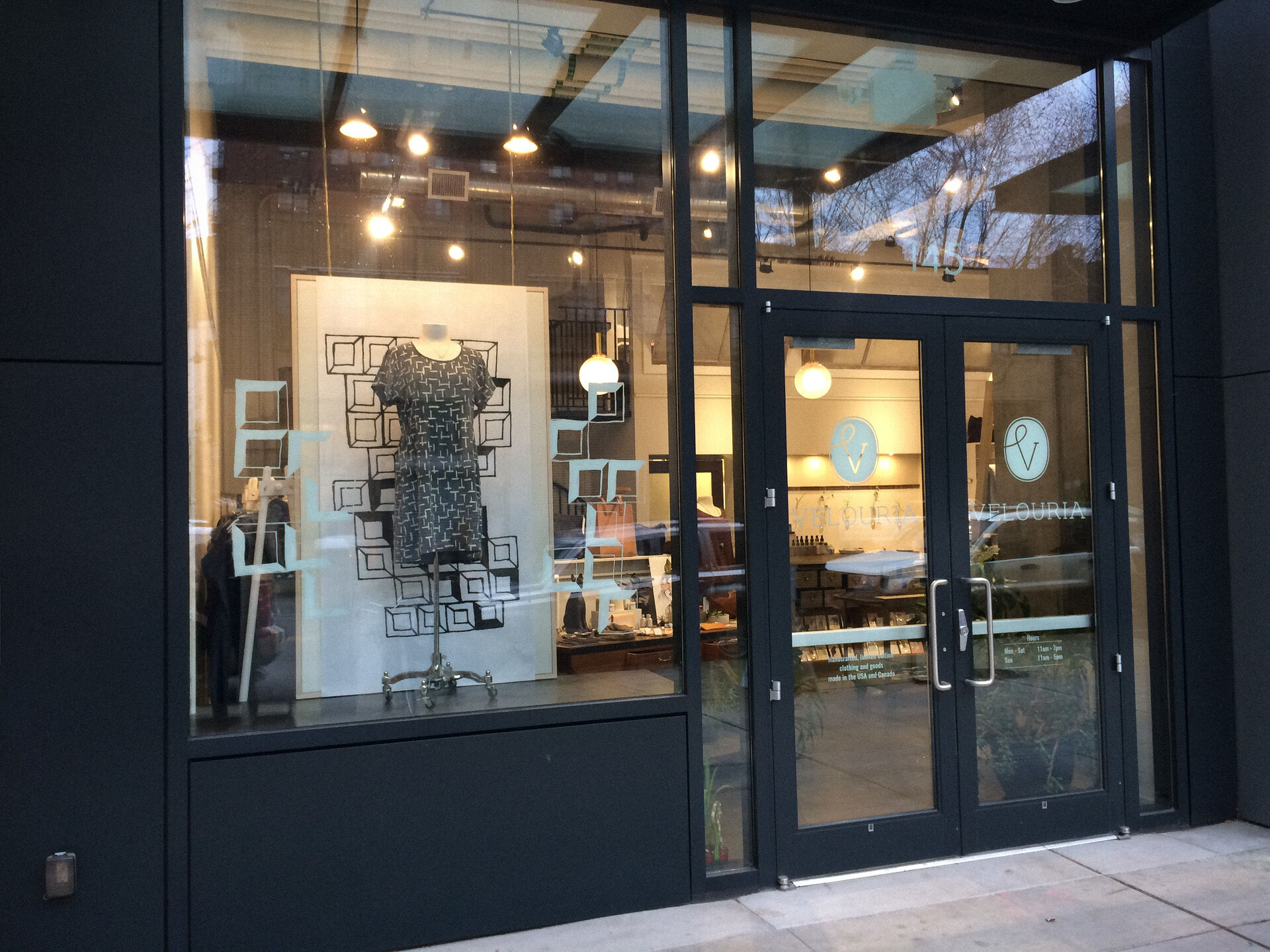
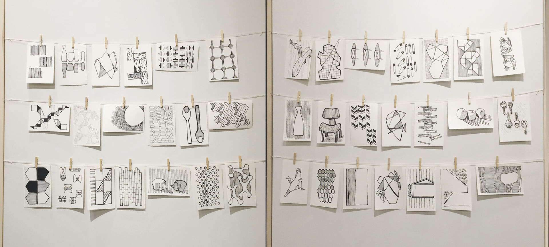
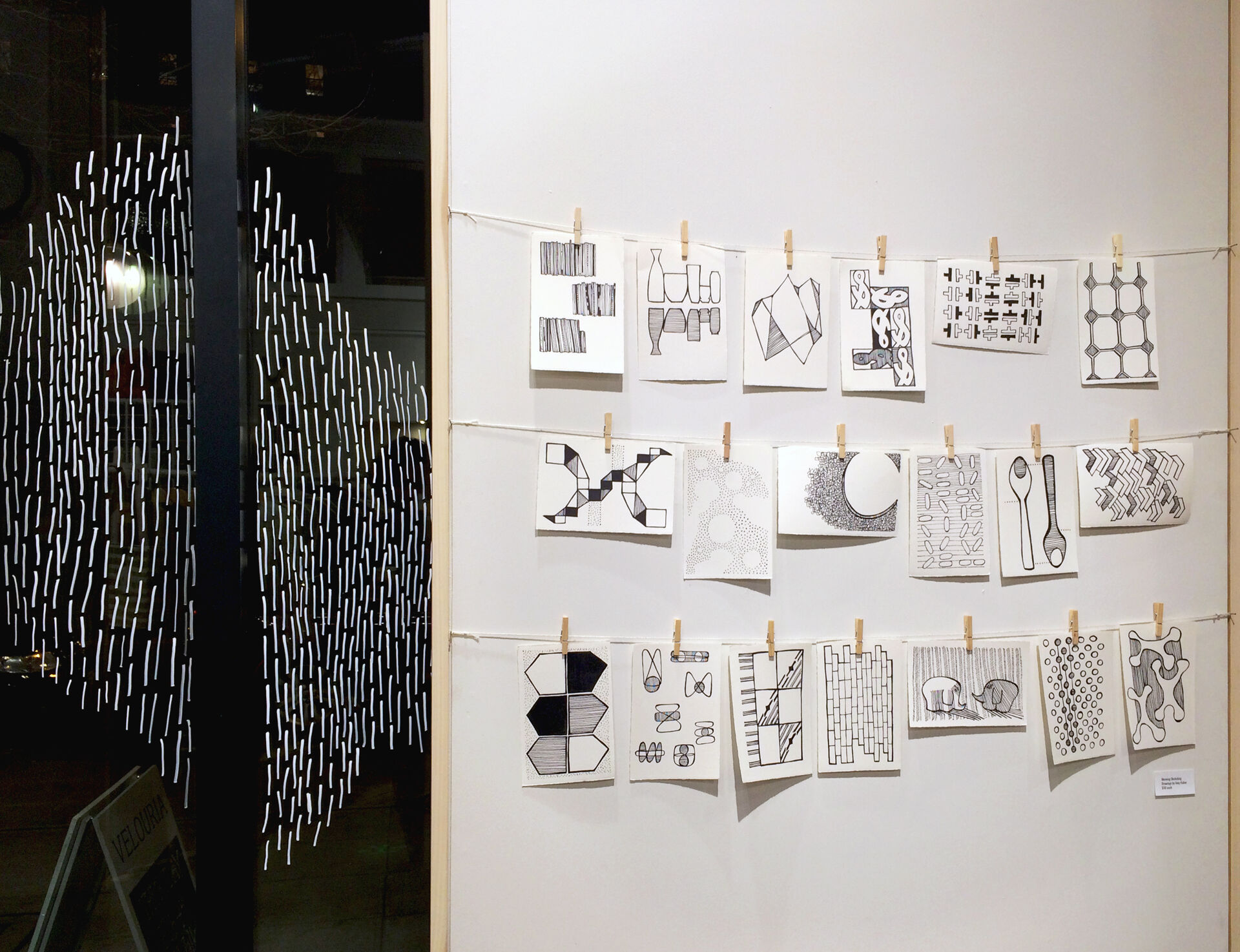
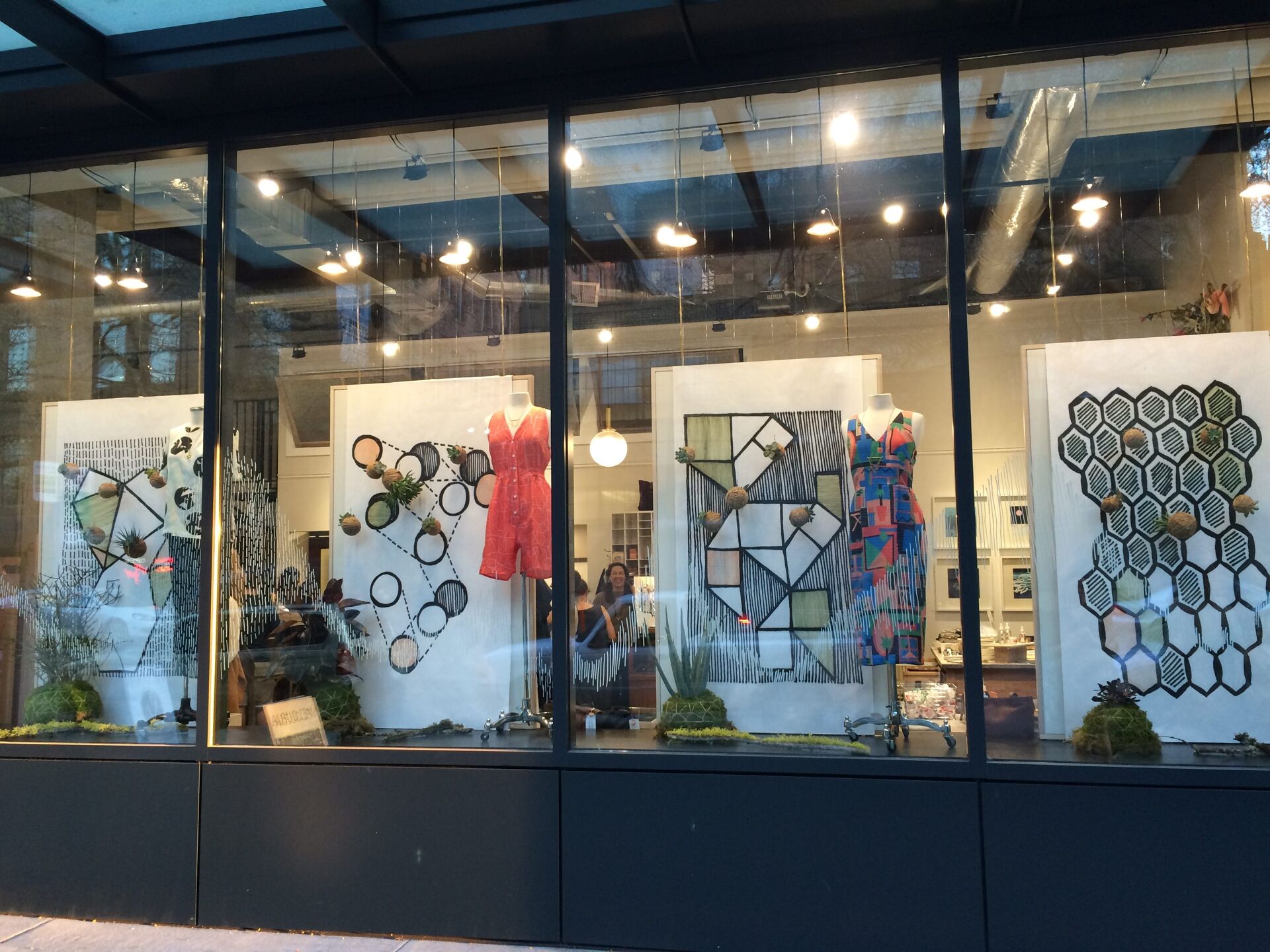
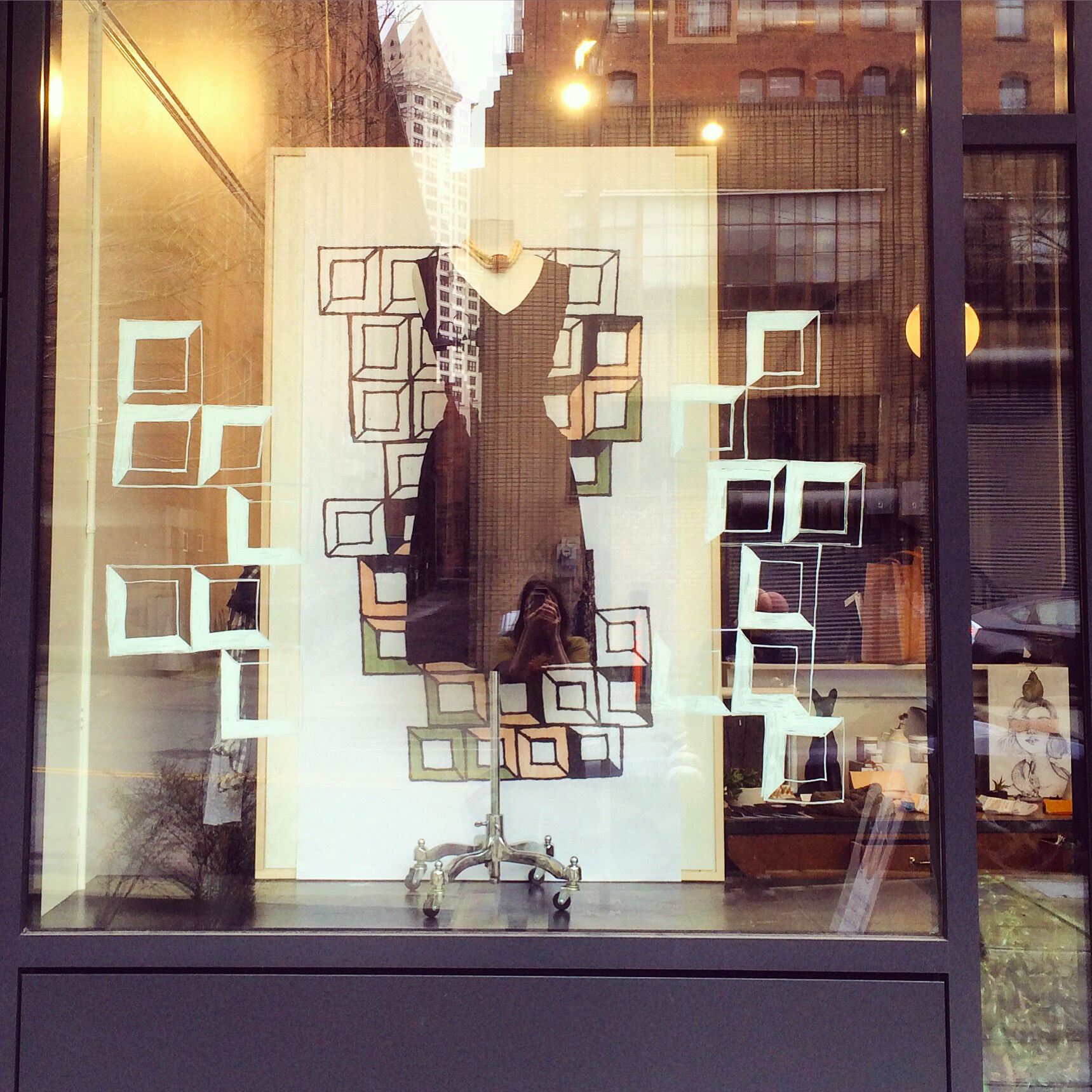
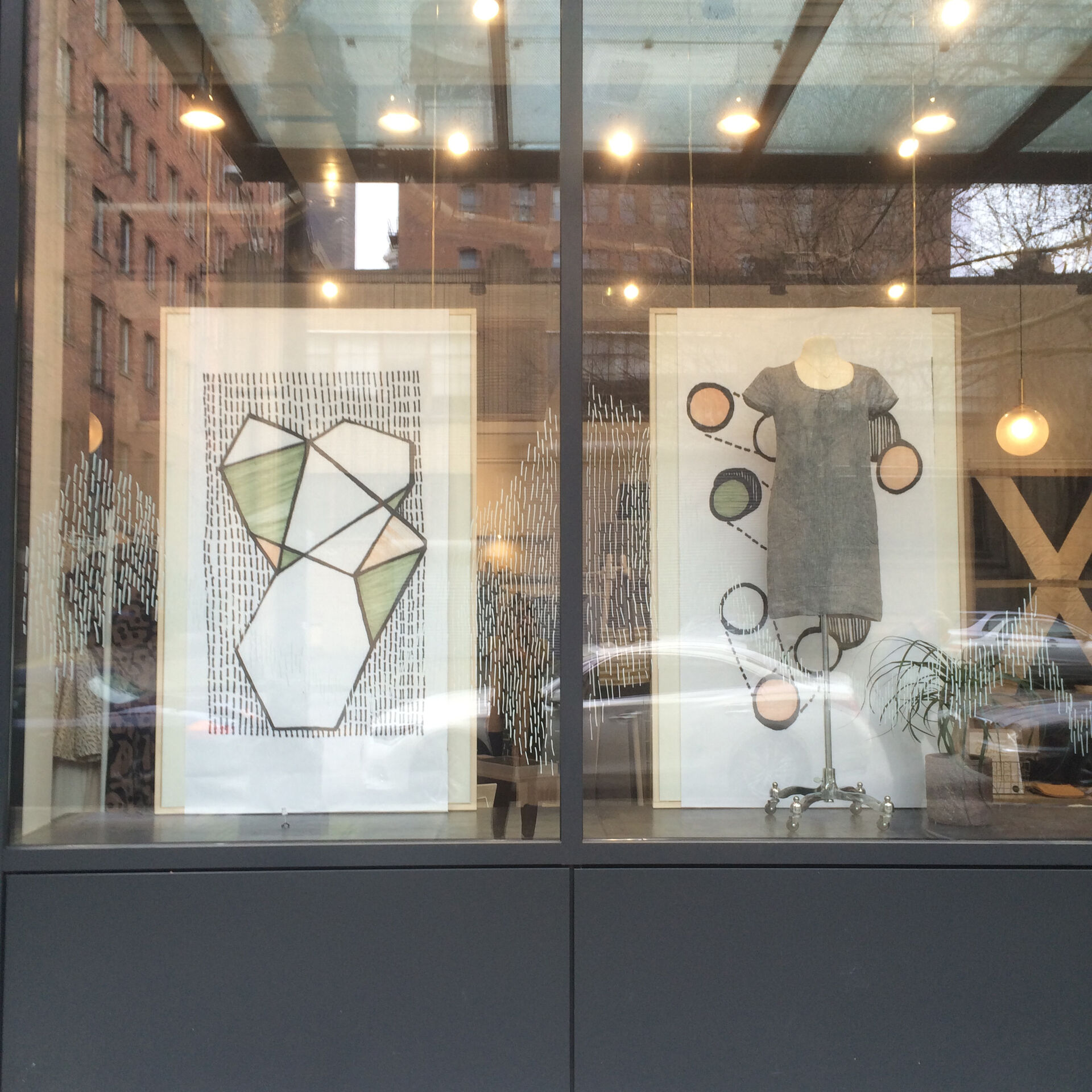
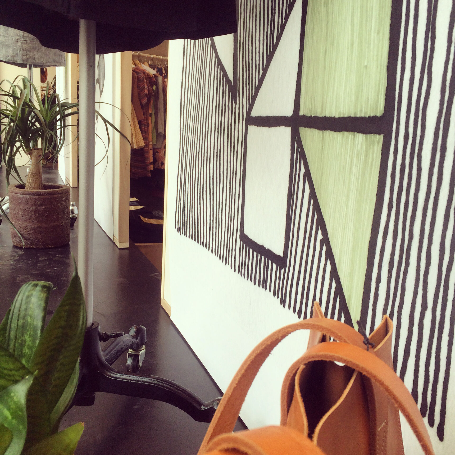
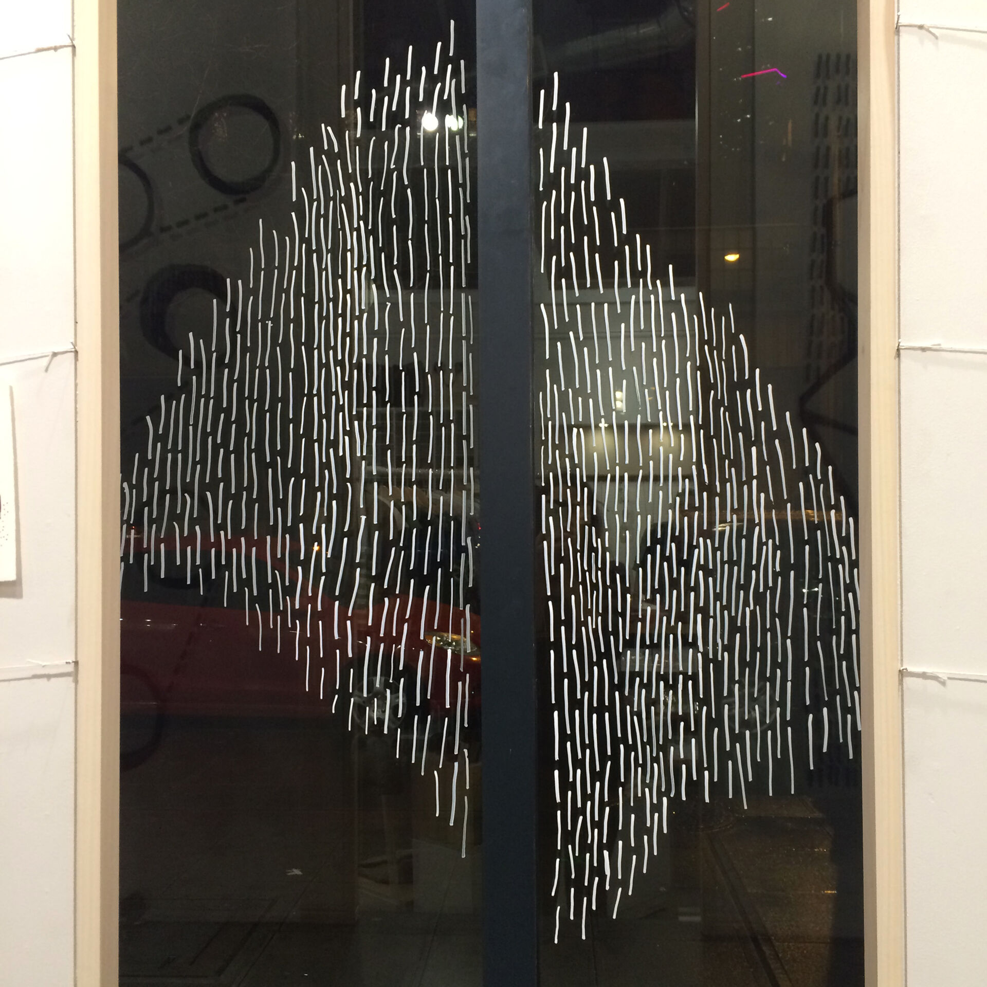
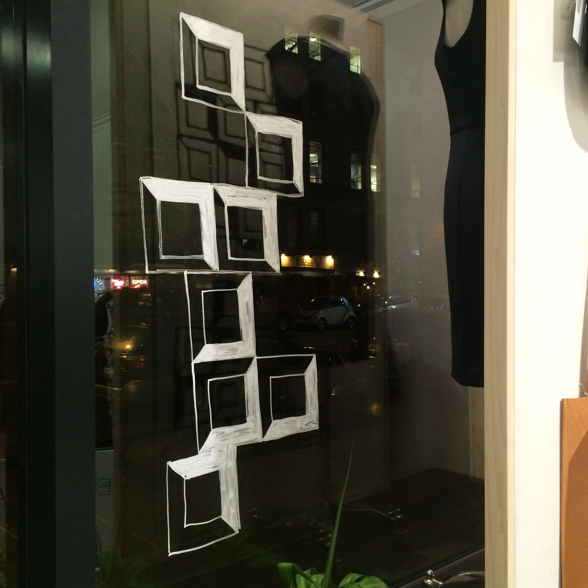
Velouria is a small Seattle boutique and gallery chock-full of US and Canadian-made goods. Their pieces are made by folks who are dedicated to beauty, quality, and sustainability.
In February and March of 2016 the wonderful ladies of Velouria and I collaborated to create a window display featuring my Morning Sketching illustration collection. The installation consisted of two parts. First, we decided on five black-and-white sketches to feature as blown-up backdrops providing wallpaper for their display mannequins. Then I implemented hand-painted designs across the front window panels to create a multilayered aesthetic. Inside the shop, Morning Sketching drawings were exhibited, and a reception was held during Pioneer Square’s First Thursday Art Walk (in conjunction with local jewelry artist Angela Delarmente’s beautiful jewelry). To create an evolving design, we followed up the February installation with added color elements in March that complemented Velouria’s new spring clothing lines.
The Black & White Phase
Gallery Show
Springtime Color Updates
Details
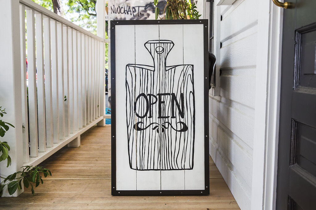
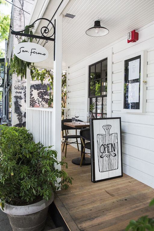
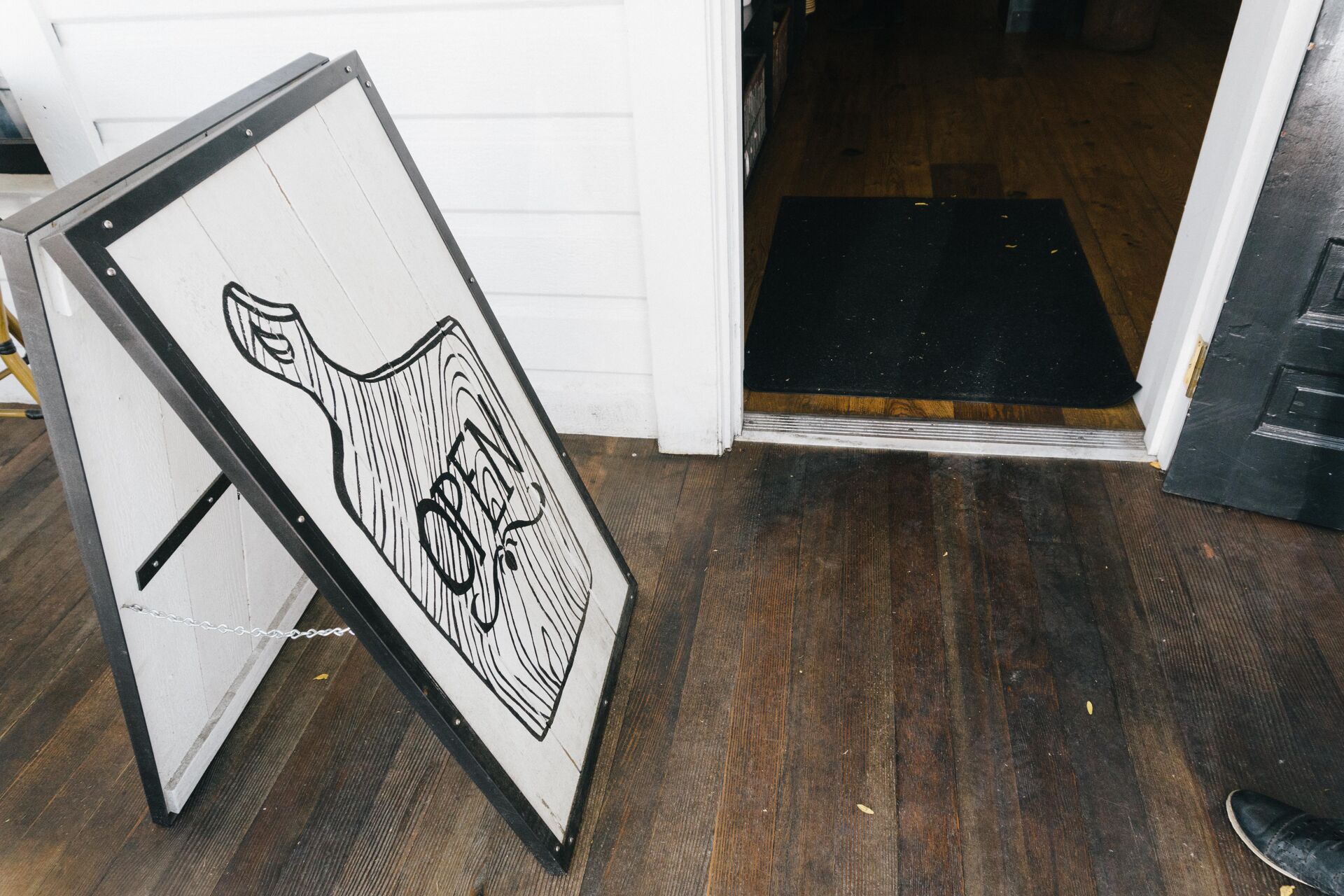
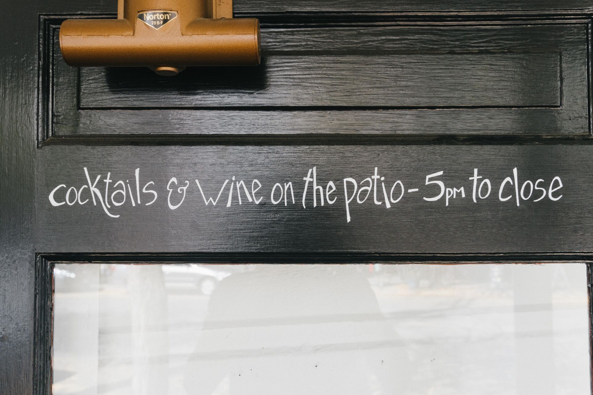
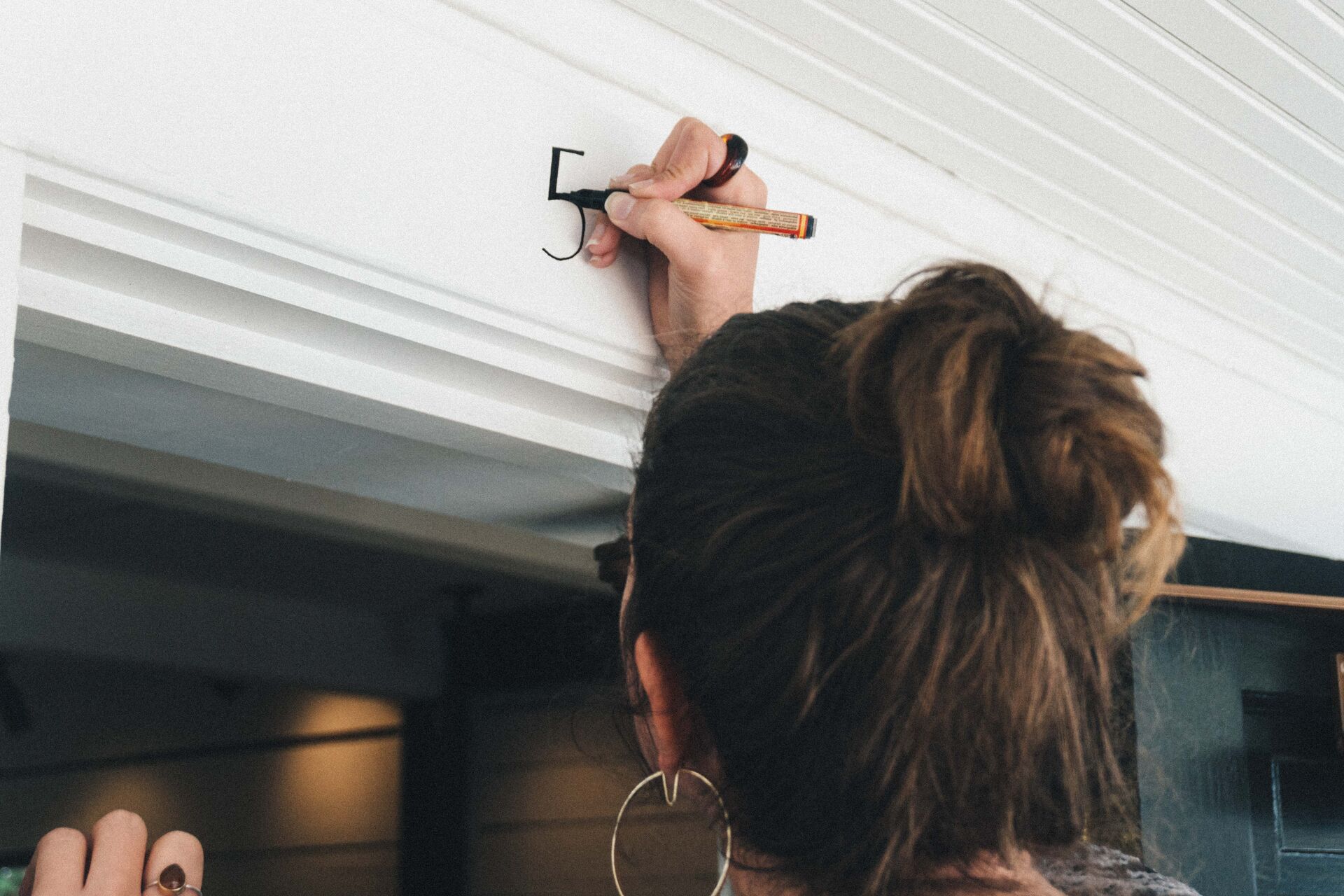
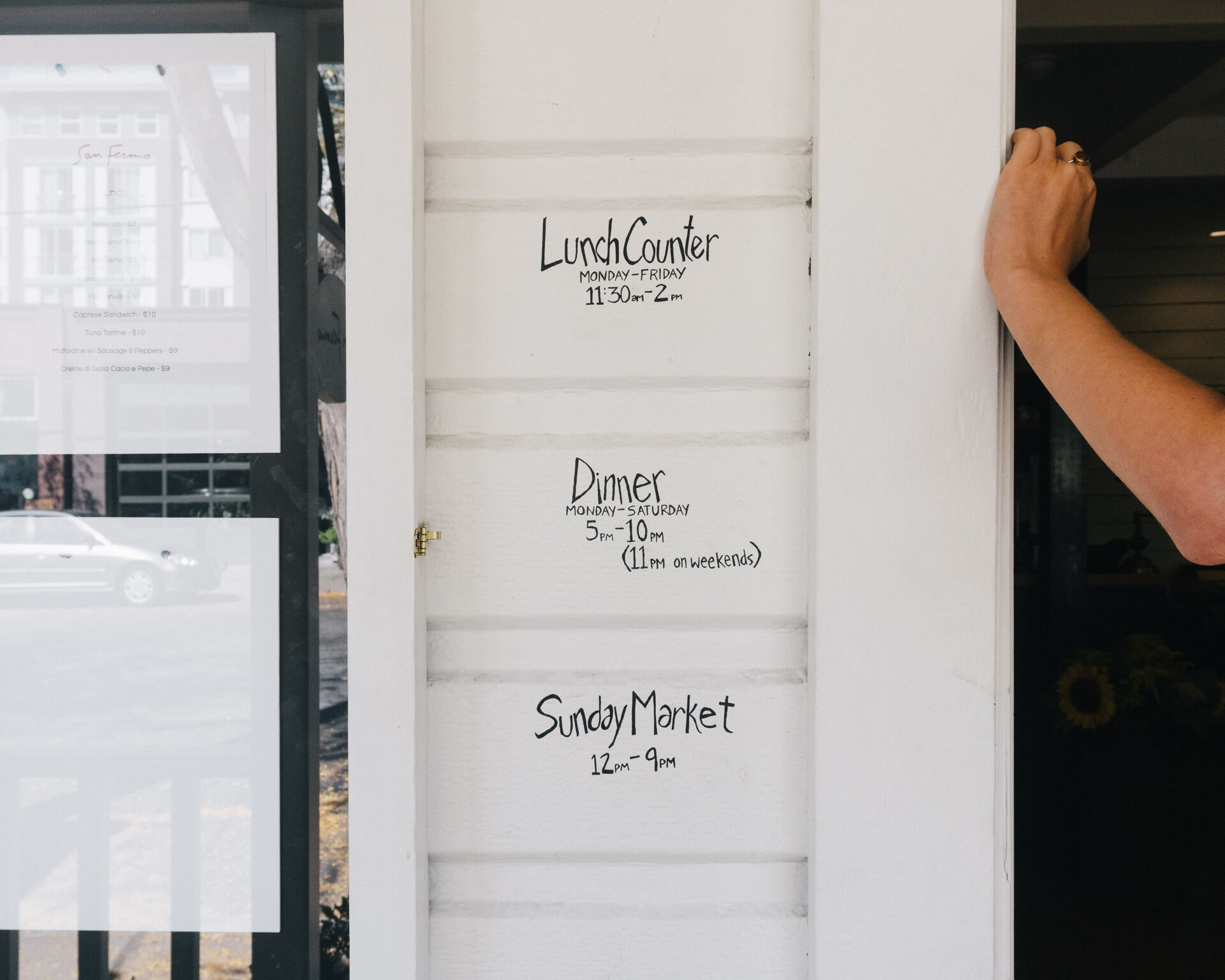
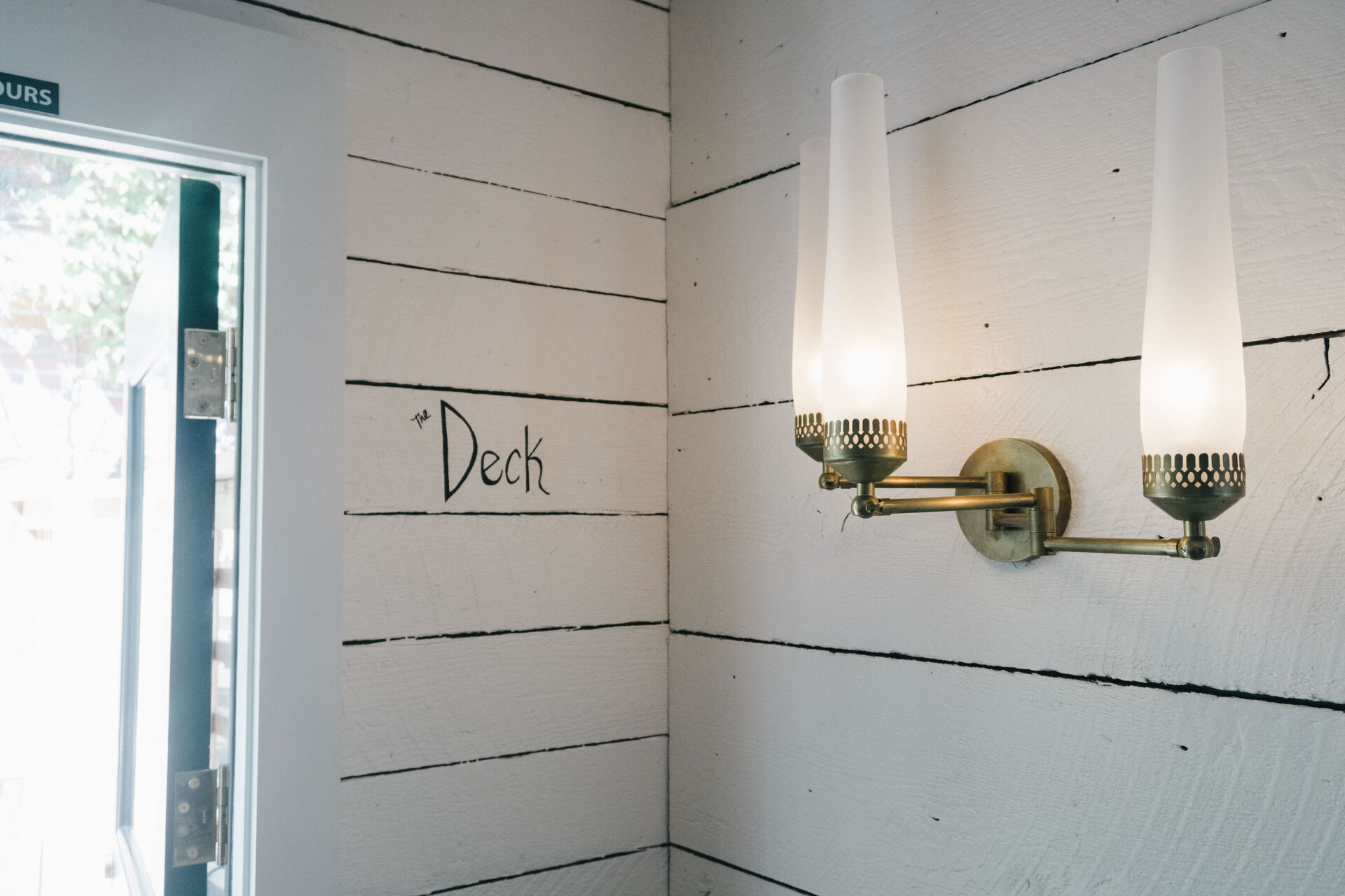
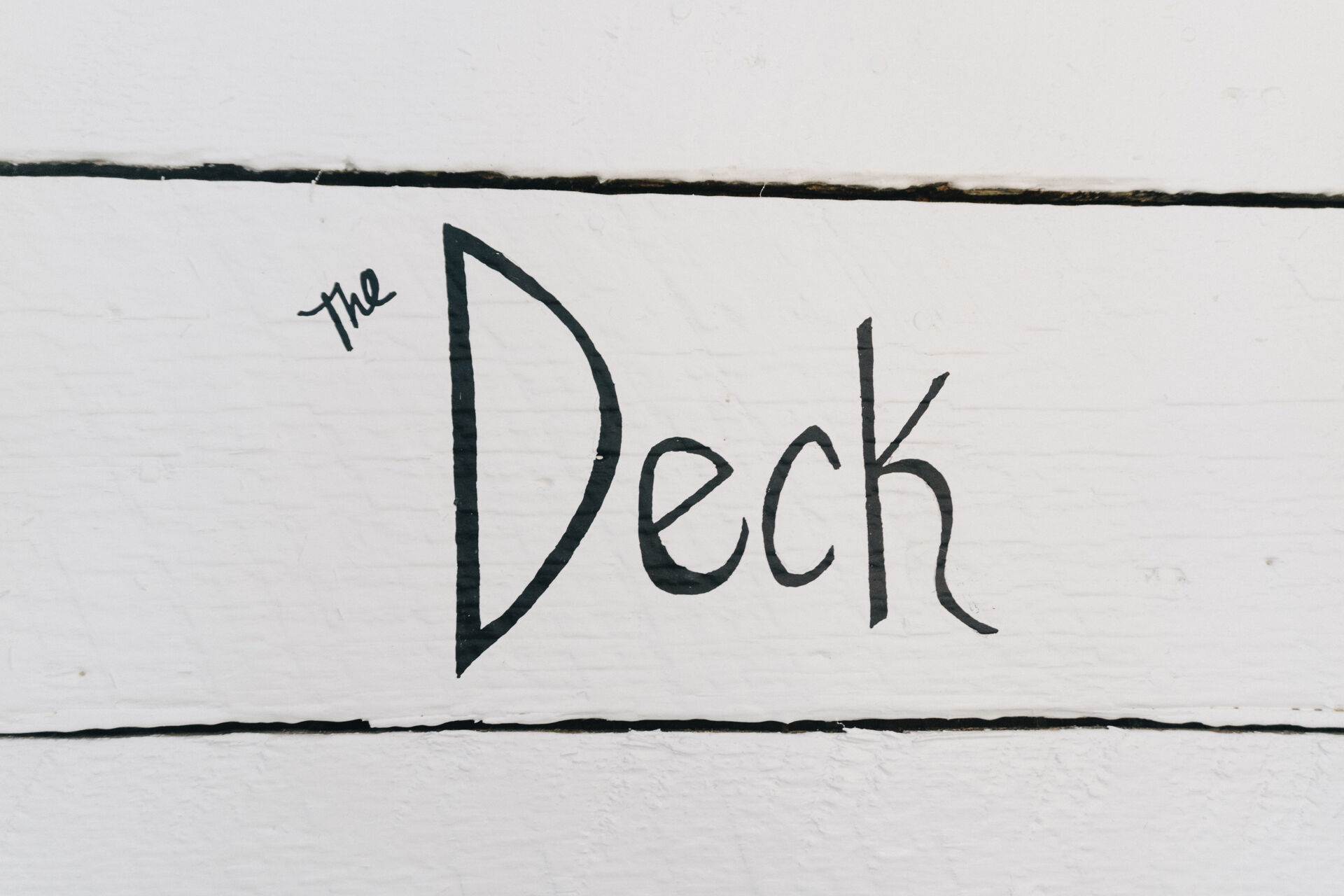
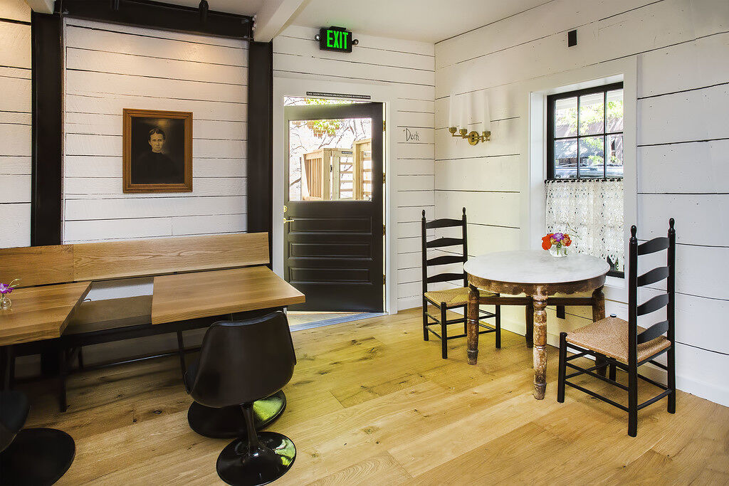
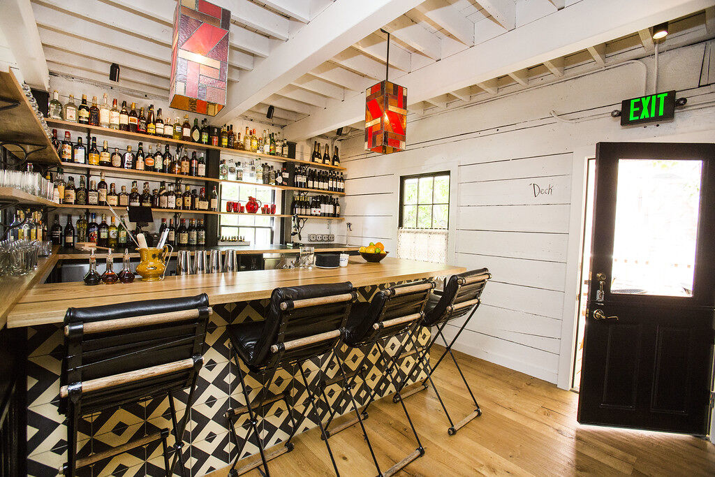
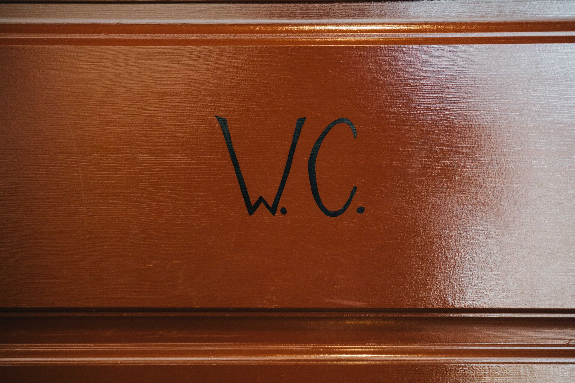
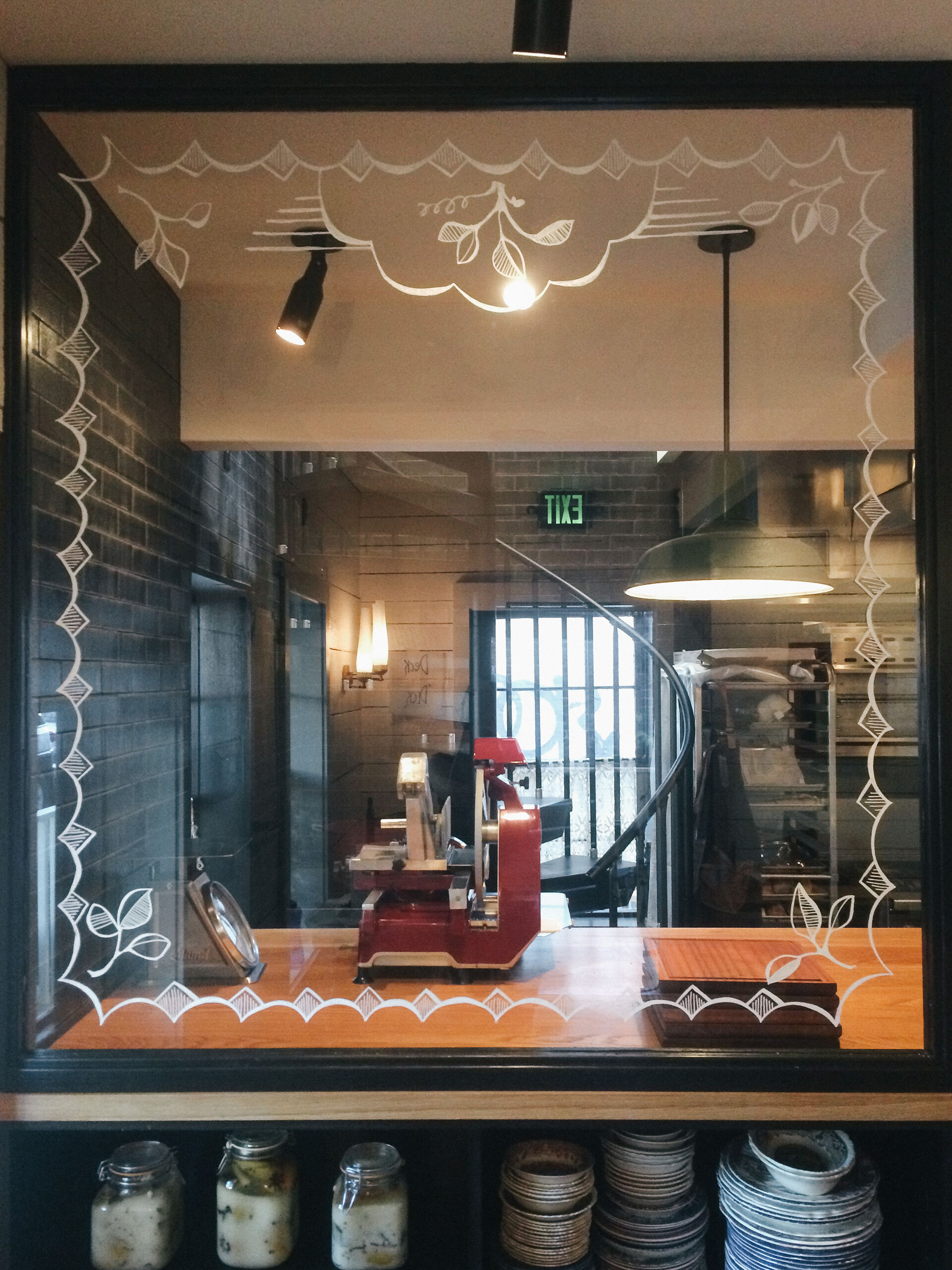
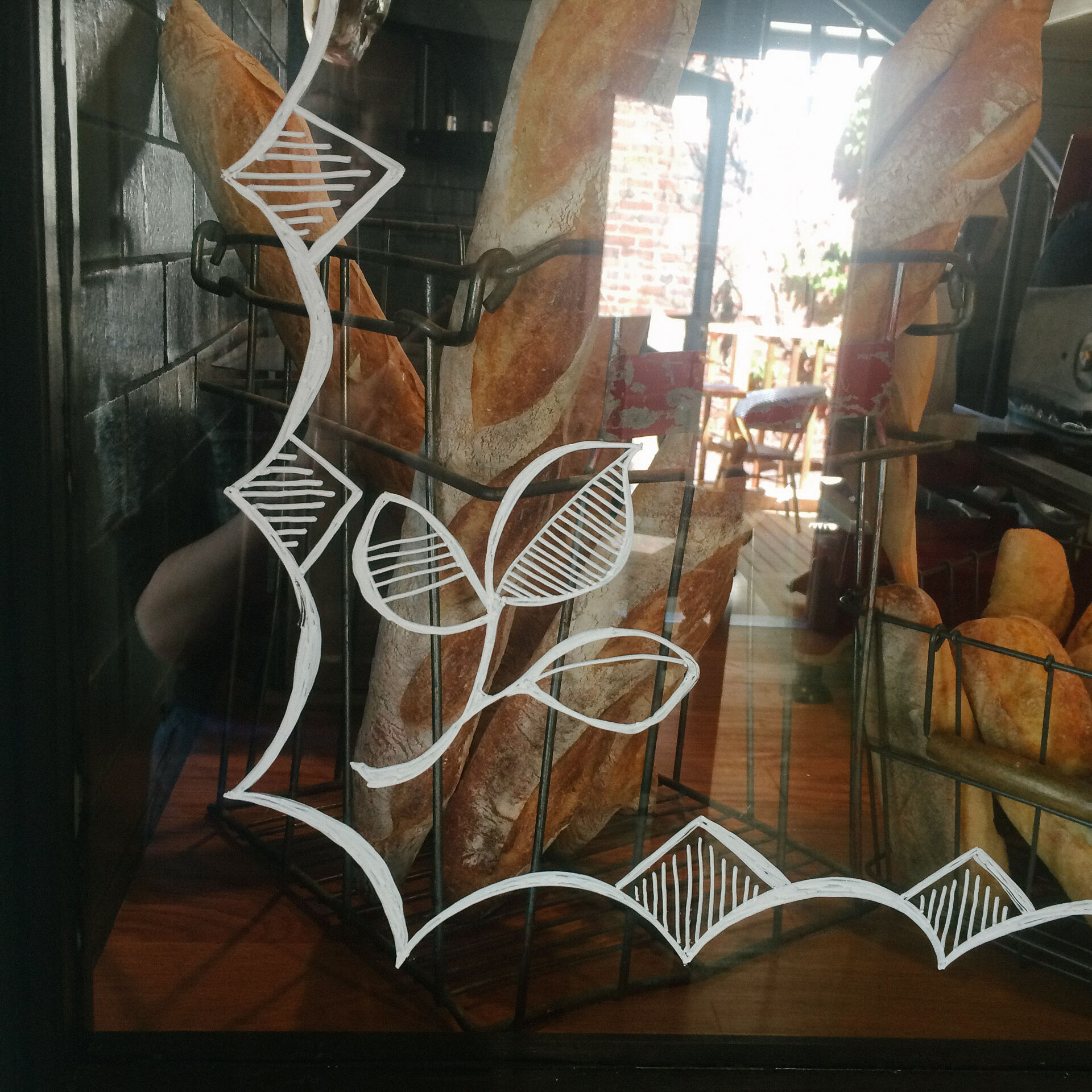
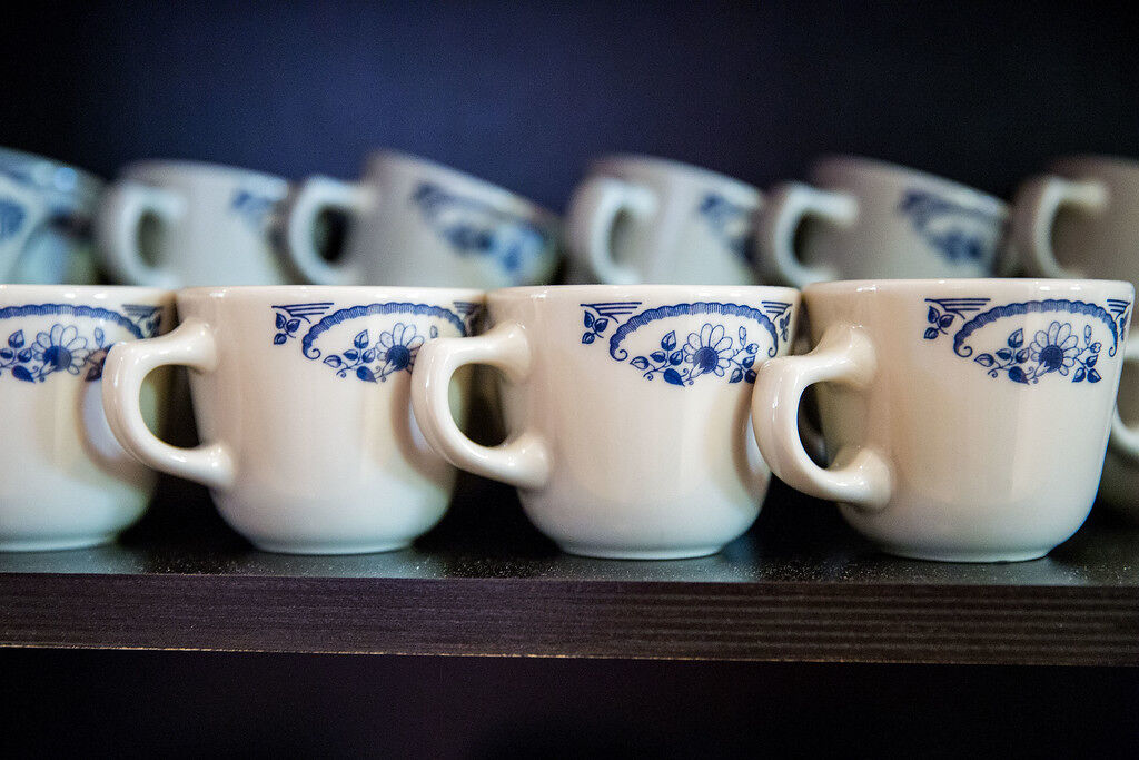
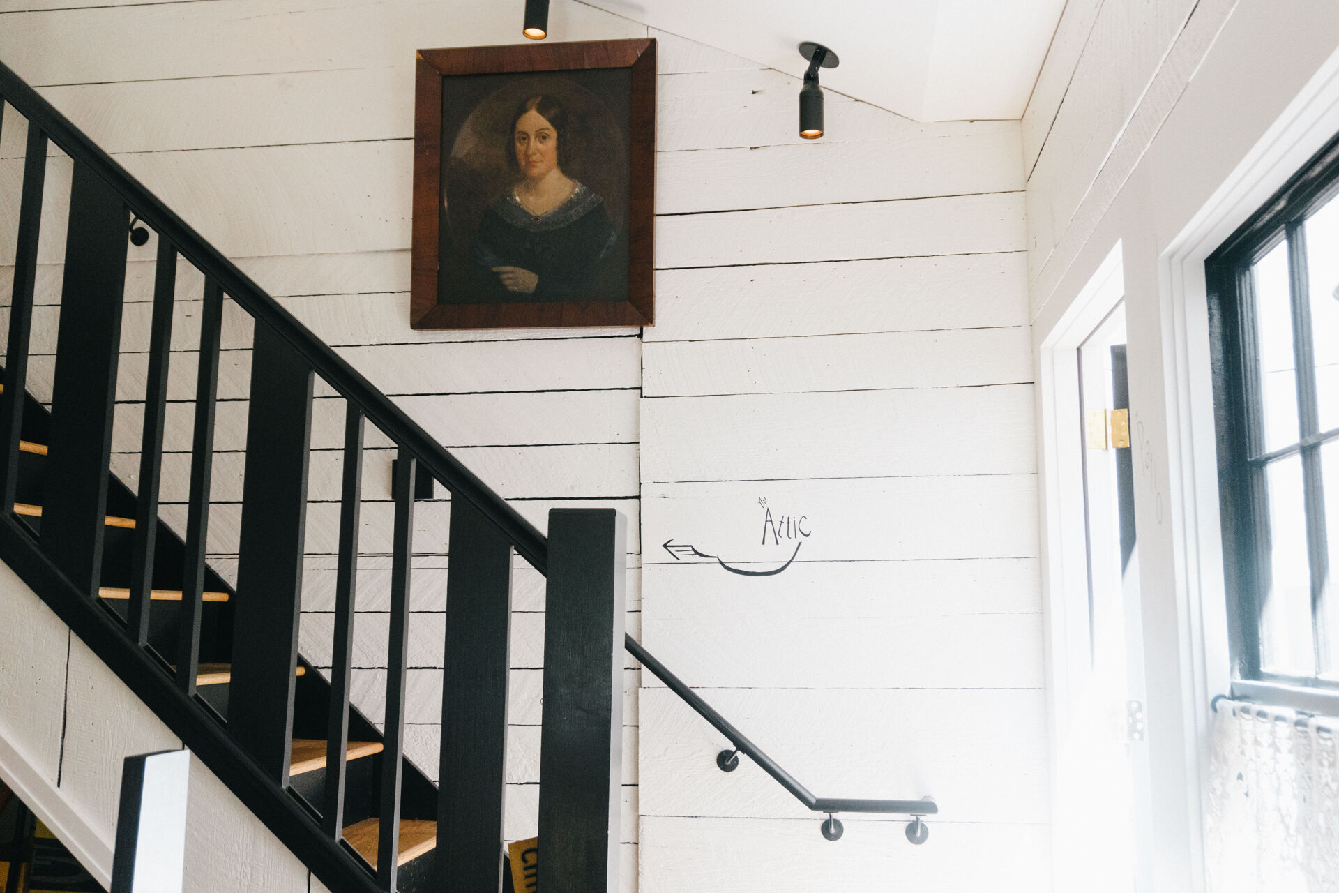
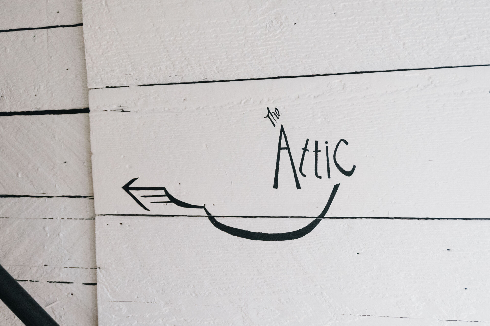
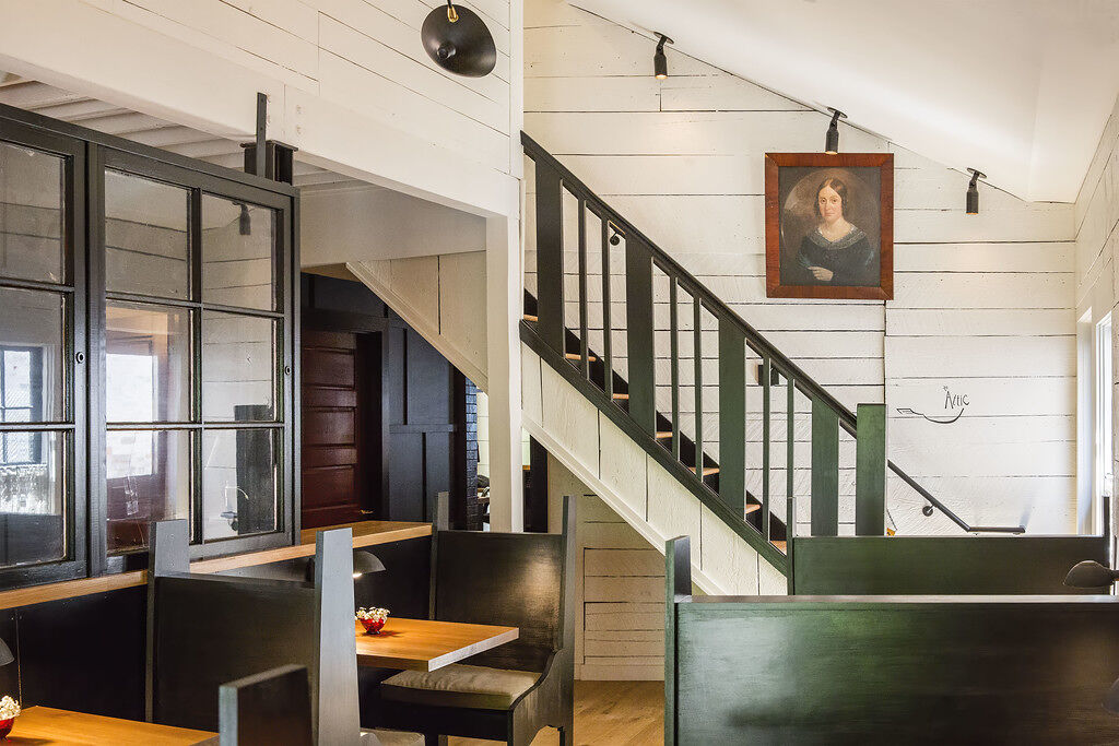
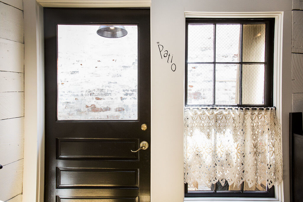
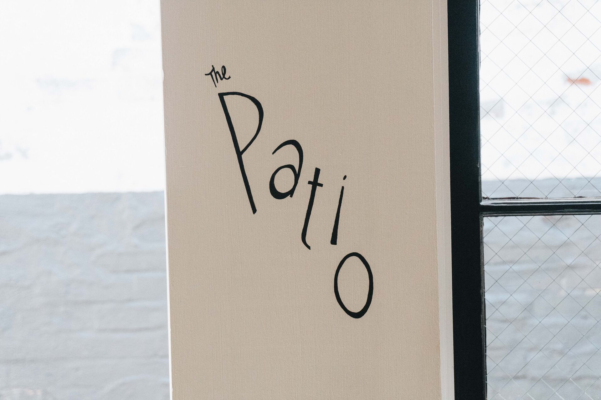
San Fermo is an Italian restaurant in Seattle situated in a newly renovated historic house.
The interior design features a mix of both vintage and clean modern aesthetics, and the owner reached out to me with the idea of using hand lettering for their signage. I started with the exterior sandwich board using imagery referencing the aged cutting boards that the owner and his wife had collected over the years. Finding inspiration for the environmental design in the space itself, I took visual cues from the vintage European tableware that the restaurant uses. For any detailed design elements, I created stylized typography that reflects the modern/vintage feel of the restaurant.