Prev Project
French Girl
Next Project
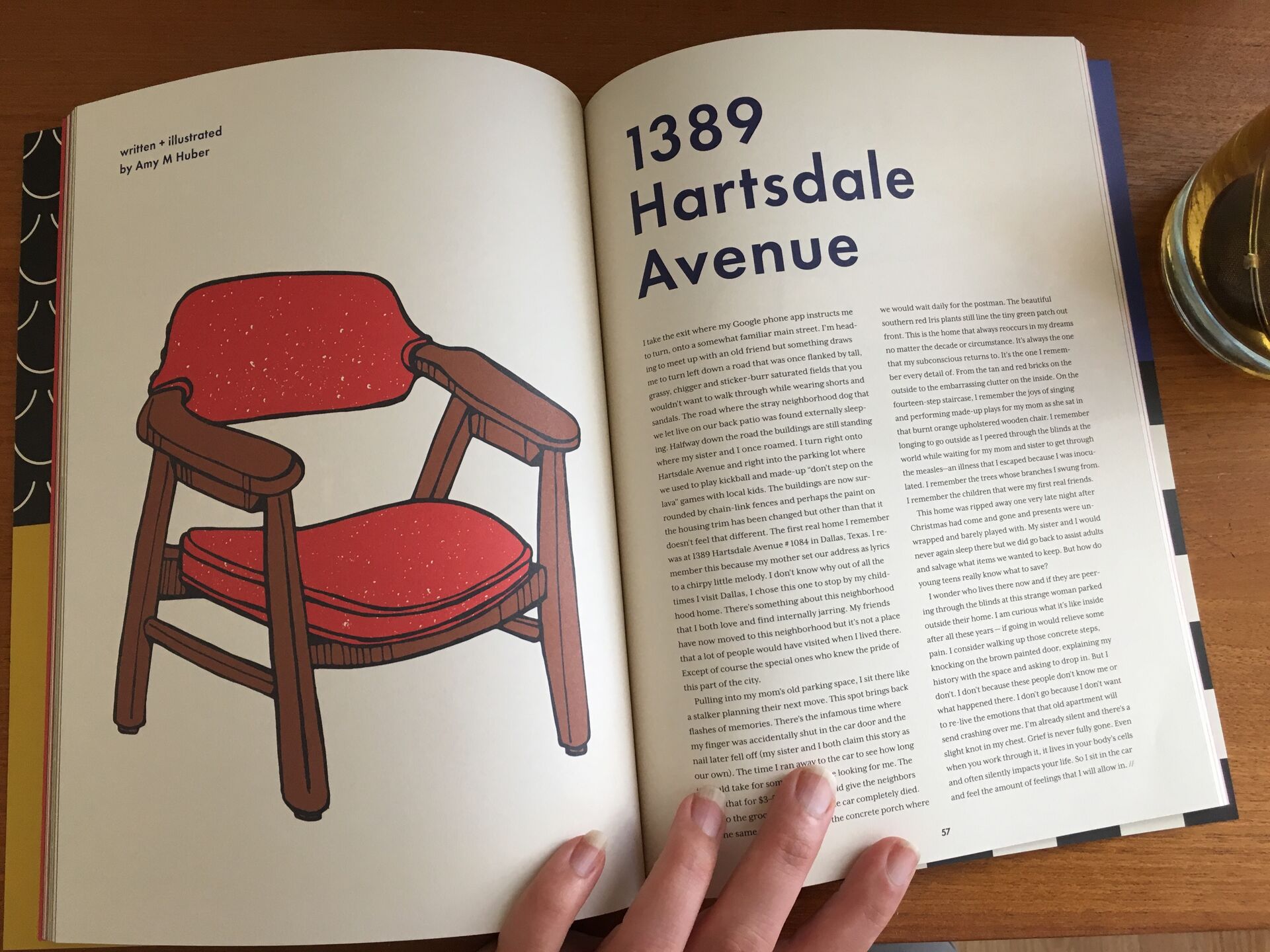
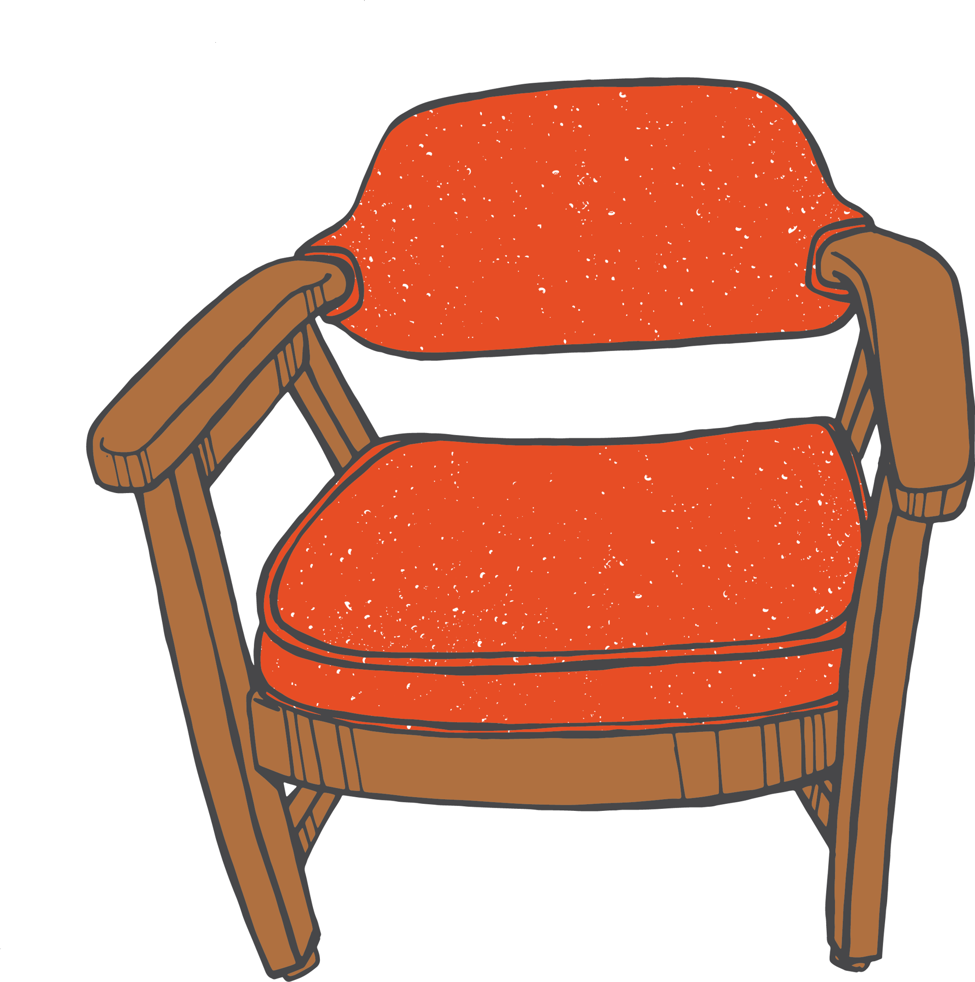
Dear Lois Magazine
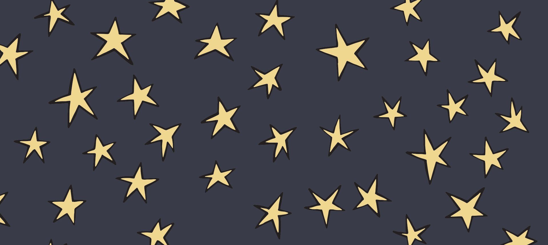
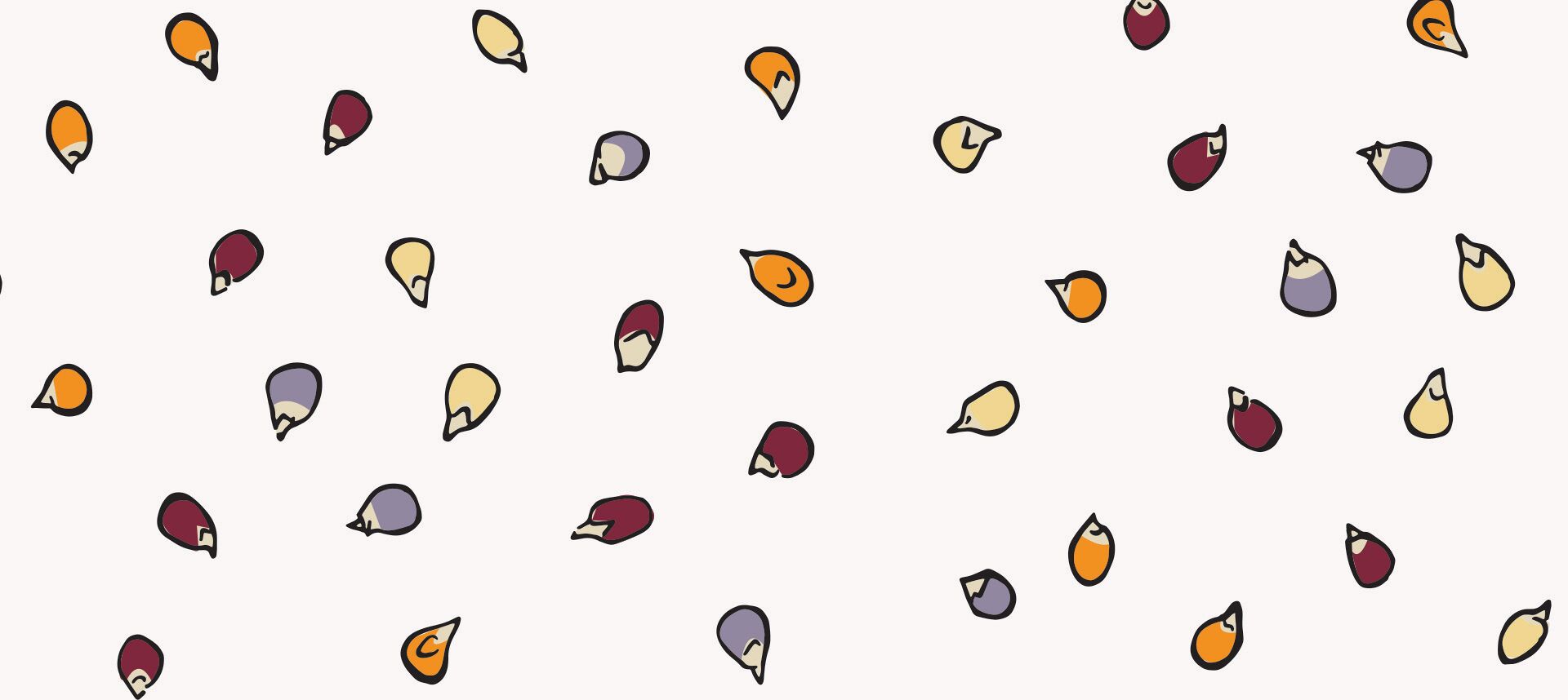
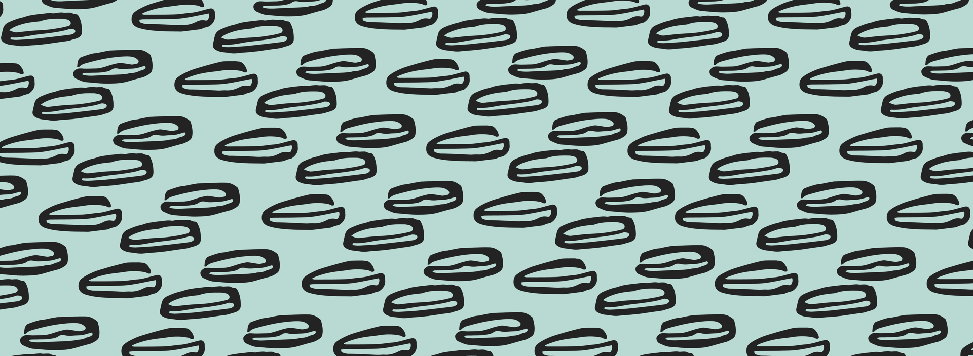
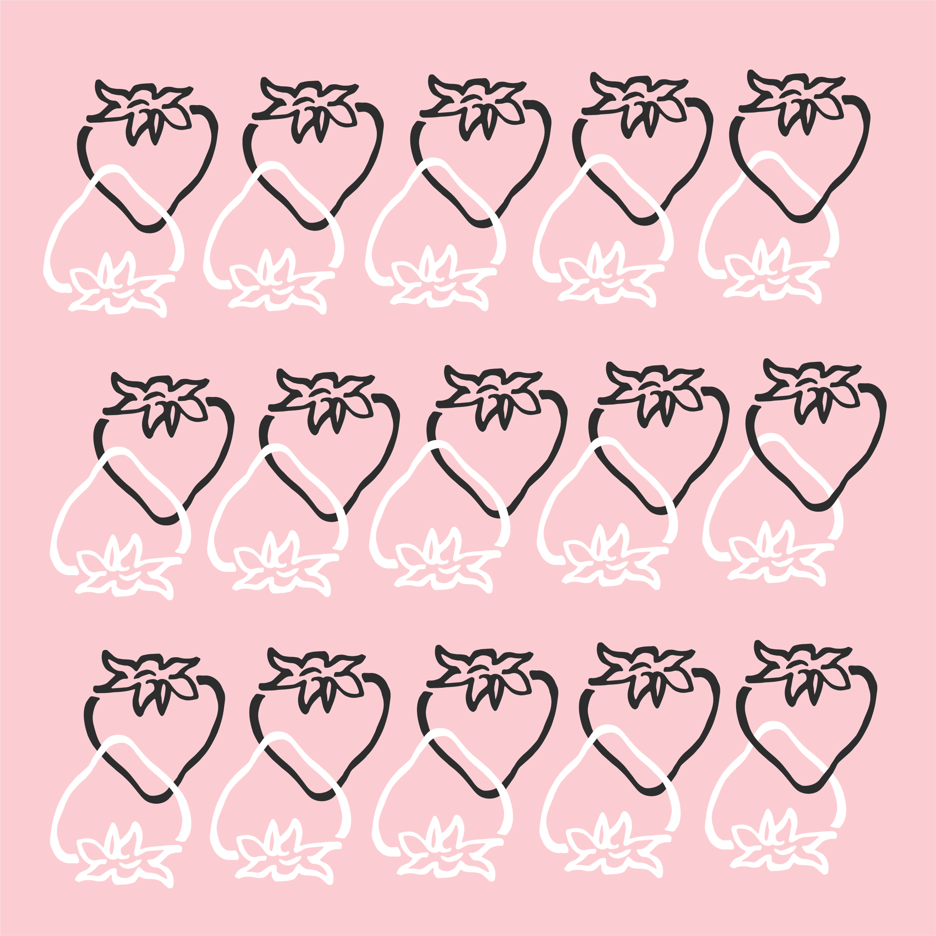
Country Lips
Merchandise & Advertising
Prev Project
French Girl
Next Project
Dear Lois Magazine
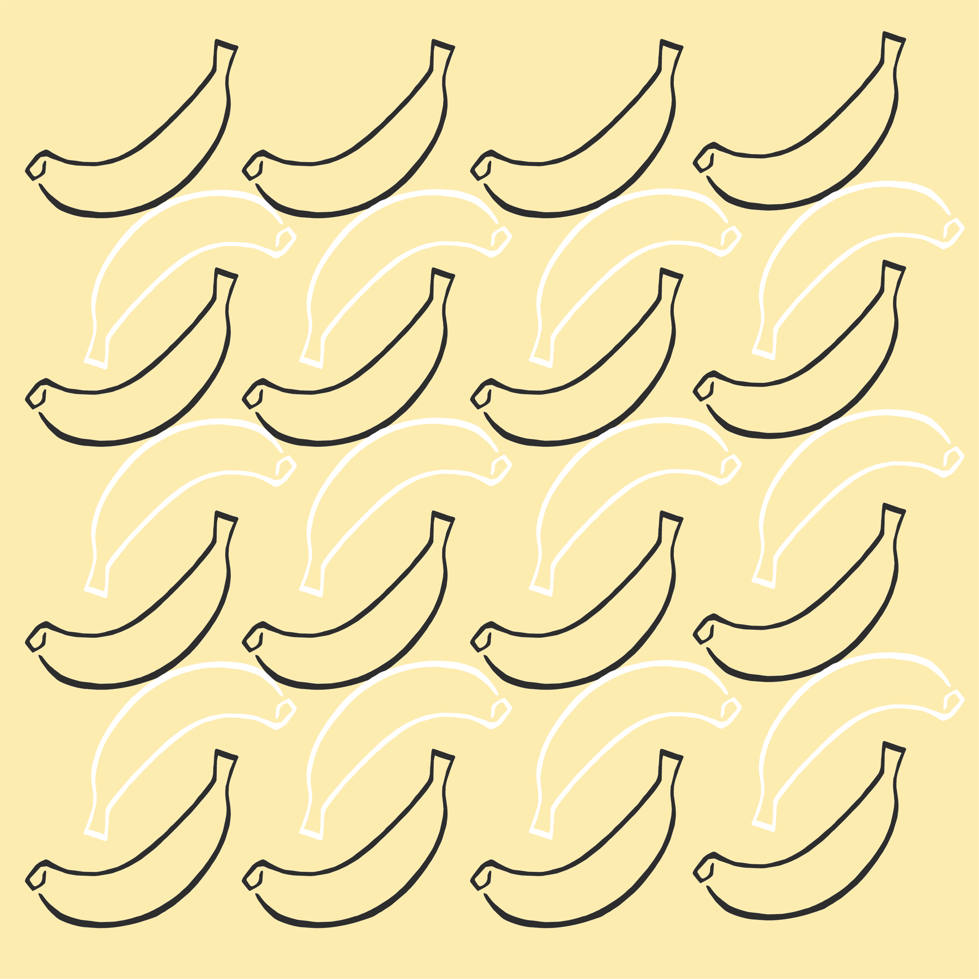
Pattern & Surface Design
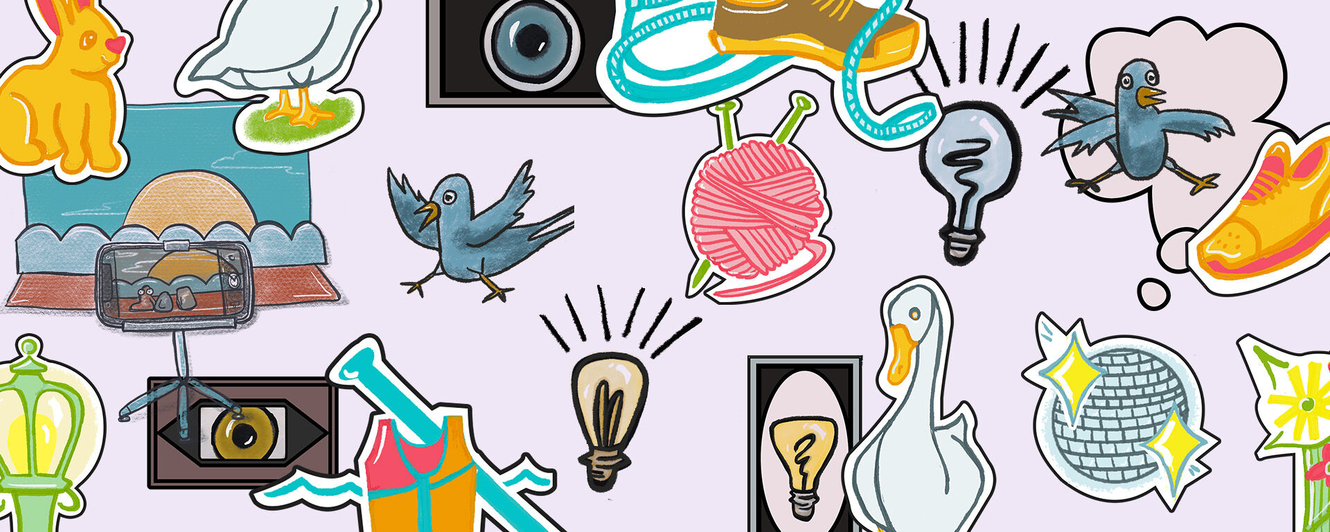
Illustrations & Graphics

Prev Project
French Girl
Next Project
Dear Lois Magazine
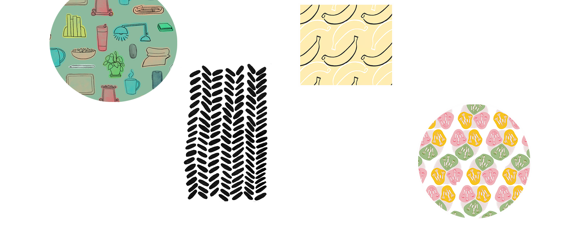
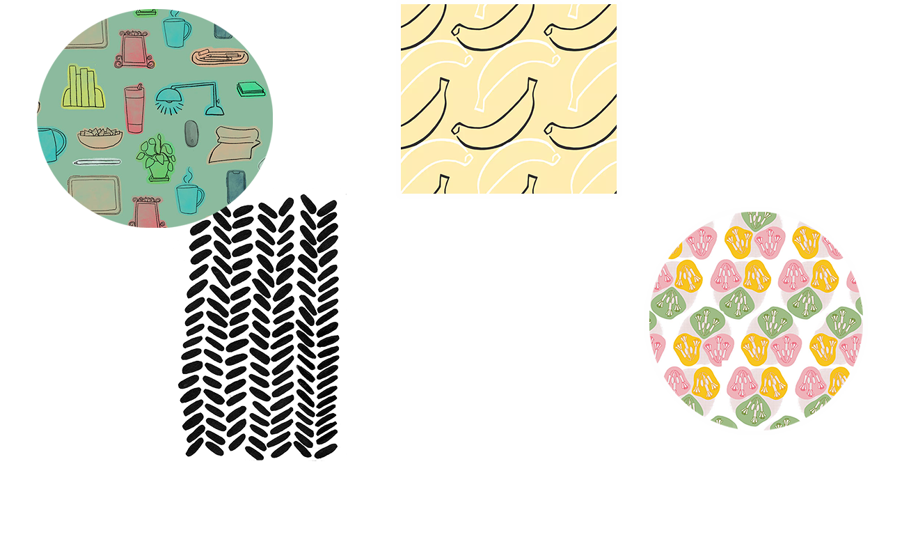
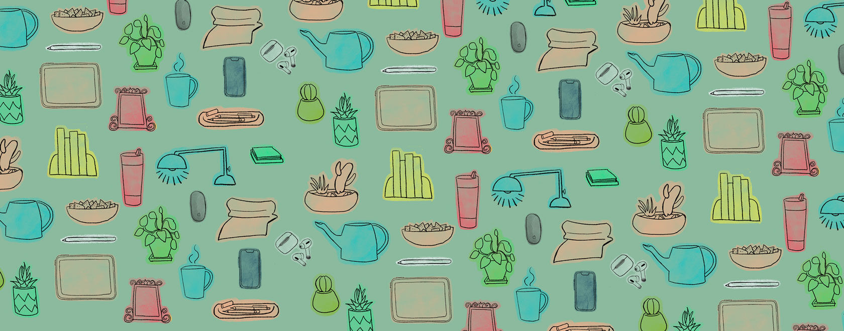
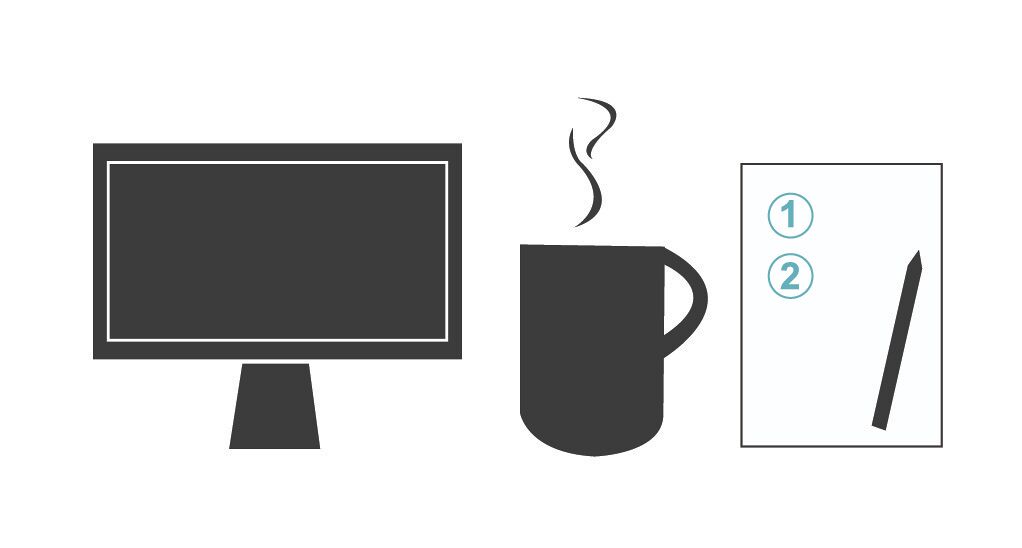
Apple Support
Digital Illustrations & Design
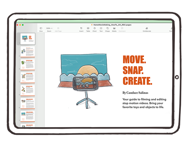
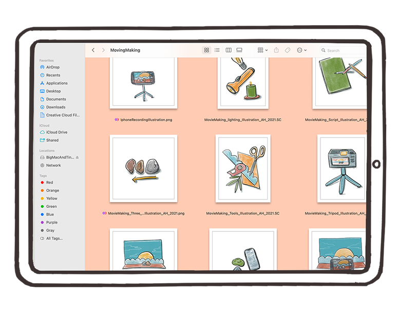
Working for the folks at the Apple Support YouTube and Twitter channels provided me with many opportunities to grow as a designer and illustrator. One of my main roles as one of the team’s graphic designers was to concept and create illustrations and designs for Apple device applications that appeared in the team’s educational motion graphic videos. Many of the graphics were created within application tools to achieve the most accuracy.
Prev Project
French Girl
Next Project
Dear Lois Magazine

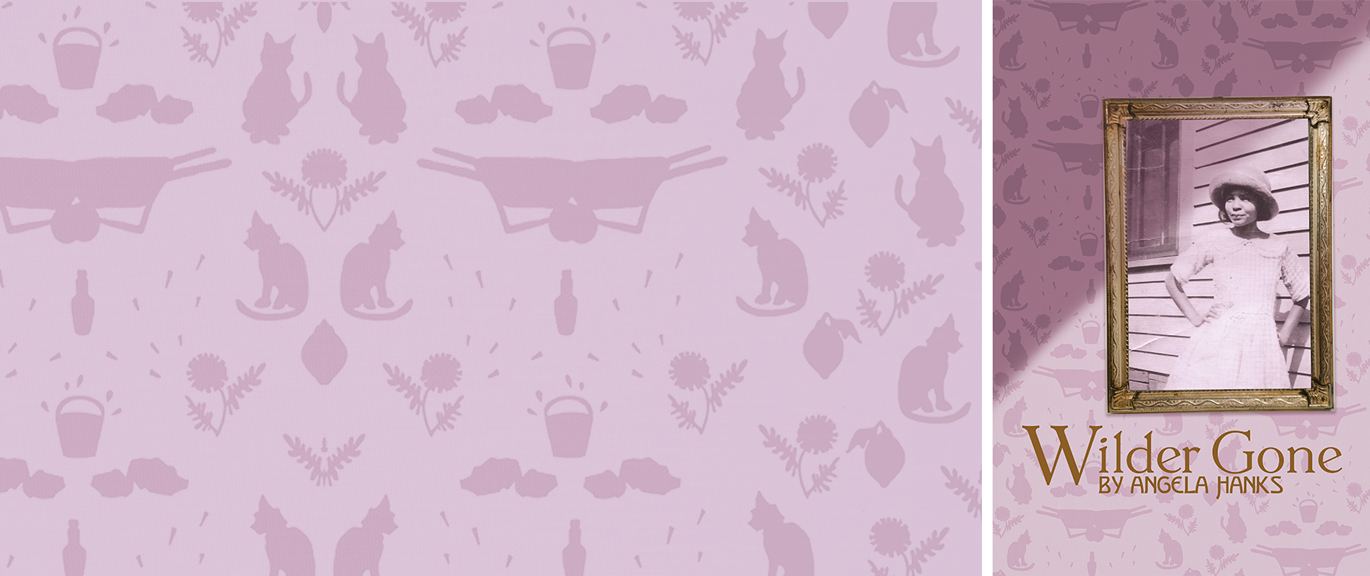
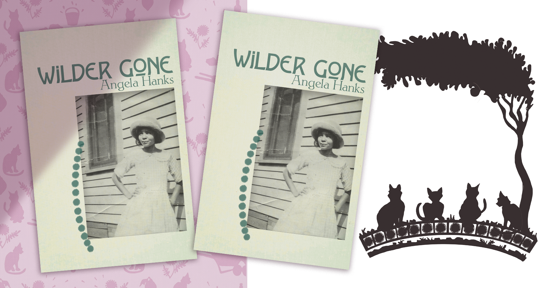
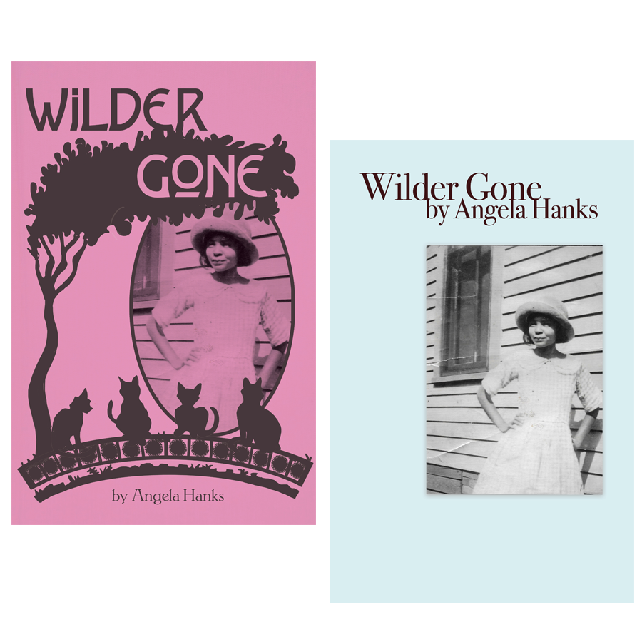
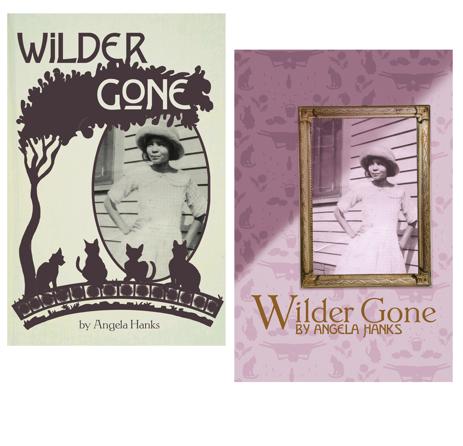
“Wilder Gone” by Angela Hanks
Published Play Cover Design
Longtime friend and playwright Angela Hanks reached out to me to design a cover for her 2018 play “Wilder Gone.” Angela and I have collaborated before, but this time a big time publishing company was in the mix. I was ecstatic to create this cover supporting my friend’s career growth and humbled that she asked me to do it. The published work will be released in Spring 2023 and I’m excited to share it with the world. If you’d like to be delighted, keep an eye out for tickets to one of Angela’s plays.
Disciplines:
Graphic Design, Typography, Illustration, Pattern Design, Editorial DesignClient:
Angela HanksPress:
Websites:
Alternative Cover Design Options
Influences and Reference Materials
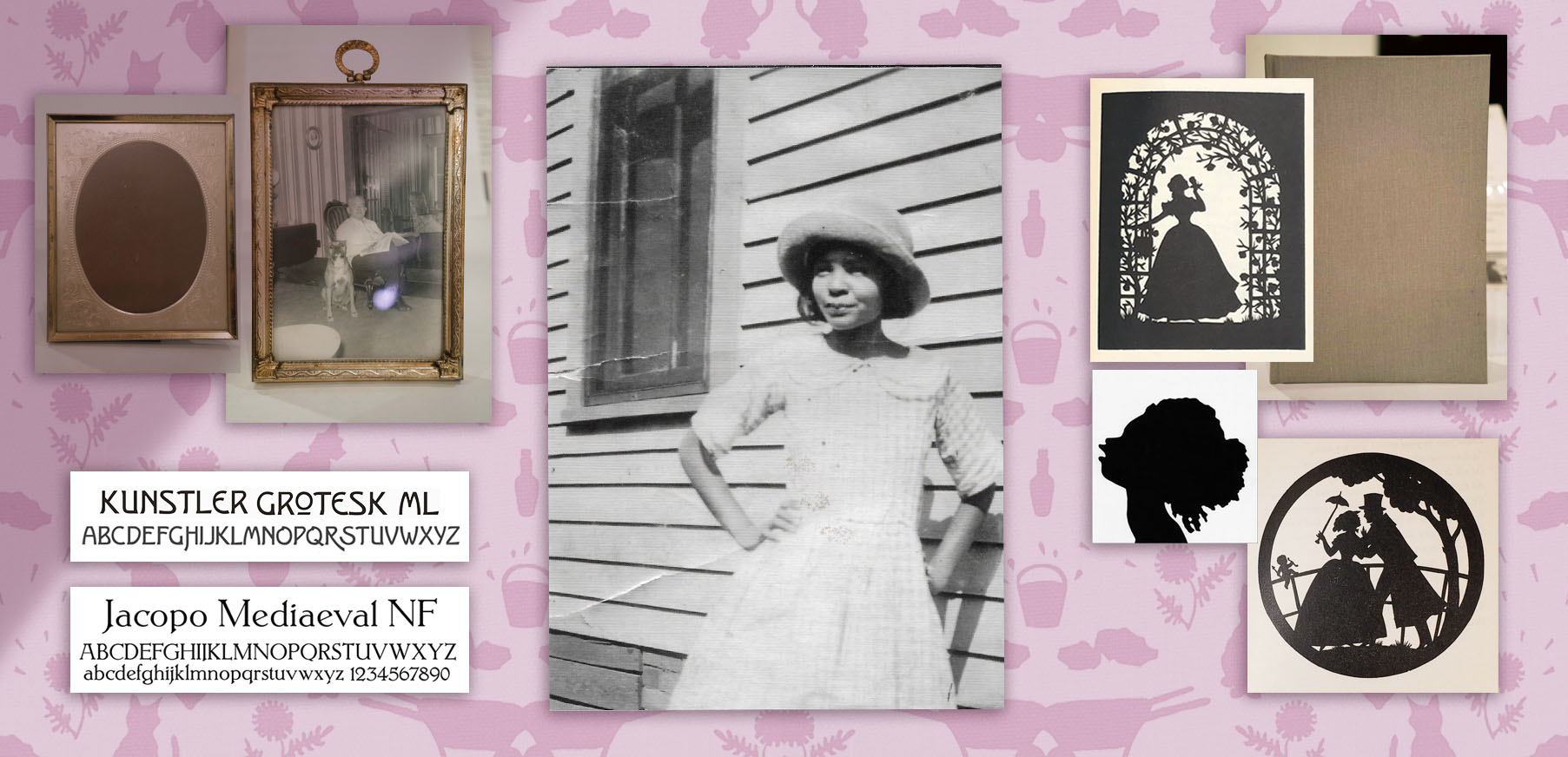
For the “Wilder Gone” cover design, I aimed to uphold the styling of the early 1930s while keeping the integrity of Depression-era Black Dallas.
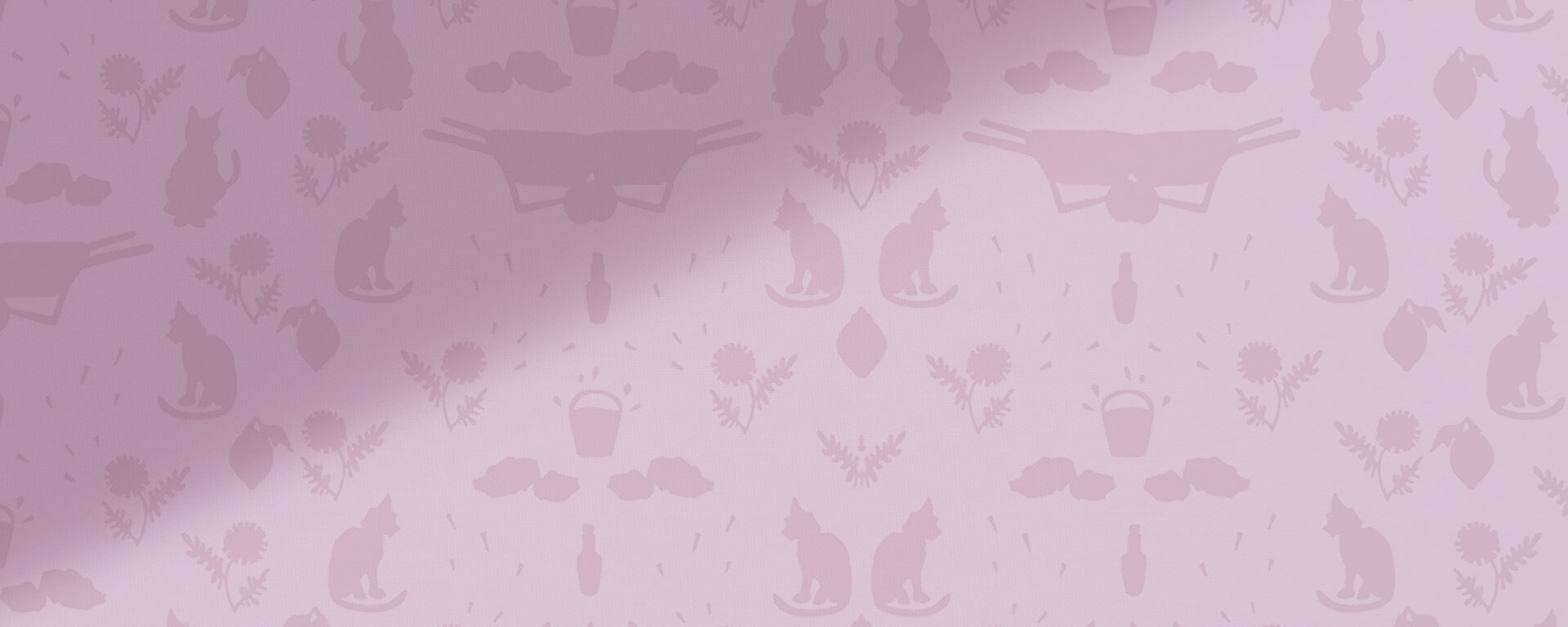
Angela gave me the family photo of her Aunt Tee, who one of the character is loosely based on, to feature in the design. There are motifs and themes in the play which I included in the custom wallpaper. At one point, the main character mentions wanting pink walls in her soon-to-be-built home. There are strong references to cats, rocks, dirt, sweat, lemonade and water.
I used digital fonts that are based on turn-of-the-century typefaces for the title. I’ve always been enticed by the stunning cutout illustrations by Frederick A. Mayer in a 1930’s publication of “Sonnets from the Portuguese” by poet Elizabeth Barrett Browning (a book inherited from my mother), and more recently, the beautifully provocative silhouetted depictions of African Americans in the visual art of Kara Walker. Photographs of my collected vintage frames and book textures give added details to honor the time and place of Angela Hanks’ “Wilder Gone.”
Prev Project
French Girl
Next Project
Dear Lois Magazine
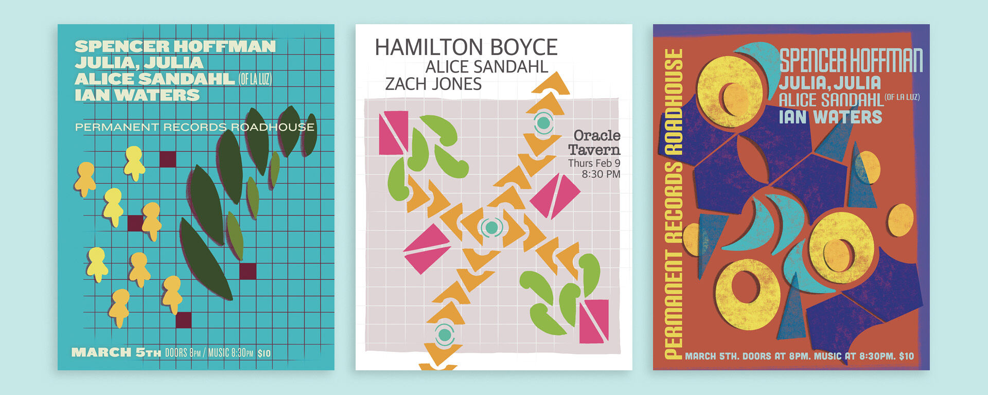
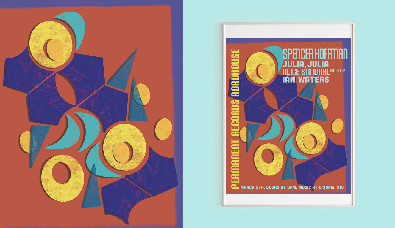
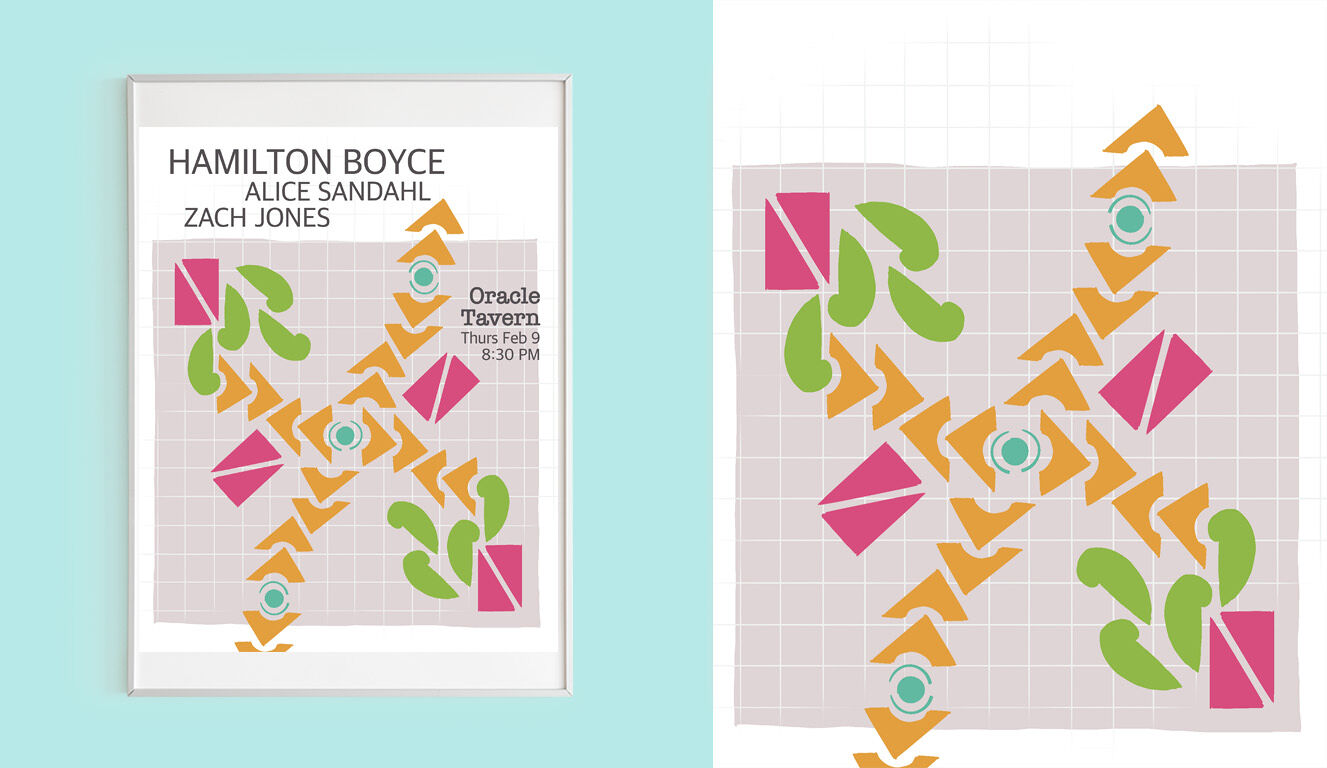
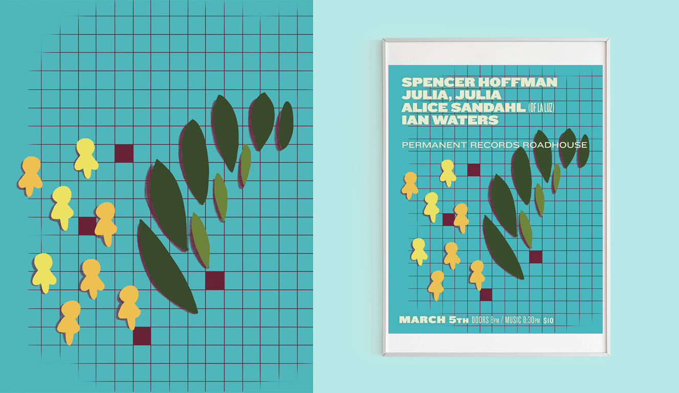
Geometric Gig Posters
Art Direction & Digital Illustration
Working and collaborating with other creative artists is a joy of mine. For this ongoing poster series I experimented using geometric shapes, bright textures, simple lines and timeless typography to create postmodern inspired designs that showcase each musician’s style.
The Geometric Gig Poster series is an extension of an experimental daily digital illustration project that I am currently working on. See more designs at Morning Sketching 2023.
Disciplines:
Art Direction, Illustration, Typography, ProCreateClient:
Music Poster Series
Prev Project
French Girl
Next Project
Dear Lois Magazine
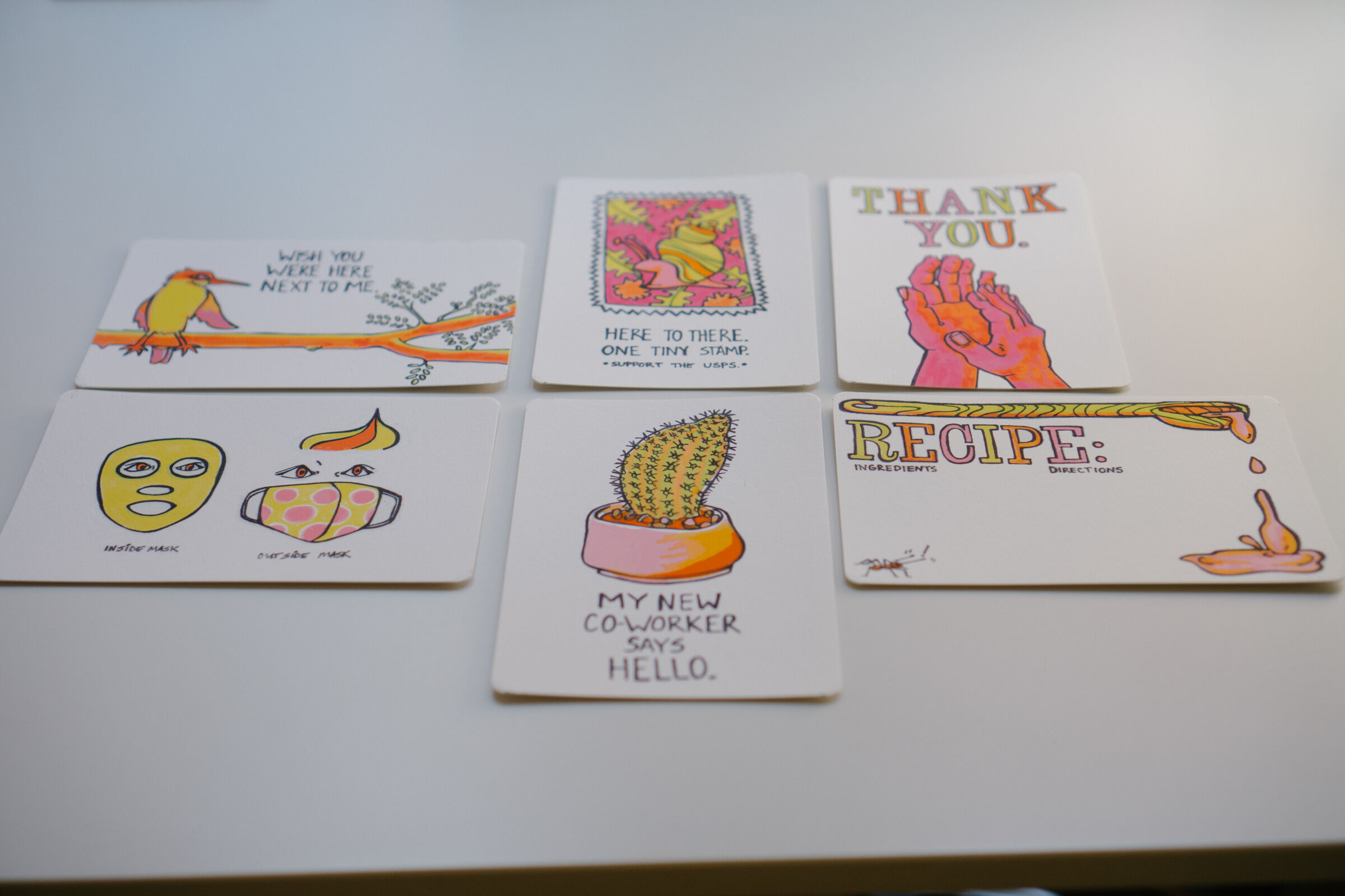
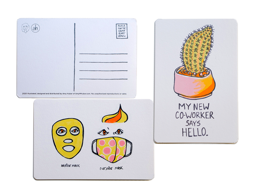
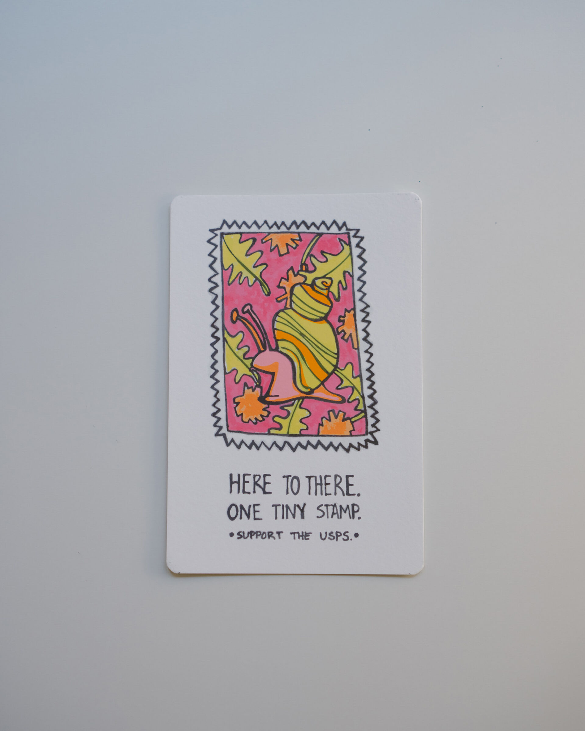
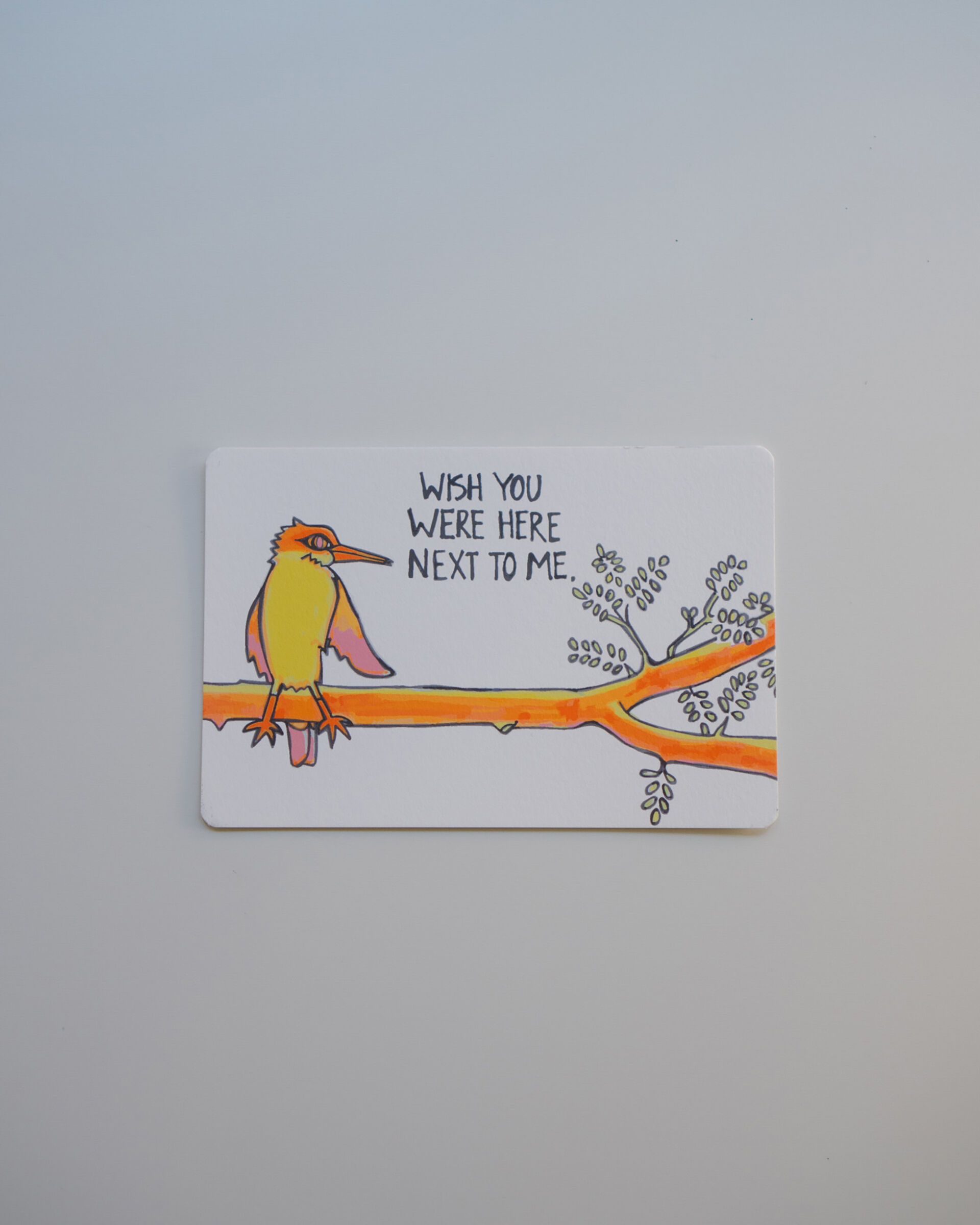
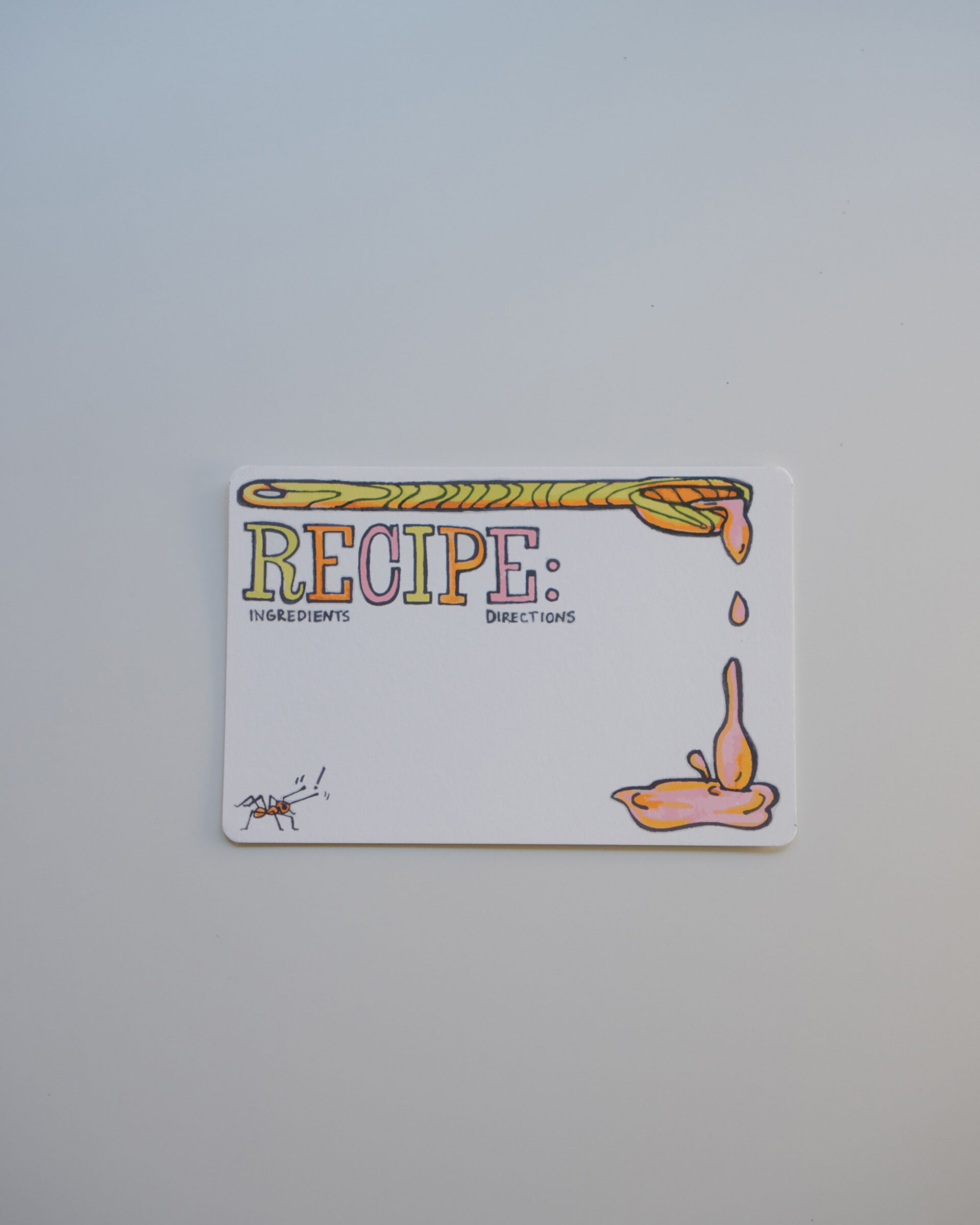
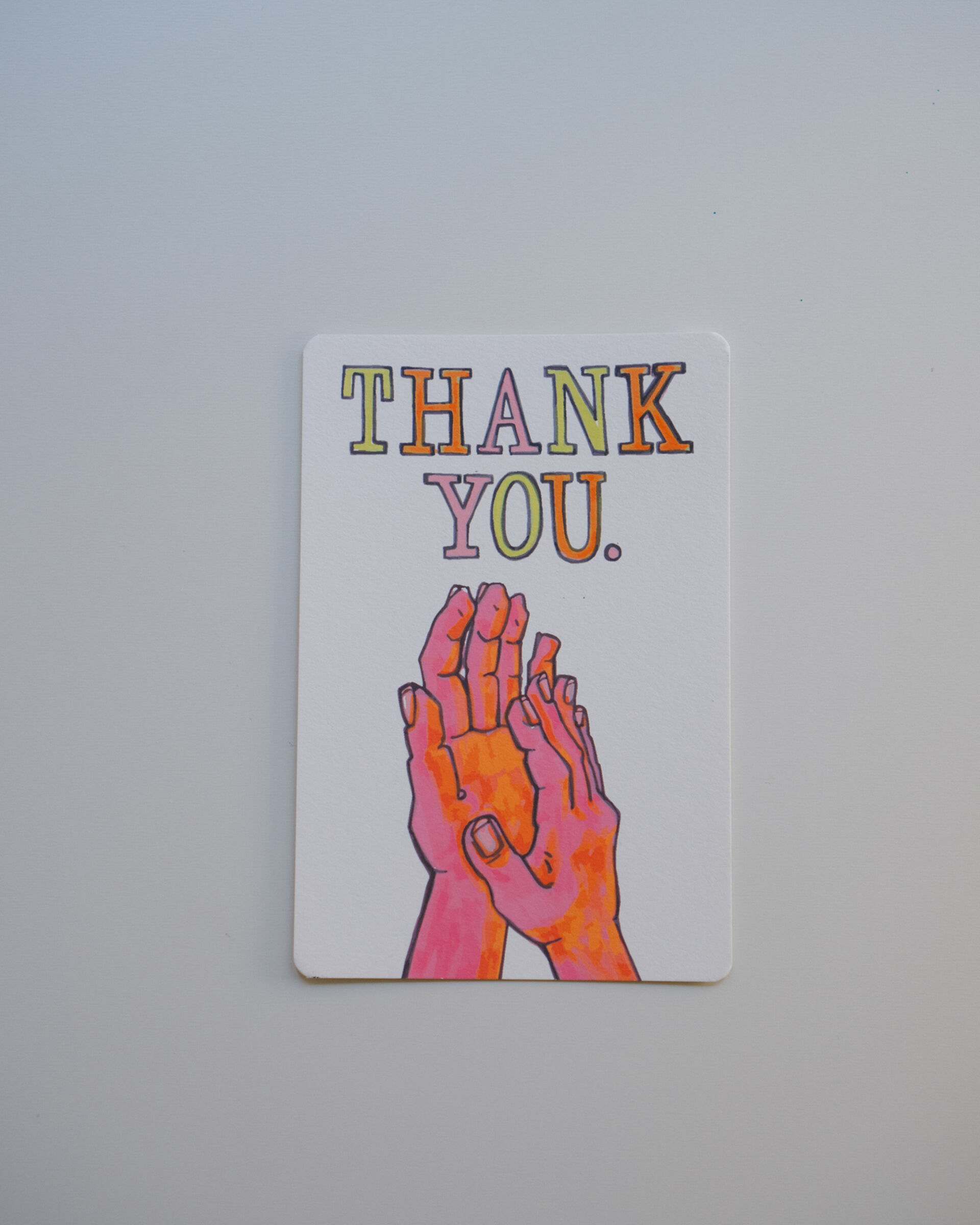
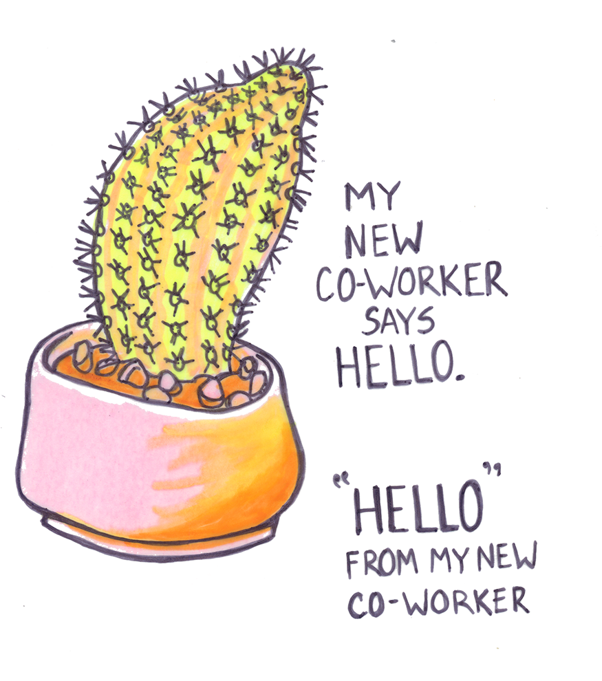
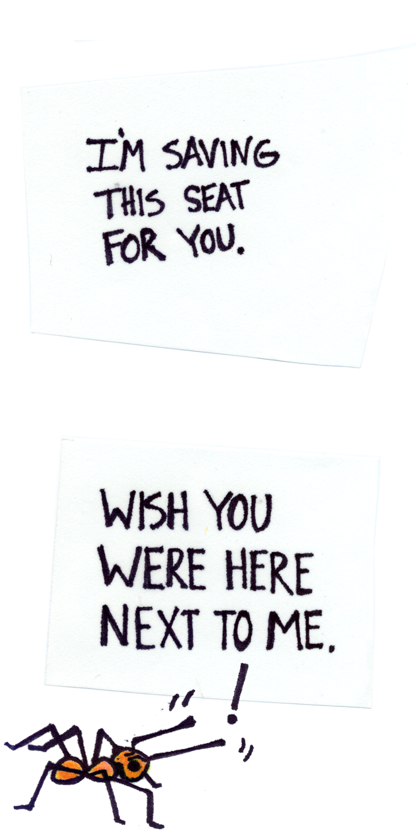
Quarantine Postcard Set
Illustration and Art Direction
During 2020 many of us were (are) quarantined at home and feeling ready to mingle but with health-minded restrictions we are limited. With more time on my hands and a desire to help lift moods and create connections among people, I decided to design a set of humorous quarantine-themed postcards. The United States Mail service is also struggling a bit so this is a great opportunity to make a difference by sending postcards to those we can’t spend time with right now.
Each postcard was lovingly conceived, designed, and printed in my downtown Los Angeles, CA home studio. I hand-illustrated each drawing with ink and highlighter. I then digitally scanned and used software to create final designs.
Disciplines:
Illustration, Art Direction, Branding, Editorial Design, Typography, Social Media MarketingClient:
Amy M Huber ShopWebsite:
Prev Project
French Girl
Next Project
Dear Lois Magazine
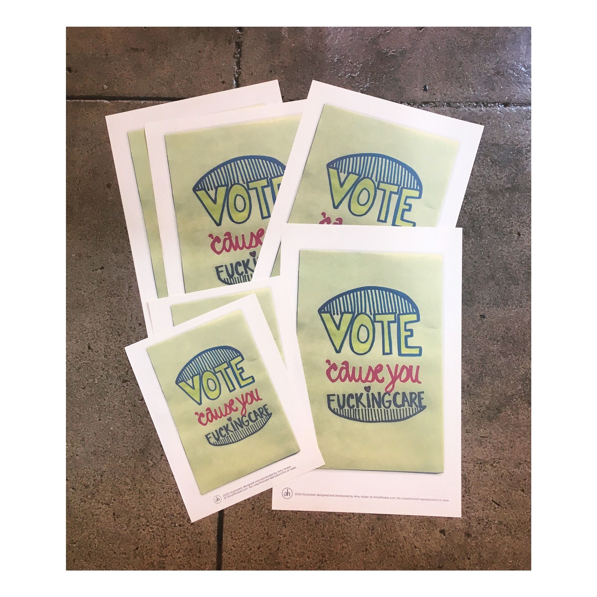
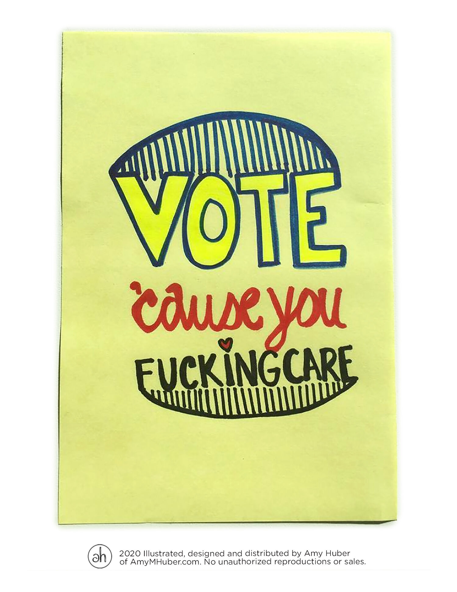
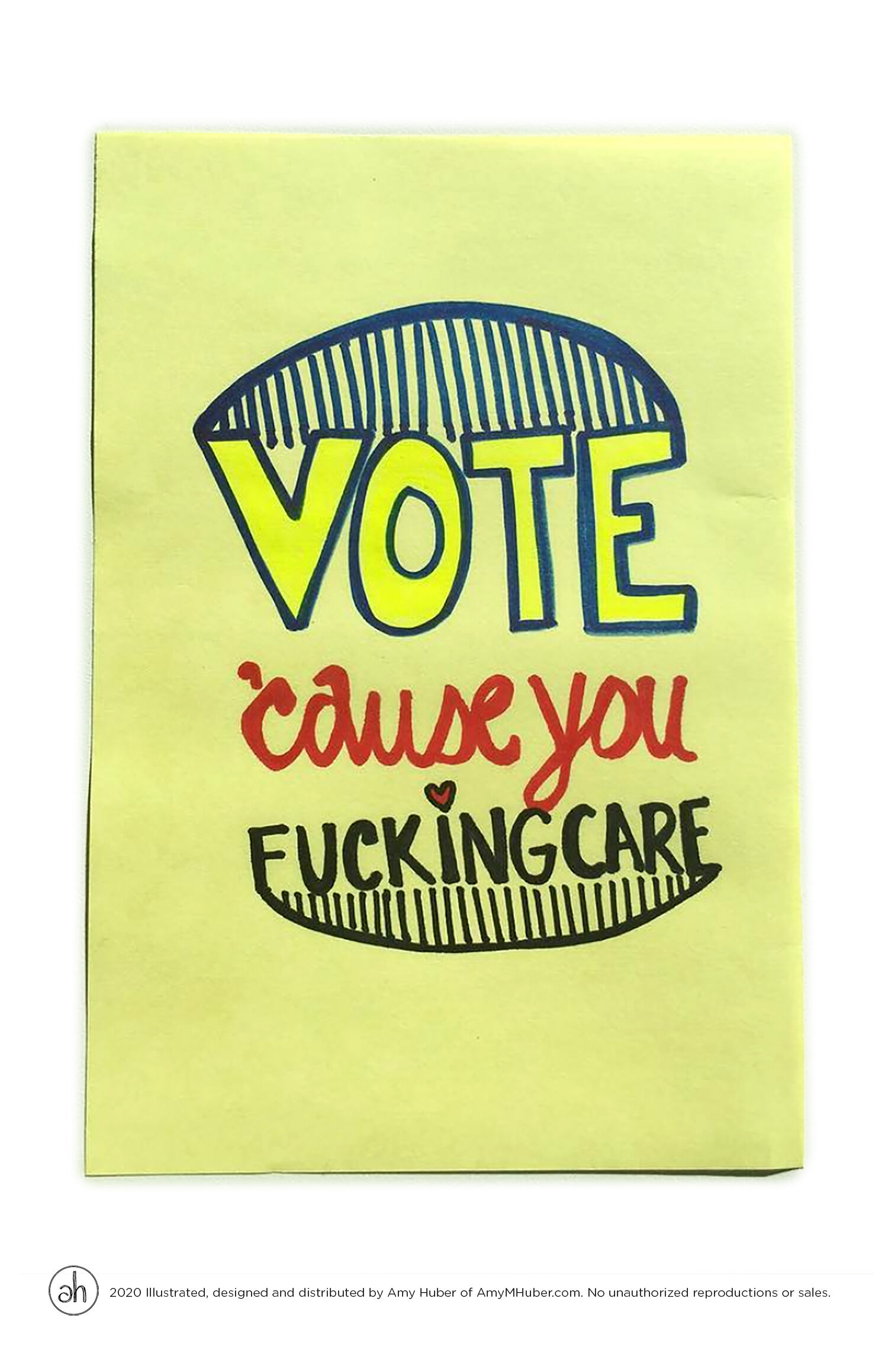
Vote ‘Cause You F^cking Care
Poster Design & Concept
Voting is an important part of the democratic process. People have fought, marched and died to have the right for their voices to be heard and to be able to implement leaders and laws best representing them. Even if a process has flaws we must keep voting because we care and because we believe in change.
I’ve created this poster to share. Please feel free to print and posts around your city.
All I ask is that you a) don’t take credit b) do not make a profit off my design c) do not copy and take as your own design.
Disciplines:
Typography, Hand-Drawn Type, Poster Design, Illustration, Art DirectionWebsite:
Prev Project
French Girl
Next Project
Dear Lois Magazine
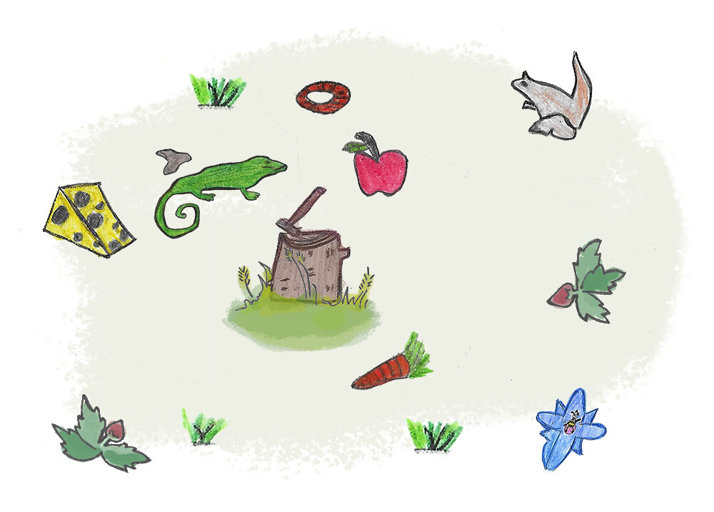
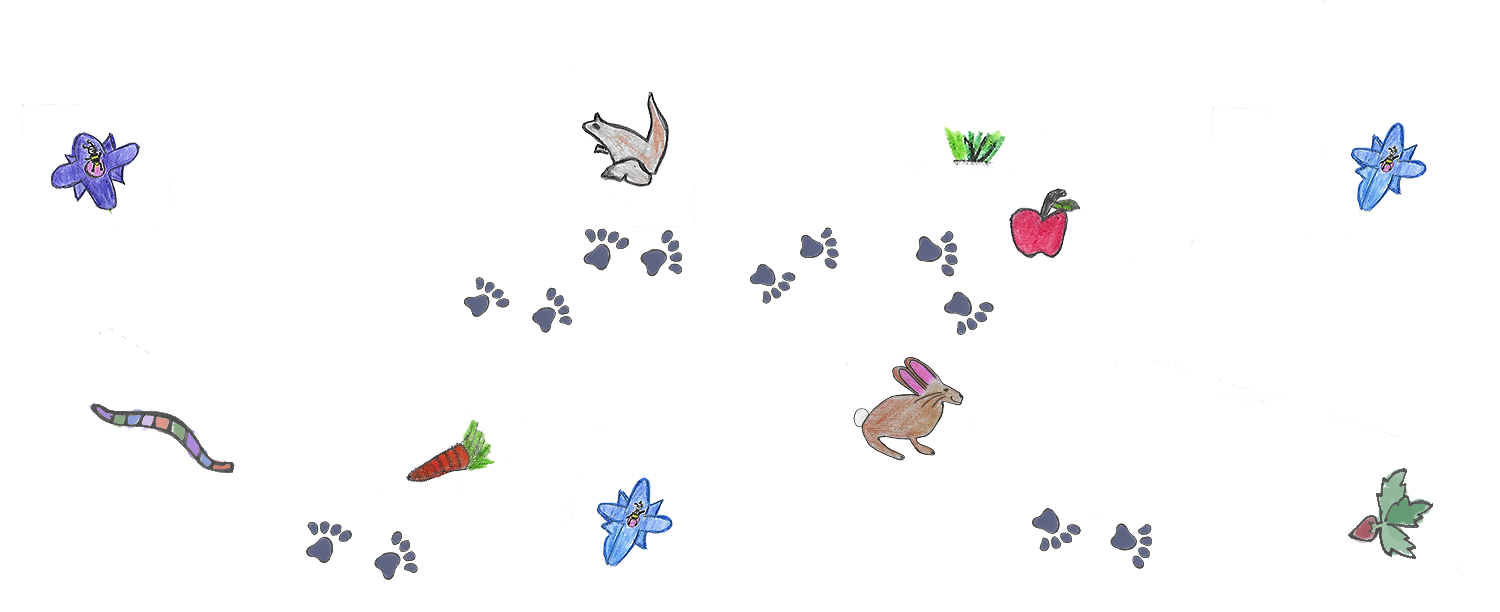
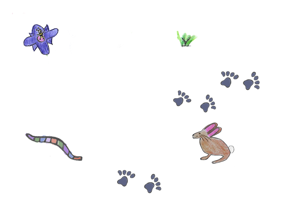
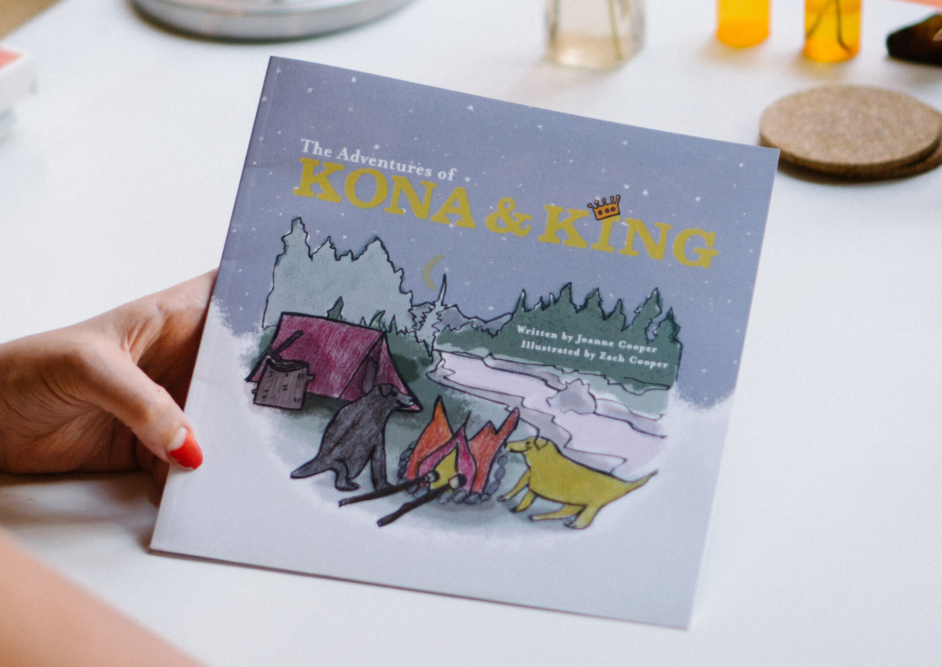
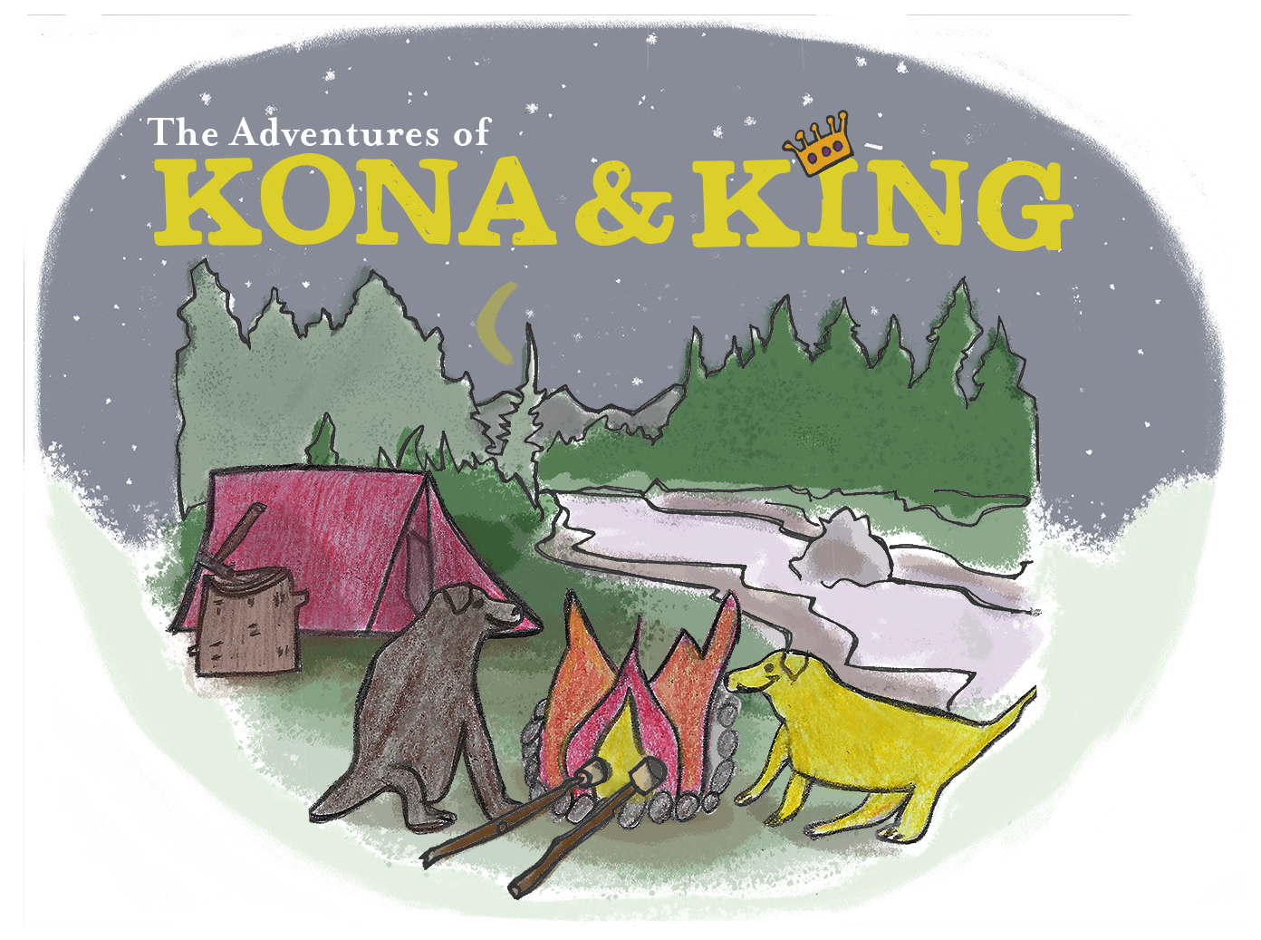
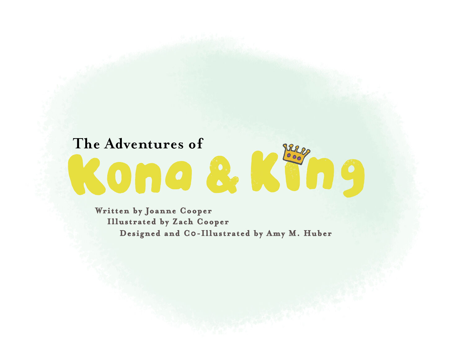
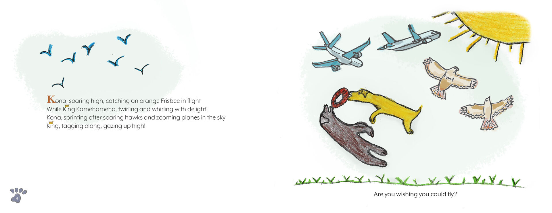
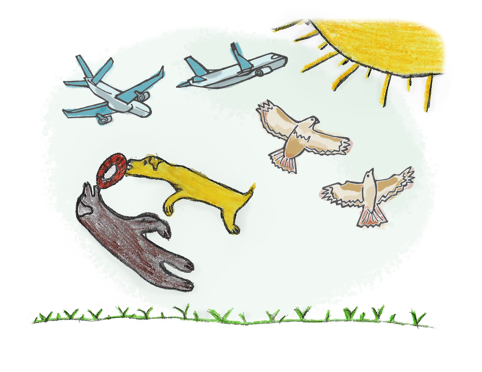
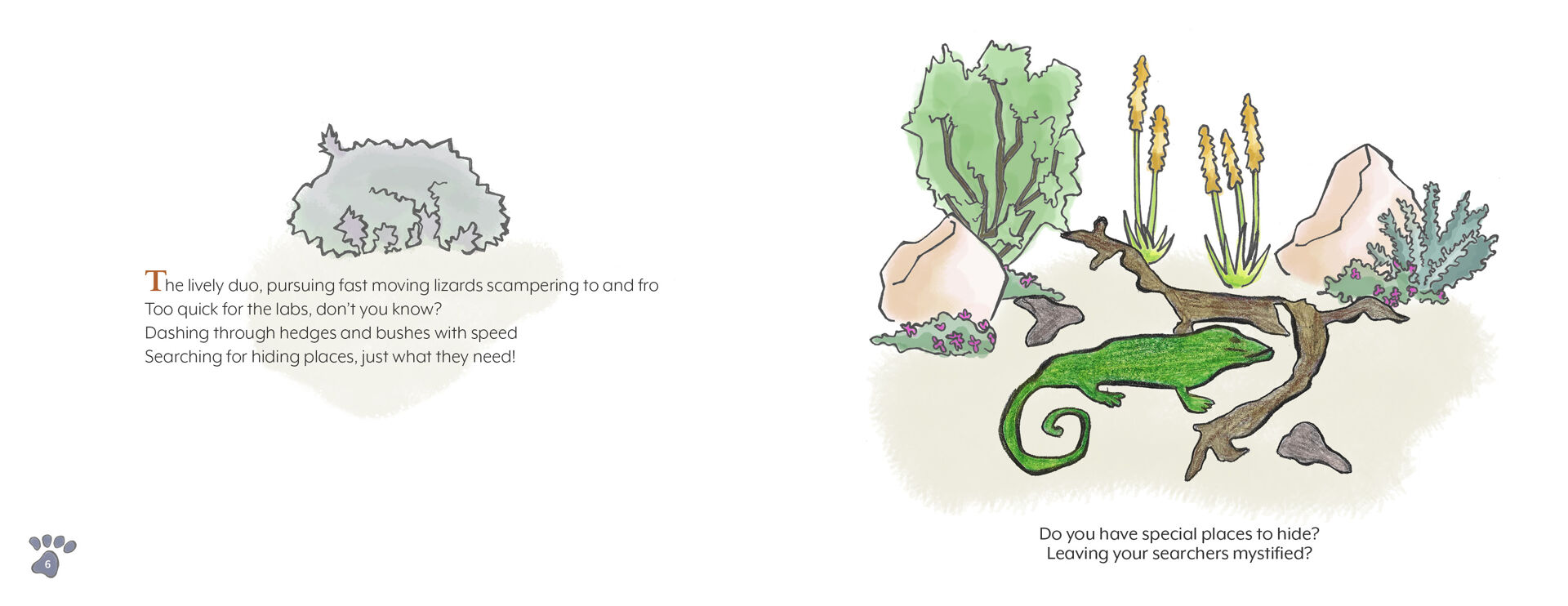
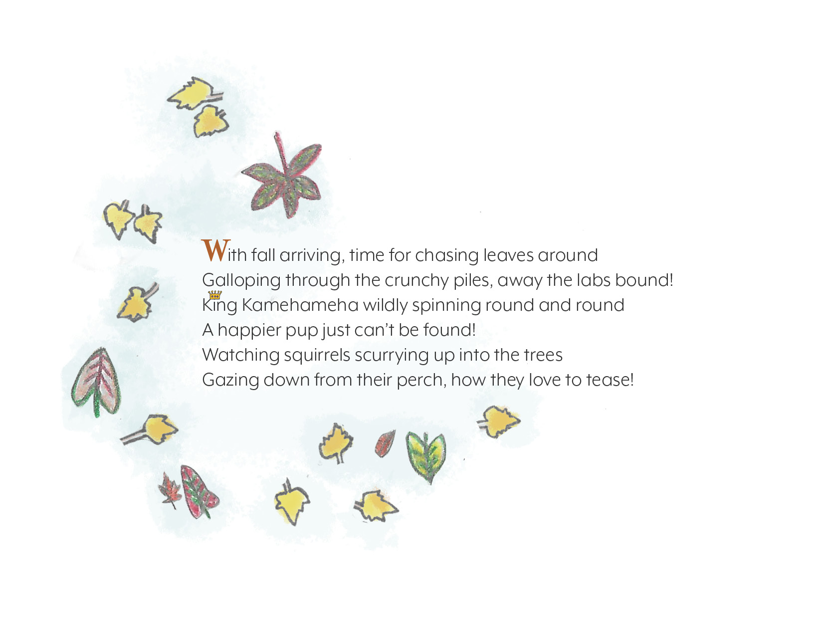
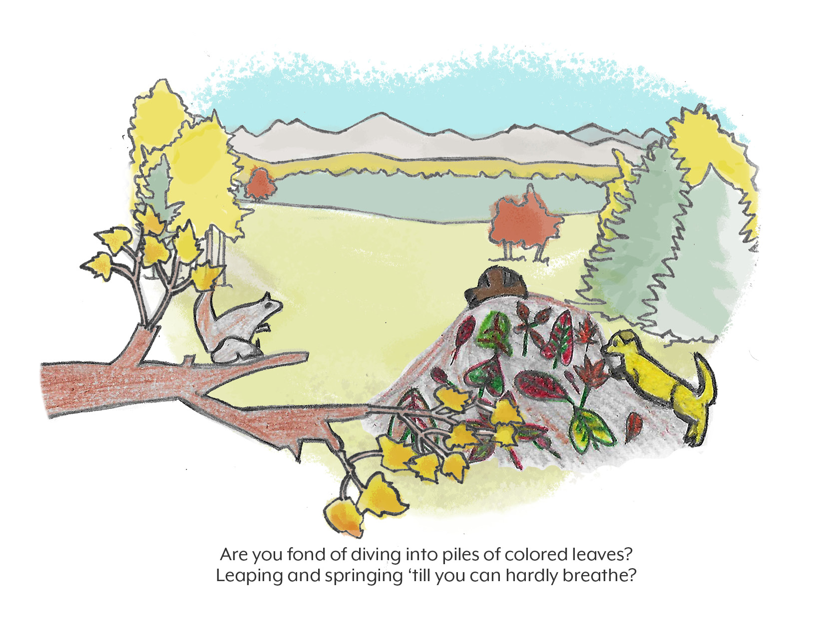
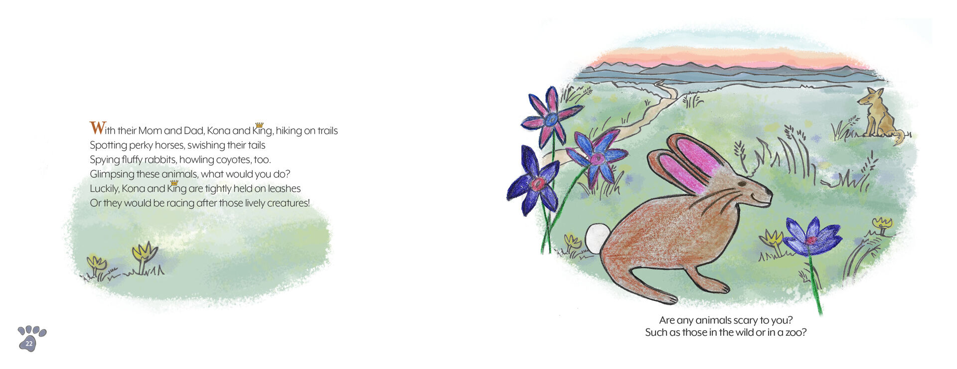
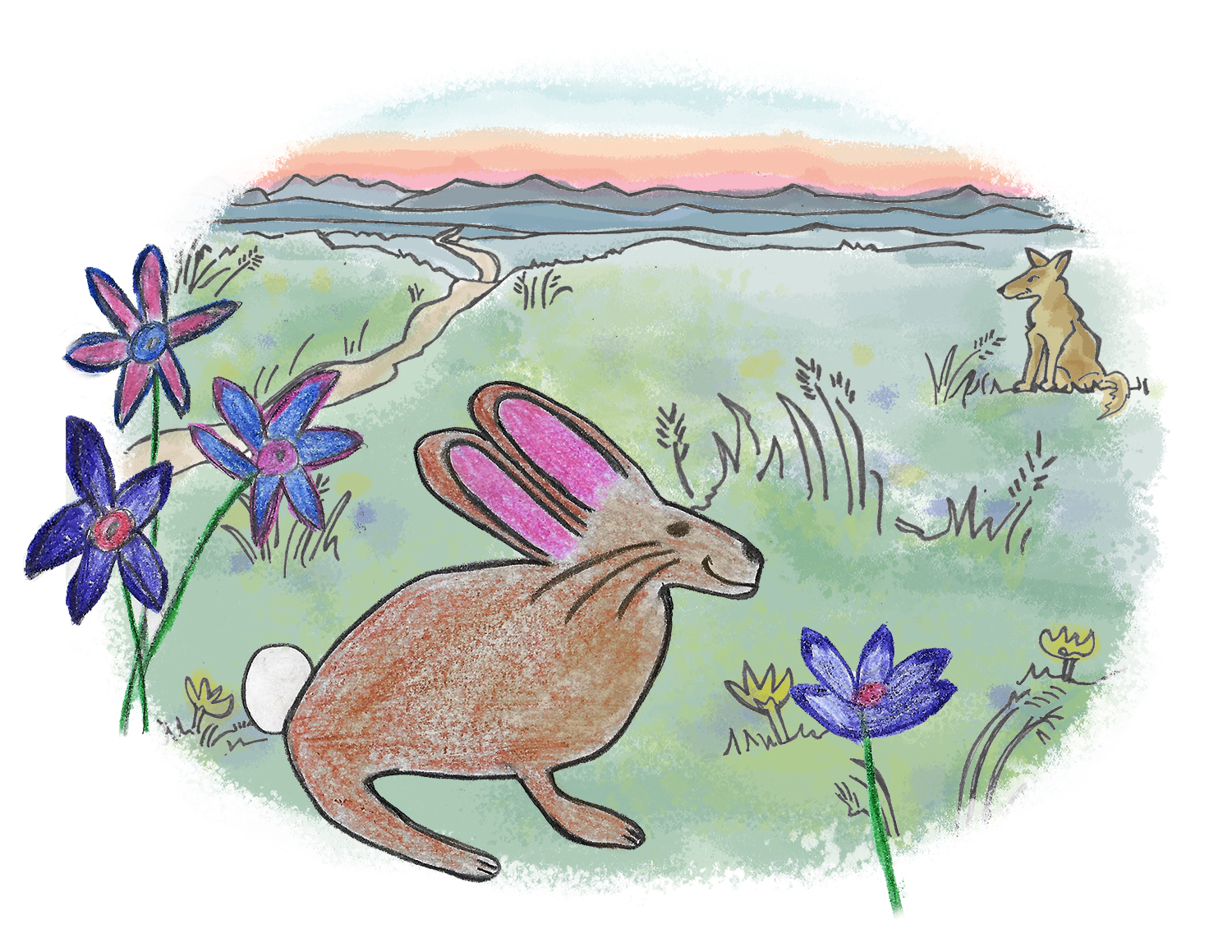
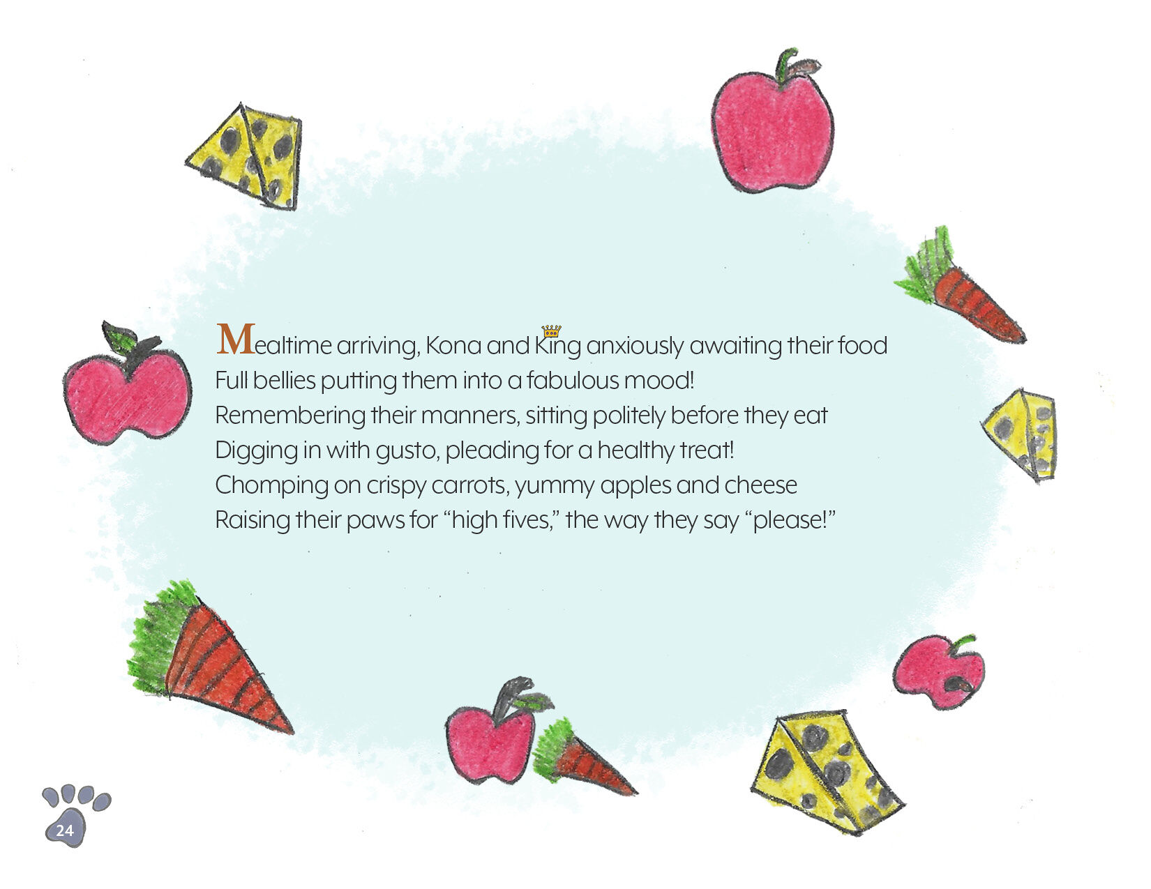
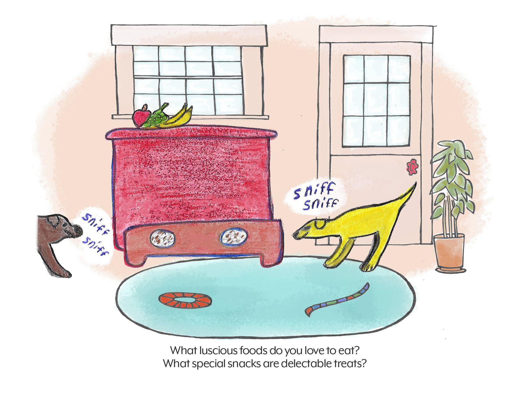
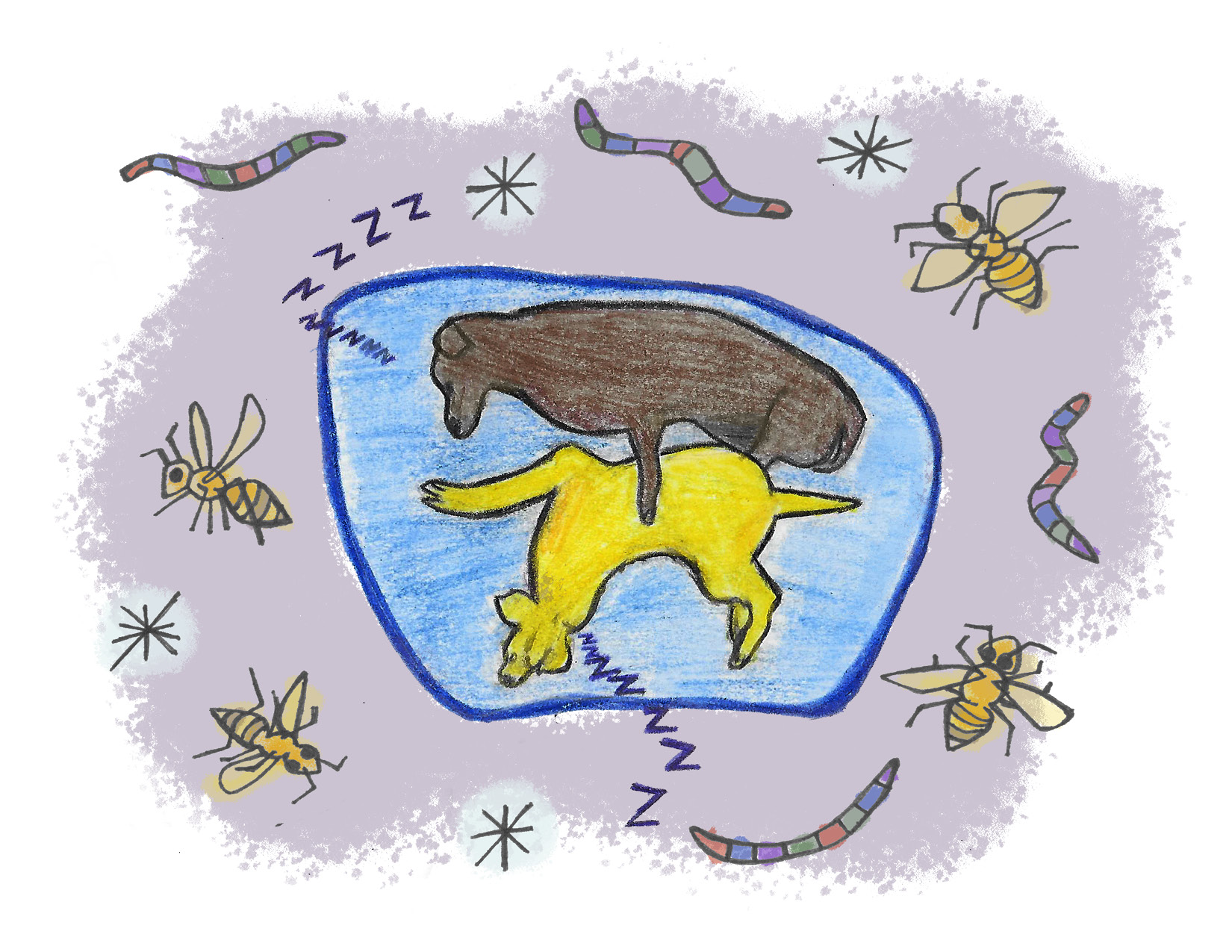
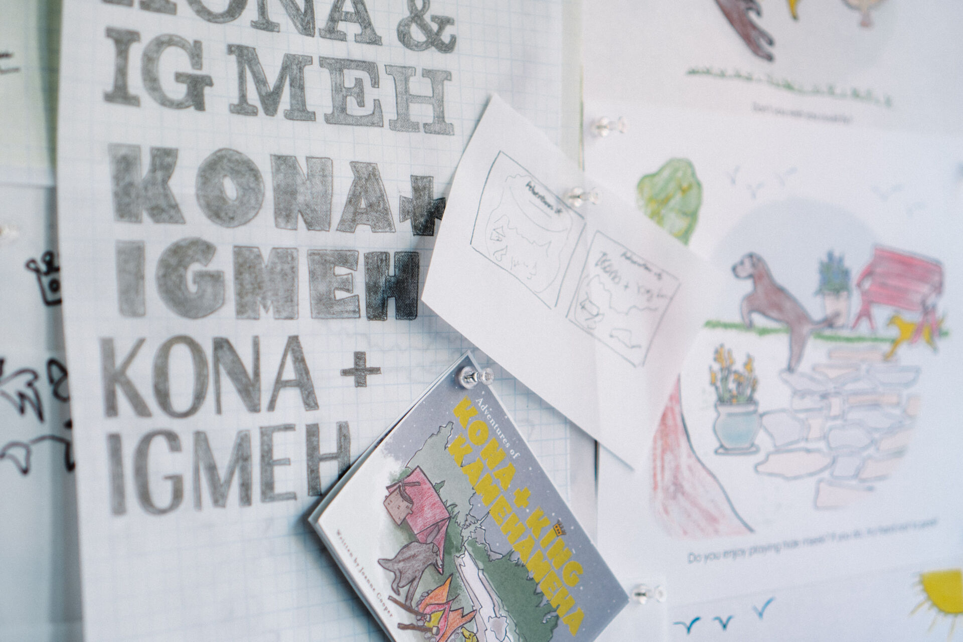
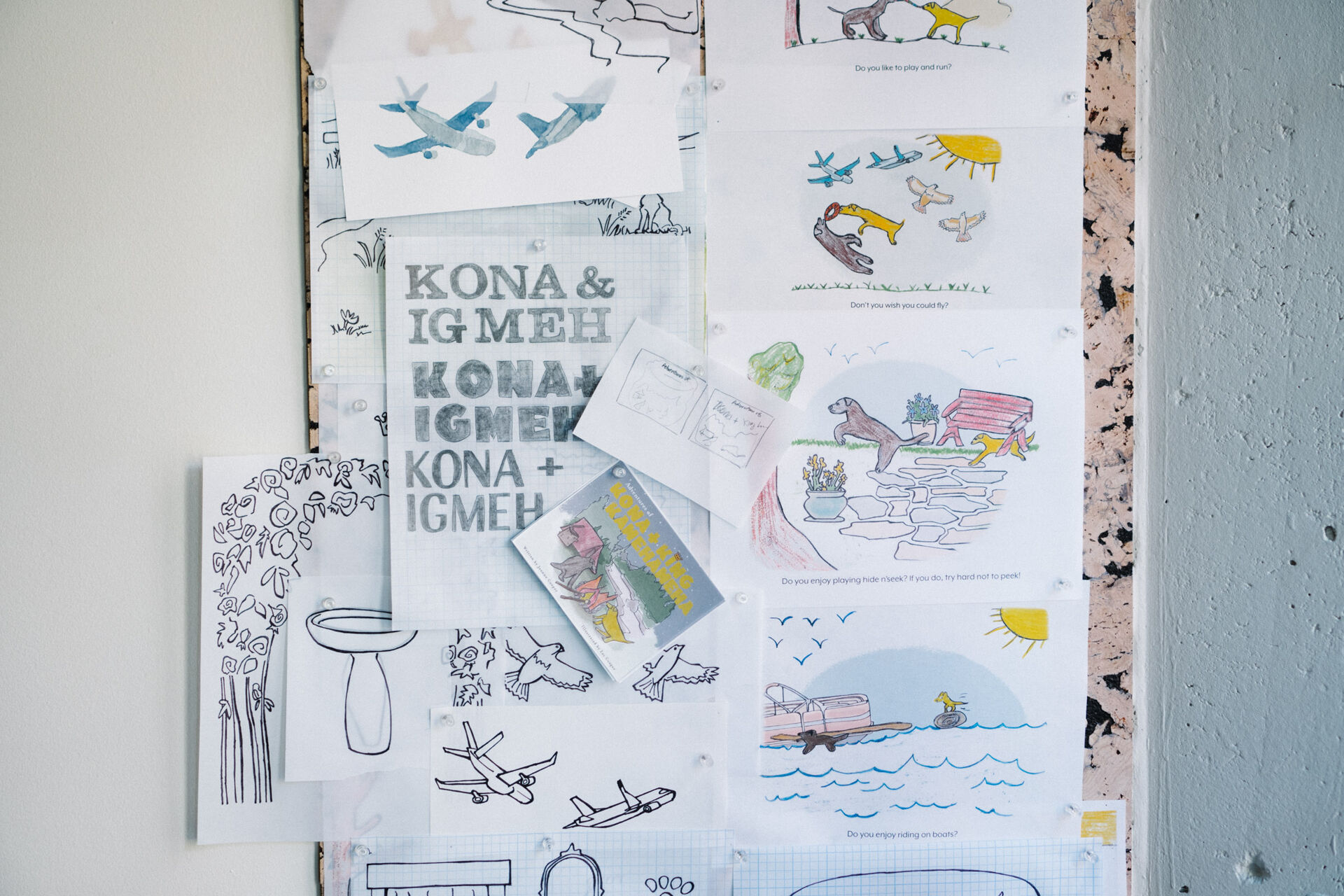
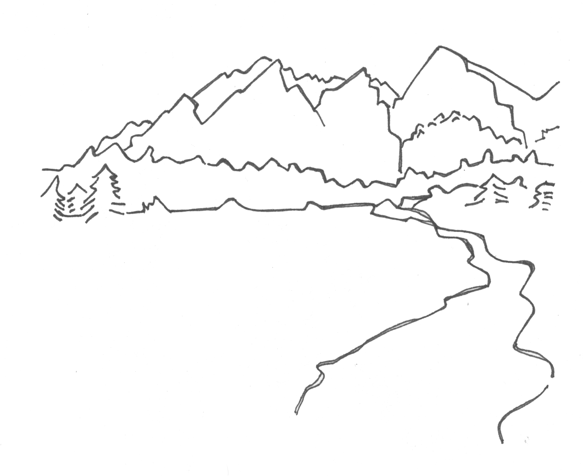
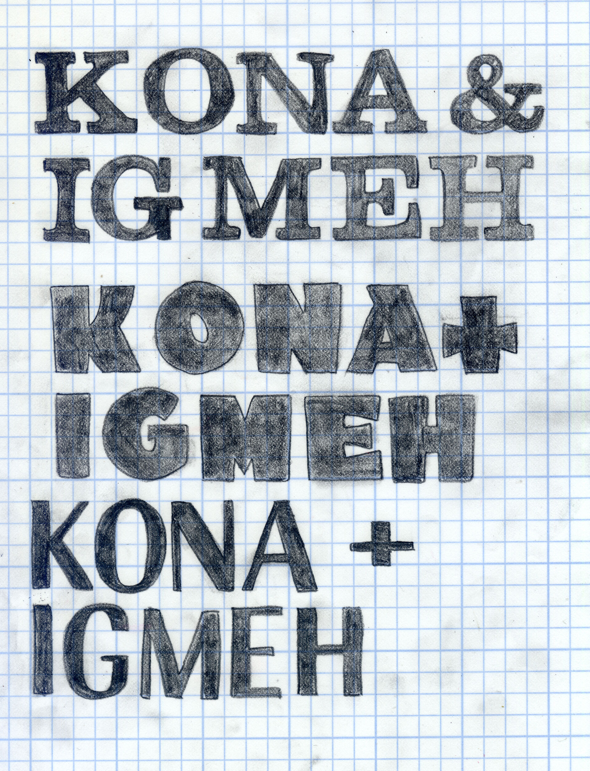
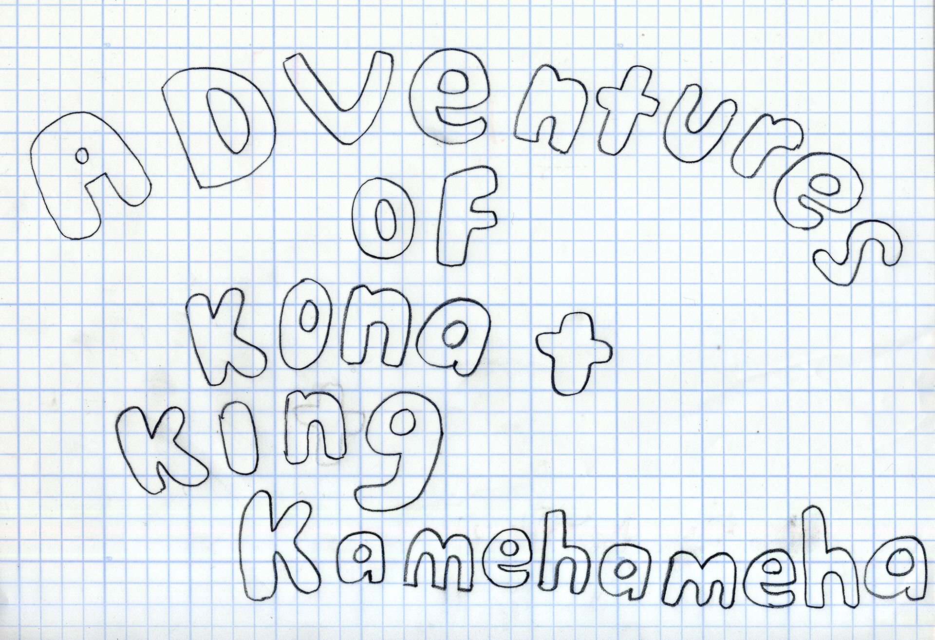
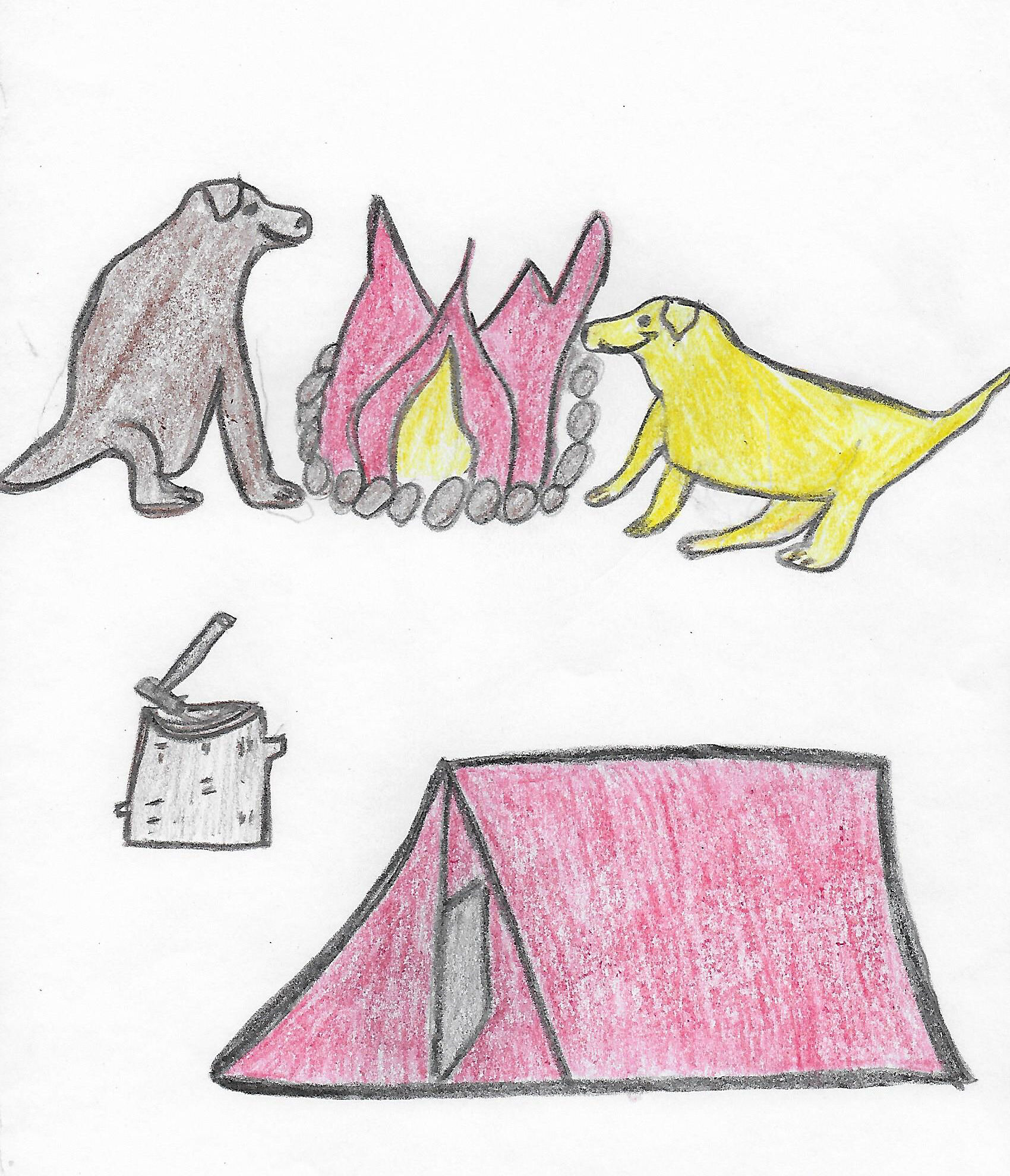
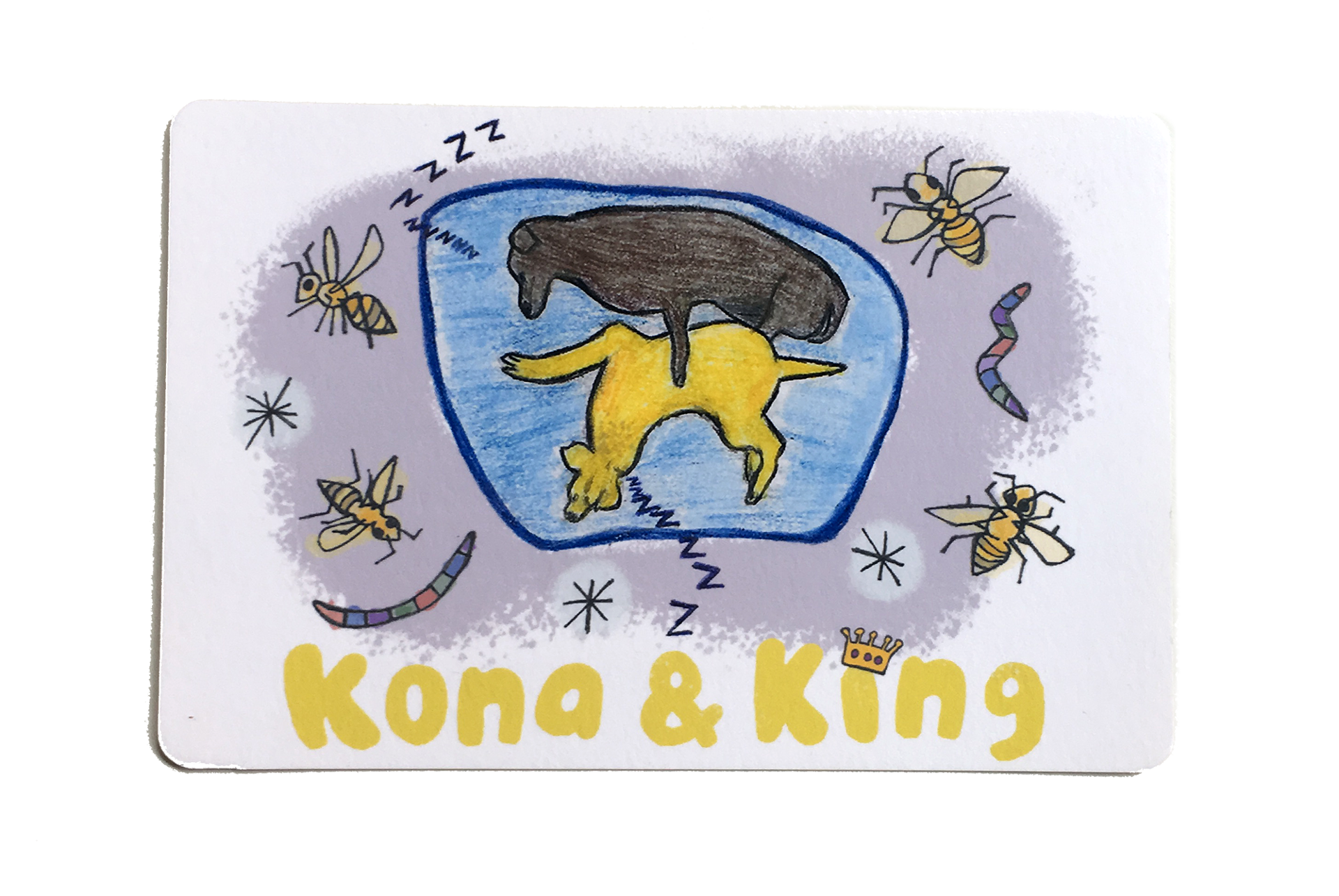
The Adventures of Kona & King
Book Design & Illustrations
“The Adventures of Kona & King” is a book delightfully written by Joanne Cooper. The original illustrations – created by her 11-year-old grandson Zachery Cooper – are accompanied by hand-drawn and digitally altered backgrounds by me. The book design and layout were also created by me.
It is an interactive book written in a rhyming poem format, asking questions to stimulate children’s imaginations and initiate conversations. The two stars of the story are two real-life Labrador Retrievers named Kona and King.
Disciplines:
Illustration, Art Direction, Branding, Book Layout, Editorial DesignClient:
Joanne Cooper & Zachery CooperWebsite:
Prev Project
French Girl
Next Project
Dear Lois Magazine
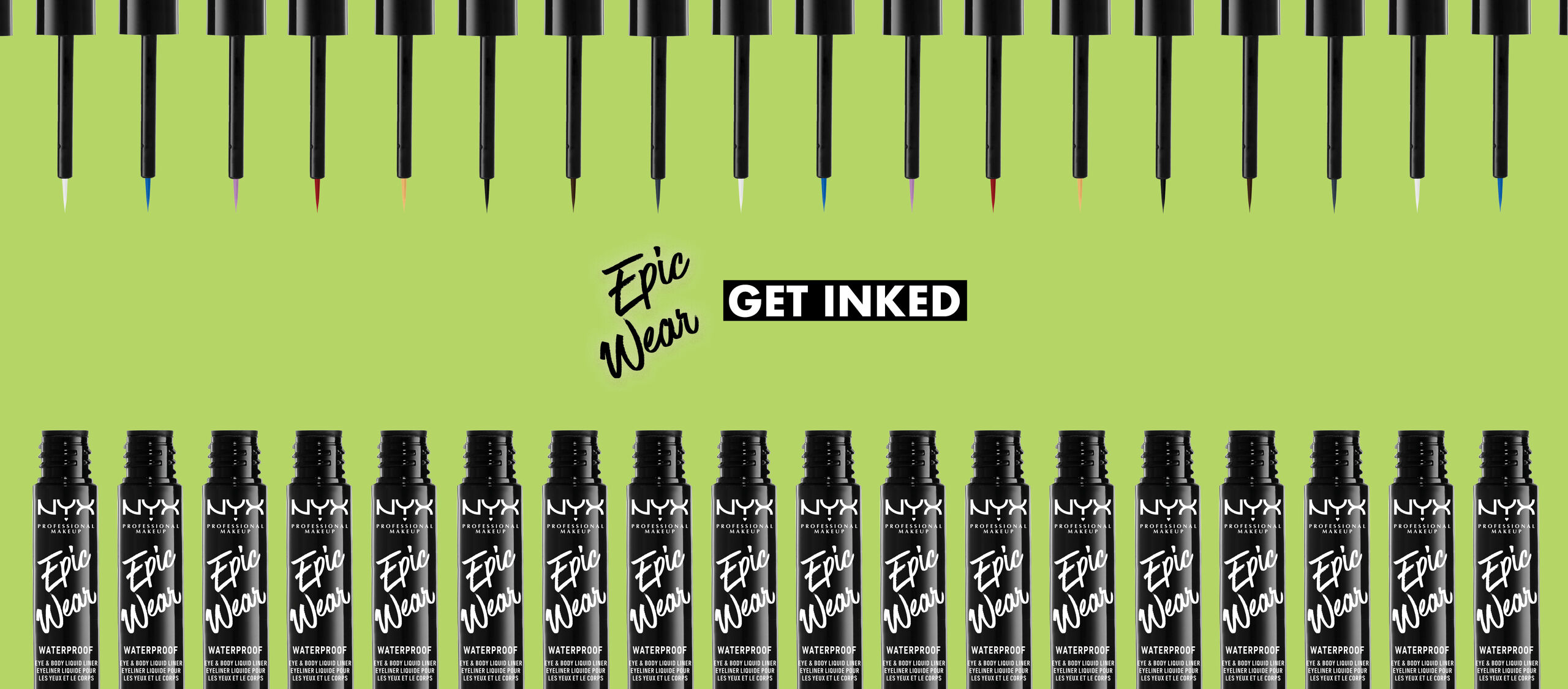
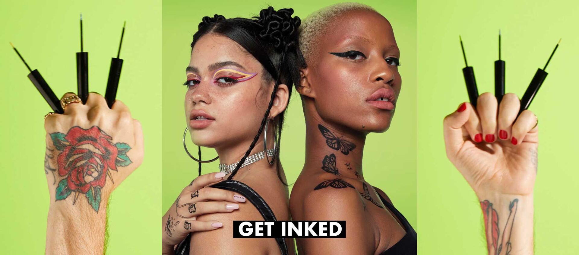
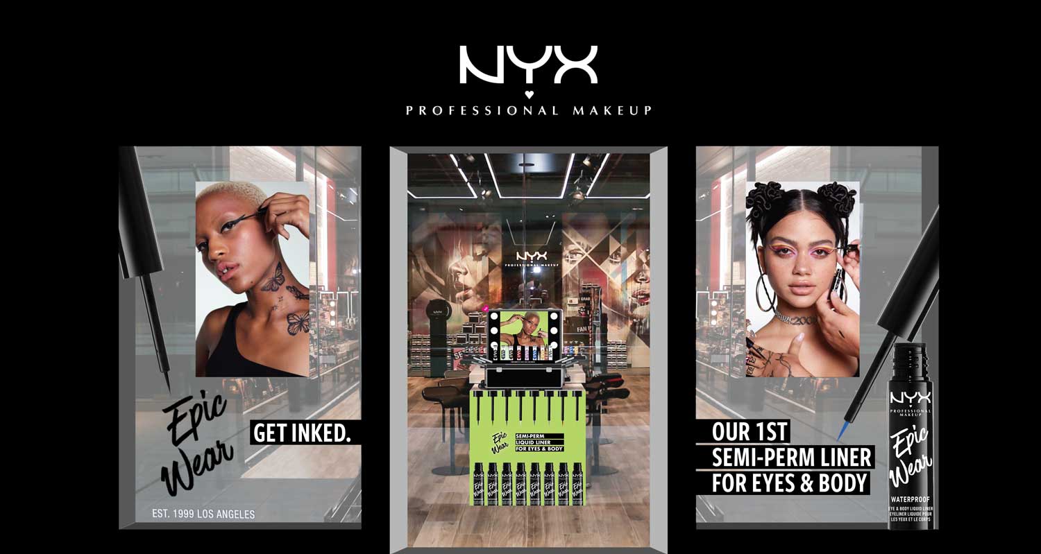
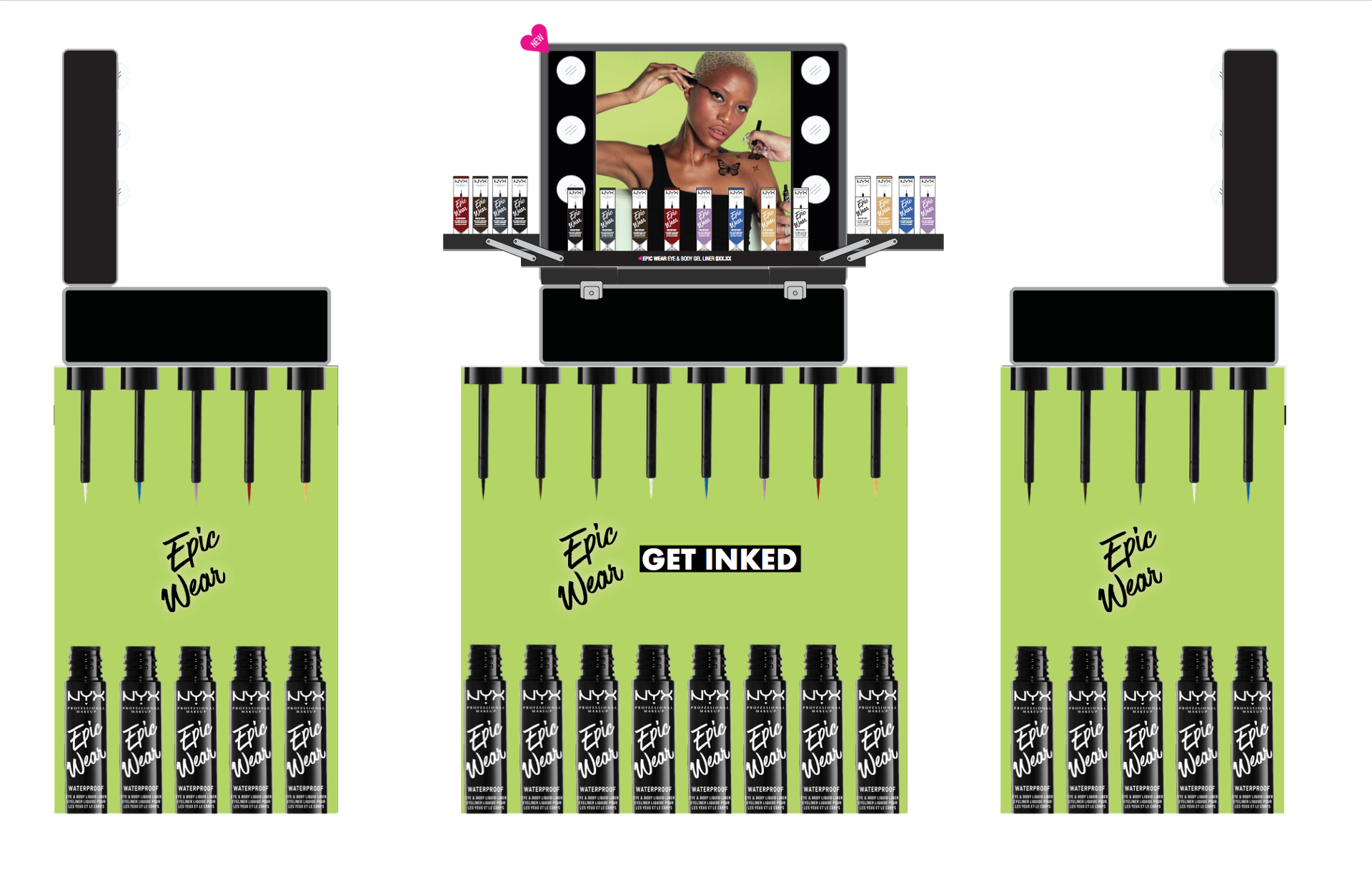
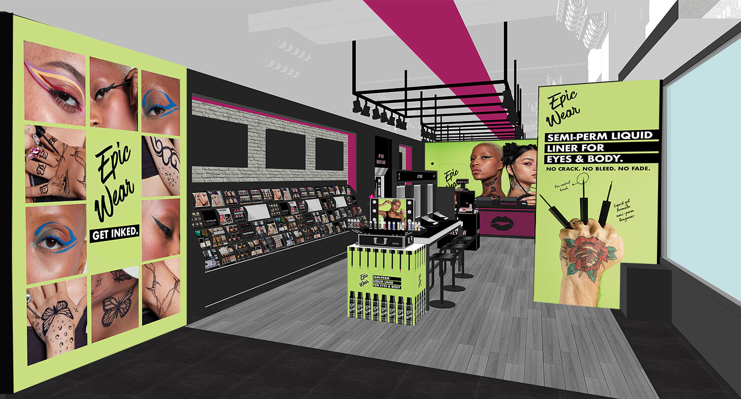
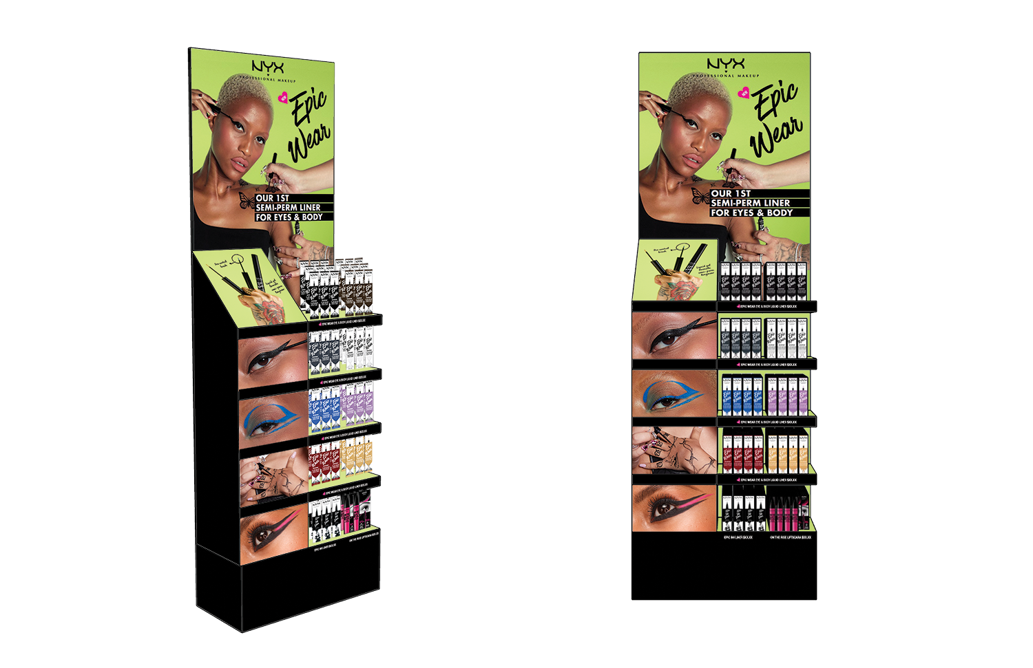
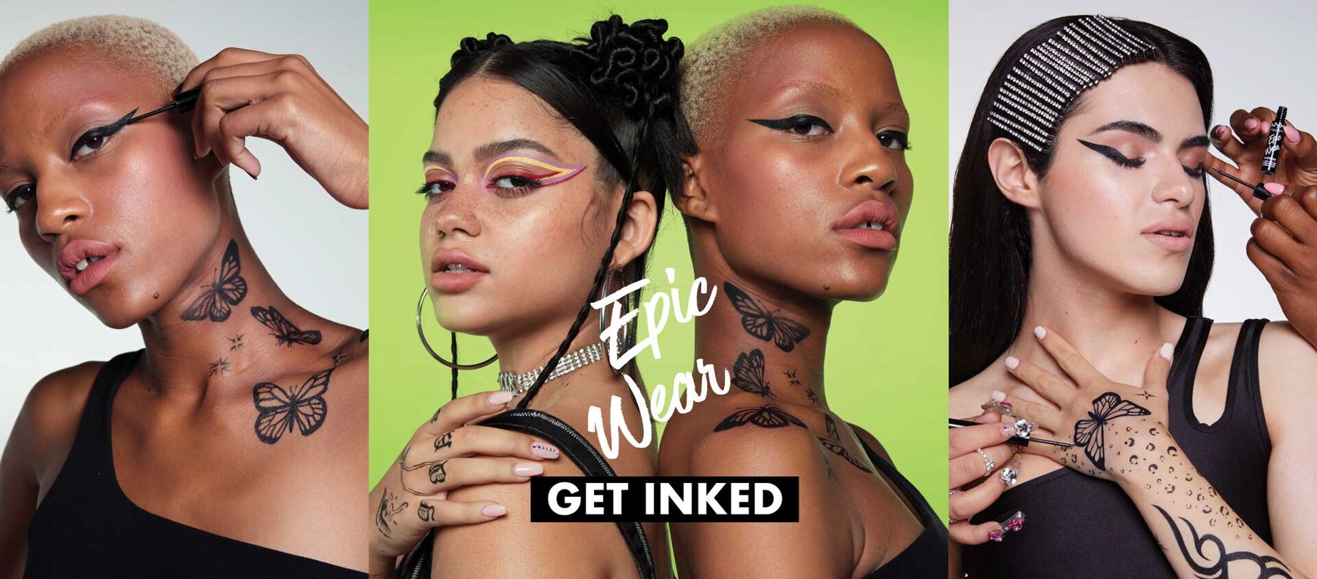
NYX Cosmetics
Environmental and Display Design
NYX Professional Makeup is an American cosmetics company that is a subsidiary of L’Oréal. The company was founded in Los Angeles by Toni Ko in 1999. It was named after Nyx, the Greek goddess of the night. NYX Professional Makeup is certified and acknowledged by PETA as a cruelty-free brand, and they offer a wide range of vegan-friendly products. NYX products are sold in over 70 countries at thousands of retailers, ranging from specialty beauty and fashion stores to freestanding shops and the brand’s corporate website. (Wikipedia)
During my time with NYX I worked with their lovely team to co-create display and environmental designs. The company focuses on diversity and inclusion through makeup and self-expression. The Epic Wear campaign features edgy graphics that emulate tattoo design and have a long-lasting life.
Disciplines:
Environmental Design, Window Display, Display Design, Visual MarketingClient:
NYX Cosmetics and Loreal
Prev Project
French Girl
Next Project
Dear Lois Magazine
Social Distancing
Coloring Pages
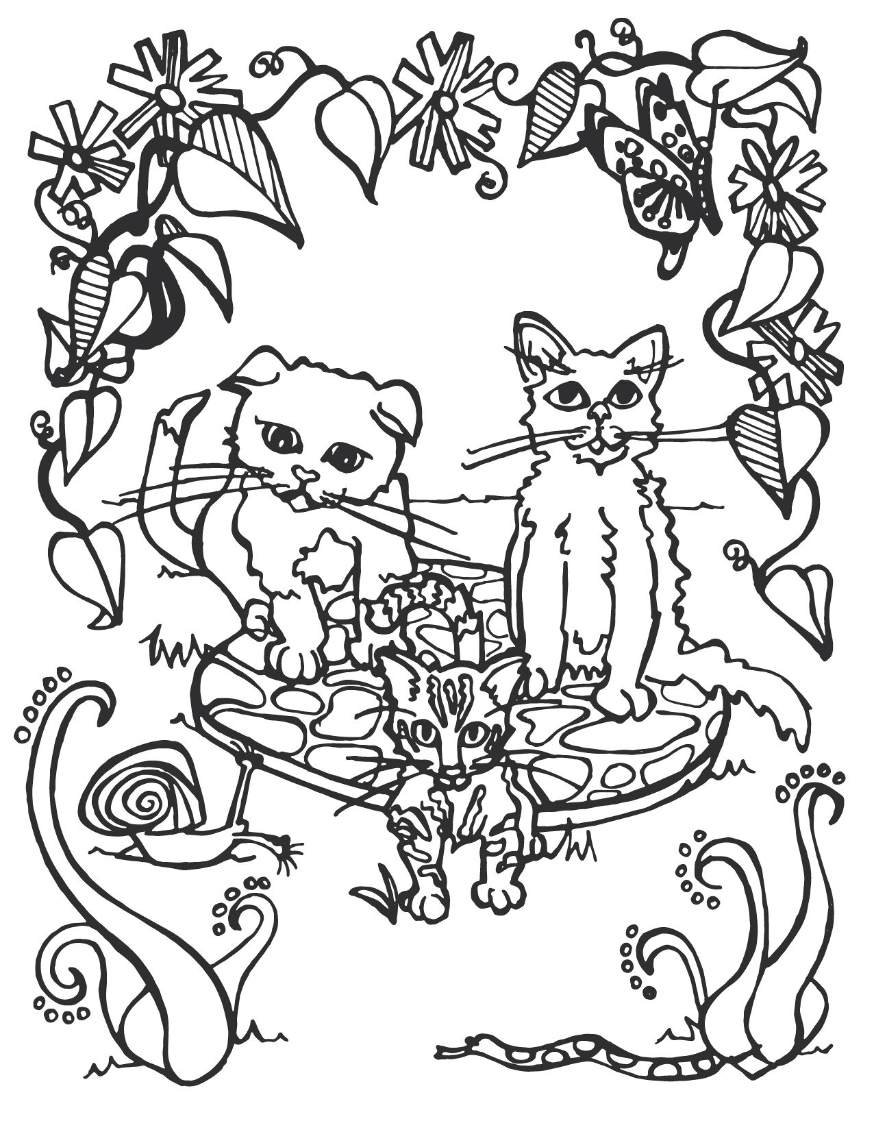
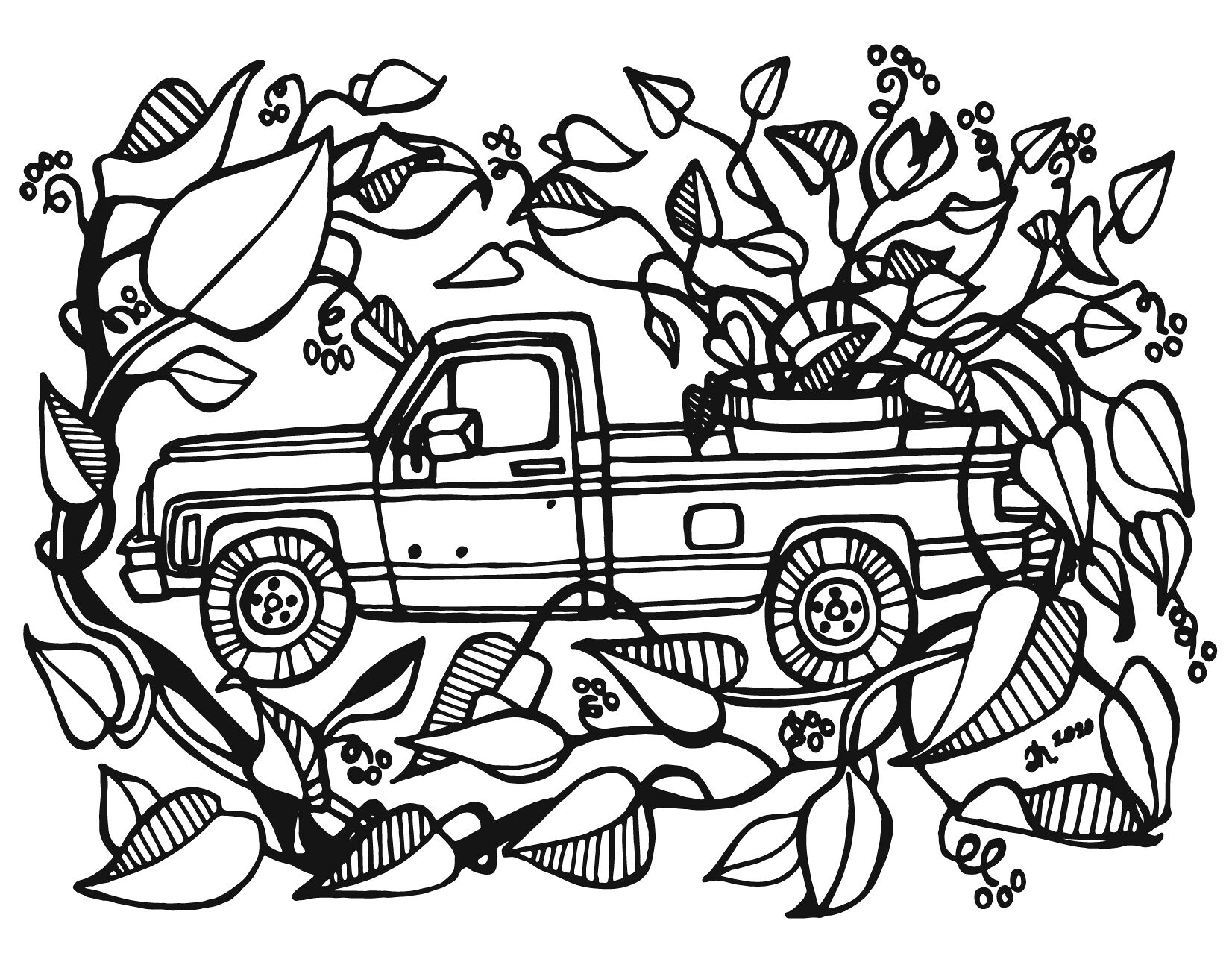
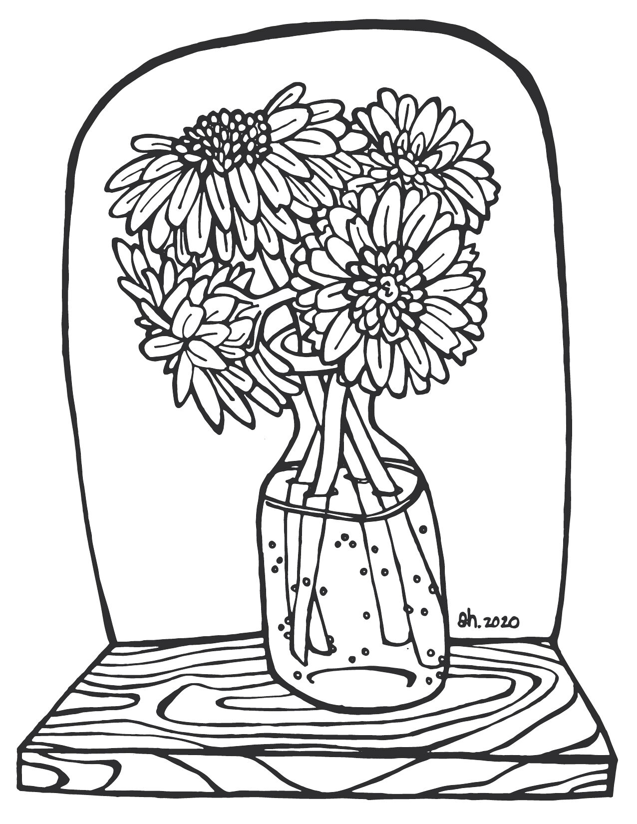
Here we are. It’s the year 2020; the world has a human-based virus and (hopefully) we are all doing our part by staying home as much as possible and flattening that curve! I wanted to find a way to make our home stays a little easier. If you have kiddos or are a kid at heart, this project is for you. Feel free to print and share coloring pages for you, your family and friends to enjoy. Also, feel free to tag me on social media with your completed pages. Just please refrain from selling, stealing or making a profit from these. They are my gift to you and I can’t wait to see how your creativity shows itself.
Love,
Amy
Disciplines:
Illustration, Art Direction,Client:
Humankind
Spring Book Club
Wildflower Garden
Garden Dance
Download/Print
Kitten Garden
The Gardener’s Truck
A Vase Full of Cheer
Prev Project
French Girl
Next Project
Dear Lois Magazine
Medium.com
Editorial Illustrations
Disciplines:
Illustration, Art Direction, WritingClient:
Personal ProjectWebsite:
Prev Project
Naturistic
Next Project
New York Short Film Festival
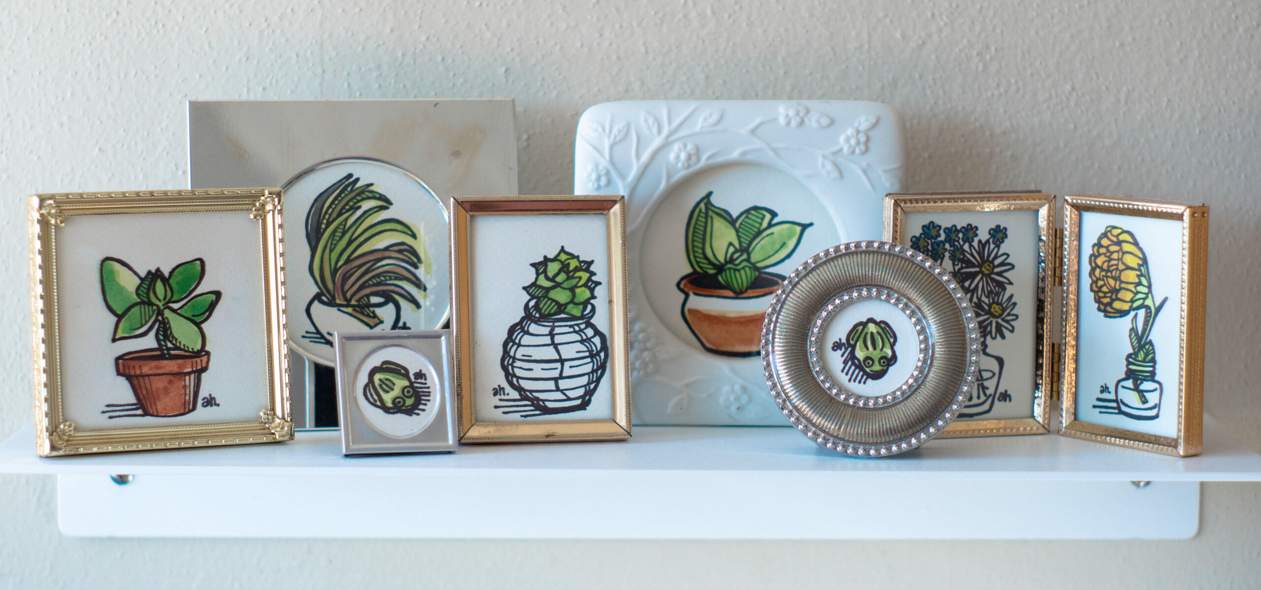
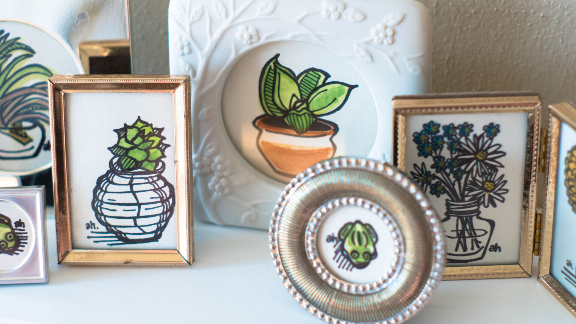
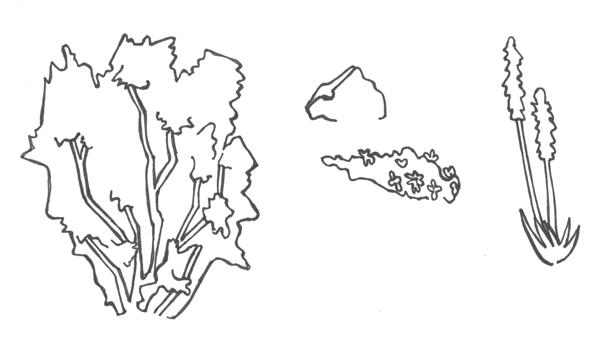
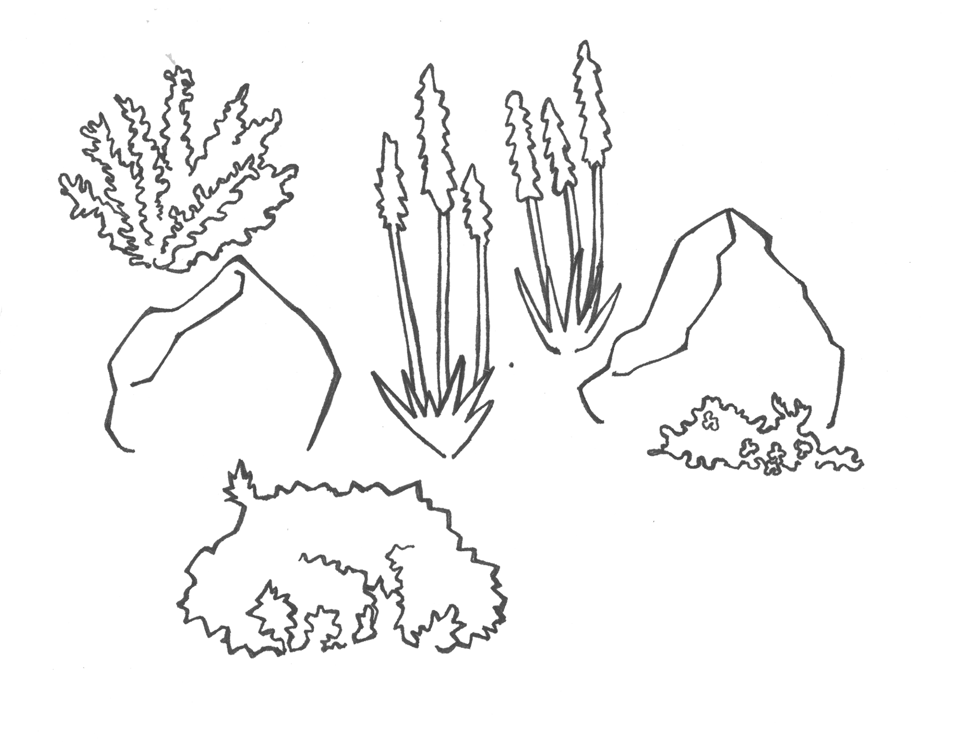
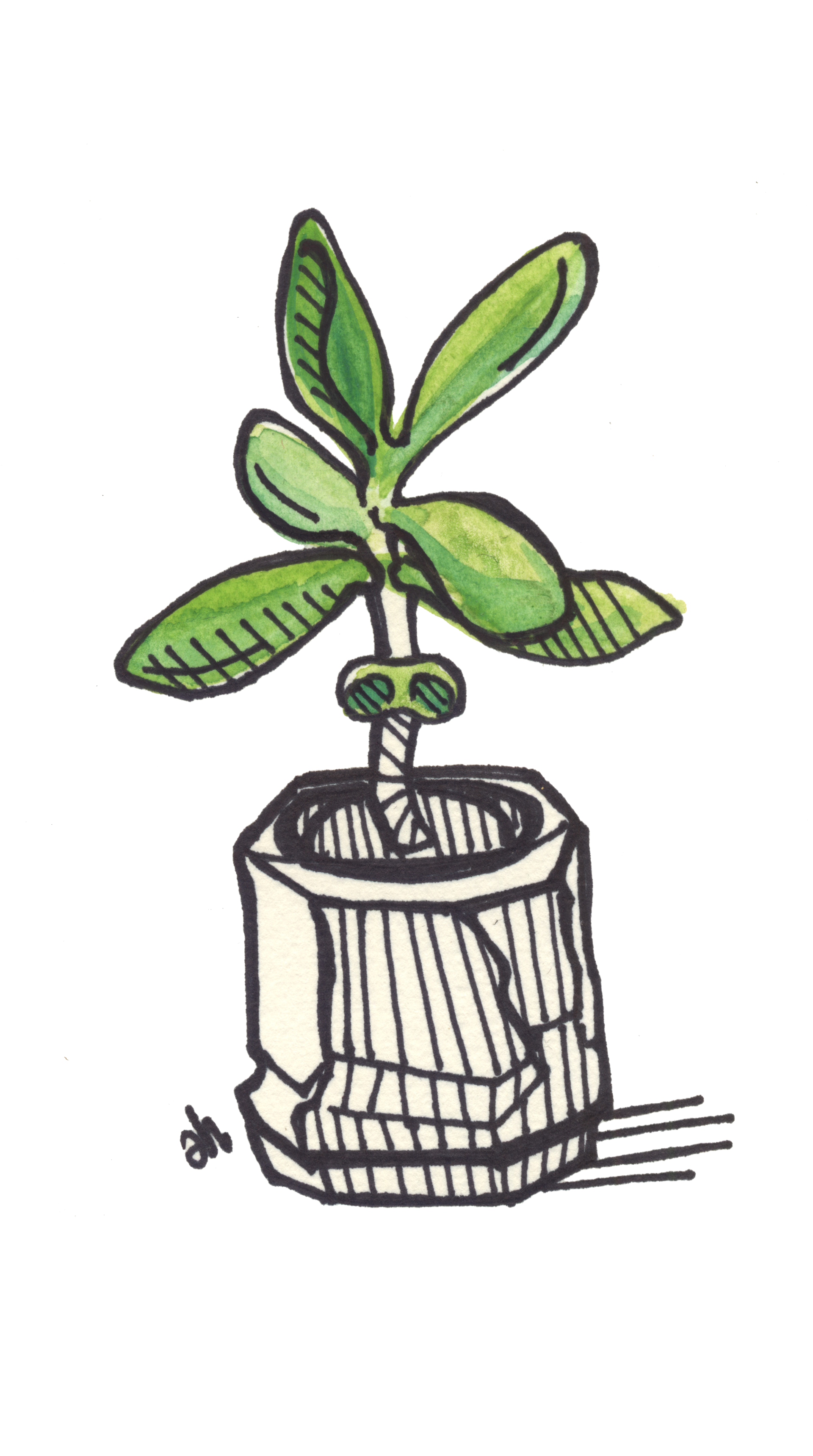
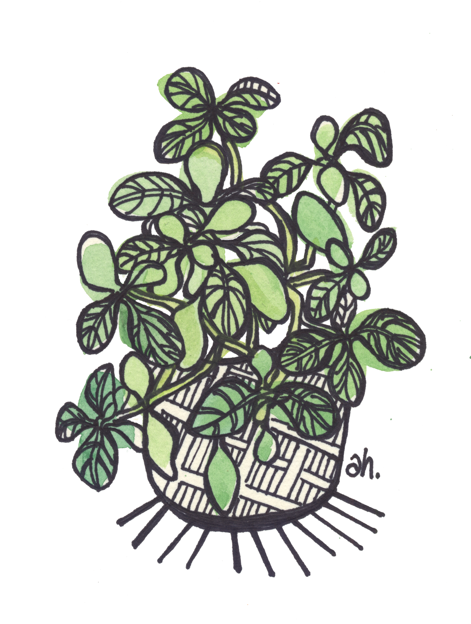
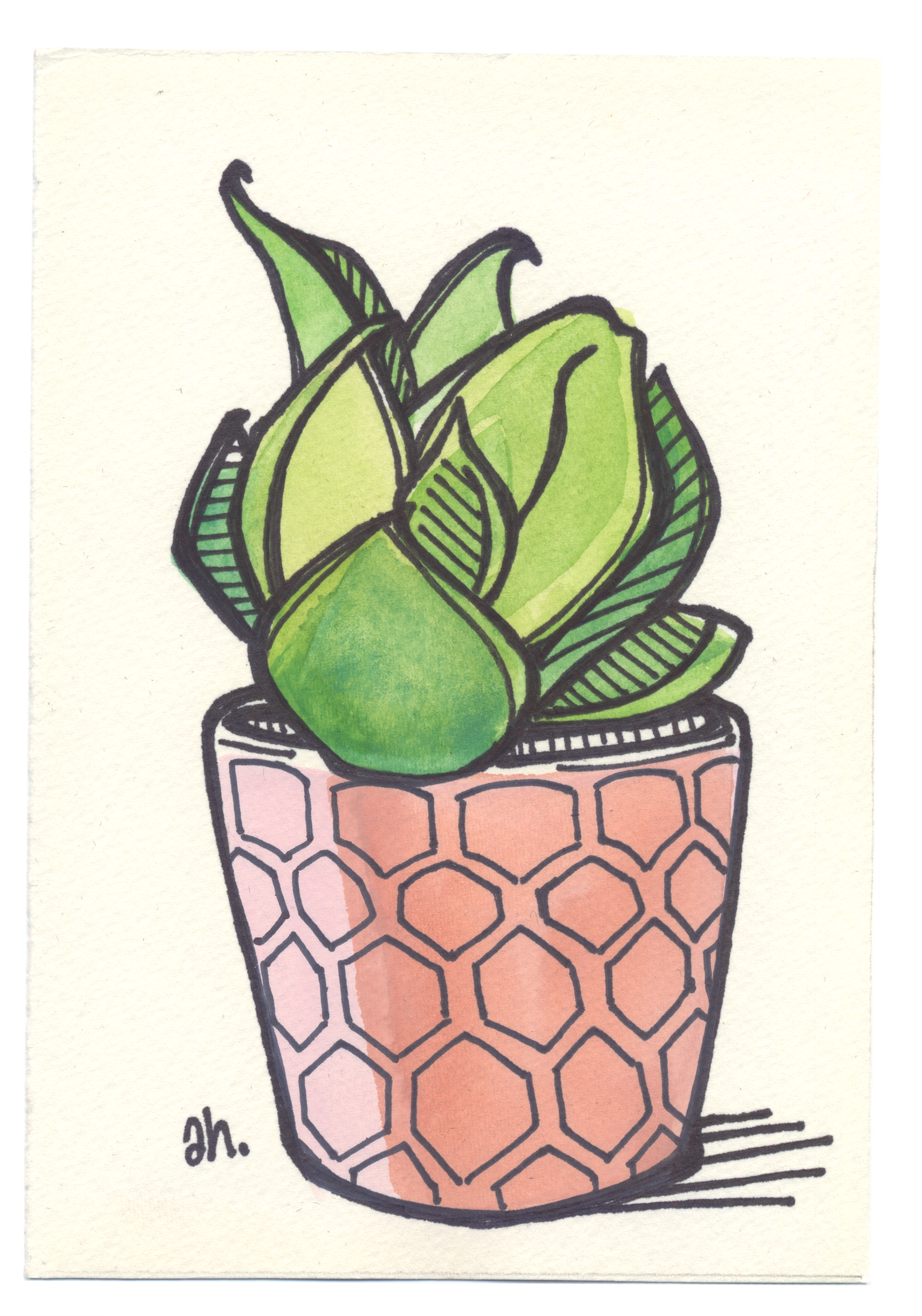
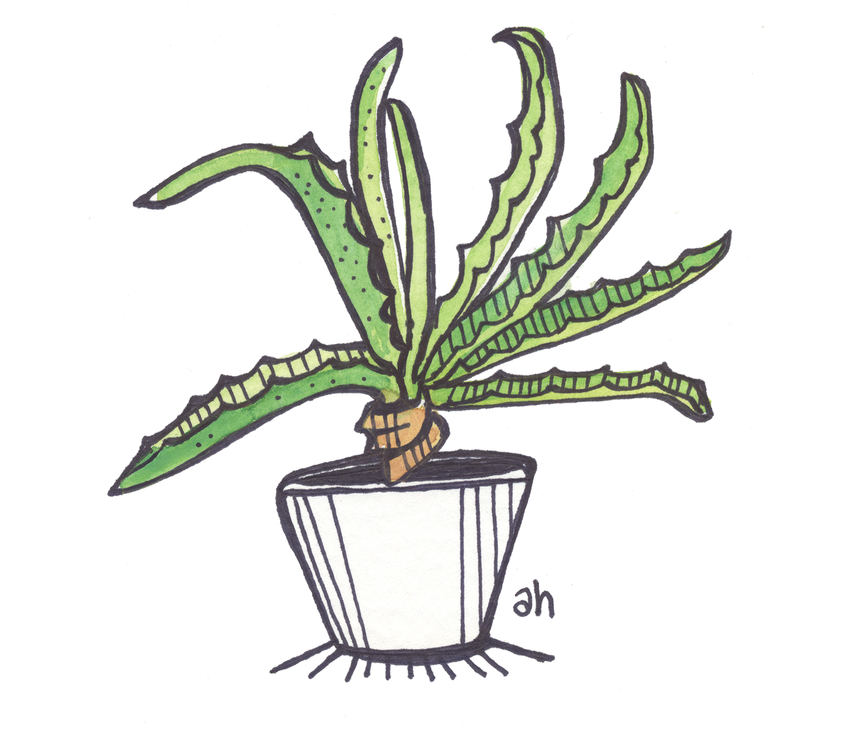
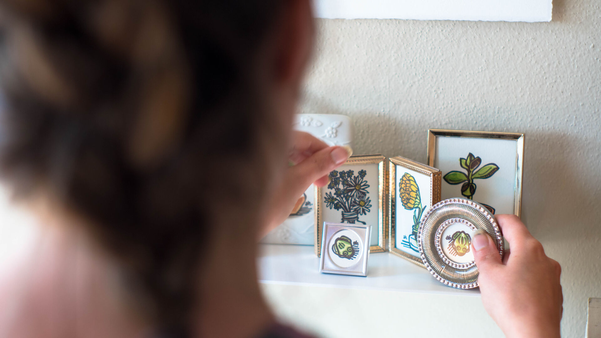
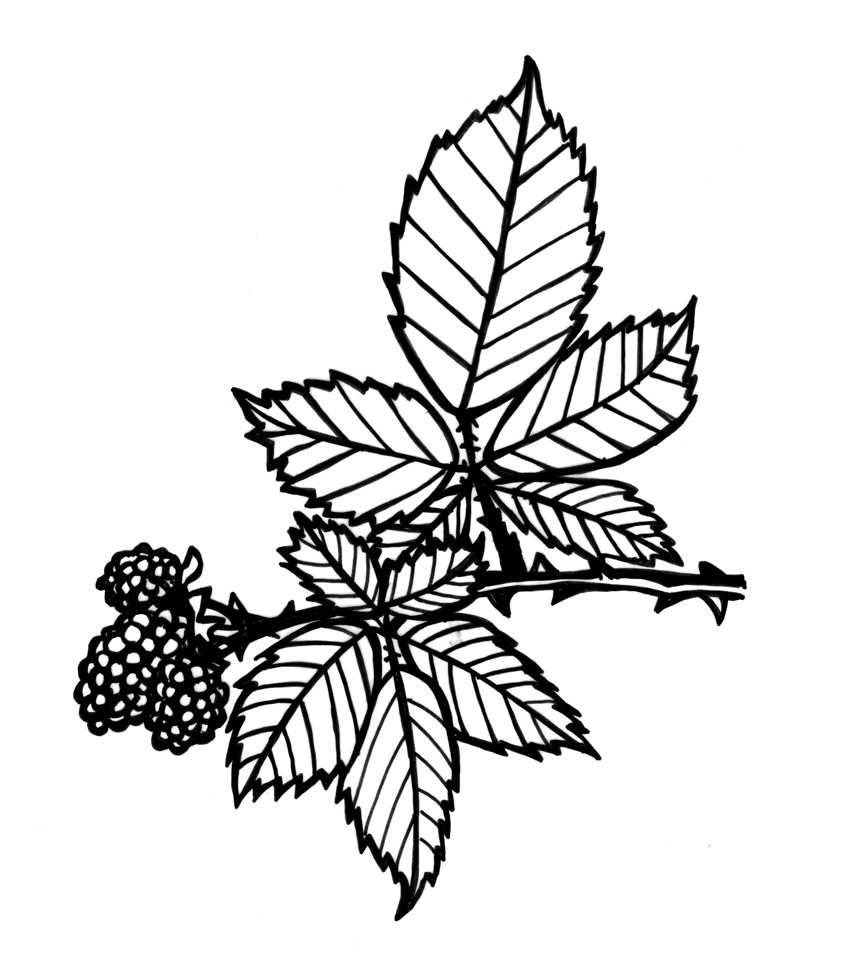
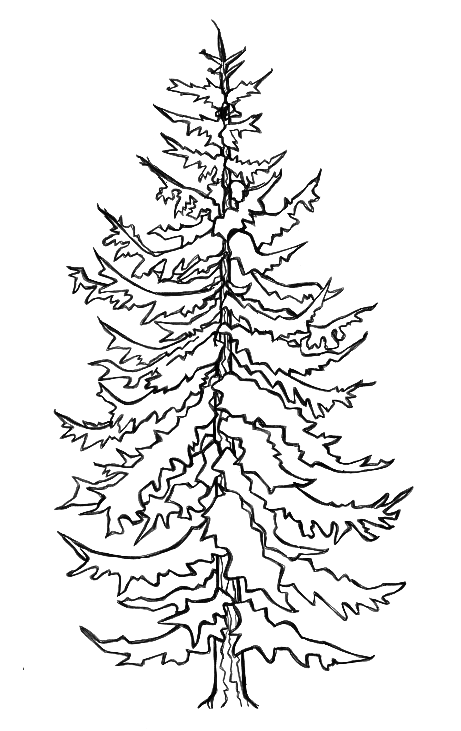
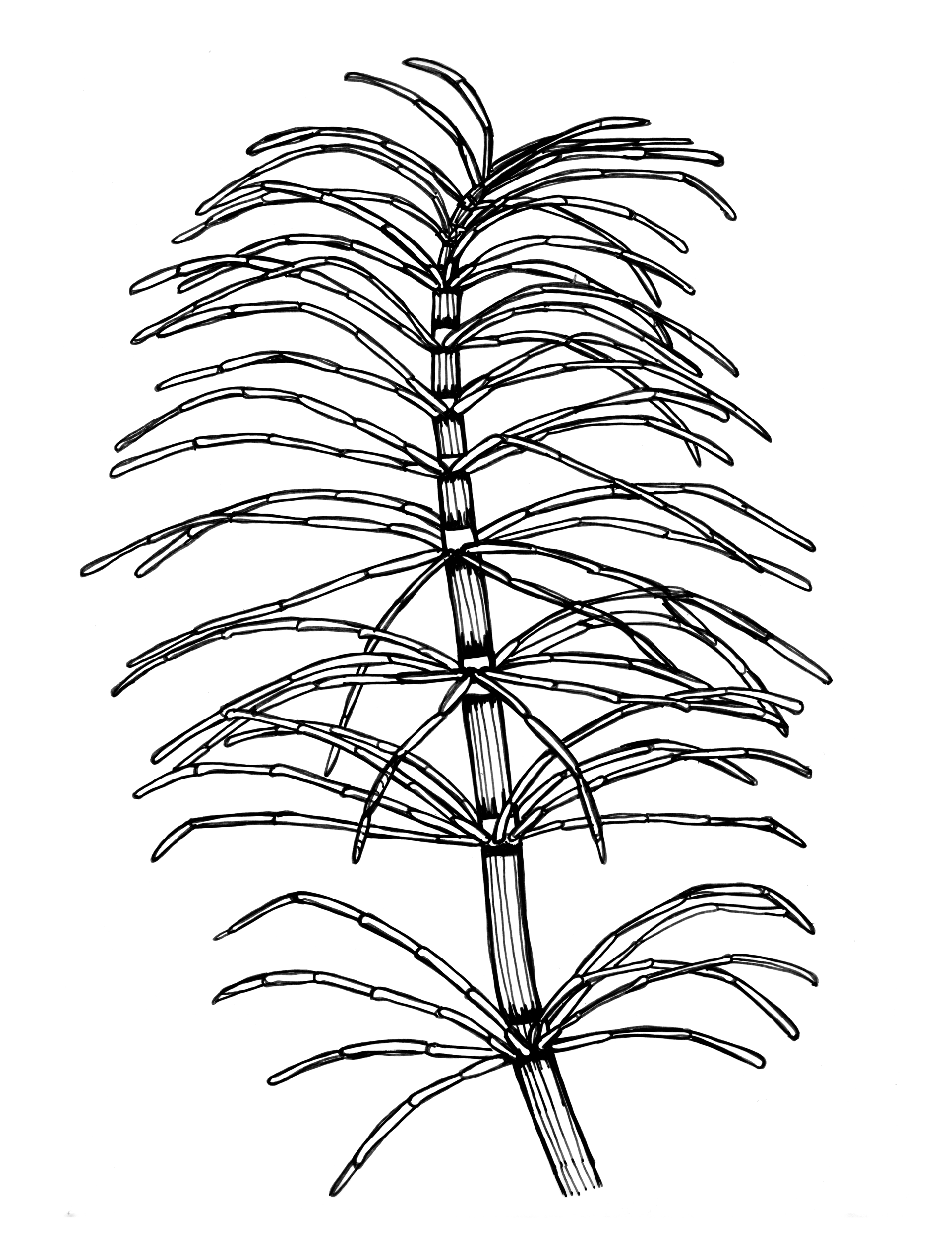
Plant Portraits
Hand Drawn Illustrations
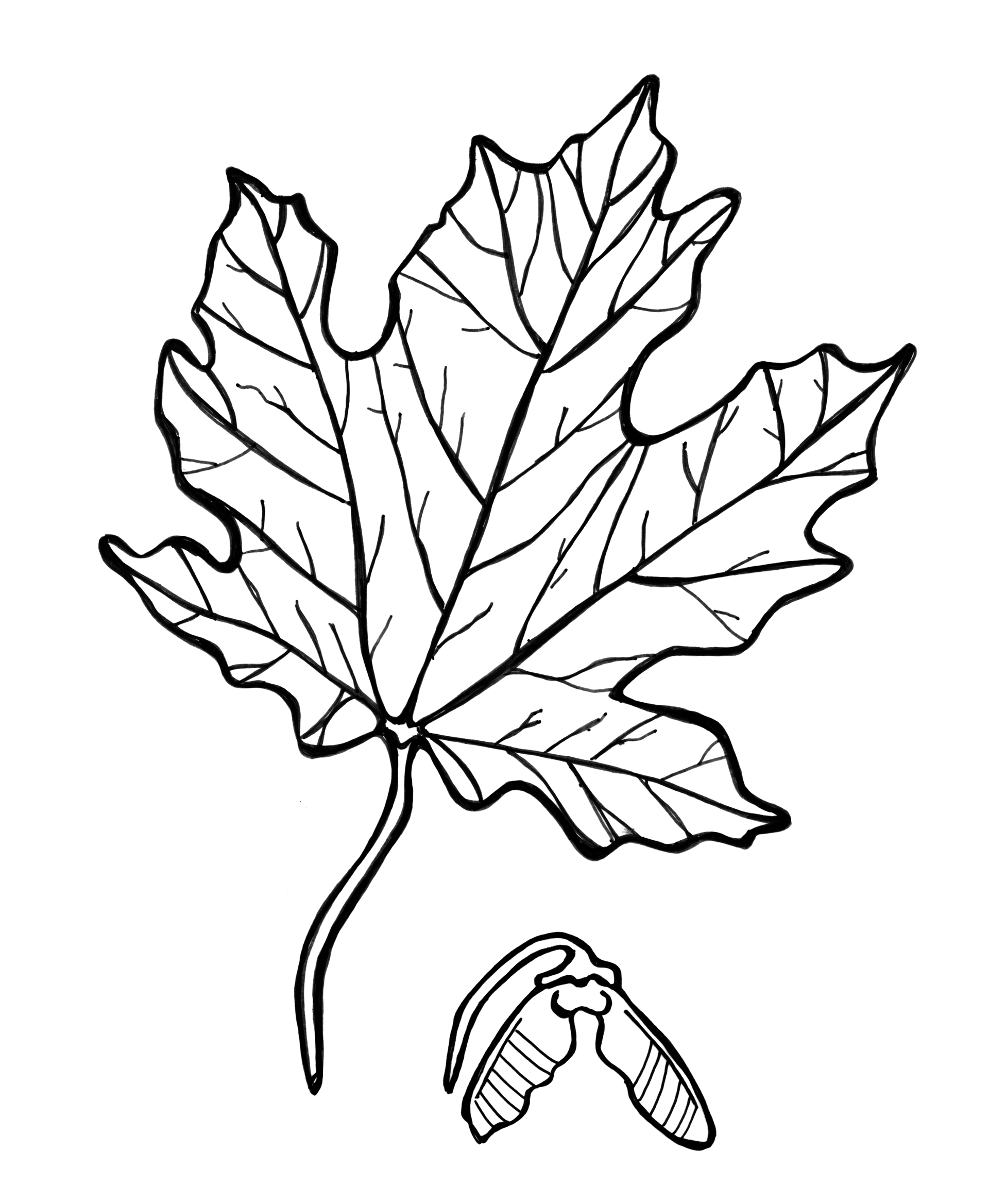
Plants clean the air in your home and give joy to your soul. They give you something to take care of and bring life to a dull space. One of my personal projects is to create illustrations of the plants in my home and frame them with vintage frames discovered at thrift and antique shops. Recently I’ve enjoyed finding ways of weaving these hand drawn and painted plant portraits into the digital world.
Disciplines:
illustration, Art Direction, Personal Branding, Personal Project, Series,


Prev Project
Miri’s at Golden Gardens
Next Project
Billabong
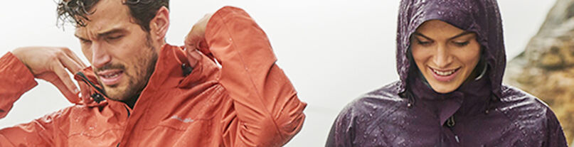
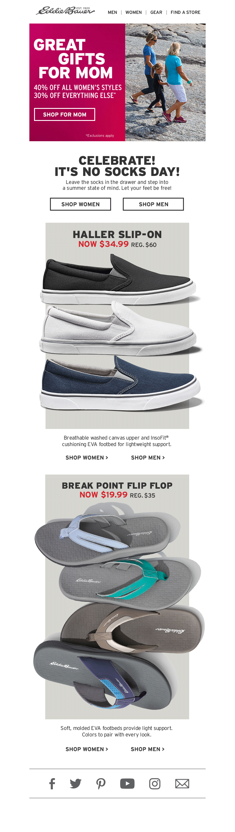
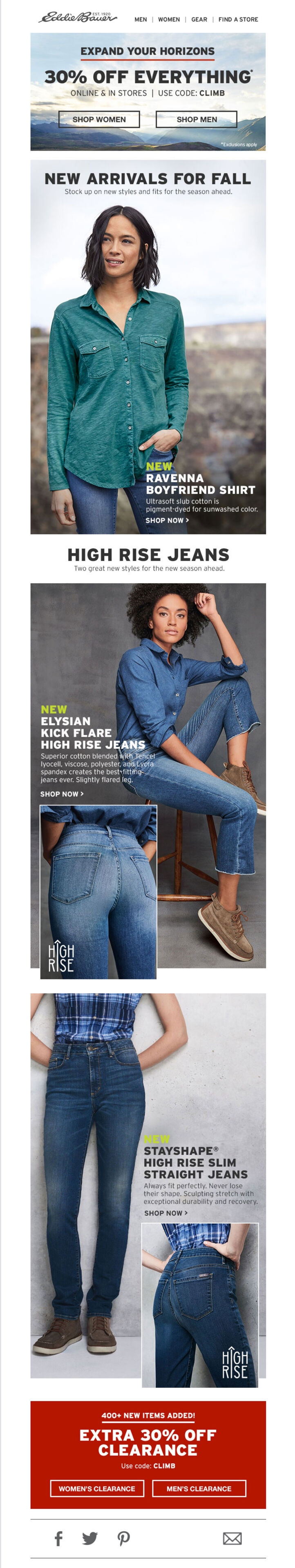
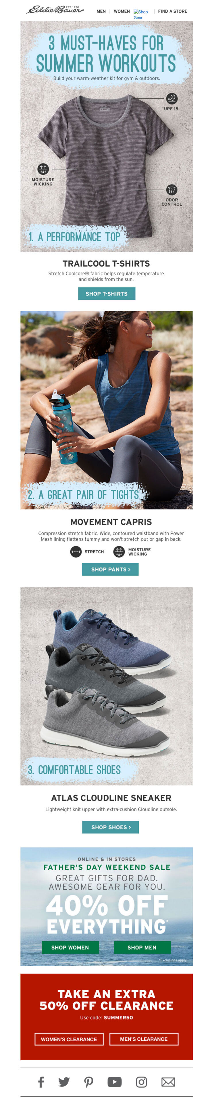
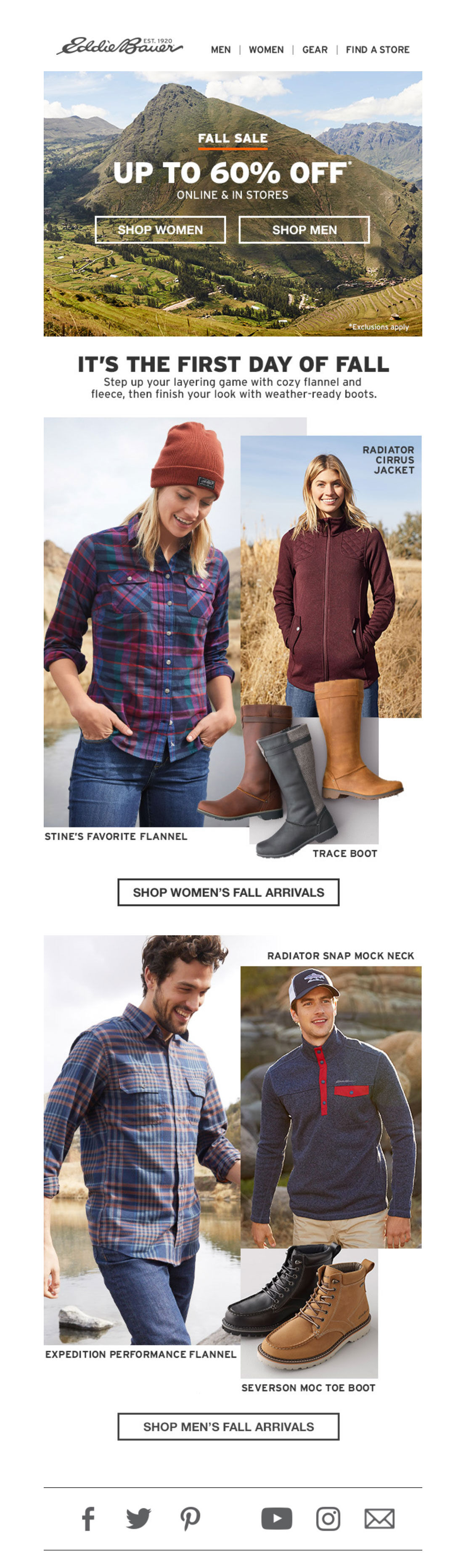
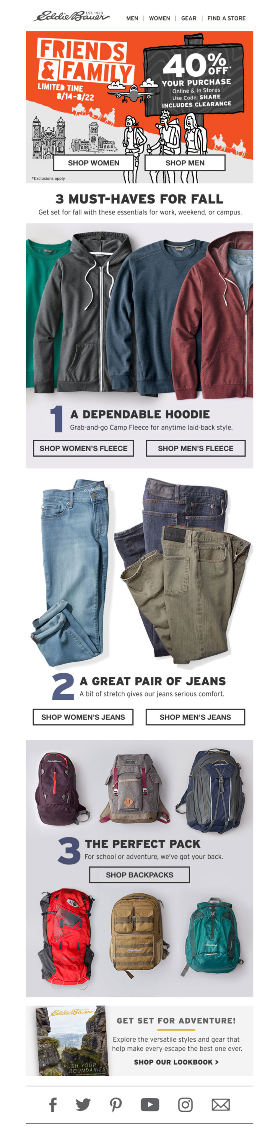
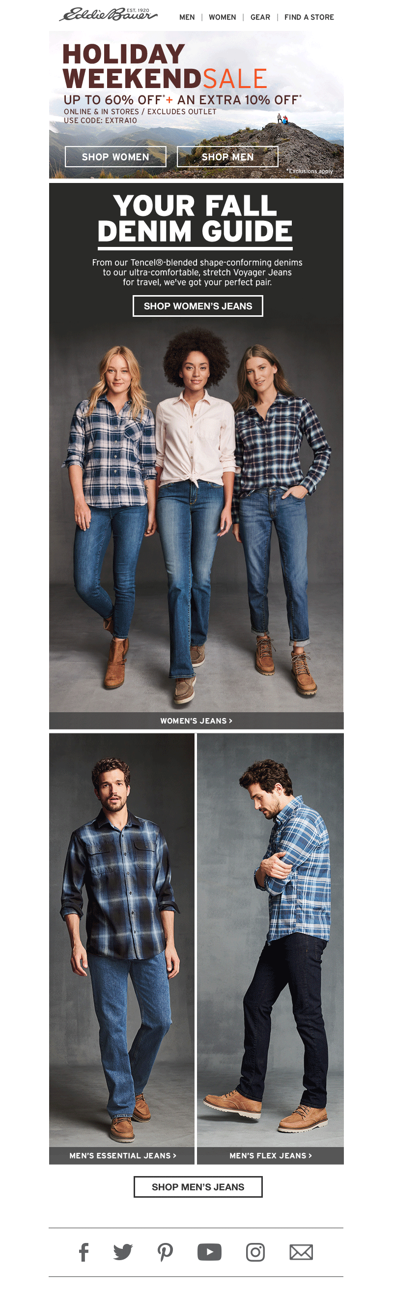
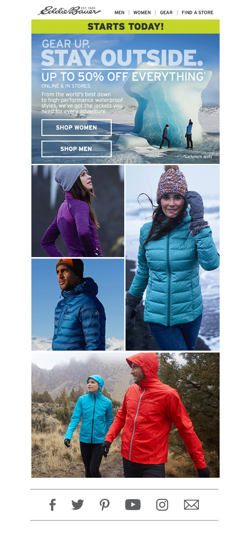
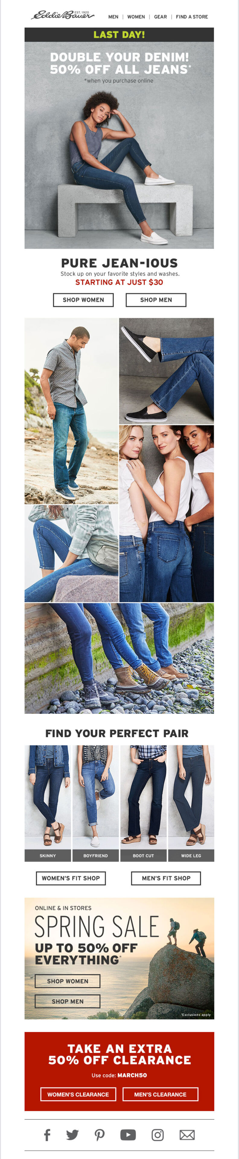
Eddie Bauer
Digital Design and Branding
Eddie Bauer is a Seattle area based outdoor clothing company that began in 1920. The company has a rich history than started with the owner, Eddie Bauer opening a tennis racket shop in downtown Seattle. The shop eventually expanded to include award-winning outdoors gear. His wife Christine “Stine” Heltborg, also an avid outdoors-person, implemented the women’s outdoor wear line. Their products are now geared towards outdoor enthusiasts with an emphasis on hiking, rain and snow-wear.
During my time with digital design team at Eddie Bauer I created visual marketing media through email, various social media outlets, website product pages and digital banners. By using E.B. brand standards and guidelines and adding modern visual aesthetics I created designs that keep with the history of the company while appealing to evolving design trends.
Disciplines:
Web Design, Graphic Design, Brand Standards, Retail Design, ConceptingClient:
Eddie BauerPress:
Websites:
Prev Project
Dear Lois Magazine
Next Project
Miri’s at Golden Gardens
Dear Lois Magazine
Illustration and article
Disciplines:
Illustration, Art Direction, WriterClient:
Dear LoisWebsite:


Prev Project
Midsummer Night’s Dream
Next Project
Eddie Bauer
Transpose
E-Book Illustrations
Transpose, a Seattle-based start-up, aimed to make everyday data storage more simplistic.
When they came to me looking for illustrations for their new e-book, I was excited. Together we explored concepts for imagery that would best support their overall company message. We settled on the theme “consolidation is key” for the chapter header illustrations. Using a keychain as a metaphor, I created a series of images supporting the idea that digital consumers store their data in too many places and that by using Transpose’s online services, users can pair down to one platform. The fox—Tranpose’s logo/mascot—holds the key.
Prev Project
Billabong
Next Project
Naturistic
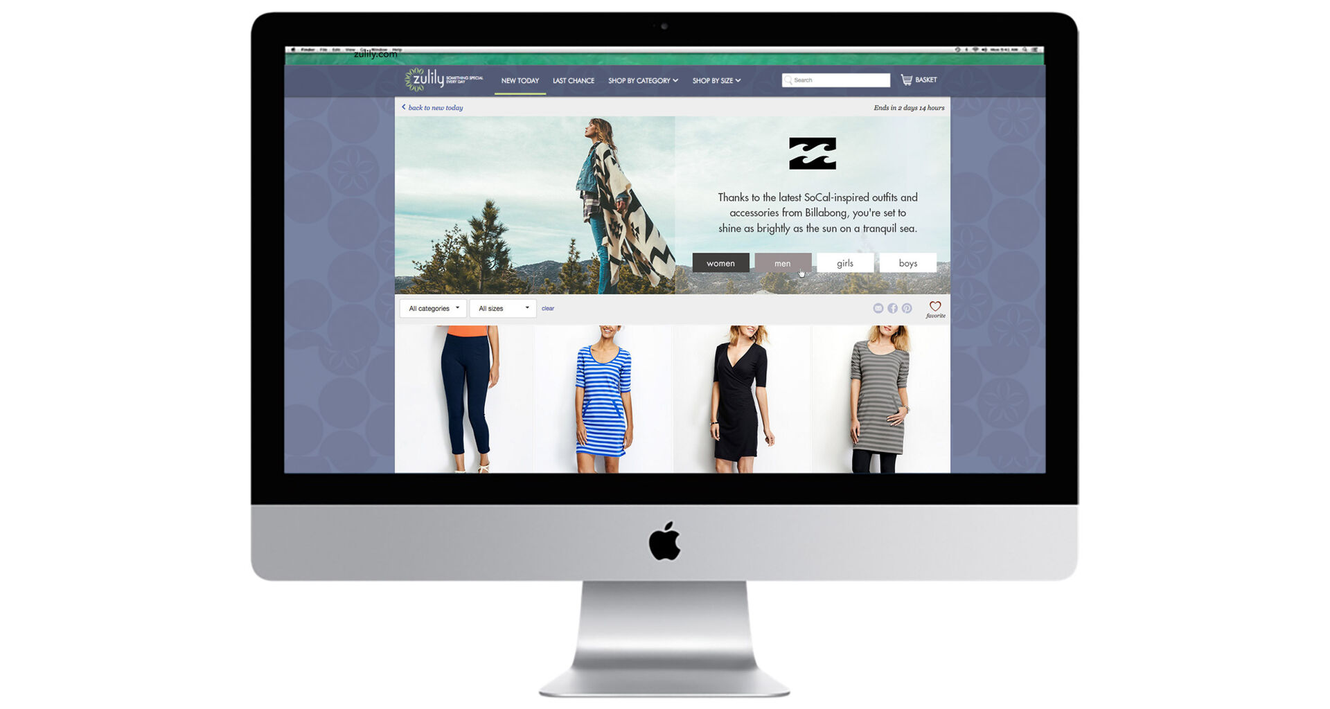
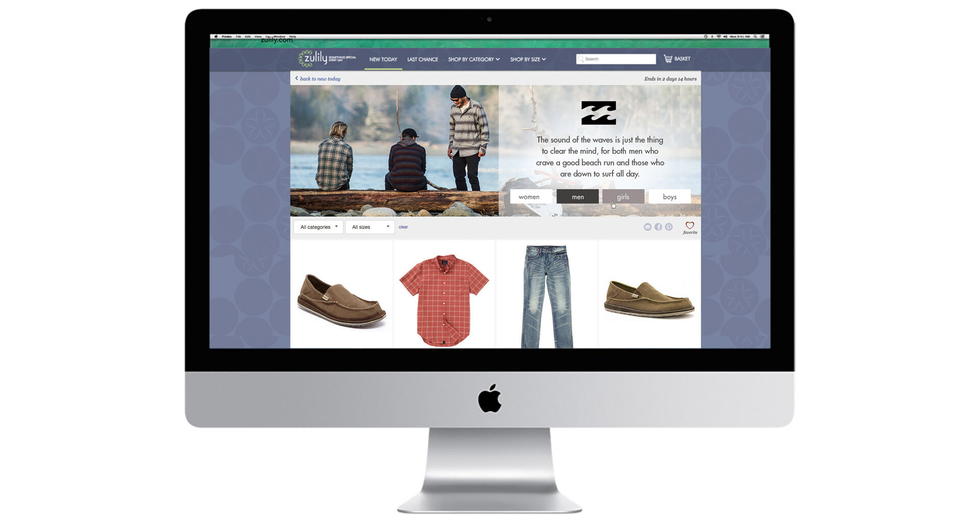
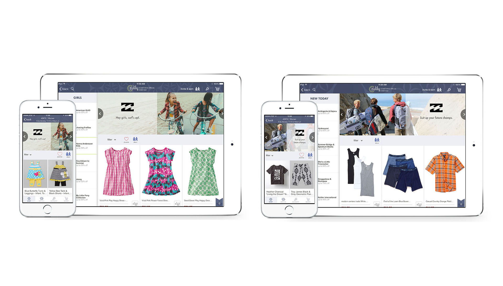
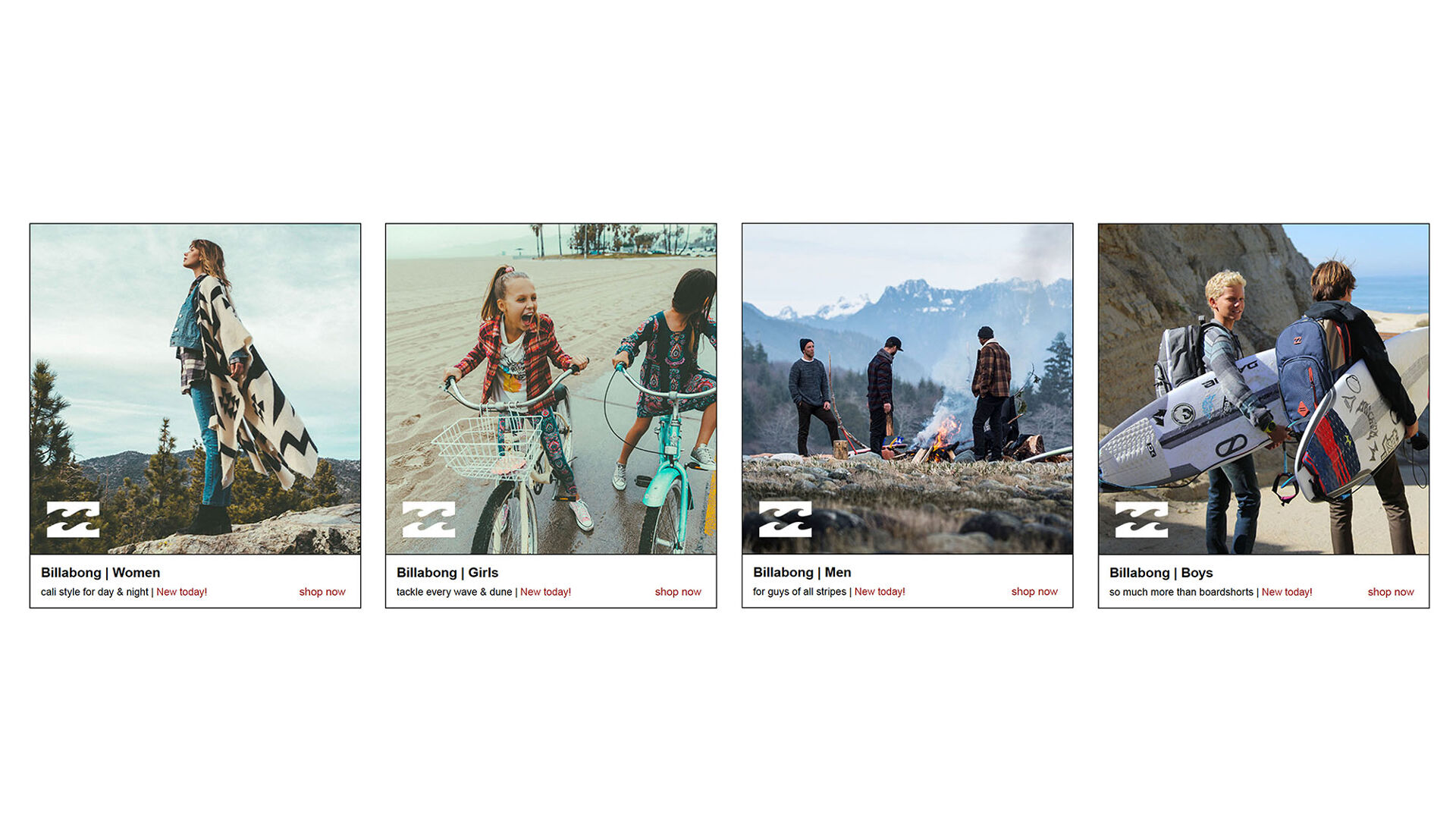
Billabong
Zulily Web Campaign
Clothing, toy, and home-product retailer Zulily often features well-known brands that their clientele—largely young mothers—will enjoy.
For this project, I designed a web campaign that reflects the Billabong brand while also adhering to Zulily’s brand aesthetics. To achieve this, I used large nature-themed images and simple text-overlays on a transparent white field. The images of outdoor adventure and family draw the customer in, suggesting a similar experience can be found through the click of a button (and purchase).
Disciplines:
Web Design, Graphic Design, Brand Standards, Retail DesignClient:
Billabong & Zulily
Prev Project
Plant Portraits
Next Project
Transpose
Zulily
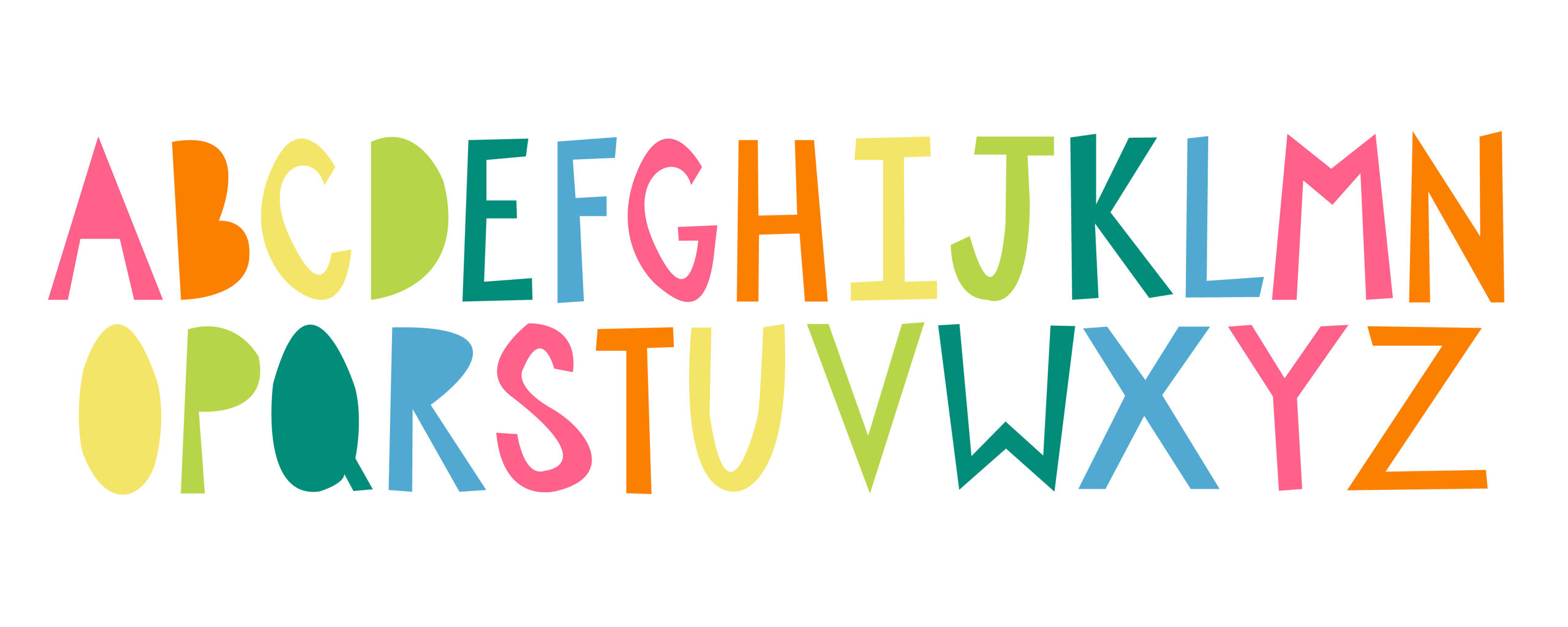
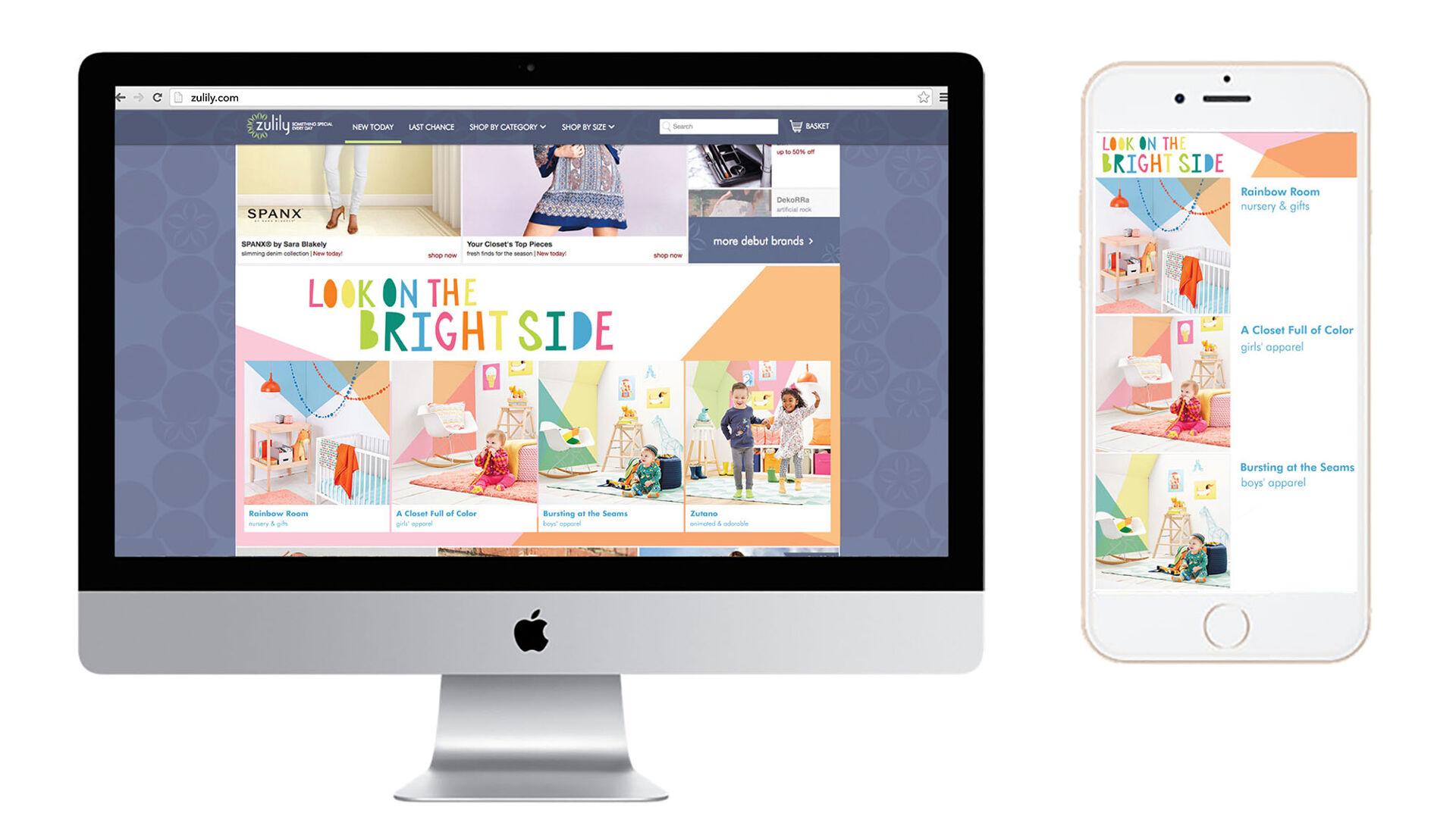
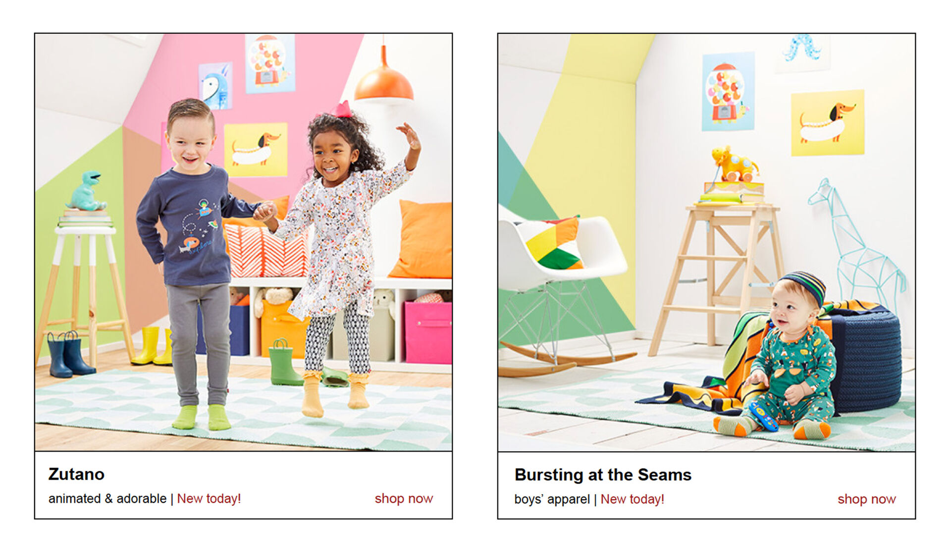
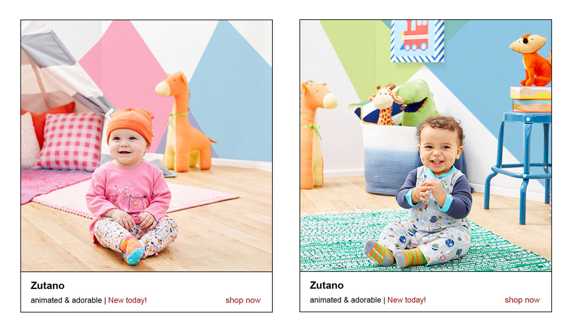
Brights for Baby Web Campaign
Zulily is an American e-commerce company headquartered in Seattle that sells clothing, toys, and home products. Their target audience is young and tech-savvy mothers on the lookout for unique brands and products for their children.
For this project I was asked to create a custom font for their special online event Brights for Baby. The creative font is based on the brand’s main typeface, Futura. Layering bright blocks of color throughout the design and onto product photographs creates a modern cheerfulness that appeals to Zulily’s client base. A sense of glee and optimism is achieved in these children’s nurseries as they enjoy their brightly colored clothes and accessories.
Disciplines:
Web Design, Graphic Design, Typography, BrandingClient:
ZulilyWebsites:

Prev Project
Vintage Truck Portraits
Next Project
San Fermo
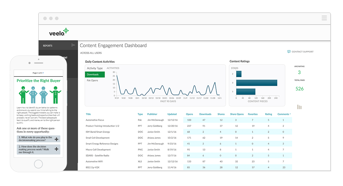
Veelo
Instructional Graphics
Veelo is an interactive online application designed to help businesses grow. Veelo provides a platform created to guide company sales teams. This includes virtual coaching, sales content management, and better prospect engagement.
I was contacted by Veelo to develop clean, vector-based business-themed graphics supporting client e-training sessions. These minimal, modern business graphics help explain real-life business scenarios. To achieve this, I chose a non-traditional three-color pallet and flat design, with character emotions and actions shown through hand gestures and simple mouth movements.
Disciplines:
Art Direction, Illustration, DesignClient:
VeeloWebsite:


Prev Project
The Vestibule
Next Project
Vintage Truck Portraits
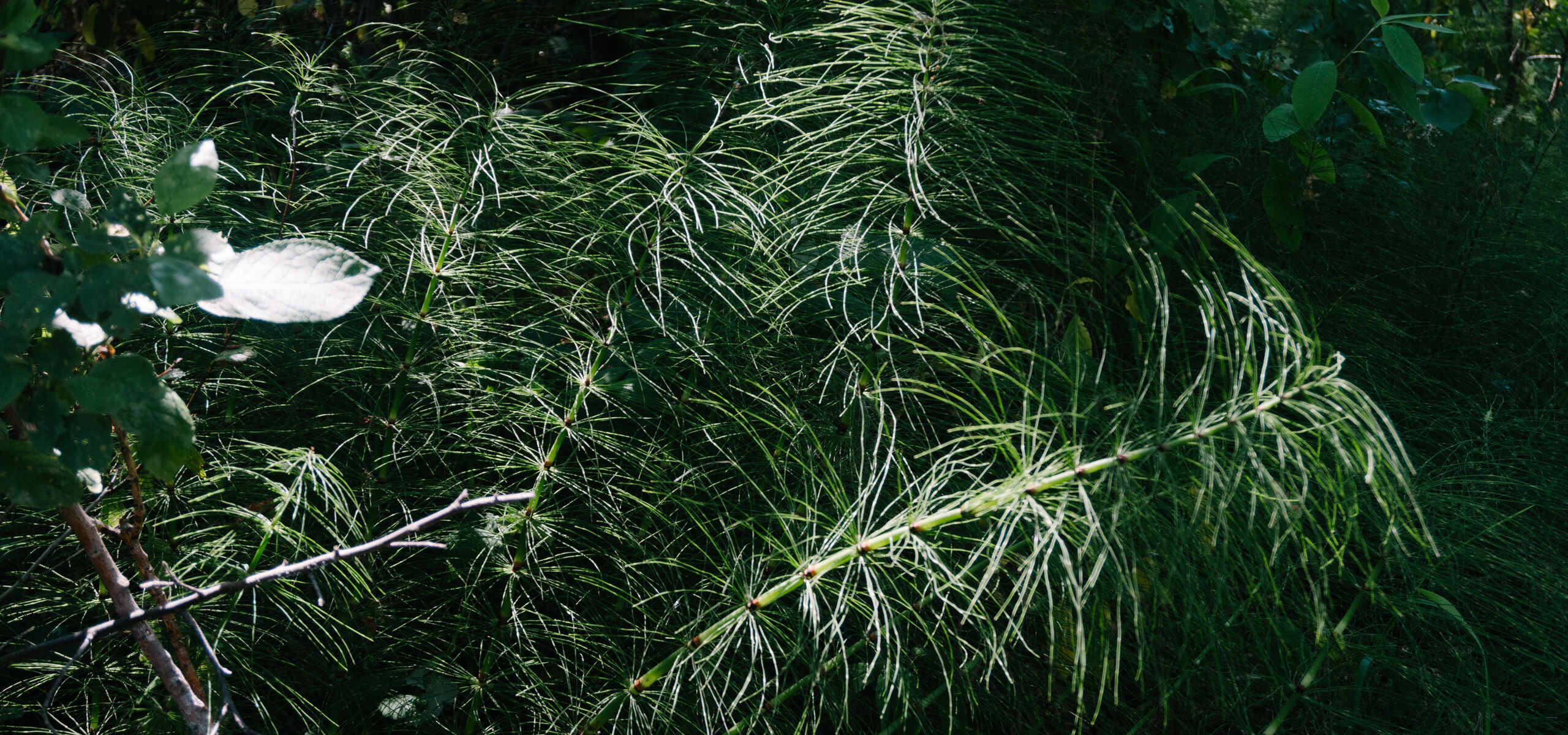
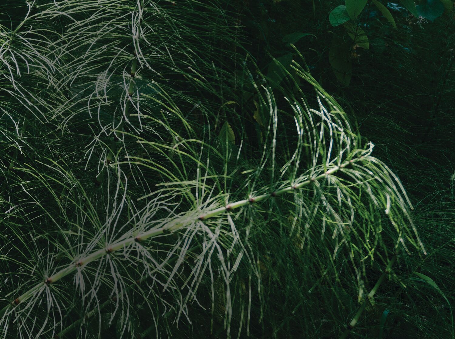

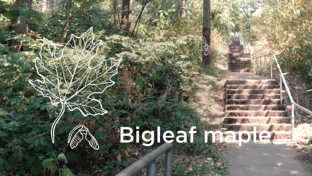
Naturistic
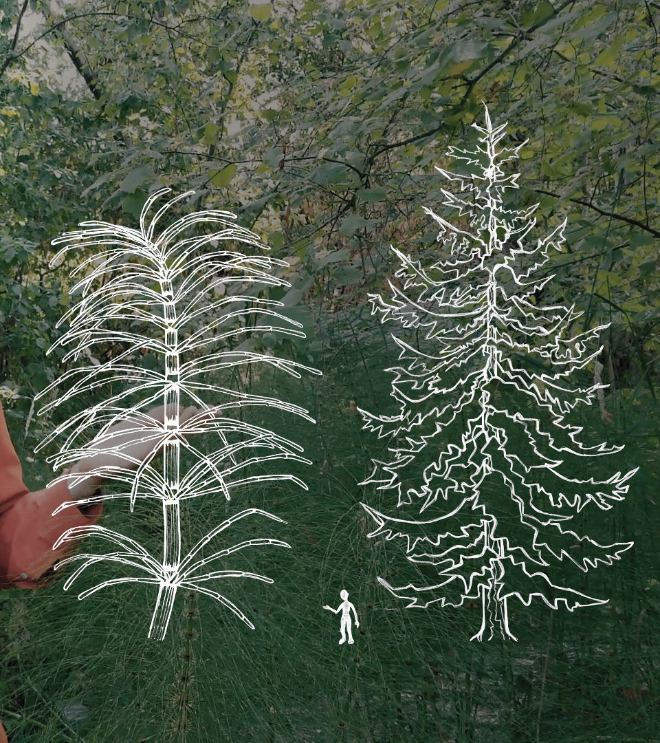
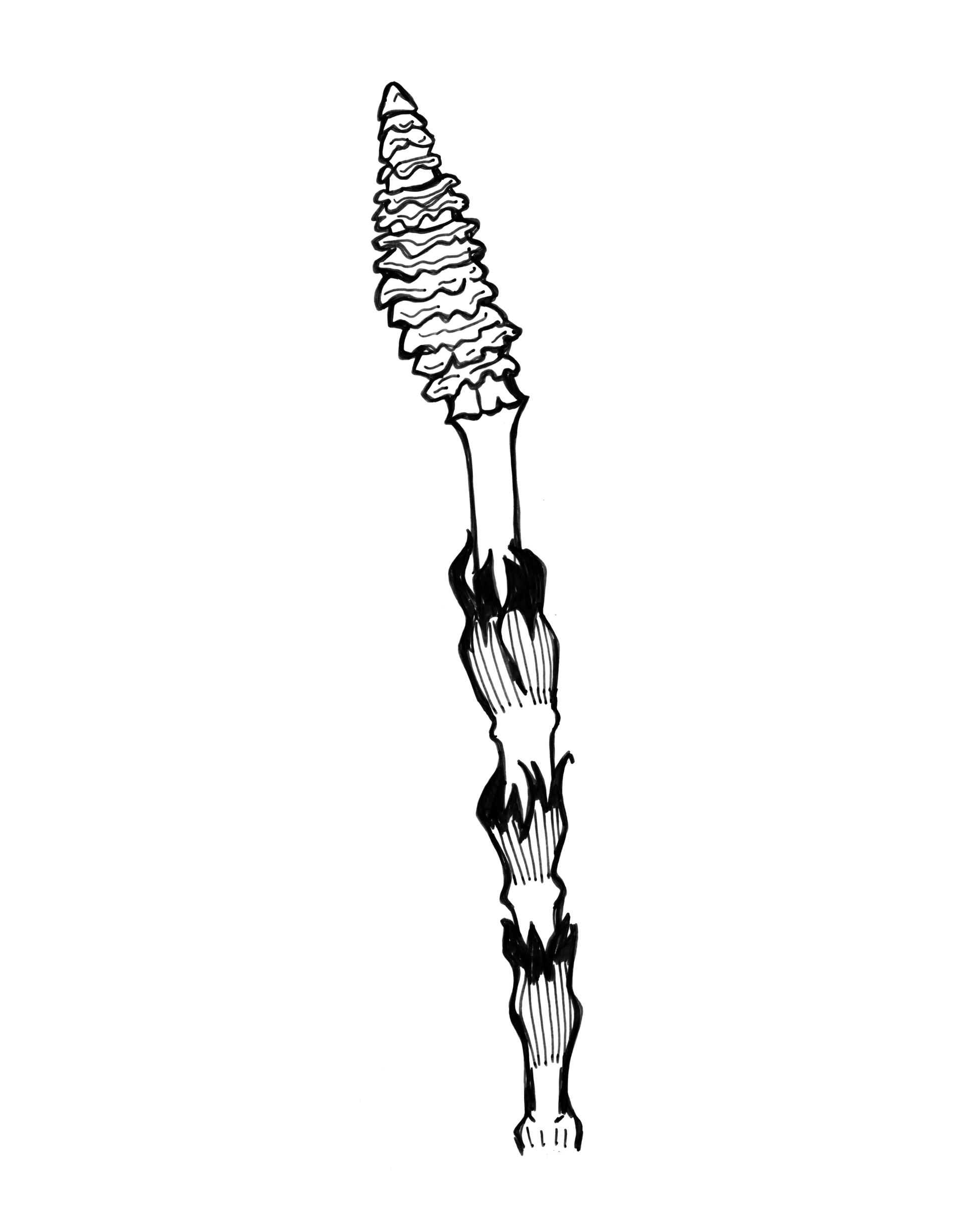
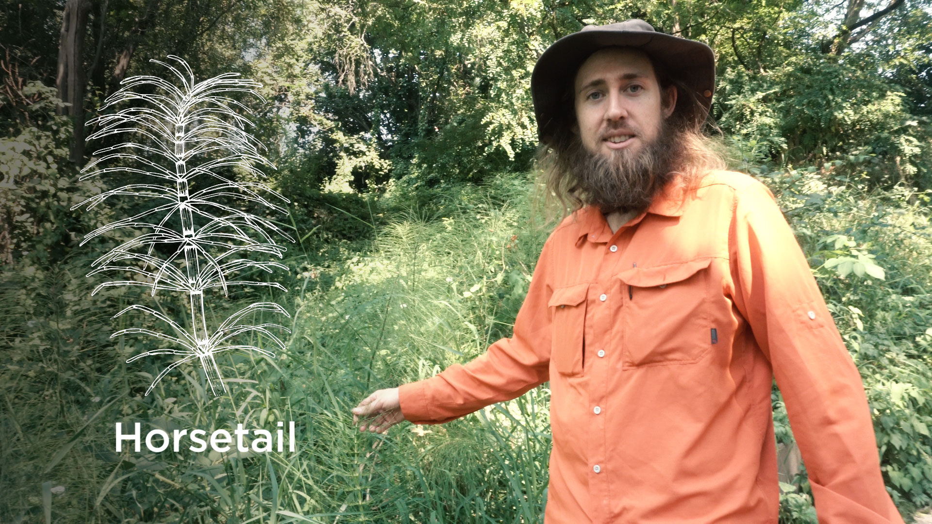
Illustrations for Science Series
Naturistic is an online educational film series exploring biology and ecology by scientist Nash Turley, PhD, and musician/composer Hamilton Boyce.
The two friends brought me onto their team to create illustrations. We discussed what areas in the video would benefit from diagrams, small animations, and more focused visuals, and I worked with Hamilton to create line drawings that clarify and support each episode’s topic. To reflect the accessible and light-hearted mood of the series, I gave the hand-drawn illustrations a slightly comical yet realistic style. We then layered the drawings over foliage-rich background photography and video to create a multidimensional feel.
Disciplines:
Illustration, Art Direction, BrandingClient:
Naturistic Video SeriesPress:
Websites:
Prev Project
Transpose
Next Project
Medium.com
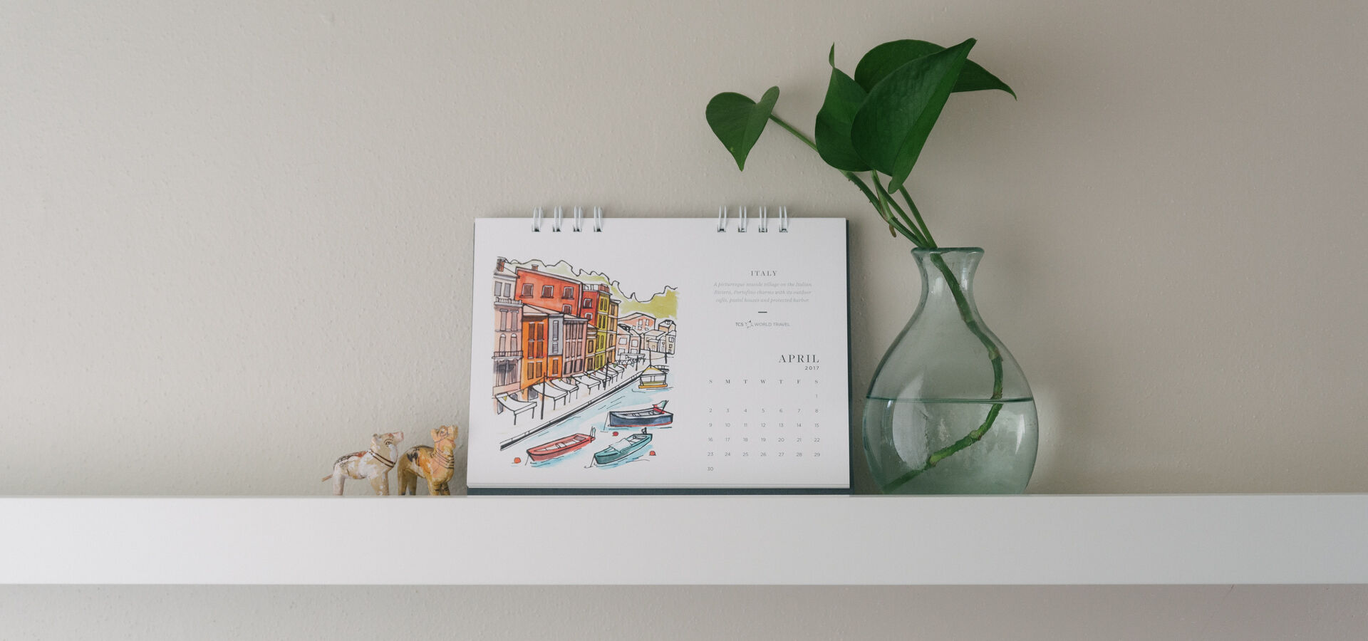
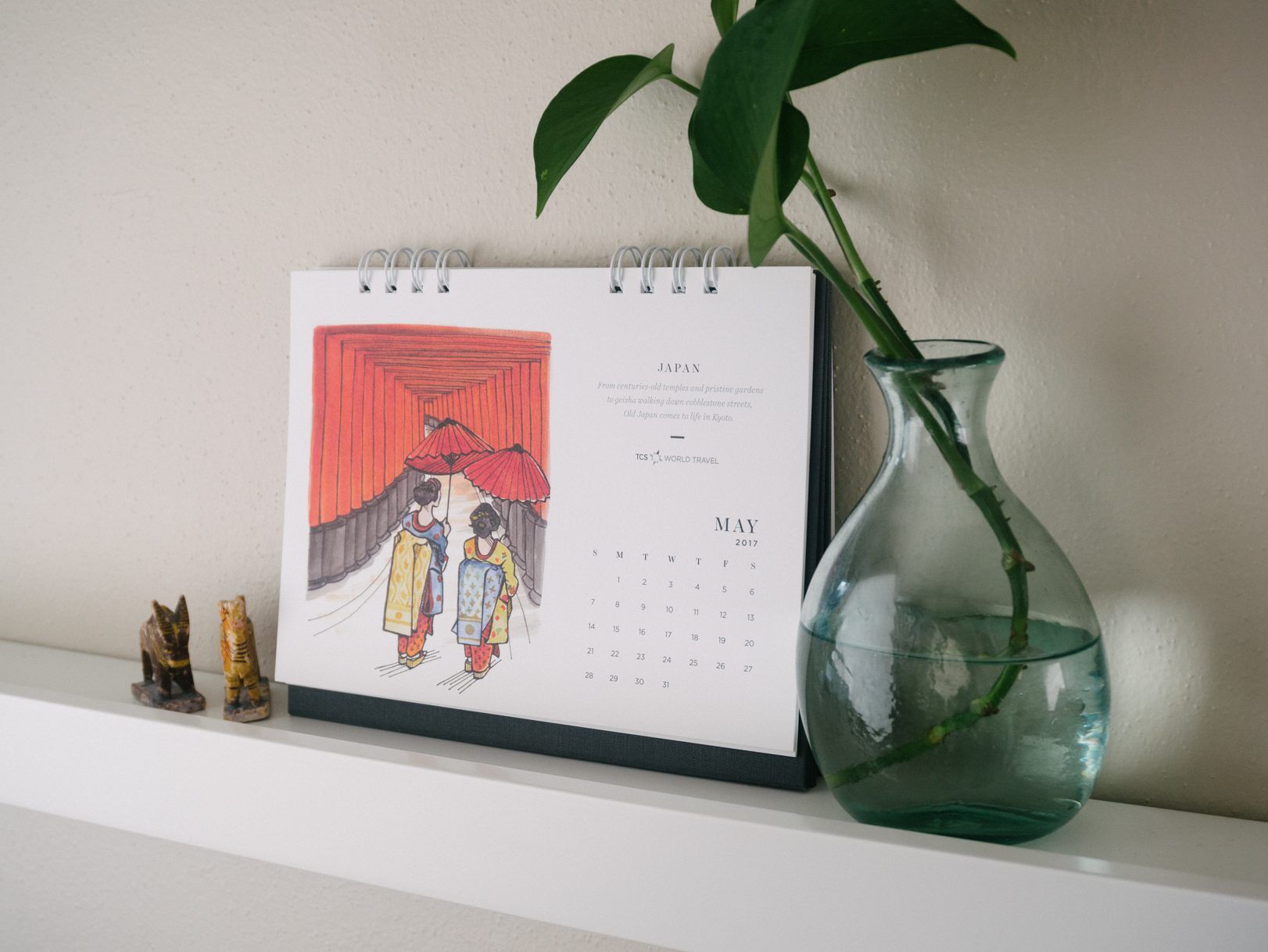
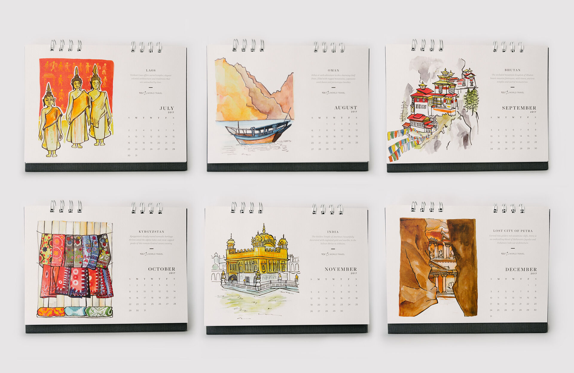
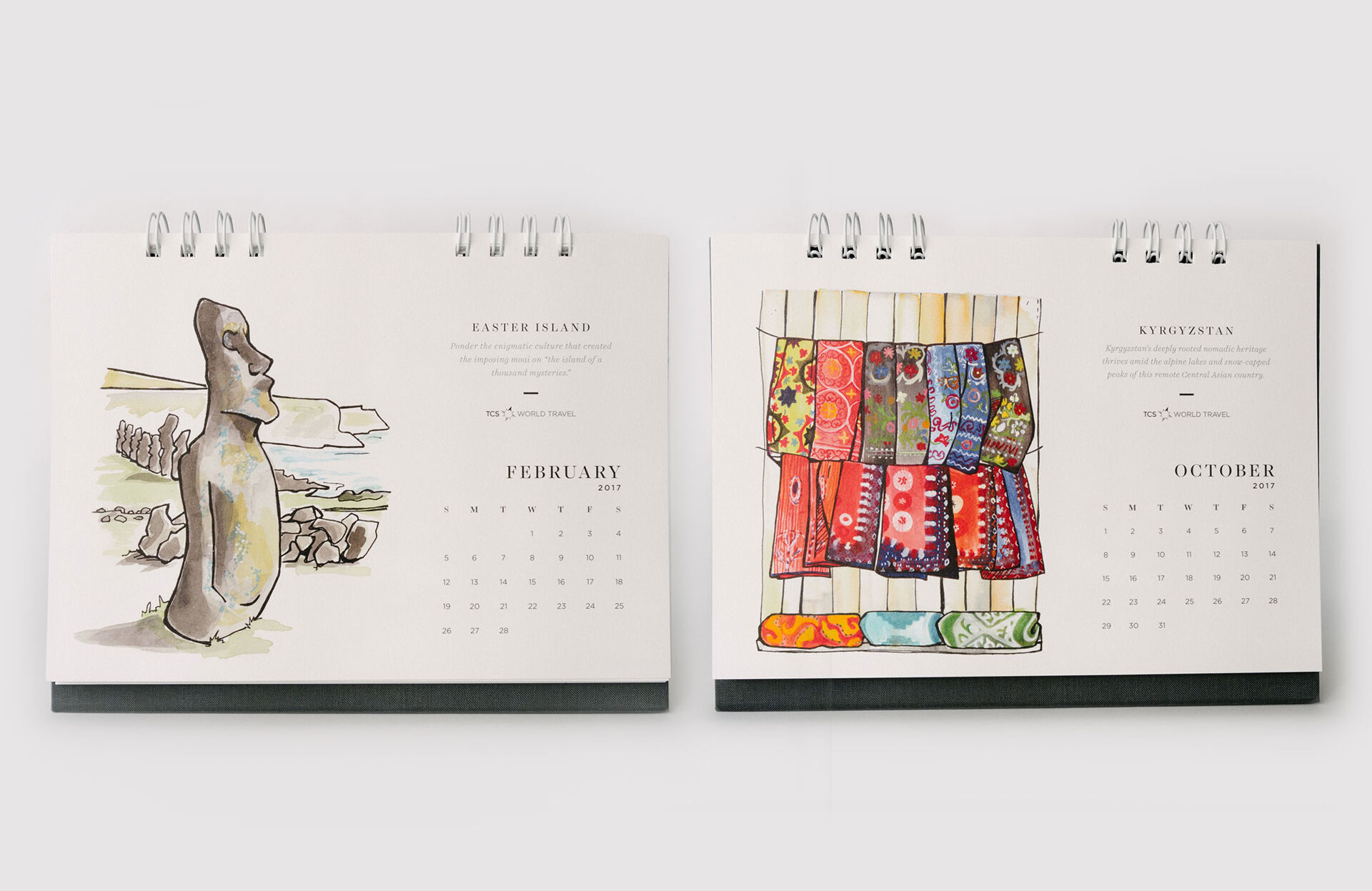
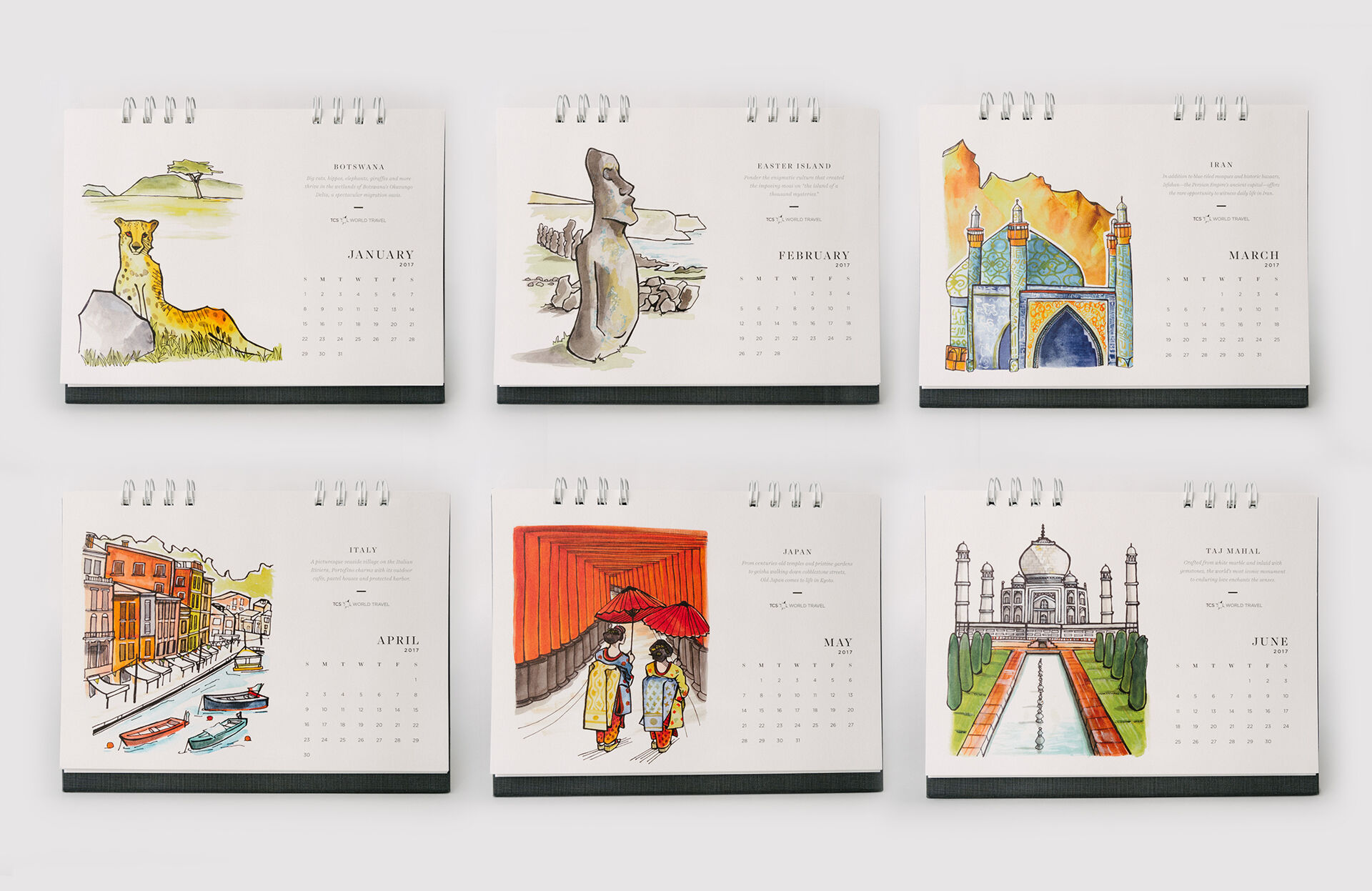
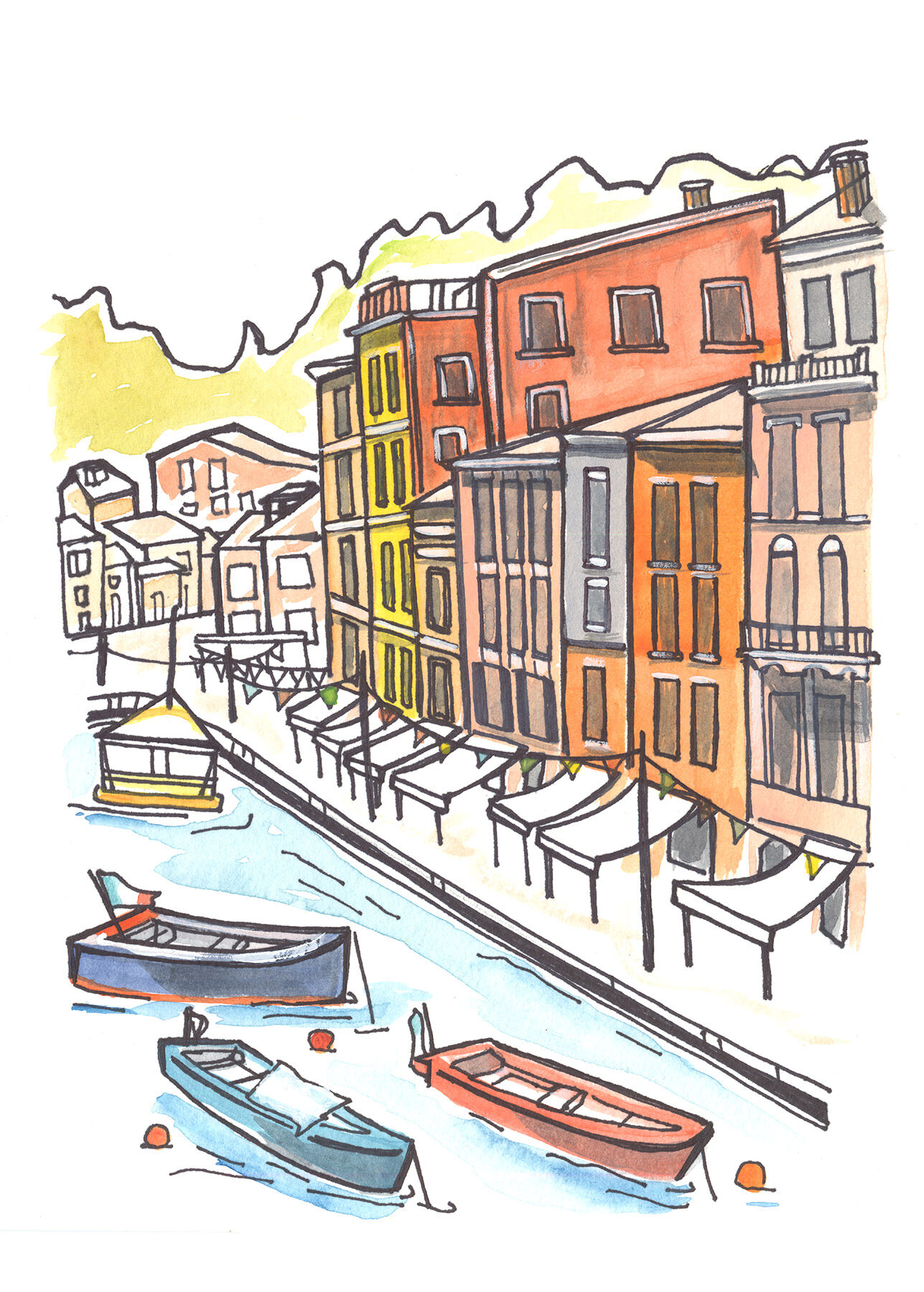
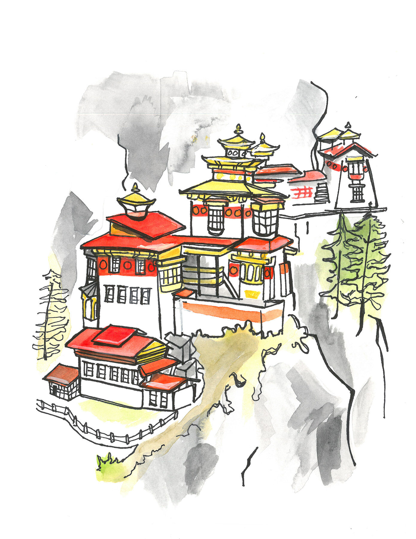
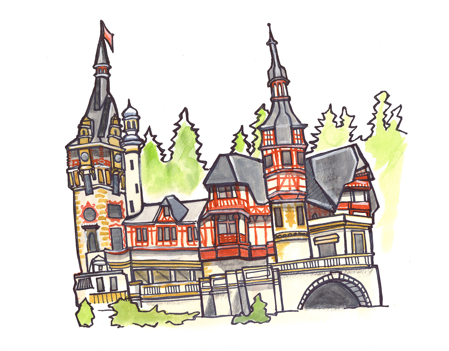
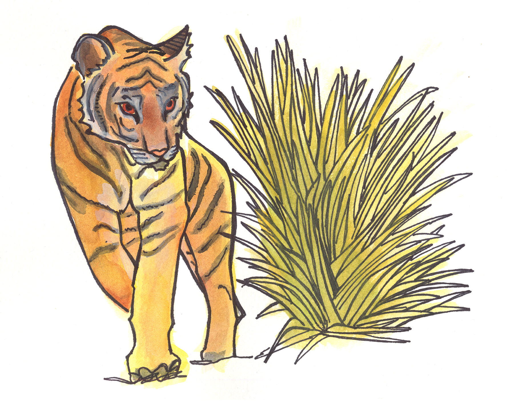
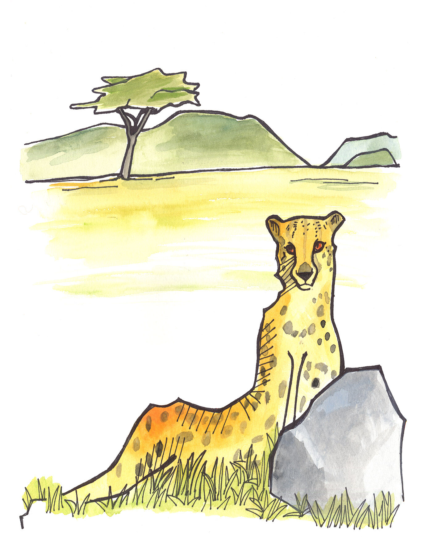
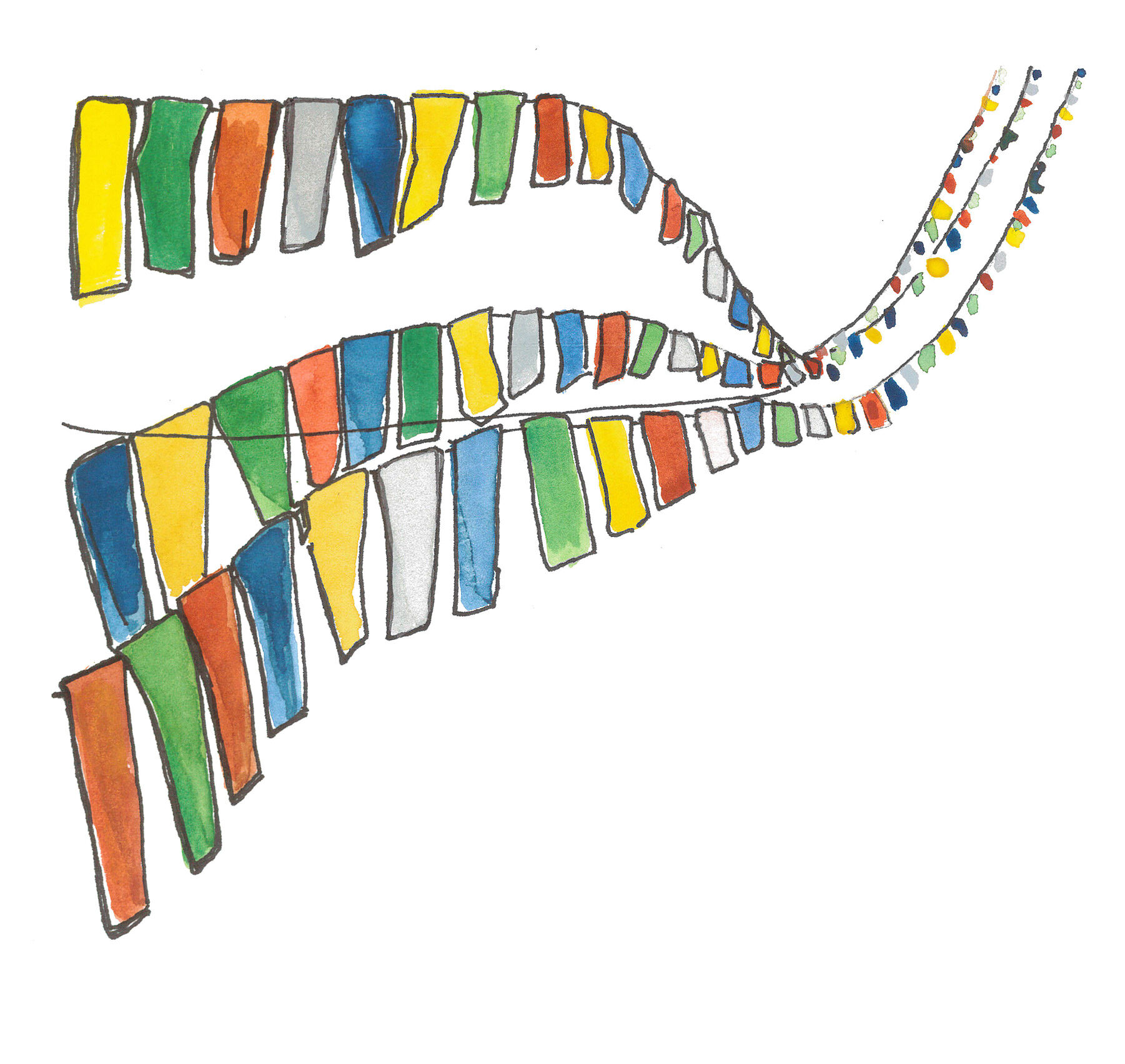
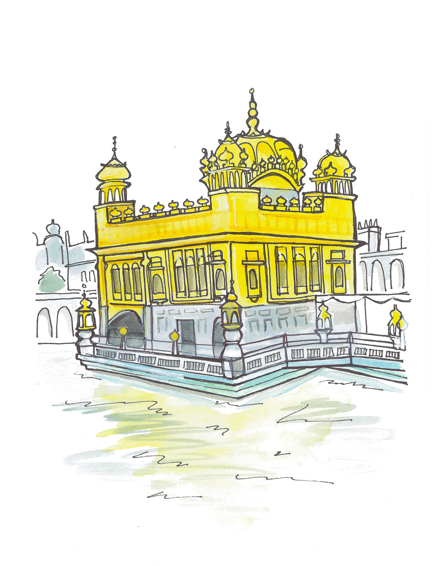
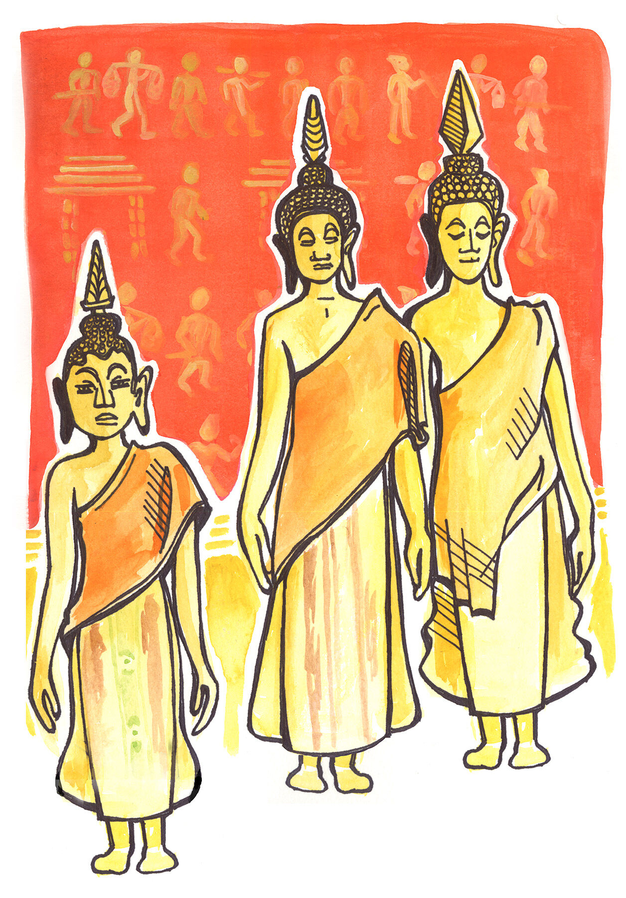
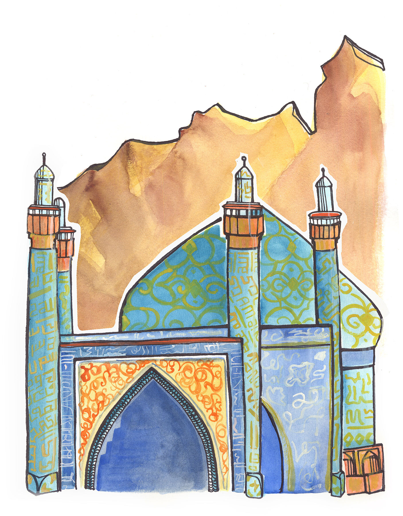
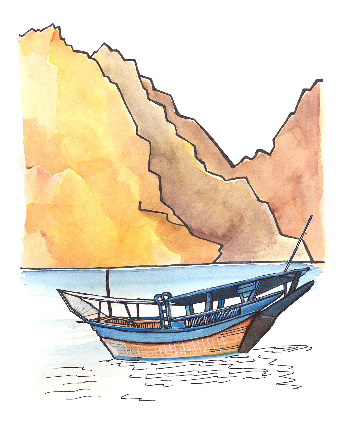
TCS World Travel
Calendar Illustrations
For over 25 years, TCS World Travel has hosted guests on adventures of a lifetime. Their high-end, all-inclusive journeys deliver unparalleled and meaningful experiences in unique destinations around the globe.
Each year, the company collaborates with an illustrator to create a calendar for their clients that celebrates world travel. In 2016 they hired me to create detailed illustrative snapshots of their beautiful featured vacation destinations. I brought scenes from around the world to life using bright colors and a style I adapted for a more realistic depiction of the locations. I created the illustrations using a combination of gouache, watercolor, and my favorite black Sharpie pens, with any edits made digitally.
Disciplines:
Illustration, Art DirectionClient:
TCS World TravelWebsite: